How to make a grainy gradient, the grainy blur look
Melted into a violet-to-peach gradient under heavy grain.
What it is
The grainy blur look takes a picture and melts it. The subject is blurred until only its silhouette and its brightest areas remain, the tones are mapped to a warm gradient — deep violet in the shadows, hot pink and coral through the middle, peach and a creamy glow in the light — and a heavy mono grain is laid over everything. The grain is what makes it: without it a blur looks like a mistake, with it the picture looks printed, tactile and deliberately soft.
It grew out of the noisy gradients of early web design and the airbrushed “aura” posters, and in 2025–2026 it is everywhere: event posters, album covers, wellness brands, app backgrounds and social templates. It is a calm counterpoint to sharp, clean type, and it turns any photo — even a weak one — into a colour field that belongs to your palette.
Where it is used
Grainy blur suits music releases and club nights, festival and event posters, wellness, beauty and fragrance brands, podcast covers, phone wallpapers and backgrounds behind bold headlines. It is best on a cut-out figure or a simple, high-contrast photo: the blur keeps the shape, the gradient gives it light. Put crisp type over it — the contrast between sharp letters and a soft field is the whole point.
Made in Paletoo with this mix:
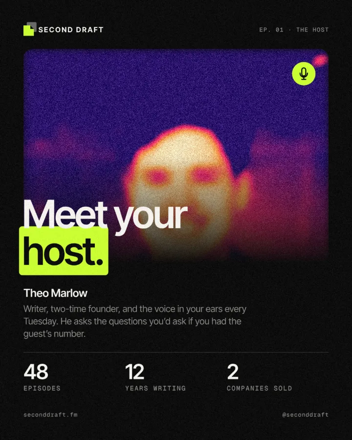
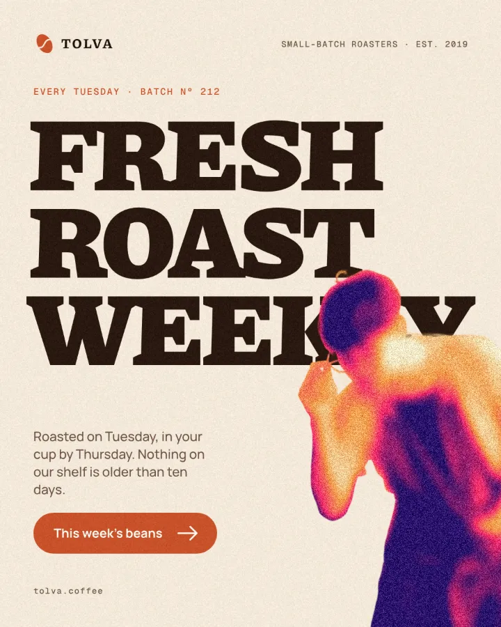
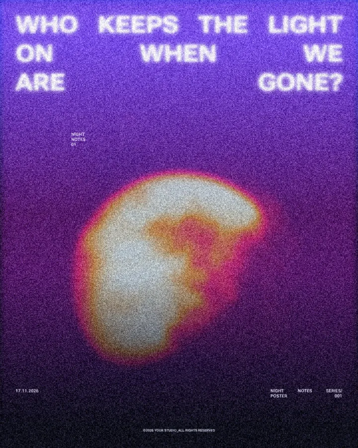
How to make it, step by step
Open your design and select the picture to melt. A cut-out figure or a photo with a clear bright area works best; here it is the cut-out coach on a running-app post.
Open the Effects tab and find Mixes; press All if Grainy blur is not in the first row.
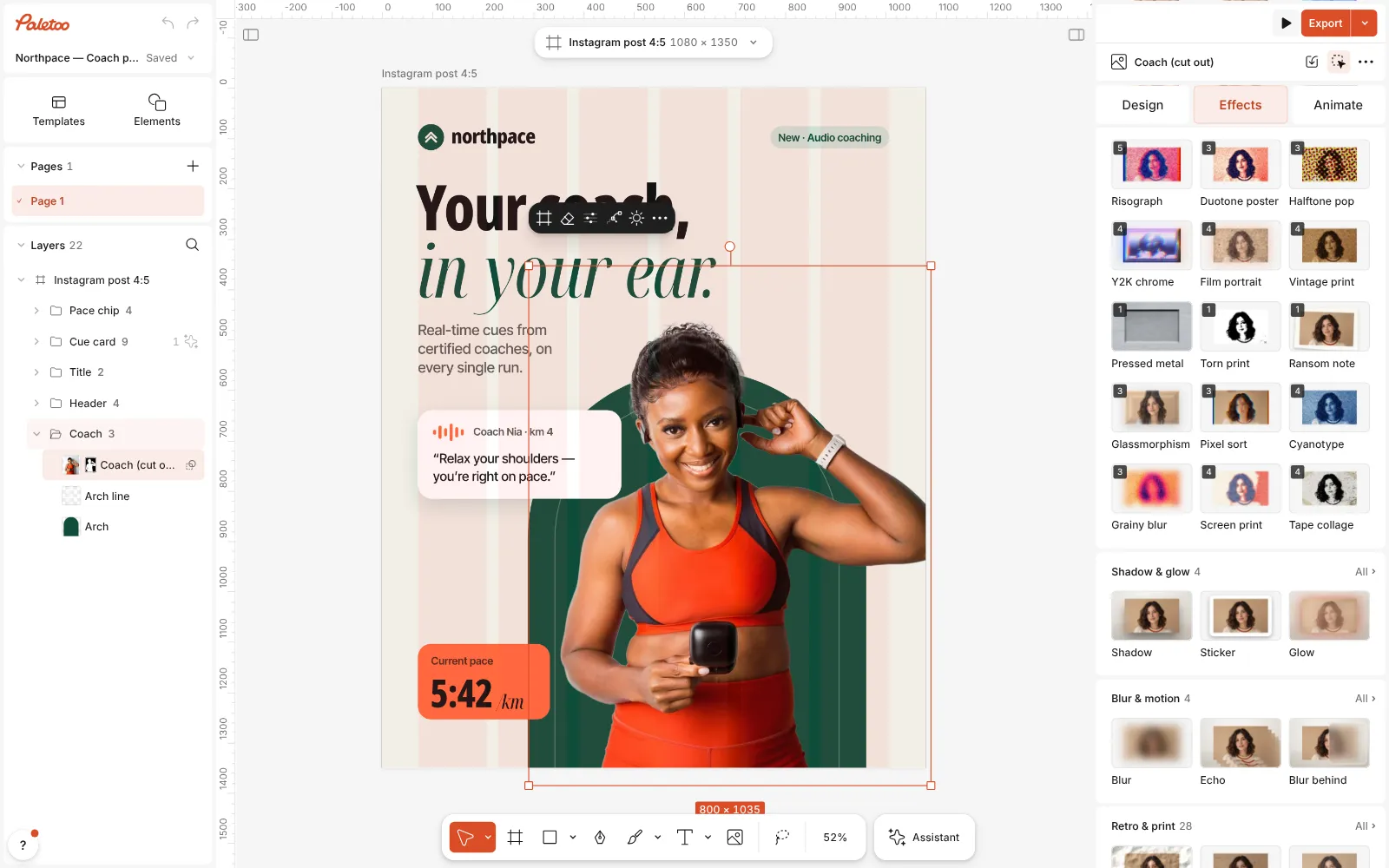
The running-app post open in Paletoo, the cut-out coach selected and the Mixes open Press Grainy blur. Three steps go on under Applied: Blur melts the coach into a soft shape, a Gradient map recolours it from deep violet through pink and peach to cream, and Grain lays a heavy mono noise over it.
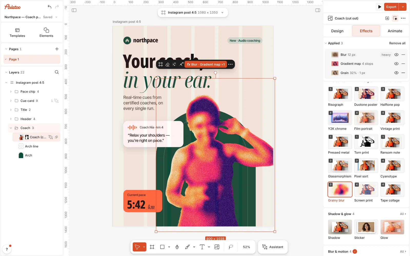
Grainy blur pressed: Blur, Gradient map and Grain under Applied, the coach melted into a grainy violet-to-peach glow Click the Gradient map row to open it. The Gradient holds the four colours of the glow; drag a stop to give one of them more room, or click one to change its colour. Contrast sets how quickly the colours change.
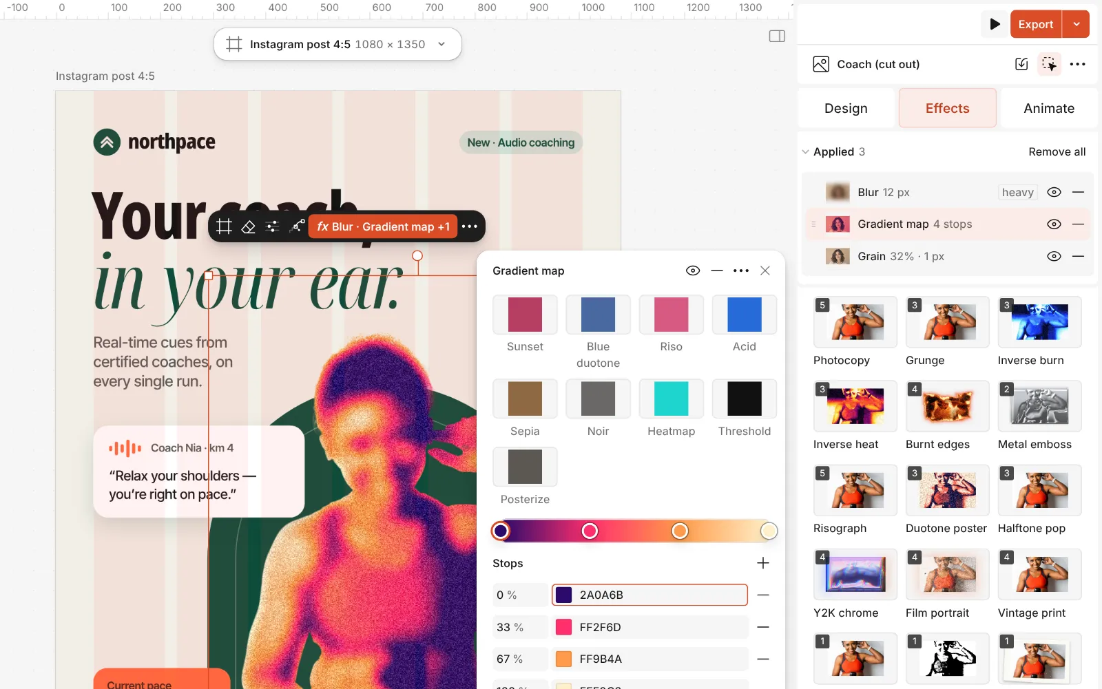
The Gradient map step open: the four stops of the violet-to-cream glow Then open Blur: Radius sets how far the shape melts, and Edges decides whether the blur spreads past the outline (Spread) or stays inside it (Keep shape).
Press Export. The grain is drawn at the export’s own resolution, so it stays fine and even in a large PNG, rather than turning into blotches.
The one-click mix
In Paletoo the whole stack is one mix, Grainy blur. One click puts every step on the selected object, one undo takes them all off, and each step stays an ordinary effect you can change, reorder or remove.
Its steps: Blur Gradient map · violet, pink, peach, cream Grain · mono noise
Open this mix in PaletooMake it your own
Decide first how much of the subject should survive. In the Blur step, a Radius of 8–12 keeps a face or a pose recognisable (the mix uses 12 on a photo); 20 and more leaves only a glowing shape, which is the classic poster look. Spread lets the glow bleed into the background, Keep shape keeps a cut-out’s outline soft but contained.
Then the palette. The Gradient runs from shadows on the left to light on the right, so the colour on the right is the colour of the glow. Swap violet and peach for your brand’s colours — deep green to lime, navy to coral — but keep the left end dark: without a deep stop the picture loses its form and the grain has nothing to sit on. Reverse, under Details, flips the map, which turns a dark background into the bright part of the field.
Grain is what makes it look intentional. In its step, Density around 30 % reads as print; much higher starts to look like a bad camera. Keep the Noise under Details on Mono — colour noise on a gradient looks muddy — and the Size at 1–2 px. Over the finished field, set short, heavy headlines in cream or in the darkest stop’s colour.
Questions
Why is my picture just a blurry mess?
The Blur radius is too high for that picture, or the photo has no clear bright area. Lower the Radius, or cut the subject out first, so the glow has a shape to follow.
Can I use it on text?
You can, but a blurred word is hard to read. The look works best on a picture or a shape behind the headline, with the headline itself left sharp on top.
How do I make the gradient in my brand colours?
Open the Gradient map step and click each stop to set its colour. Keep a dark colour on the left and a light one on the right, so the picture keeps its depth.
Is the grain the same in the export?
Yes. It is measured in document pixels and drawn at the export’s resolution, so it looks the same on screen, in a PNG and in a PDF.
More effects
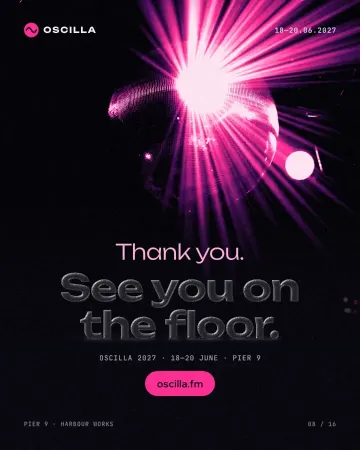
How to make a glassmorphism effect, like liquid glass
Thick, clear glass that bends the picture behind it, lit on one rim and shaded on the other.
How to make a duotone effect
Two bold inks, punchy contrast and a fine poster grain.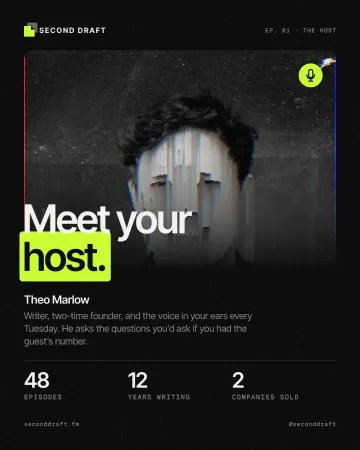
How to make a pixel sorting effect
Mid-tones and lights sorted by brightness into falling streaks.
Read the overview: graphic design trends 2026
Make it online: All tools
Try it on your own design
Paletoo opens in your browser, with no sign-up. Every effect here is live: change the picture or the words and the effect follows.
Open in Paletoo