Graphic design trends 2026: 26 looks and how to make them
The strongest trend in graphic design right now is a reaction to smoothness. After years of clean gradients, flat icons and AI images that all look a little too perfect, designers are reaching for things that feel made: toner, ink, paper, broken pixels, type you can almost touch.
Below are the twenty-six looks we see most on posters, album and magazine covers, packaging and social feeds in 2026 — what each one says, where it fits, and a guide to making it in Paletoo, with every step left editable. The last group puts them to work: a gig poster, a carousel and a business card, each started from a template.
Looking further ahead? Graphic design trends 2027 follows six looks into next year: clay 3D type, grain and print, chrome and liquid glass, collage, kinetic type and Y2K pixels.
Print is back
Textures that come from real printing processes — and from film and old paper — give a digital design weight and honesty. They work best on photos, and they make stock images look like your own.
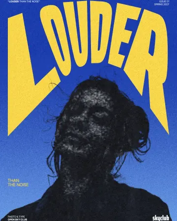
How to make a photocopy effect
Dense toner blacks, greys in scan lines and grey copier paper, from any photo.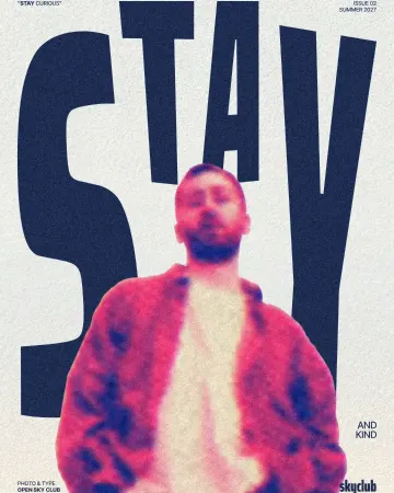
How to make a risograph effect
Two riso inks out of register, a coarse screen, riso paper.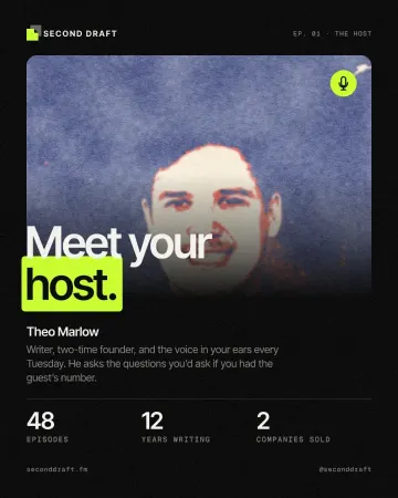
How to make a screen print effect
Three flat inks, a coarse dot and screens out of register.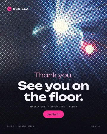
How to make a halftone effect
Comic-book CMYK dots, newspaper screens or one ink.
How to make a duotone effect
Two bold inks, punchy contrast and a fine poster grain.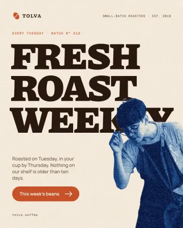
How to make a cyanotype effect from a photo
A sun print in Prussian blue on cream watercolour paper.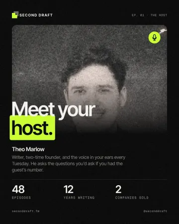
How to give a portrait an analog film look
Warm, faded, a soft halo round the lights, grain and dust.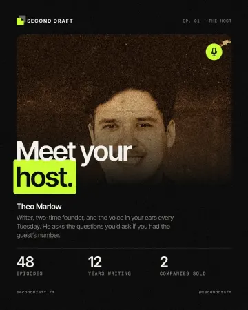
How to make a vintage sepia print effect
Sepia on yellowed, folded paper.
Rough, burnt and broken
Wear, inverted light and digital failure bring urgency — the look of music, sport and youth culture. Use them on one hero image, and keep the type clean.
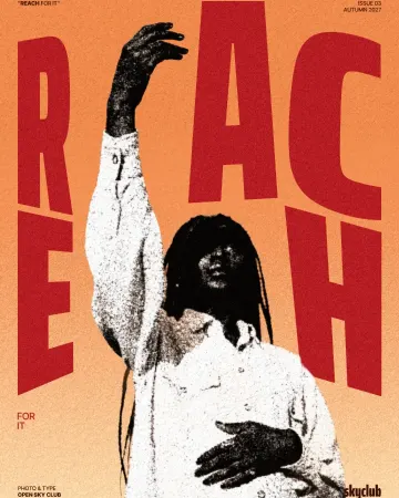
How to make a grunge effect with torn edges
Pure black and white, a ragged torn edge and spatter in the shadows.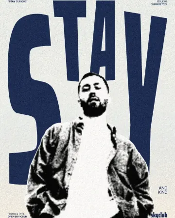
How to make a torn edges effect, like Photoshop’s Torn Edges
Ink and paper, split at a ragged, grainy edge.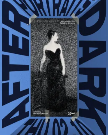
How to make a photocopy collage with tape
A grey photocopy, held to the page with strips of masking tape.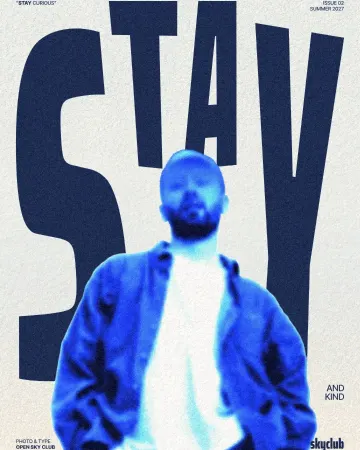
How to make an inverse burn effect
Half negative, half positive, in electric blue.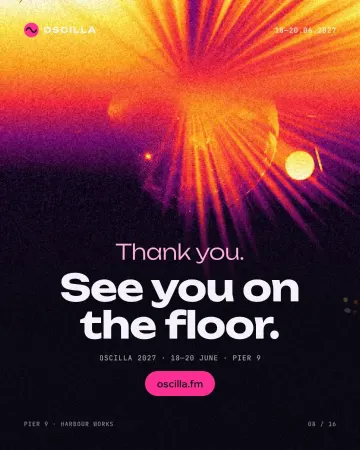
How to make an inverse heat effect
Half negative, half positive, in purple, magenta, orange and yellow.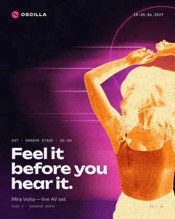
How to make a burnt edges effect with a fire negative
A fire negative with charred, glowing edges.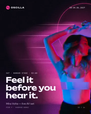
How to make a glitch effect
Blocky pixels, torn colour channels and a smeared trail.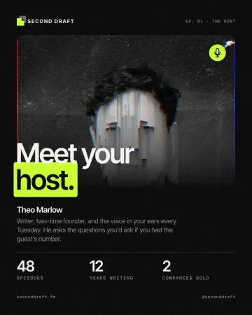
How to make a pixel sorting effect
Mid-tones and lights sorted by brightness into falling streaks.
Glass, blur and grain
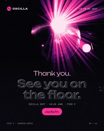
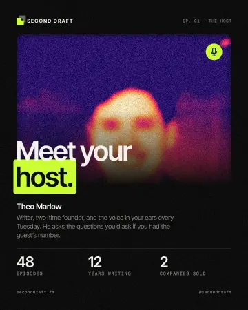
The softer side of 2026: panes of clear glass over a frosted backdrop, and pictures melted into grainy gradients. They make a busy photo calm and give sharp type a soft field to stand on.
Type you can feel
Headlines are becoming objects: stretched, bent along a path, pressed into metal, stamped in gold, cut out of the page or out of old newspapers. The trick is to keep them live, so the words can still change.
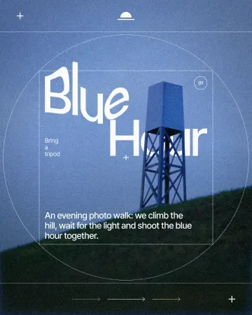
How to warp text on a mesh without rasterising it
Pull a grid over a headline; the words stay editable.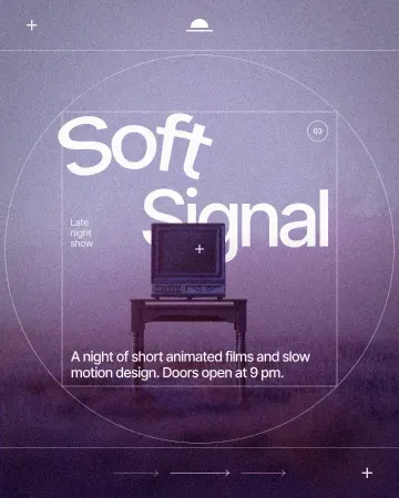
How to put text on a path that stays editable
Type along a curve you shape on the canvas; the words stay live.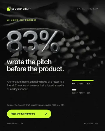
How to make an embossed metal effect
Live text pressed into the sheet and turned to chrome.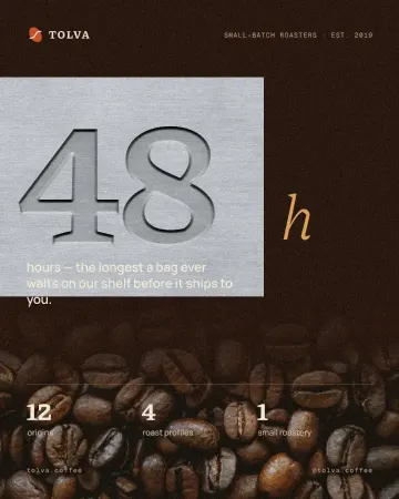
How to make an emboss effect: press text into metal or stone
The design pressed into a plate of metal or stone, its own colour gone.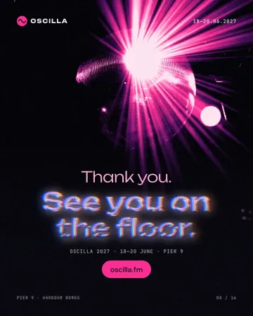
How to make a Y2K chrome text effect
Fat liquid chrome in pearly pastels, with a soft glow.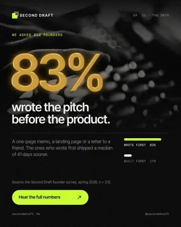
How to make a gold foil text effect
Stamped gold leaf: a pressed edge, warm metal bands and a soft shine.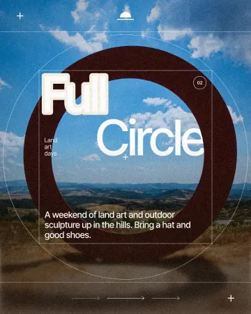
How to make a knockout outline that cuts through
A stroke that cuts through the layers under the text.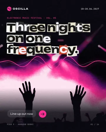
How to make newspaper cutout letters (ransom note text)
Every letter on its own scrap of paper, turned and nudged.
Put them to work
A look is only half a design. These guides start from a template and take it all the way to print or to the feed: the words, the photos, the details that make it read, and the export.
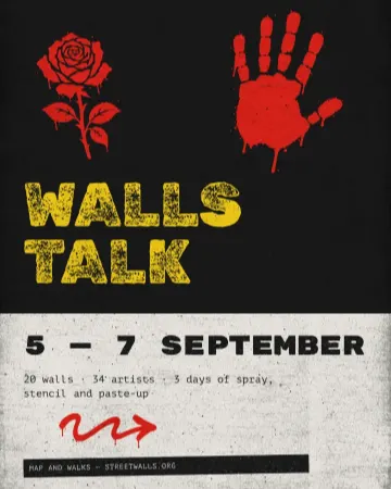
How to make a concert poster from a template
A ready-made gig flyer, your bands and your date, a file for print and one for social.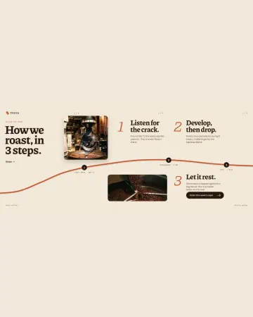
How to make an Instagram carousel from a template
One wide artboard, a design that runs across the cuts, a file for every slide.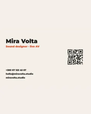
How to make a business card with a QR code
The right size, your details, a QR code that scans and a PDF for the printer.
How to use trends without looking dated next year
Pick one trend per design and let it carry the idea; three at once is a moodboard, not a layout. A risograph portrait with clean type will still look good in two years; a riso, glitched, chrome, warped poster will not.
Keep the effect live. When the trend moves on, a design with editable steps can be toned down in a minute instead of rebuilt — which is exactly why every look on this page is made from ordinary, editable effects rather than flattened images.
Try it on your own design
Paletoo opens in your browser, with no sign-up. Every effect here is live: change the picture or the words and the effect follows. Free design templates.
Open in Paletoo