How to make a duotone effect
Two bold inks, punchy contrast and a fine poster grain.
What it is
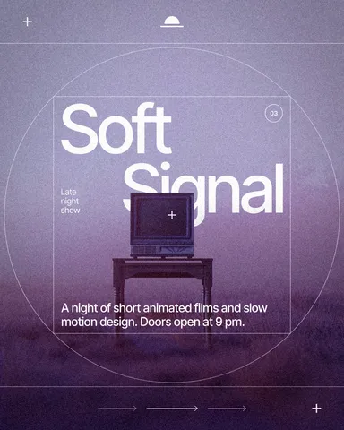
A duotone shows a photo in two colours instead of full colour: one ink for the shadows and one for the highlights, with every tone in between mixed from the two. It started as a printing technique for richer black-and-white photos, and became a graphic style of its own when designers swapped the inks for bright, unexpected pairs.
Duotone is the simplest way to make photos look like they belong to one brand. The original colours of the picture stop mattering — a beach, a street and a face all come out in the same two inks — so a whole campaign, a feed or a website suddenly feels consistent, even when the photos come from ten different sources.
Where it is used
Duotone works for music and event posters, conference and tech branding, social feeds that need one recognisable look, album and podcast covers, and hero images on websites. It also rescues weak photos: a dull, badly lit picture often looks great once it is reduced to two strong colours.
Made in Paletoo with this mix:
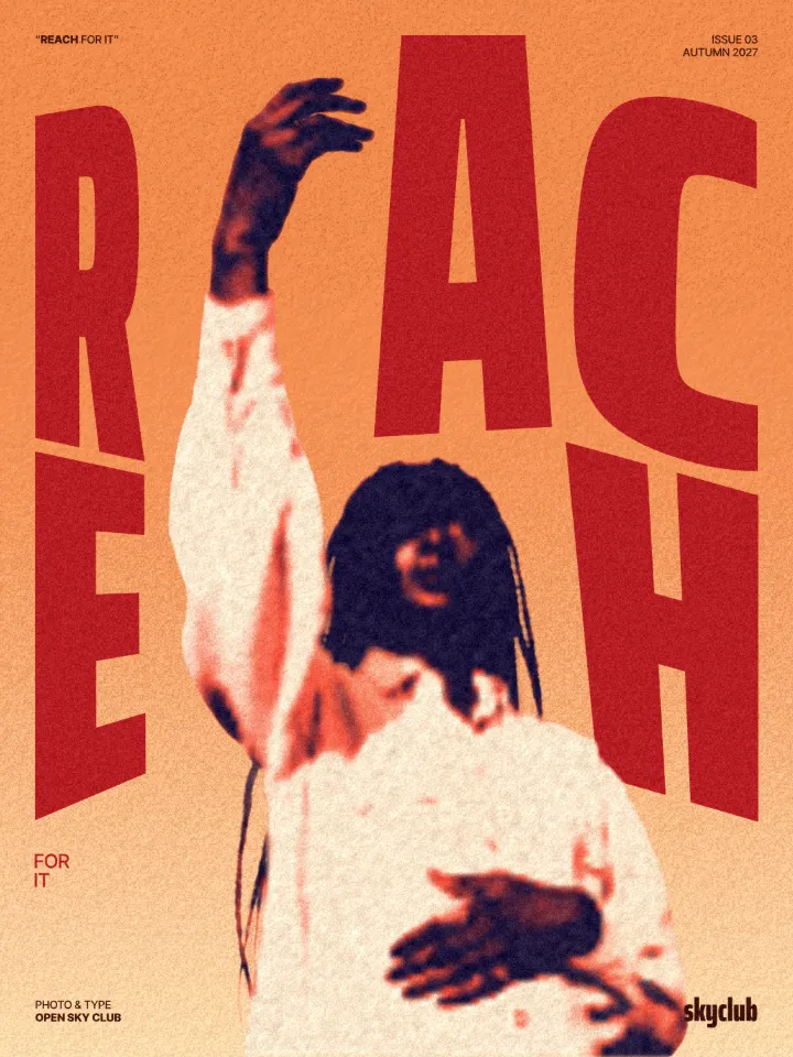
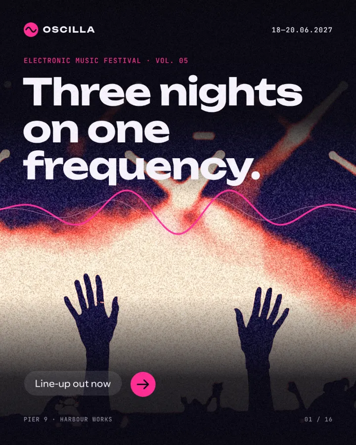
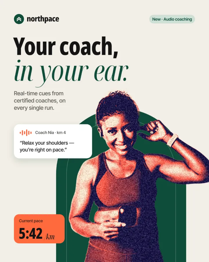
How to make it, step by step
Open your design and select the photo. Pictures with a good range from deep shadow to bright light give the richest duotones.
Open the Effects tab and find Mixes; press All if you do not see Duotone poster.
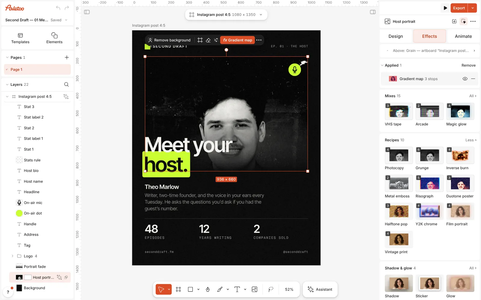
A podcast post open in Paletoo, the host’s portrait selected and the Mixes open Press Duotone poster. Three steps go on: Basic pushes contrast and clarity, a Gradient map maps the shadows to navy and the lights to coral and cream, and Grain adds a fine poster texture.
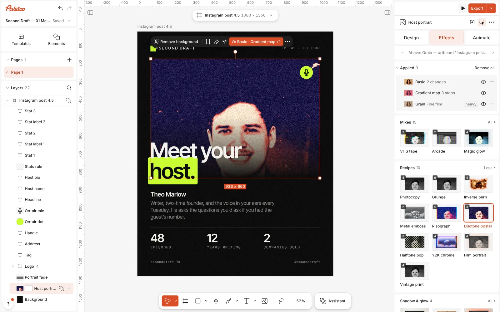
Duotone poster pressed: Basic, Gradient map and Grain under Applied, the portrait in navy and coral Open the Gradient map. Its Gradient runs from shadows on the left to highlights on the right: click a stop to change its colour, drag it to move the point where one ink turns into the other.
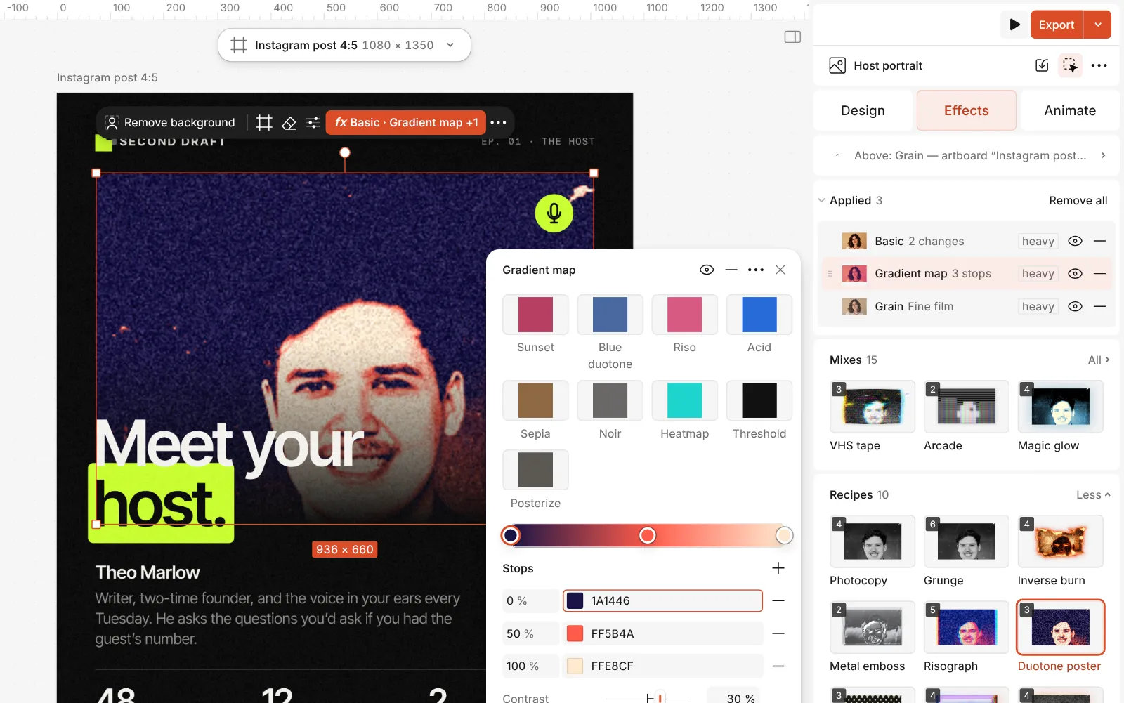
The Gradient map step open: the Gradient with its three stops, Contrast, Reverse and Levels Use Contrast in the same step to make the two inks meet softly or hard. Its presets, like Blue duotone, Sunset and Noir, are good starting pairs.
Press Export. Change the colours later and every photo with the same mix can be matched in seconds.
Watch it
The one-click mix
In Paletoo the whole stack is one mix, Duotone poster. One click puts every step on the selected object, one undo takes them all off, and each step stays an ordinary effect you can change, reorder or remove.
Its steps: Basic Gradient map · navy, coral, cream Grain · Fine film
Open this mix in PaletooMake it your own
Start with the dark ink. It carries the shape of the picture, so it needs to be really dark — navy, deep purple, forest green or near-black. The light ink sets the mood: coral and peach feel warm, mint and sky blue feel fresh, acid yellow feels loud.
A third, lighter stop at the end of the gradient keeps the highlights from turning into a flat block of colour; the mix uses cream for that. Remove it for a stricter, two-colour screen-print look.
For a consistent feed, save the stack: once the gradient is right, the same mix on every picture gives you the same two inks without picking colours again. If a photo comes out too dark, raise Brightness in the Basic step rather than changing the inks.
Templates with this look
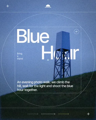
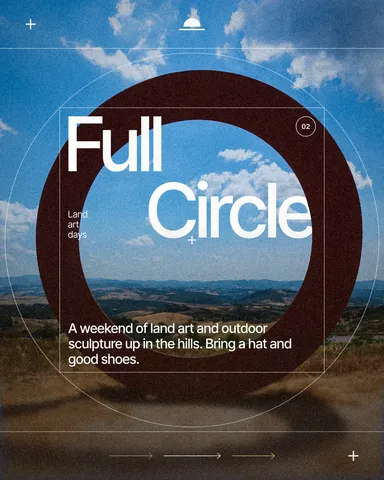
Questions
How do I pick good duotone colours?
One dark, one light, with a clear difference in brightness. Two colours of similar lightness, such as red and green, lose the picture.
Can I use my brand colours?
Yes. Click the stops of the Gradient map and enter your hex values; if your brand colours are saved as colour styles, pick them from there.
Can I turn a duotone back into the original photo?
Any time. Turn off the eye of the Gradient map step, or undo the mix in one step.
Does duotone work on video?
In Paletoo it works on pictures, text, shapes and on whole artboards, so an animated design exported to video keeps its duotone.
More effects
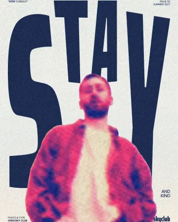
How to make a risograph effect
Two riso inks out of register, a coarse screen, riso paper.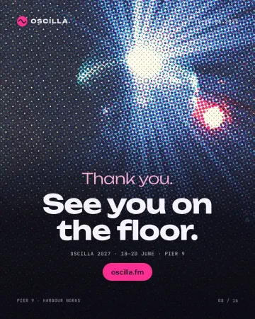
How to make a halftone effect
Comic-book CMYK dots, newspaper screens or one ink.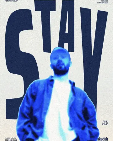
How to make an inverse burn effect
Half negative, half positive, in electric blue.
Read the overview: graphic design trends 2026
Make it online: Instagram post maker · Instagram story maker · Remove background online · Photo effects online · Presentation maker · Duotone, halftone and glitch photo effects online · Carousel maker · Social media post templates · Story and Reels templates · Team and speaker templates · Poster templates · Presentation templates · Instagram carousel templates
Try it on your own design
Paletoo opens in your browser, with no sign-up. Every effect here is live: change the picture or the words and the effect follows.
Open in Paletoo