How to make an inverse heat effect
Half negative, half positive, in purple, magenta, orange and yellow.
What it is
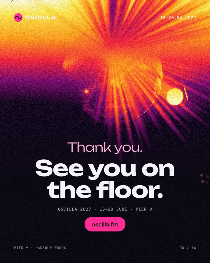
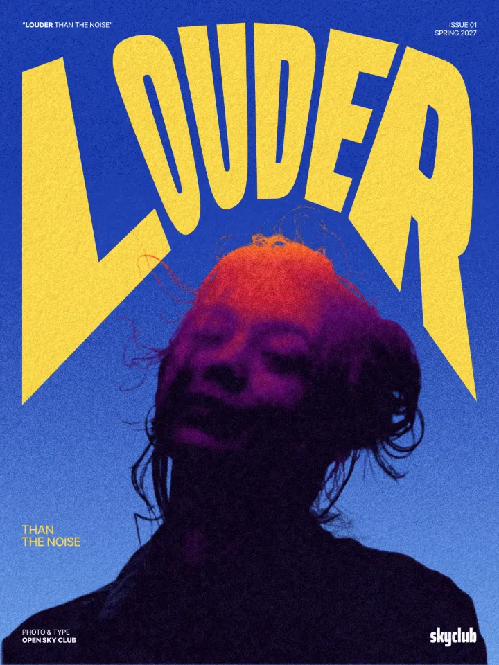
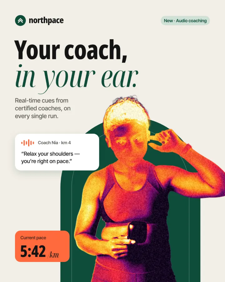
Inverse heat is the warm twin of inverse burn. The top of the photo becomes its own negative and the inversion fades out across the eyes, so the subject slides from negative to positive in one soft band. Then every tone is mapped to a hot palette: near-black plum in the deepest shadows, magenta and red through the mid-tones, orange and yellow in the light, a pale cream at the very top. A clumped grain keeps the colour from looking digital.
It reads the way a thermal camera picture does: the eye takes the brightest colour for the hottest spot, so the face glows while the edges cool to purple. That makes it energetic and a little uncanny — warmer and friendlier than the blue version, and just as strong at thumbnail size.
Where it is used
Choose the hot palette for summer events, festivals and late-night parties, sport and fitness, food and drink, podcasts and talk shows with a lively host, and any brand whose colours are already red, orange or pink. Cold blue suits tech, night and calm; heat suits sweat, sound and sun. It is strongest on portraits with clear features, on cut-out people and on photos with bright highlights, which become the yellow core of the picture.
Made in Paletoo with this mix:
How to make it, step by step
Open your design and pick a photo with a clear subject — a face, a head and shoulders, a cut-out person. Here it is the host portrait on a podcast post called “Meet your host”.
Select the photo, open the Effects tab and look under Mixes. Press All if Inverse heat is not in the first row.
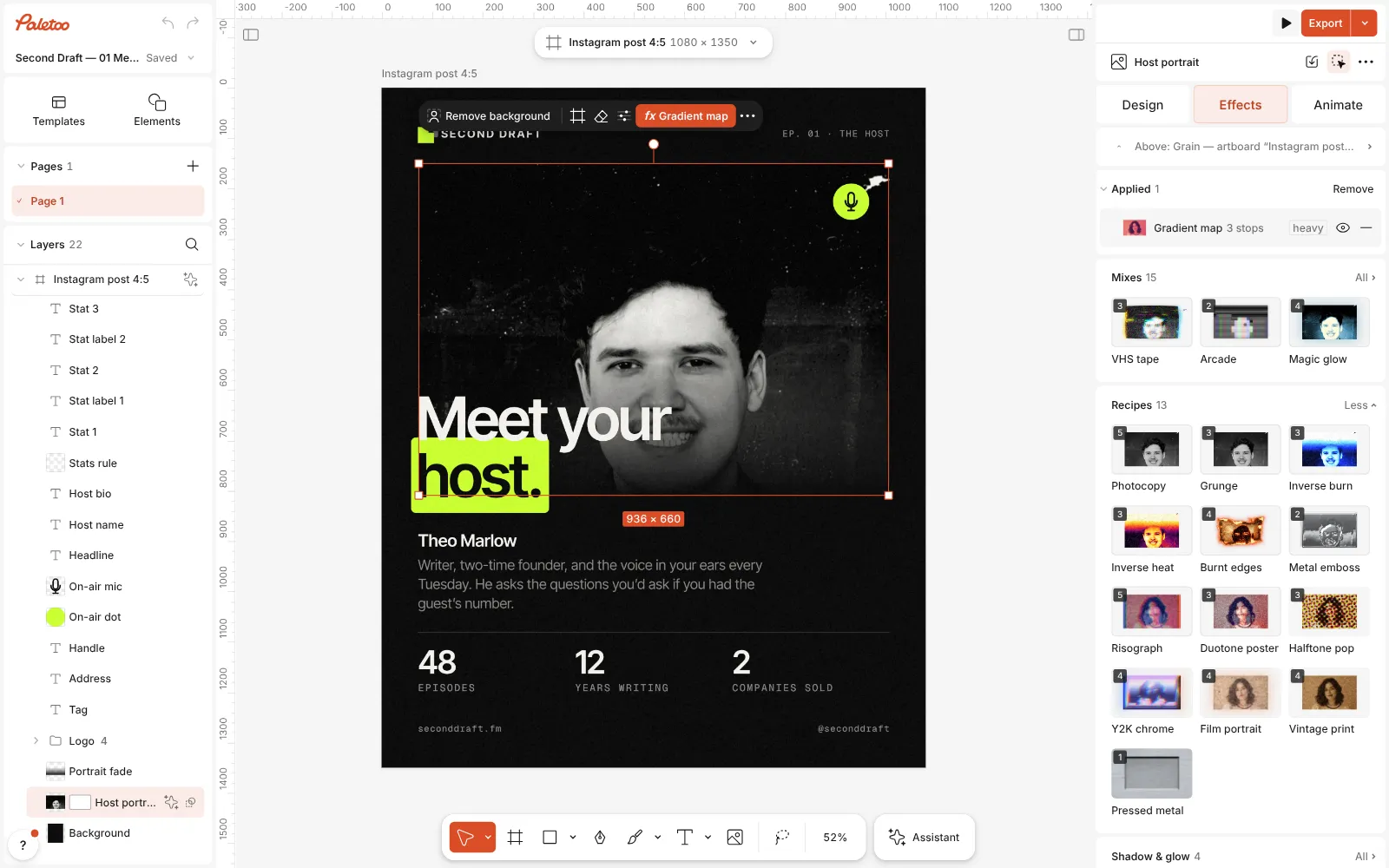
The podcast post open in Paletoo, the host portrait selected and the Mixes open Press Inverse heat. Three steps go on under Applied: Invert turns the top of the photo negative through a mask that fades out across the eyes, a Gradient map recolours everything from purple through magenta and orange to yellow, and Grain adds a clumped film texture.
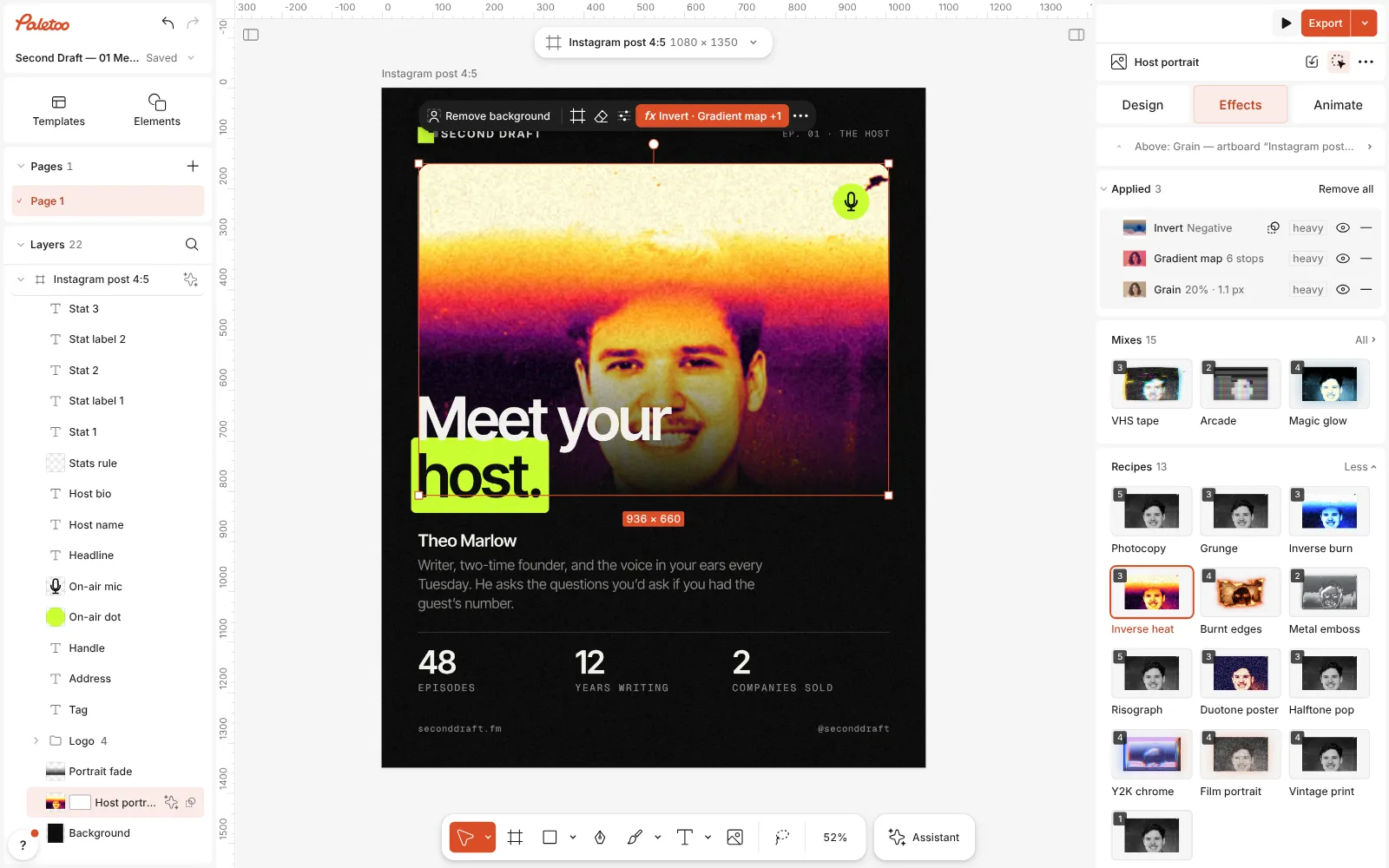
Inverse heat pressed: Invert, Gradient map and Grain under Applied, the top of the portrait negative, everything purple, magenta, orange and yellow Click the Gradient map row to open it. The Gradient holds six stops, from near-black plum to pale cream; under it, Contrast starts at 25 % to keep the light hard.
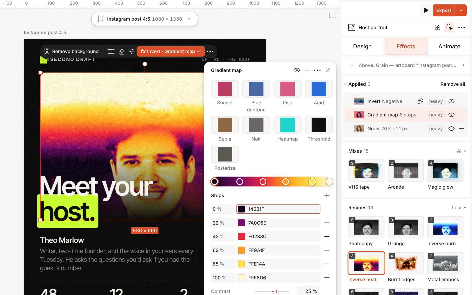
The Gradient map step open: the hot gradient with its stops To move the band, open the Mask of the Invert step and drag its handles on the canvas until the fade sits where the picture needs it — across the eyes on a portrait.
Press Export. Replace the photo later and the band, the palette and the grain all follow.
Watch it
The one-click mix
In Paletoo the whole stack is one mix, Inverse heat. One click puts every step on the selected object, one undo takes them all off, and each step stays an ordinary effect you can change, reorder or remove.
Its steps: Invert Gradient map · purple, magenta, orange, yellow Grain
Open this mix in PaletooMake it your own
The whole palette lives in the Gradient of the Gradient map step, and the stops decide how much of the picture each colour takes. Drag the orange and yellow stops to the left and more of the face glows; drag the magenta one to the right and the image sinks into purple. Keep the darkest stop nearly black — without it the picture loses its depth and turns flat pink.
Warm palettes are easy to overdo. If skin melts into one orange blur, raise Contrast in the same step, or move the red stop closer to the orange so the mid-tones get more steps. Reverse swaps the hot and cold ends — try it when the background glows brighter than the subject. The Heatmap and Sunset presets at the top of the step are quick alternatives, but they replace the mix’s stops.
The band belongs to the Invert step: keep the fade across the eyes, higher for a calmer picture, lower for a stranger one. For the same band in navy, blue and cyan, press Inverse burn; for fire without a band, Burnt edges. Over the hot palette, set the headline in its pale cream or in solid black — another bright colour only fights it.
Questions
When should I choose Inverse heat over Inverse burn?
When the subject is about energy, warmth or noise — summer, sport, music, food. Blue reads as night, tech and calm. Both share the same band and grain, so press one, then the other, and compare on your own photo.
Can I invert the whole photo?
Yes. Open the Invert step and remove its mask: the whole picture becomes a negative, still in the hot palette.
Why does the face look flat orange?
The photo has few mid-tones. Raise Contrast in the Gradient map, or add a Basic step before Invert and push its contrast, so the gradient has more tones to spread across.
Does it work on text and shapes?
Yes, letters and shapes take the band and the palette. Use a heavy typeface or a large shape so the colours have room to show.
More effects
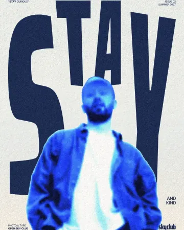
How to make an inverse burn effect
Half negative, half positive, in electric blue.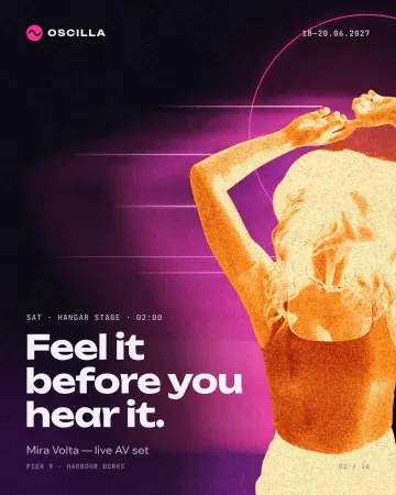
How to make a burnt edges effect with a fire negative
A fire negative with charred, glowing edges.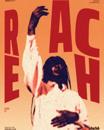
How to make a duotone effect
Two bold inks, punchy contrast and a fine poster grain.
Read the overview: graphic design trends 2026
Make it online: All tools
Try it on your own design
Paletoo opens in your browser, with no sign-up. Every effect here is live: change the picture or the words and the effect follows.
Open in Paletoo