How to make a vintage sepia print effect
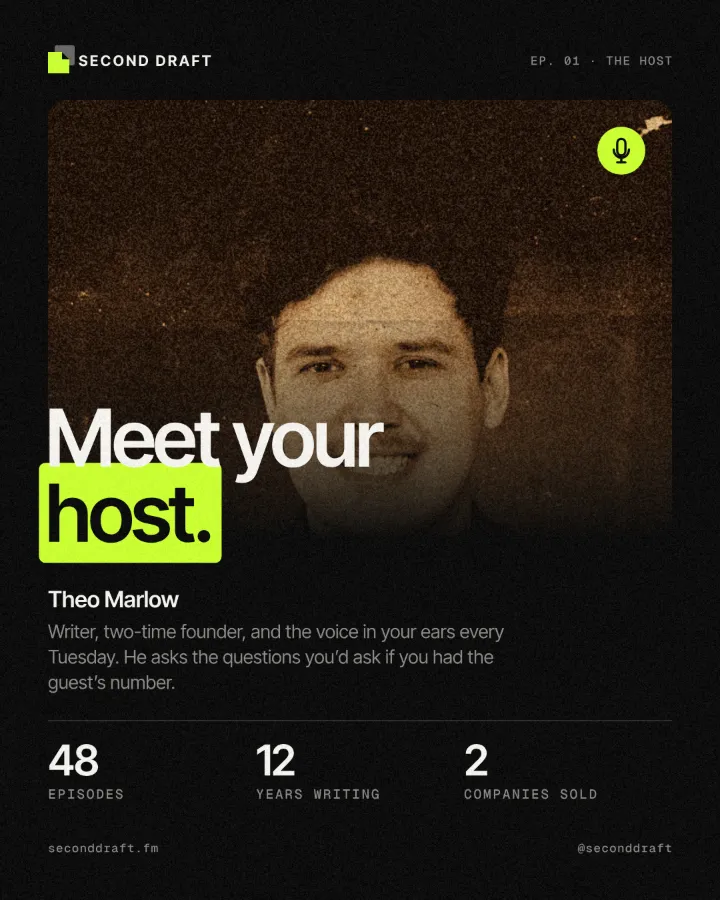
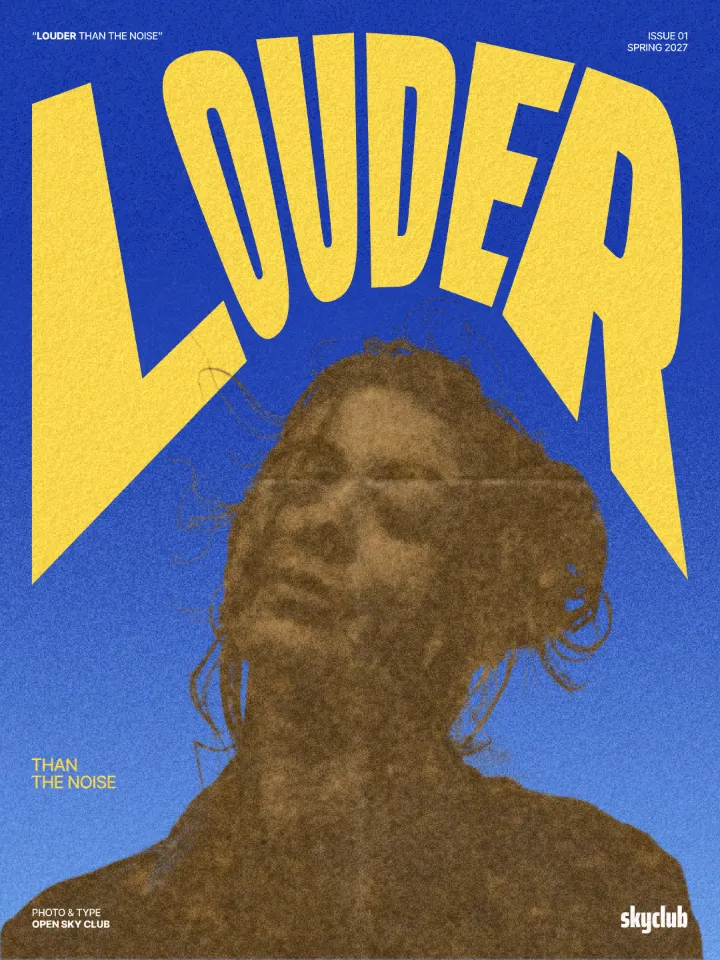
Sepia on yellowed, folded paper.
What it is
A vintage print effect makes a photo look like an old print found in a drawer. Its colours are replaced by sepia — dark brown shadows, warm tan mid-tones, cream highlights — the way toned silver prints aged. The picture then sits on old, yellowed paper with its fibres and stains, crossed by the soft creases of a sheet that was folded in four, and a fine grain holds it all together.
Designers use it to borrow the authority of the past: an archive, a family story, a place with history. Sepia also unifies very different photos, because once every colour is a shade of brown, a phone snapshot and a studio portrait sit happily on the same page.
Where it is used
It suits anniversary and heritage campaigns, museum and history posts, vintage shops and barbers, craft beer and coffee brands, book covers, invitations and retro event posters — and, for contrast, a modern event such as a club night, where an old-looking photo makes a playful farewell.
Made in Paletoo with this mix:

How to make it, step by step
Open your design and select the photo. Pictures with a clear subject and a full range of tones age best; here it is an electronic festival farewell post with a disco-ball photo.
Open the Effects tab and look under Mixes; press All if Vintage print is not in the first row.
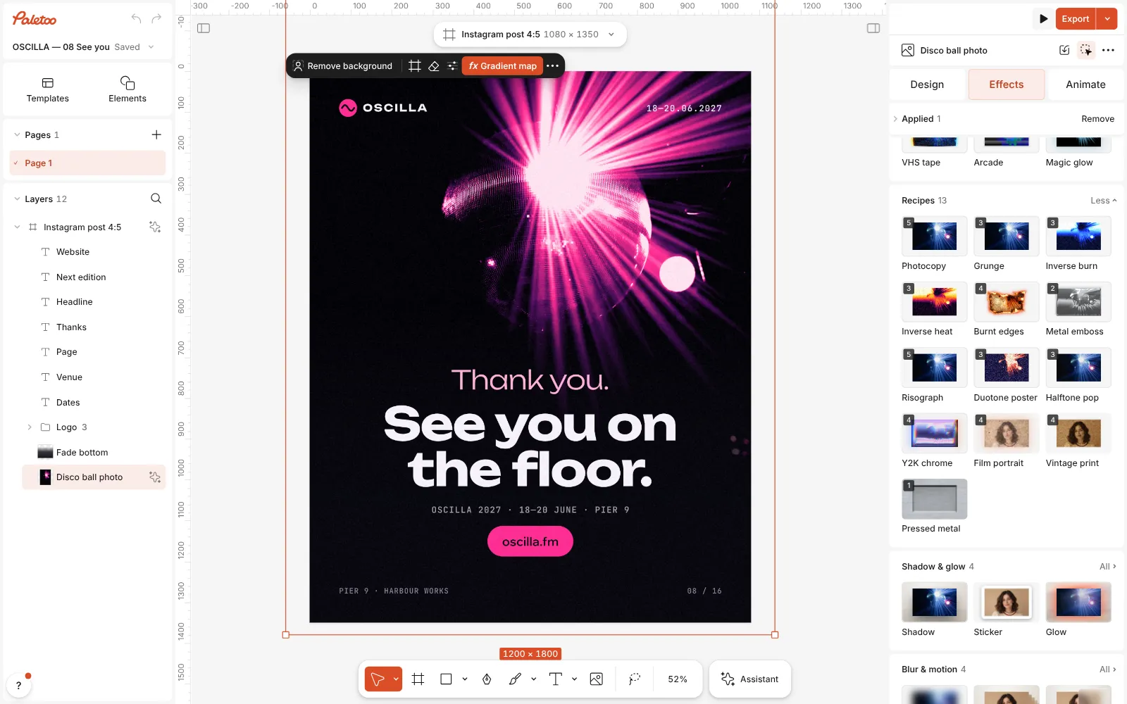
The festival farewell post open in Paletoo, the disco-ball photo selected and the Mixes open Press Vintage print. Four steps go on under Applied: a Gradient map with the Sepia preset, a Texture of Old paper, a second Texture that folds the sheet, Folded in 4, and Grain with its Fine film preset.
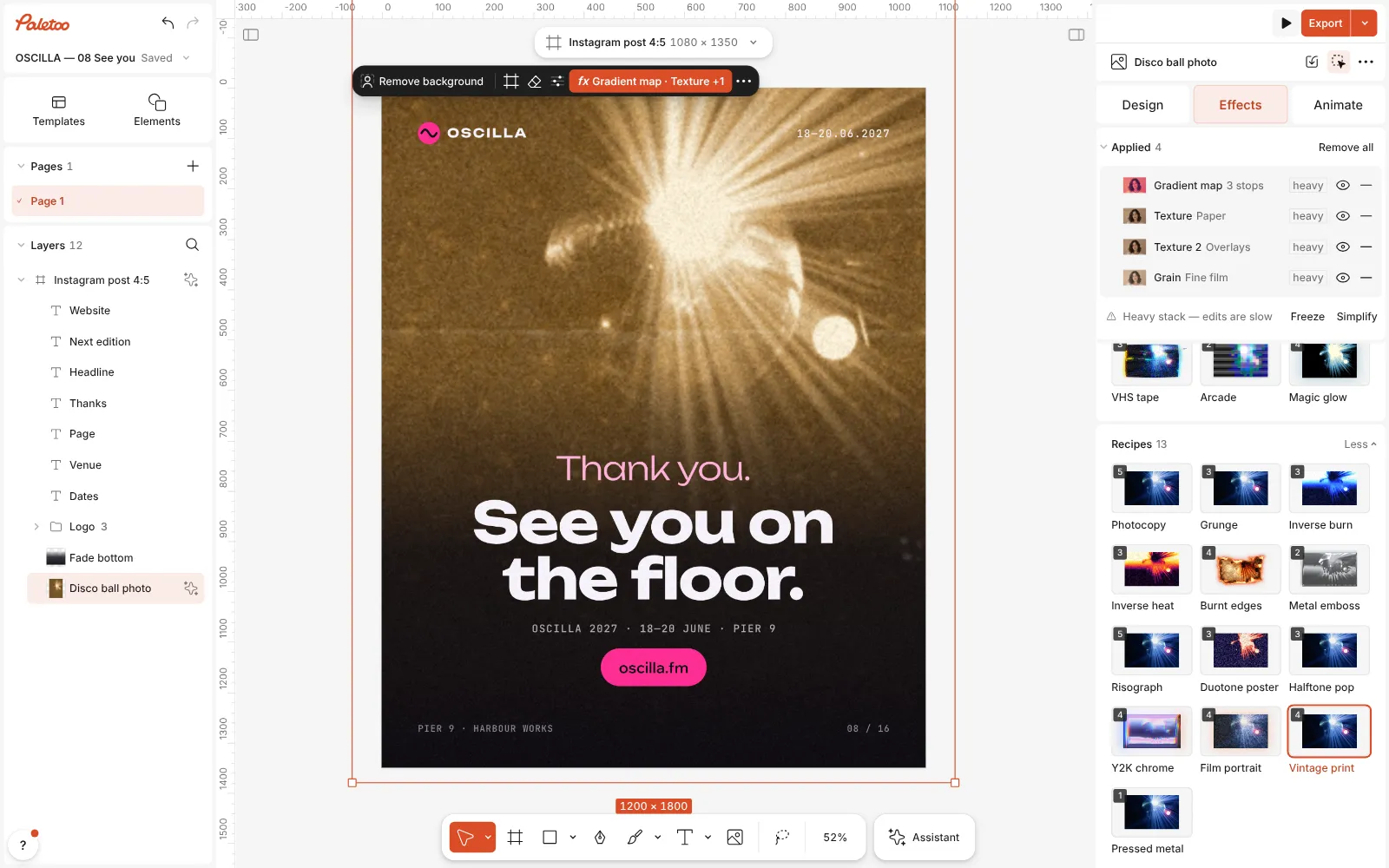
Vintage print pressed: the four steps under Applied, the photo sepia on folded old paper Click the Gradient map row to open it. Sepia is picked at the top; the Gradient runs from dark brown through tan to cream, and Contrast is raised slightly to keep the print crisp.
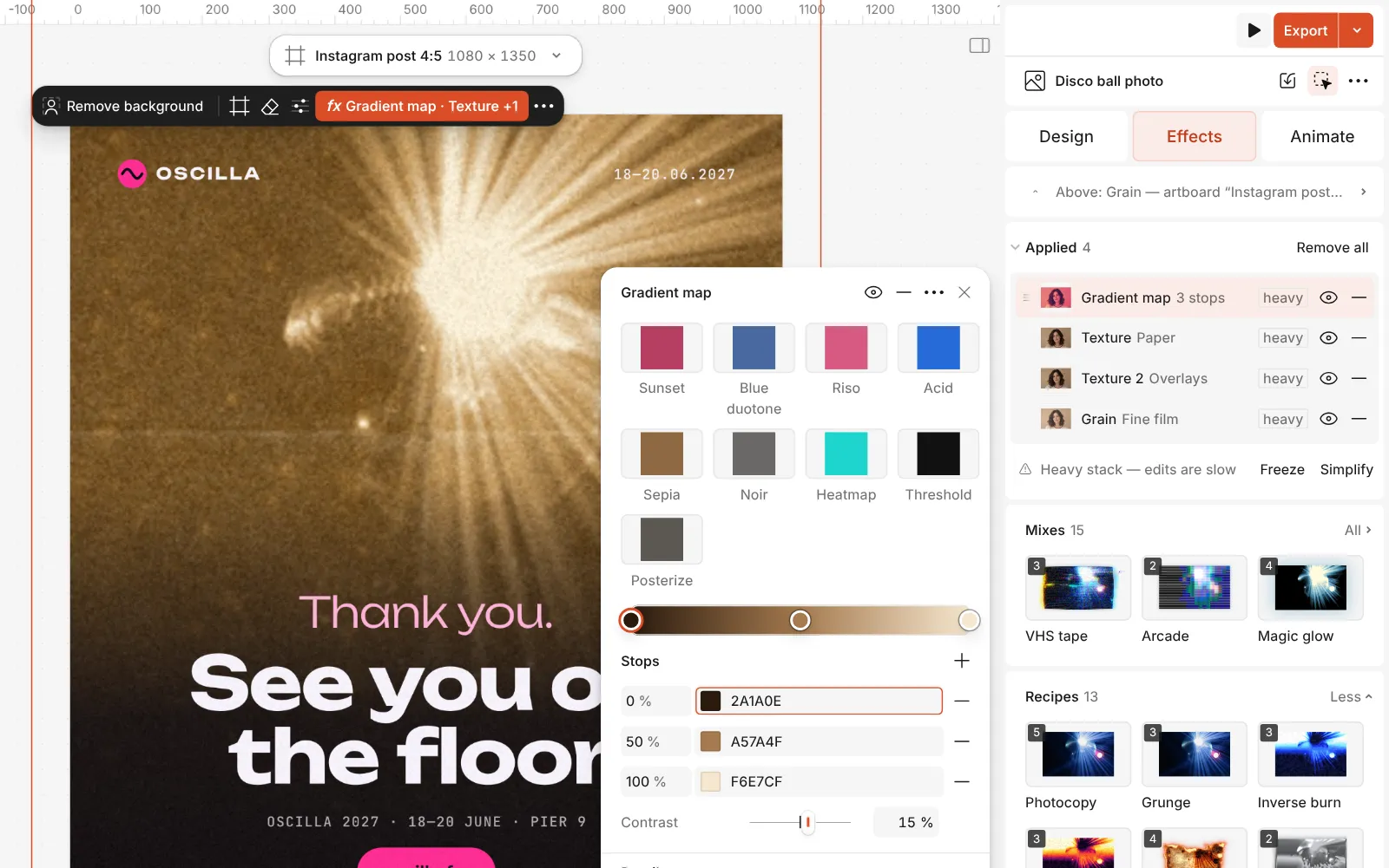
The Gradient map step open with the Sepia preset and its gradient Open either Texture row to change the paper: Amount sets how strong it is, and the same step can switch to another sheet — Foxed paper for brown spots, Parchment for a smoother page, Coffee rings for a stained one.
Press Export. Replace the photo and the new one lands on the same old, folded sheet.
Watch it
The one-click mix
In Paletoo the whole stack is one mix, Vintage print. One click puts every step on the selected object, one undo takes them all off, and each step stays an ordinary effect you can change, reorder or remove.
Its steps: Gradient map · Sepia Texture · Old paper Texture · Folded in 4 Grain · Fine film
Open this mix in PaletooMake it your own
Tone first. In the Gradient map, drag the middle stop toward the dark end for a heavier, older print, or toward the light end for a faded one. If you prefer a cooler, silvery look, try the Noir preset at the top of the step: black and warm white instead of brown.
Paper second. Old paper carries the yellowing, the fold carries the story. If the creases cut across a face, lower Amount on the fold step or change its Rotation. If the print looks dirty, turn the paper step down rather than removing it — a print with no paper under it reads as a plain brown filter.
Keep the rest of the layout in the same era. Set type in a serif or a typewriter face, in dark brown rather than black, and leave a margin around the photo so it reads as a print on a page. The Grain step is the finishing touch: raise its Density a little for a newspaper reprint, lower it for a well-kept photograph.
Questions
How is this different from Film portrait?
Film portrait keeps the colour and makes it warm and faded, like a colour negative. Vintage print replaces the colour with sepia and adds the paper, so it looks older and more like an object.
Can I get black and white instead of sepia?
Yes. In the Gradient map step pick Noir, or set the stops yourself to black and an off-white.
Can I keep the paper without the sepia?
Yes. Turn off or remove the Gradient map step: the photo keeps its own colours and still sits on old, folded paper.
Does it work on text?
Yes. The sepia and the paper textures apply to text too, so a heading can share the print’s colours and wear.
More effects
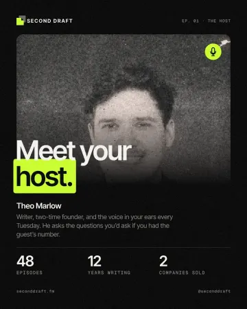
How to give a portrait an analog film look
Warm, faded, a soft halo round the lights, grain and dust.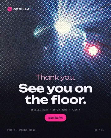
How to make a halftone effect
Comic-book CMYK dots, newspaper screens or one ink.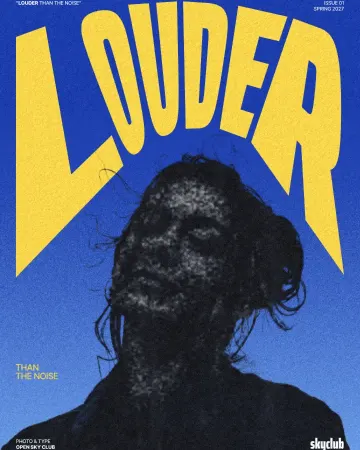
How to make a photocopy effect
Dense toner blacks, greys in scan lines and grey copier paper, from any photo.
Read the overview: graphic design trends 2026
Make it online: All tools
Try it on your own design
Paletoo opens in your browser, with no sign-up. Every effect here is live: change the picture or the words and the effect follows.
Open in Paletoo