How to make a cyanotype effect from a photo
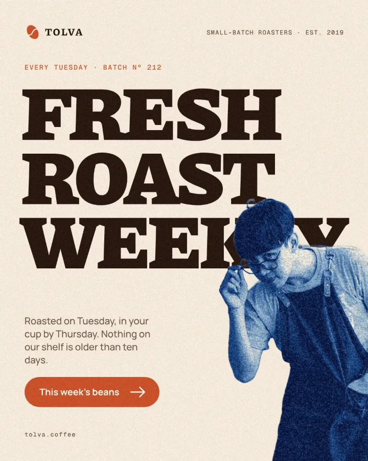
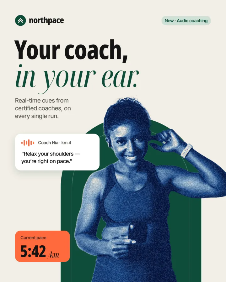
A sun print in Prussian blue on cream watercolour paper.
What it is
A cyanotype is one of the oldest photographic prints. Paper is brushed with an iron solution, a negative or a plant is laid on it, and the sheet is left in the sun; where the light reaches, the paper turns a deep Prussian blue, and where it is blocked, it stays pale. Rinsed in water, the print keeps every tone as a shade of one blue — dark ink-blue in the shadows, soft sky-blue in the mid-tones and the cream of the paper in the highlights — with the uneven edges and the texture of the sheet showing through.
Designers like it because it is calm, crafted and instantly recognisable. A single blue unifies photos from different sources, the paper texture makes a digital layout feel physical, and the colour sits well next to white or cream type. The digital version does what the darkroom does: it drops the colour, maps the tones to the blue and lays the photo on watercolour paper.
Where it is used
Cyanotype suits botanical and nature topics, wellness, craft and stationery brands, architecture and interior studios, wedding stationery, editorial pages about history or science, and album covers with a quiet, analogue mood. It is lovely on plants, flowers and cut-out objects with a clear silhouette, where it looks like a real photogram, and on portraits with soft light.
Made in Paletoo with this mix:

How to make it, step by step
Open your design and select the photo. Soft light and a clear subject give the most beautiful tones; here it is the cut-out figure in front of the REACH letters on an autumn magazine cover.
Open the Effects tab and look under Mixes; press All if Cyanotype is not in the first row.
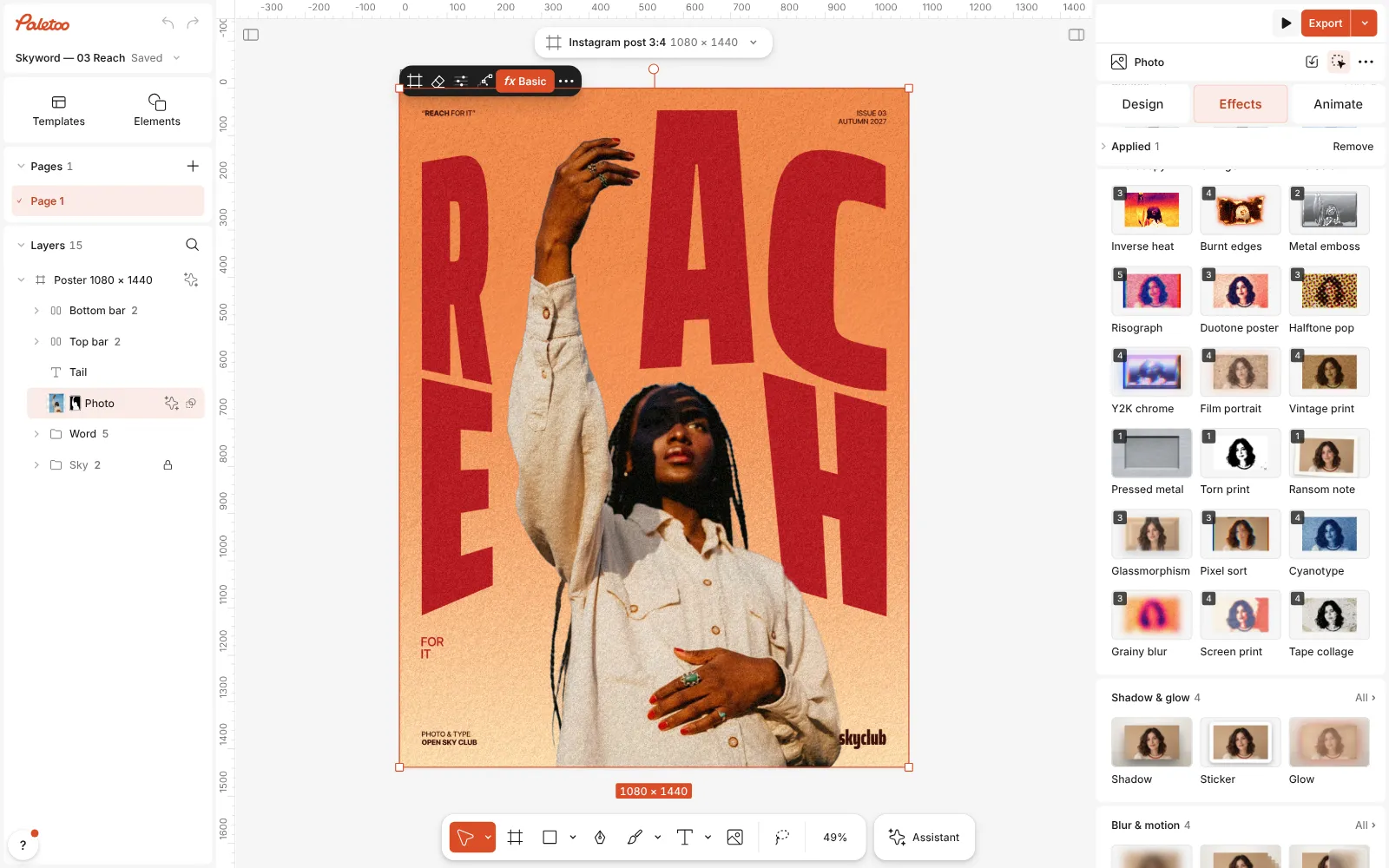
The autumn cover open in Paletoo, the photo selected and the Mixes open Press Cyanotype. Four steps go on under Applied: Basic takes the colour out and adds a little contrast, a Gradient map maps every tone from deep Prussian blue to cream, a Texture lays the photo on watercolour paper, and Grain adds a fine print texture.
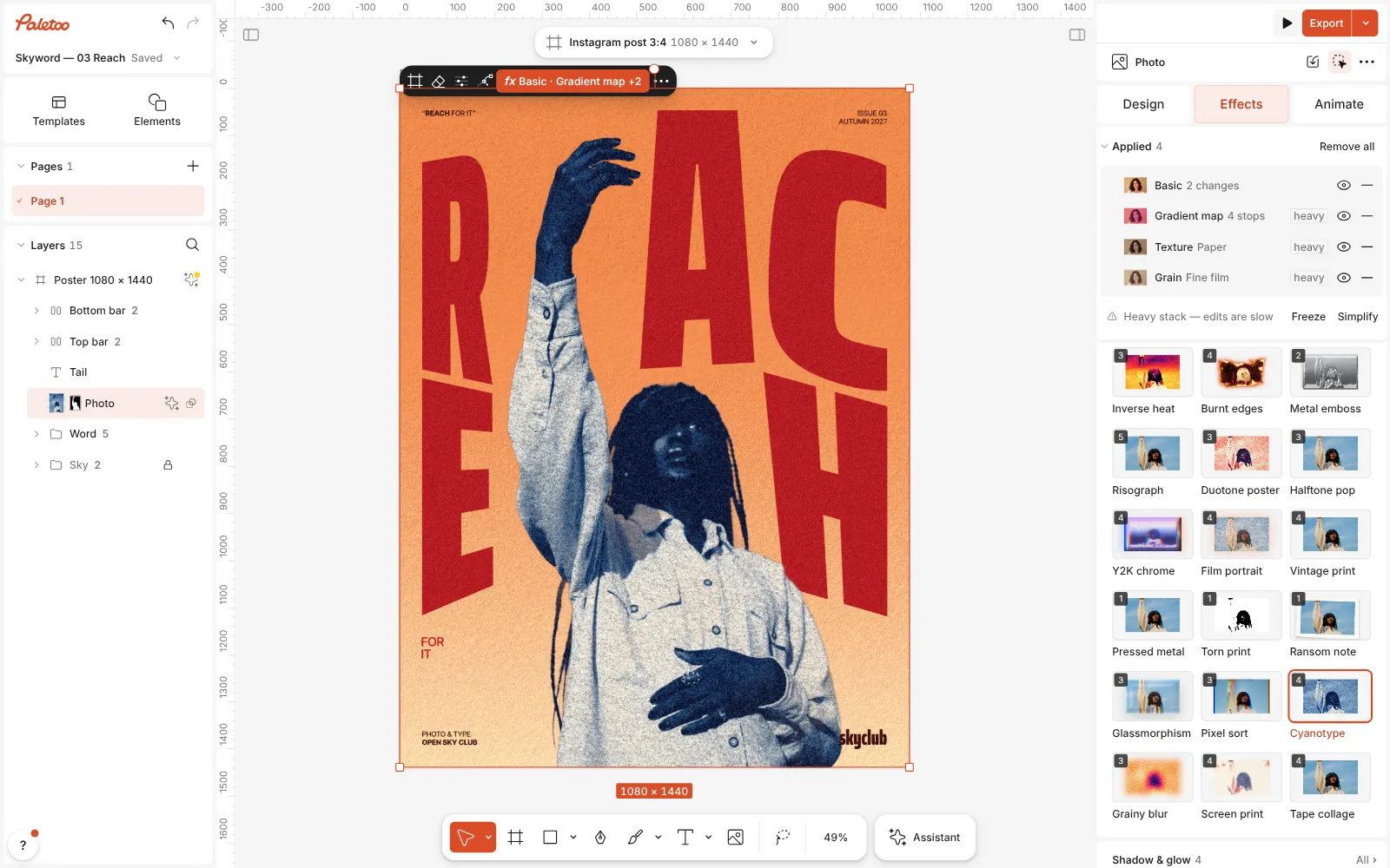
Cyanotype pressed: Basic, Gradient map, Texture and Grain under Applied, the photo a blue sun print Click the Gradient map row to open it. The Gradient holds four stops — near-navy, Prussian blue, a pale sky-blue and cream — and under it Contrast sets how hard the print is, and under Details, Reverse swaps the ends, for a pale print on blue.
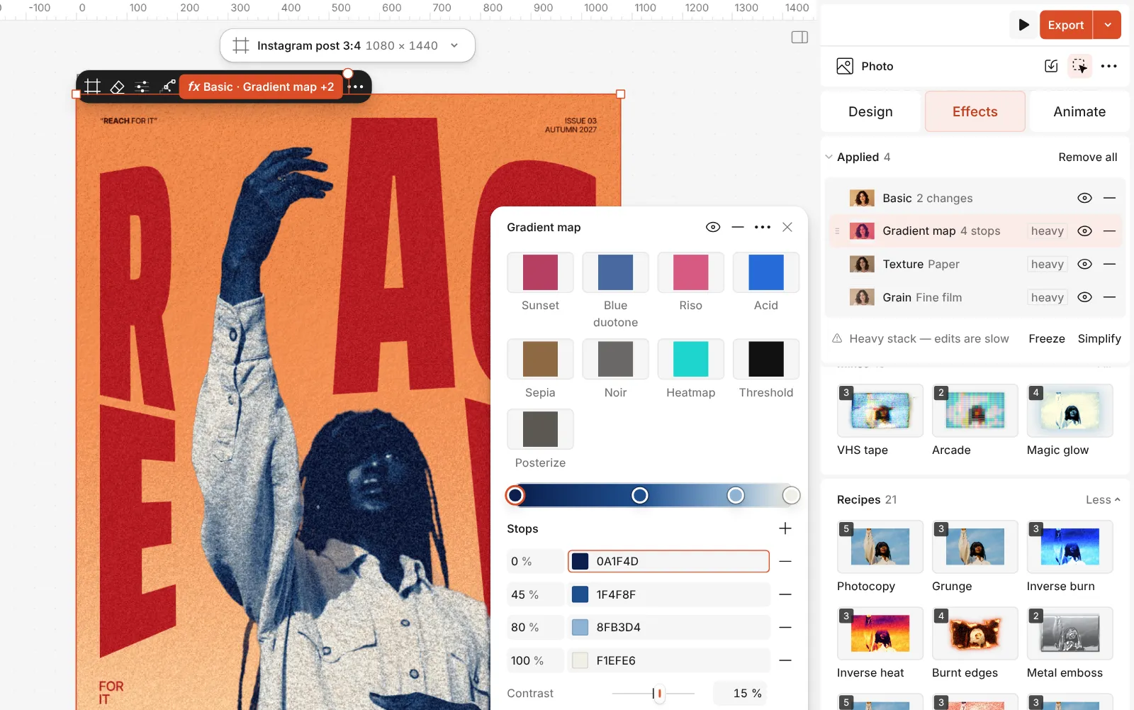
The Gradient map step open: the four stops from Prussian blue to cream Then open the Texture row: Amount sets how much of the watercolour paper shows through, and Scale how coarse its fibres are. Try another paper from the same list for a smoother or a rougher sheet.
Press Export. Replace the photo later and the new one comes out as the same sun print.
The one-click mix
In Paletoo the whole stack is one mix, Cyanotype. One click puts every step on the selected object, one undo takes them all off, and each step stays an ordinary effect you can change, reorder or remove.
Its steps: Basic · grey Gradient map · Prussian blue to cream Texture · Watercolour Grain
Open this mix in PaletooMake it your own
The look lives in the Gradient. Drag the cream stop to the left and more of the picture turns to bare paper, which gives an airy, overexposed print; drag the dark stop to the right and the print deepens, like a sheet left too long in the sun. Keep the darkest stop a very dark navy, not black: a real cyanotype never reaches neutral black.
If the face or the subject turns muddy, raise Contrast in the Basic step before the map, not in the map itself — it spreads the tones so each one lands on a different blue. A cut-out object on an empty background prints as a clean silhouette; put a cream background behind it to match the paper and it looks like a real photogram.
For the paper, keep the Texture step’s Amount around 60–80 %: lower and the print looks digital, higher and the fibres fight the picture. Grain is the last touch — turn its Density down for a smooth museum print or up for a rough handmade one. Set any headline in cream or white over the dark areas, or in the same deep blue over the paper.
Questions
Is this the same as a blue duotone?
Close, but not quite. A duotone maps a photo to two inks. Cyanotype maps it through four shades of one historical blue to the cream of the paper, and adds watercolour paper and grain, so it reads as a print rather than a colour treatment.
How do I make the print paler?
Drag the cream and sky-blue stops of the Gradient map to the left, or lower the Contrast in the Basic step. Both let more of the picture reach the paper colour.
Can I use another colour?
Yes. Change the stops of the Gradient map: brown and cream make a van Dyke print, green and cream a chlorophyll print. Keep a very dark stop and a paper-coloured one, and the texture still sells it.
Does it work on text and shapes?
Yes. A word or a shape takes the blue and the paper texture; it looks best on large, simple shapes, like a sun-printed leaf or a stamp.
More effects
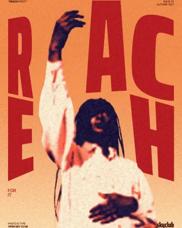
How to make a duotone effect
Two bold inks, punchy contrast and a fine poster grain.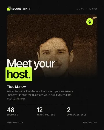
How to make a vintage sepia print effect
Sepia on yellowed, folded paper.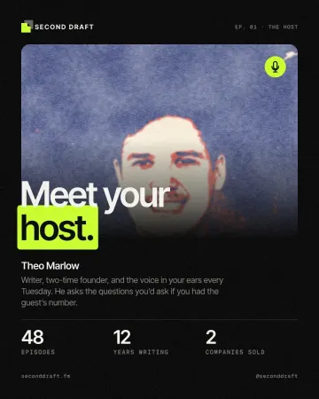
How to make a screen print effect
Three flat inks, a coarse dot and screens out of register.
Read the overview: graphic design trends 2026
Make it online: Photo effects online · Poster templates
Try it on your own design
Paletoo opens in your browser, with no sign-up. Every effect here is live: change the picture or the words and the effect follows.
Open in Paletoo