How to make a screen print effect
Three flat inks, a coarse dot and screens out of register.
What it is
A screen print is pushed through a mesh, one ink at a time. Each colour needs its own screen, so a print uses only a few flat inks, and every tone of the photo has to land on one of them: the shadows in the darkest ink, the mid-tones in the bright one, the light left as bare paper. Halftone dots break the steps between them, the inks spread a little into the paper, and because each screen is lined up by hand, the colours never sit exactly on top of each other.
That is the look of gig posters, Pop Art prints, band T-shirts and protest posters, and it is back because it is the opposite of a perfect digital image: bold, flat and a little imperfect. It turns any photo into a graphic, matches it to a strict palette and makes a series of pictures from different sources look like one edition.
Where it is used
Screen print suits gig and festival posters, merch and T-shirt graphics, Pop Art portraits, craft beer and coffee labels, exhibition posters and covers for zines and records. It is strongest on a cut-out person or a portrait with clear light and shadow; a busy photo with many small details turns into noise at three levels.
Made in Paletoo with this mix:
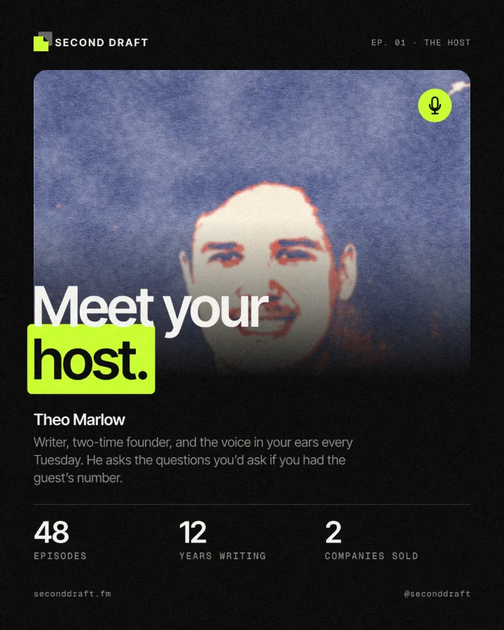
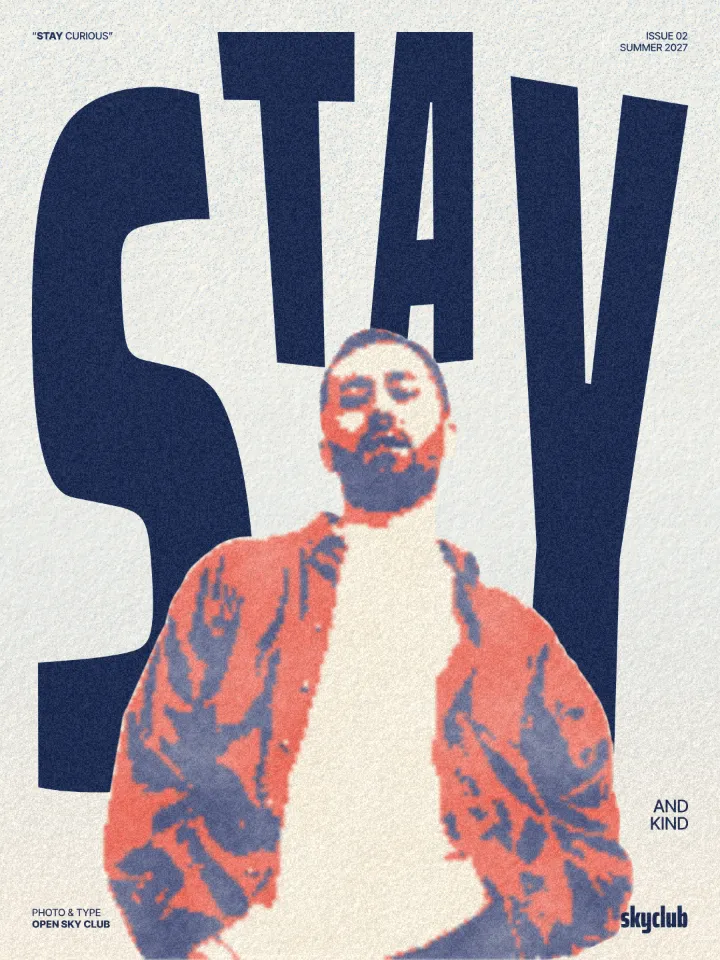
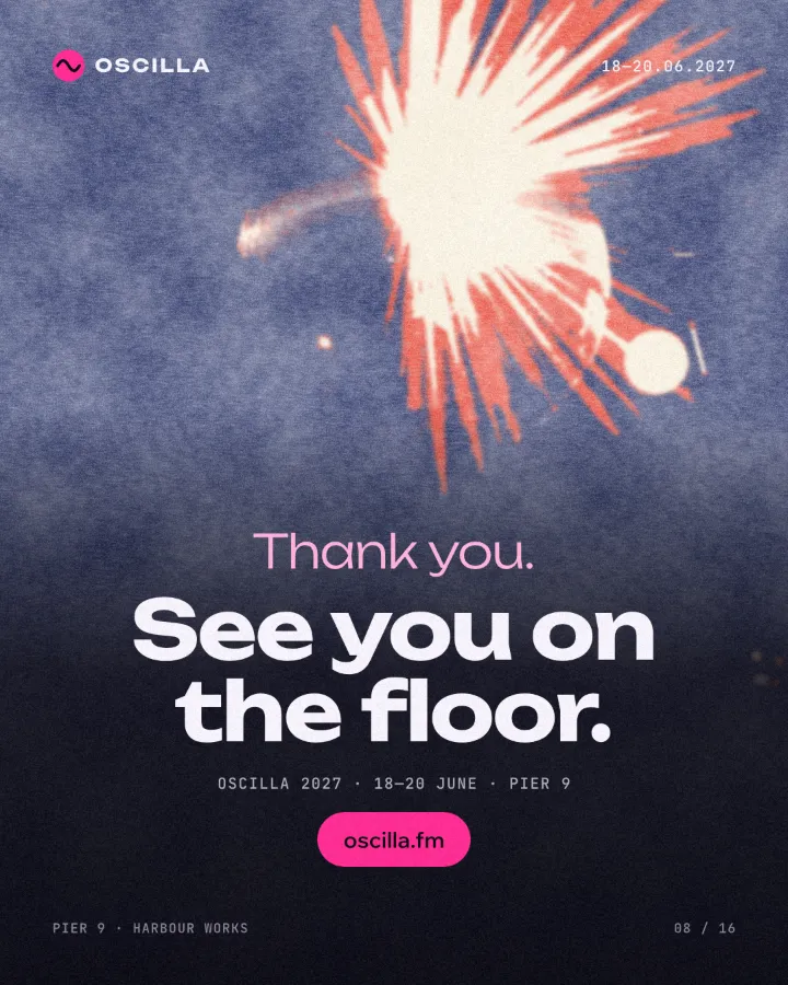
How to make it, step by step
Open your design and select the photo. A cut-out person or a portrait with strong light gives the cleanest separation; here it is the cut-out barista on a coffee roaster’s post.
Open the Effects tab and find Mixes; press All if Screen print is not in the first row.
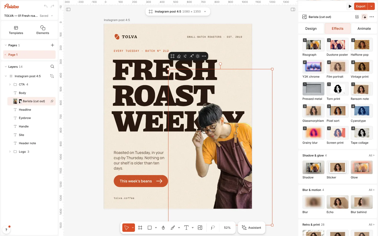
The coffee roaster’s post open in Paletoo, the cut-out barista selected and the Mixes open Press Screen print. Four steps go on under Applied: Basic adds contrast, a Gradient map cuts every tone to one of three inks — navy, red and cream — a Halftone breaks the edges between them into a coarse dot, and Print spreads the ink, shifts the screens and adds the paper.
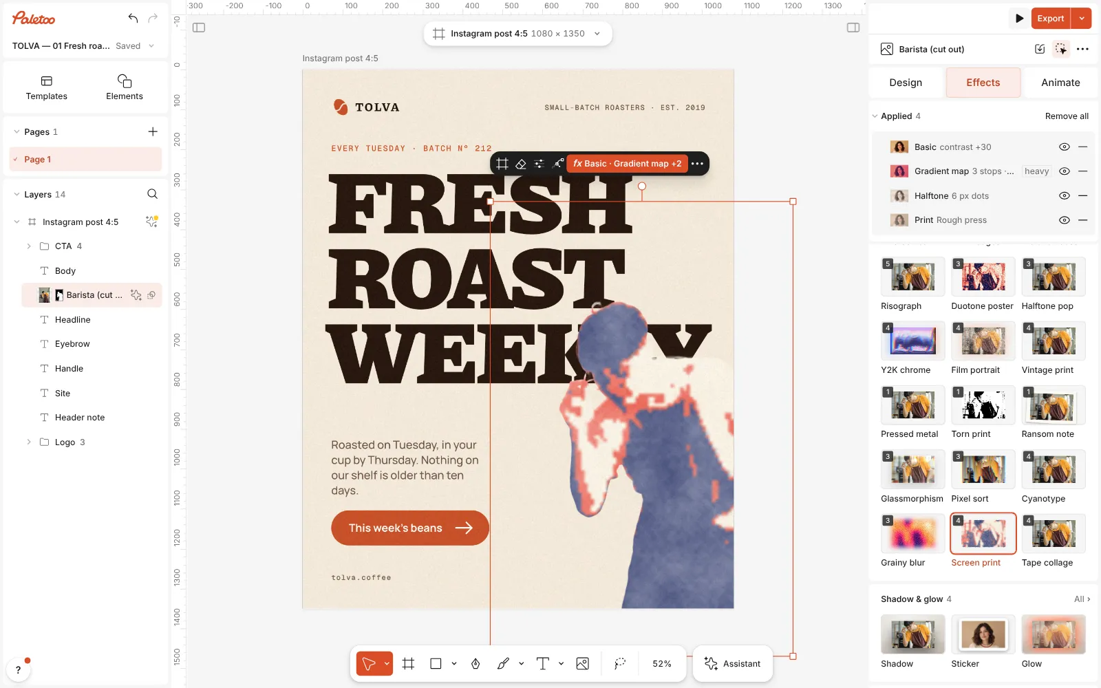
Screen print pressed: Basic, Gradient map, Halftone and Print under Applied, the barista in navy, red and cream Click the Gradient map row to open it. The Gradient holds the three inks; open Details under it, where Levels, set to 3, is what makes them flat: every tone snaps to the nearest ink instead of blending. Click a stop to change an ink.
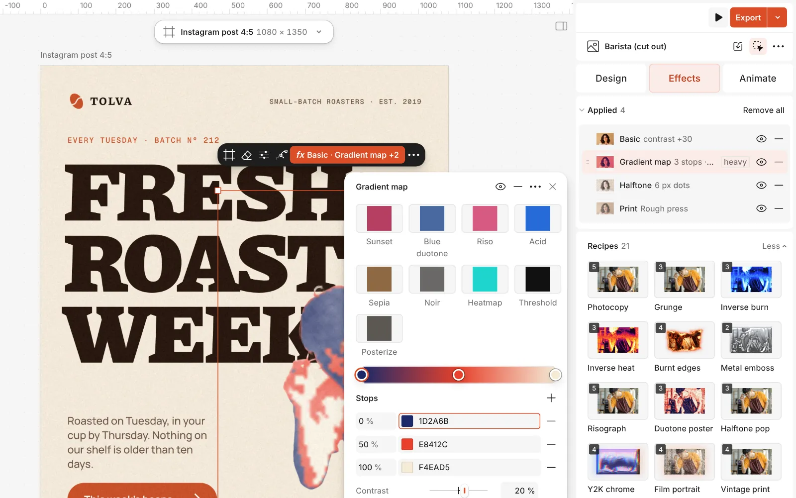
The Gradient map step open: the three inks, with Levels under Details Then open the Print row. Its presets are Clean print, Newsprint and Rough press (the mix’s); under them Ink spread, Misregistration, which shifts the screens apart, and Paper texture.
Press Export. PDF keeps the full resolution, so the dots and the paper are sharp on a large print.
The one-click mix
In Paletoo the whole stack is one mix, Screen print. One click puts every step on the selected object, one undo takes them all off, and each step stays an ordinary effect you can change, reorder or remove.
Its steps: Basic · contrast Gradient map · navy, red, cream in 3 levels Halftone · Comic Print · Rough press
Open this mix in PaletooMake it your own
Get the separation right first. In Basic, Contrast decides how much of the picture falls into each ink: more contrast pushes the mid-tones to the dark and the light inks, which gives a bolder, simpler print. Then drag the red stop of the Gradient left or right to choose how much of the face or the subject is printed in the bright ink.
Choose the inks like a printer would: one dark, one bright, one paper. Black, fluorescent pink and white is a gig poster; green, orange and cream a vintage travel print. Set Levels to 4 to add a fourth ink, or turn it Off for smooth blends, which is no longer a screen print but still a lovely palette.
The dot is the Halftone step: its Size is in document pixels, so a bigger poster can take a bigger dot; its Amount and Blend (Multiply at 45 % in the mix) keep it in the tones rather than over everything. In Print, a little Misregistration sells the look; too much just looks blurry. If the paper is too visible, lower Paper texture.
Questions
How is this different from the Risograph mix?
Risograph uses two soy inks with a fine line screen and a grain, soft and slightly translucent. Screen print uses three opaque, flat inks cut to exact levels, a coarse dot and a rough press, which is bolder and more graphic.
Can I print it for real?
You can export a high-resolution PDF or PNG for a digital or offset printer. For a real screen print, the artwork would need separating into one file per ink, which Paletoo does not do.
The face turned into flat blocks. What can I do?
Lower Contrast in the Basic step, or drag the red stop so more of the face lands on one ink. A cut-out with a plain background separates more cleanly.
Does it work on text?
Yes. A heading gets the inks, the dot and the press: the letters keep their shapes, pick up a rough edge and stay editable.
More effects
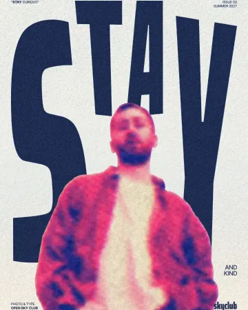
How to make a risograph effect
Two riso inks out of register, a coarse screen, riso paper.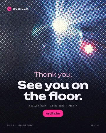
How to make a halftone effect
Comic-book CMYK dots, newspaper screens or one ink.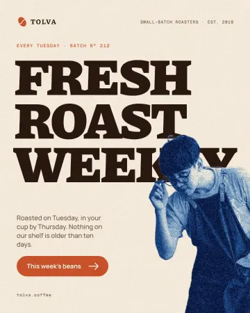
How to make a cyanotype effect from a photo
A sun print in Prussian blue on cream watercolour paper.
Read the overview: graphic design trends 2026
Make it online: Photo effects online · Poster templates
Try it on your own design
Paletoo opens in your browser, with no sign-up. Every effect here is live: change the picture or the words and the effect follows.
Open in Paletoo