How to make a risograph effect
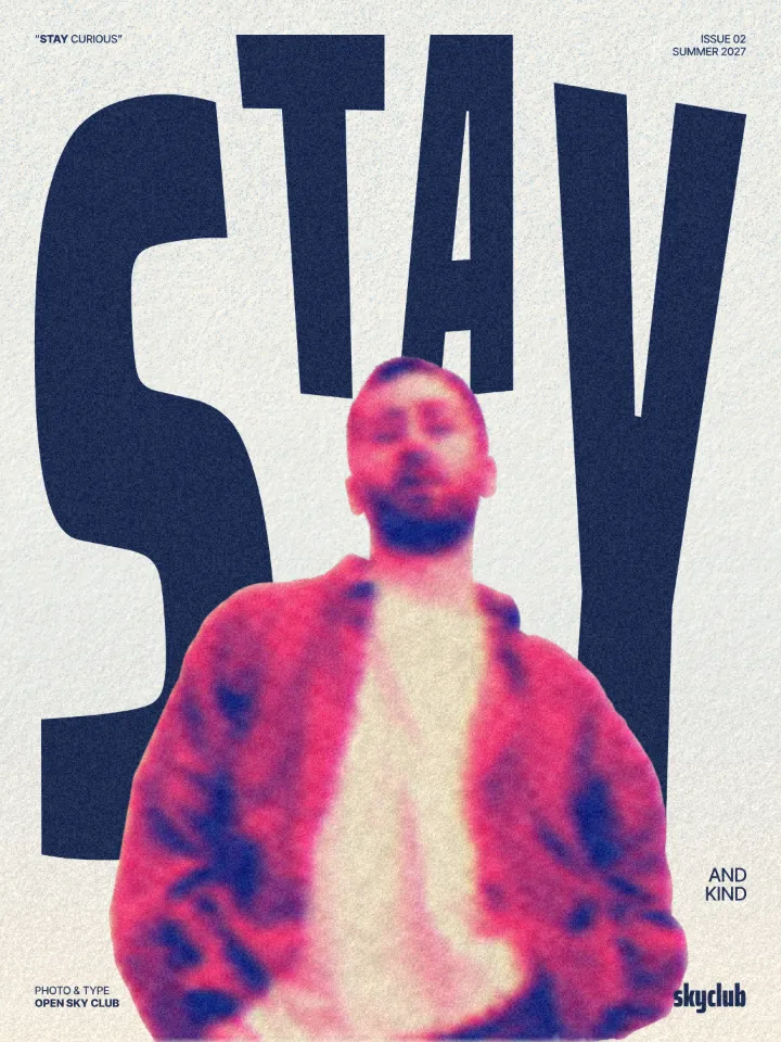
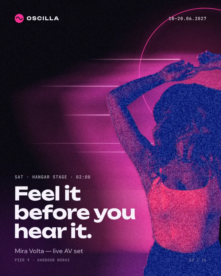
Two riso inks out of register, a coarse screen, riso paper.
What it is
A risograph is a Japanese stencil duplicator that prints one colour at a time with soy-based ink, a bit like a fast, cheap screen-printer. Each colour is a separate pass through the machine, so the layers never line up perfectly, the inks are bright and slightly transparent, and the paper soaks them up into a soft, grainy finish. Fluorescent pink, blue, yellow and green are the signature inks.
Designers love riso because it is imperfect in a warm, human way. The misregistration gives every print a little jump, the overlapping inks make new colours where they cross, and the coarse screen turns photos into something between a print and a drawing. A riso effect brings that tactile feeling to a design that will only ever live on a screen.
Where it is used
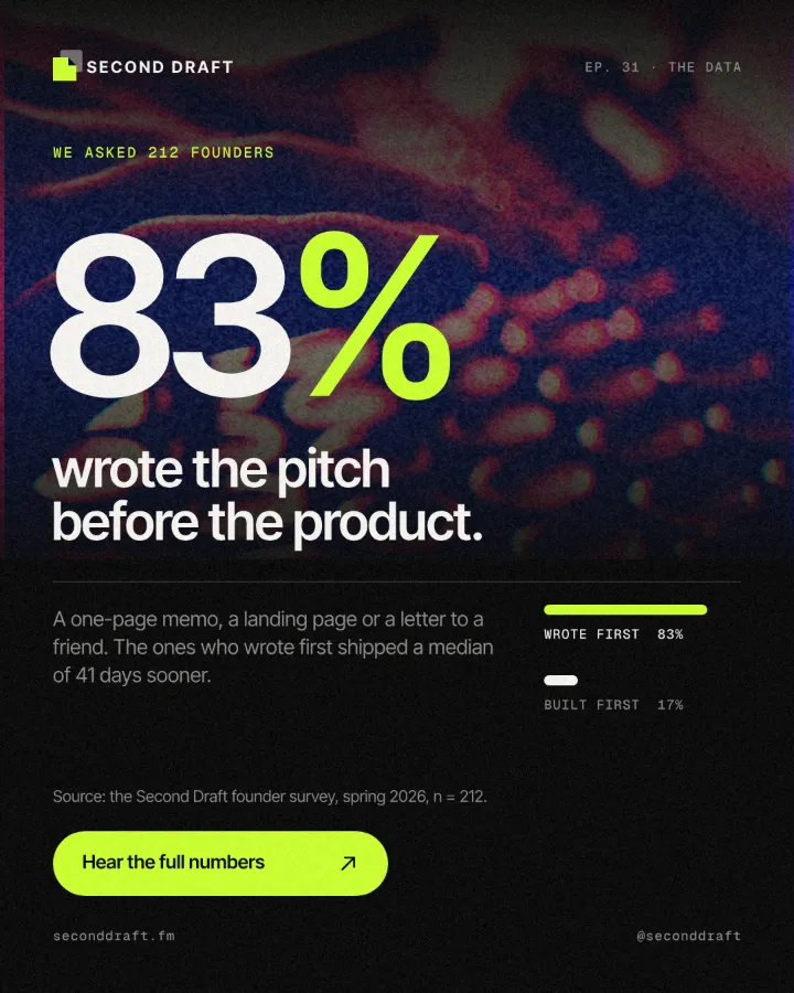
Riso is the look of independent publishing: zines, art-book fairs, small-press covers, illustration prints, gig posters for small venues and community events. Brands borrow it for packaging, coffee bags, cafe menus and social posts that want to feel crafted rather than corporate.
Made in Paletoo with this mix:
How to make it, step by step
Open your design and select a photo. Riso is generous with almost anything, but pictures with a clear subject and a light background keep the most of their shape.
Open the Effects tab and go to Mixes; press All to see every mix.
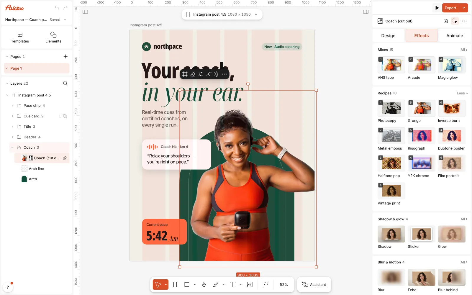
A running club post open in Paletoo, the cut-out runner selected and the Mixes open Press Risograph. Five steps go on: a Gradient map recolours the photo in two riso inks, Halftone adds a coarse line screen, Colour split knocks the inks out of register, Grain adds texture and a Texture step lays riso paper under it.
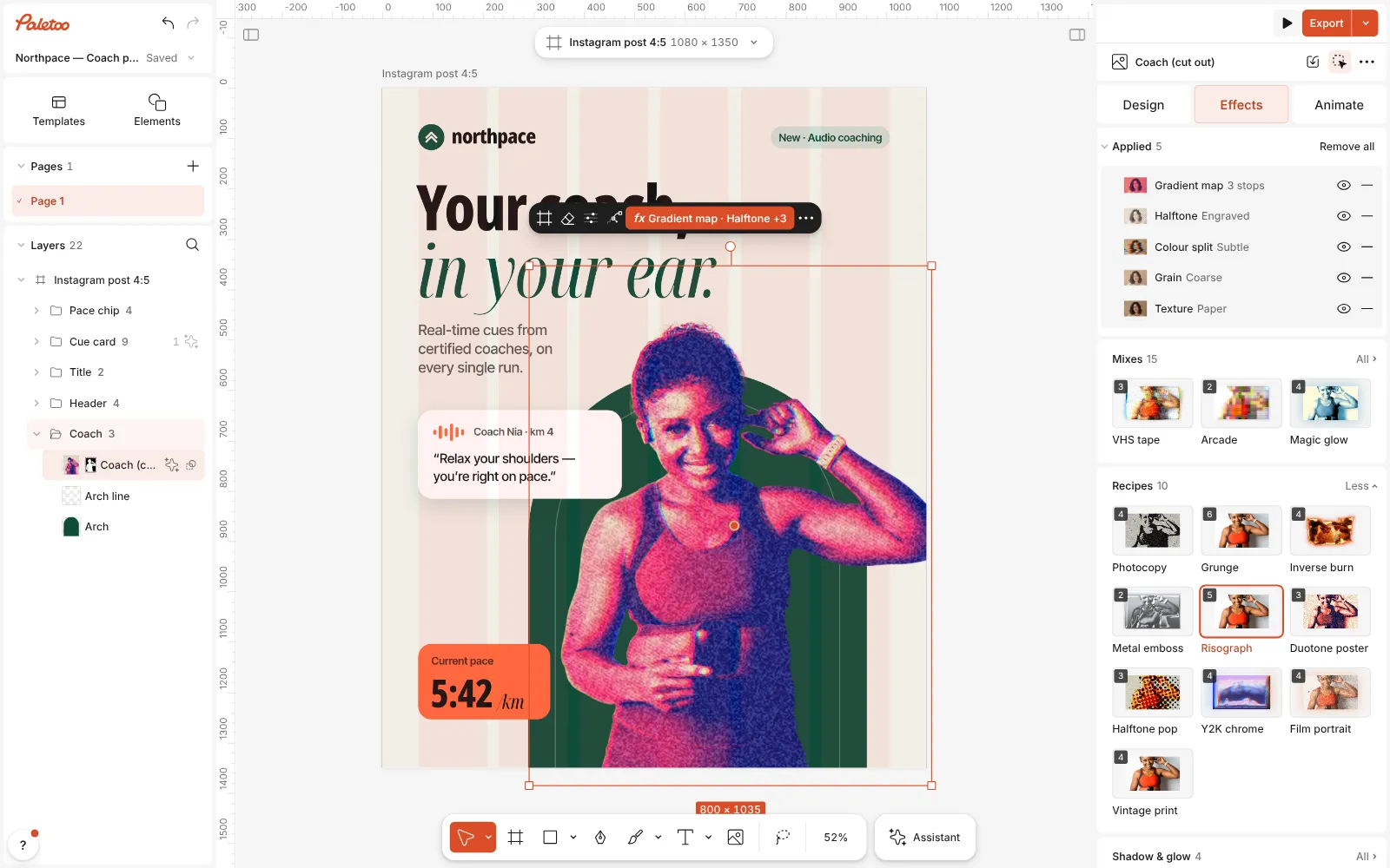
Risograph pressed: Gradient map, Halftone, Colour split, Grain and Texture under Applied Open the Gradient map to change the inks. Its Gradient runs from the darkest ink to the paper colour; click a stop to pick a new colour.
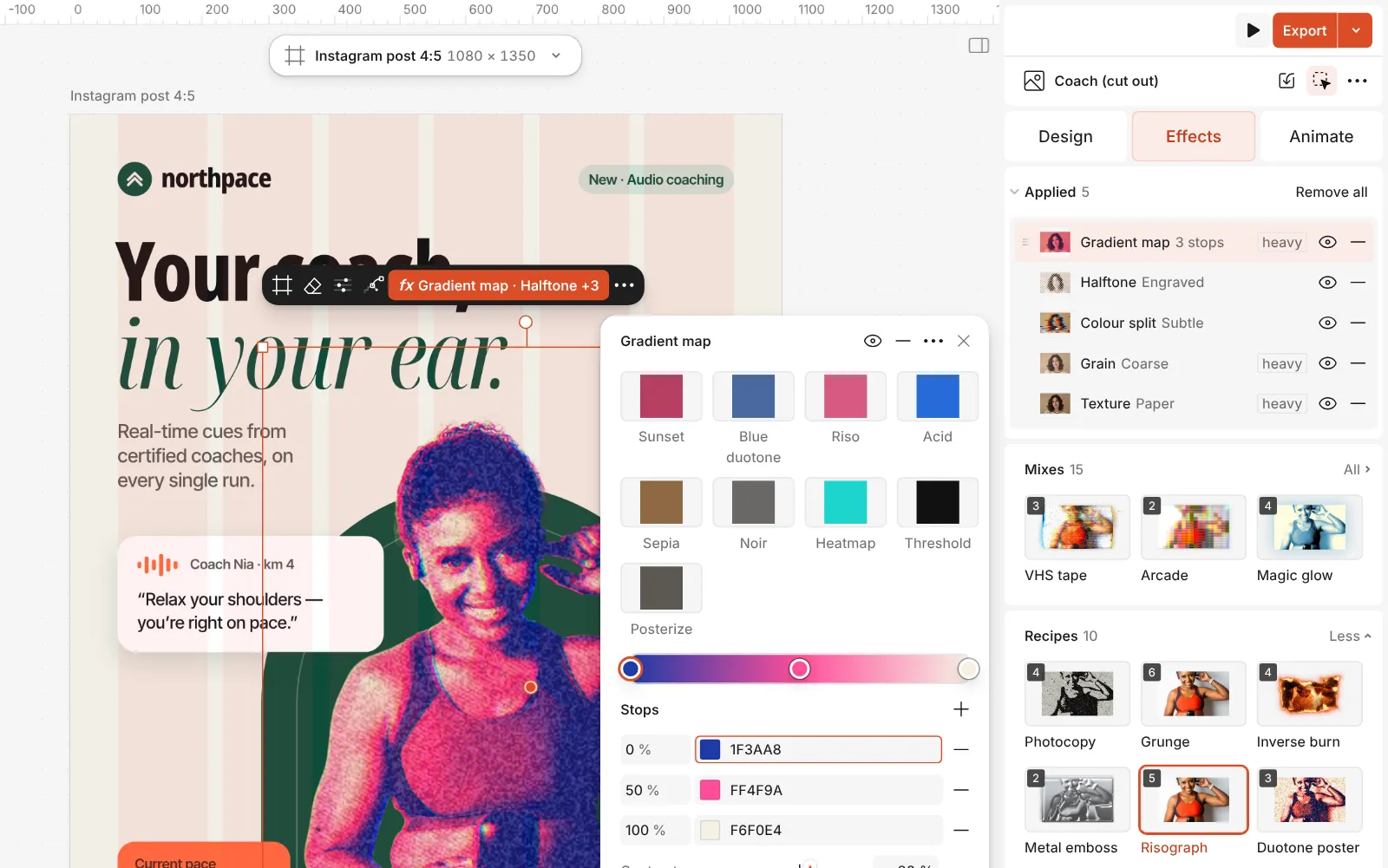
The Gradient map step open: the two riso inks and the paper colour on its Gradient, with Contrast Open Colour split to decide how far the second ink drifts: Distance for how much, Angle for which way.
Press Export. Riso looks especially good printed for real on uncoated paper, too.
Watch it
The one-click mix
In Paletoo the whole stack is one mix, Risograph. One click puts every step on the selected object, one undo takes them all off, and each step stays an ordinary effect you can change, reorder or remove.
Its steps: Gradient map · blue and fluoro pink Halftone · Engraved Colour split · Subtle Grain · Coarse Texture · Risograph
Open this mix in PaletooMake it your own
Choose inks the way a riso studio would: one dark, one bright. Blue with fluoro pink is the classic pair; teal with orange, purple with yellow or green with red all work. Keep the last stop of the gradient a warm off-white — that is the paper, and pure white looks digital.
The line screen in the Halftone step is half-blended into the picture on purpose. Raise its Amount for a rougher, more printed look, or switch its shape to dots for a softer one. For a flat, poster-like riso, lower the Gradient map’s Contrast and use the Levels control there to cut it into three or four flat tones.
Do not overdo the misregistration. Real riso drifts by a millimetre or two, so a few pixels of Distance is enough at post size. If the type sits on top of the photo, keep it in one ink and in register: the contrast between crisp type and drifting image is part of the charm.
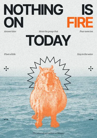
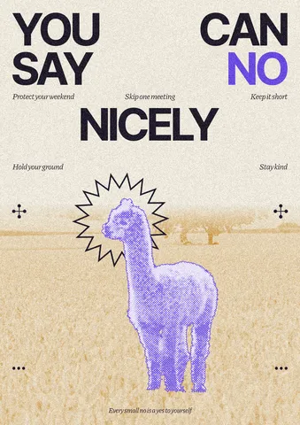
Templates with this look
Questions
What is the difference between riso and duotone?
Duotone maps a photo to two colours, smoothly. Riso adds what the machine does: a print screen, inks out of register, grain and paper. In Paletoo, Duotone poster is the clean version and Risograph the printed one.
Can I use three inks?
Yes. Add a stop to the Gradient map step: each stop is an ink, from the darkest to the paper.
Which colours are real riso inks?
Fluorescent pink, blue, yellow, green, red, teal and black are among the most common. Using them makes a later real riso print match the screen design more closely.
Does it work on illustrations and text?
Yes. Flat artwork and bold type take the screen and the misregistration particularly well.
More effects
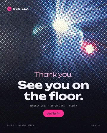
How to make a halftone effect
Comic-book CMYK dots, newspaper screens or one ink.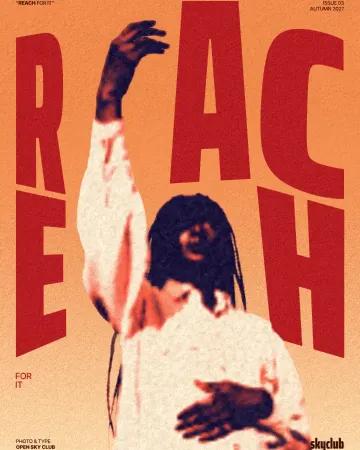
How to make a duotone effect
Two bold inks, punchy contrast and a fine poster grain.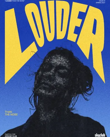
How to make a photocopy effect
Dense toner blacks, greys in scan lines and grey copier paper, from any photo.
Read the overview: graphic design trends 2026
Make it online: Poster maker · Remove background online · Duotone, halftone and glitch photo effects online · Poster templates · Team and speaker templates
Try it on your own design
Paletoo opens in your browser, with no sign-up. Every effect here is live: change the picture or the words and the effect follows.
Open in Paletoo