By decade4 min readFreeUpdated 2026-11-14
The best free 70s fonts
Groovy, chunky, soft — twelve free fonts that say 1970s, a mini timeline of the decade’s lettering, and a poster a click away.
By Paletoo’s designers · fonts checked
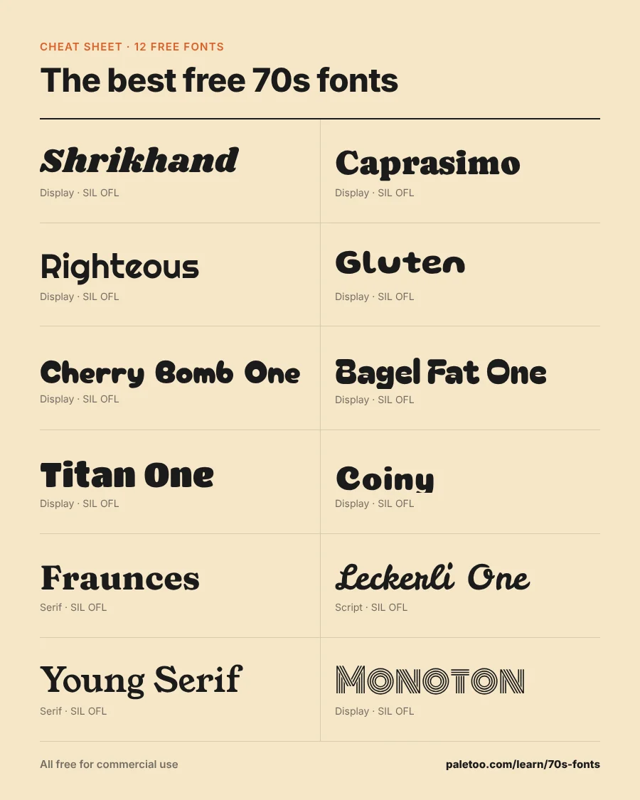
Short answer: the most 70s free font is Caprasimo (a soft, chunky serif in the spirit of Cooper Black); for the swashy, funky look, Shrikhand; for roller-disco geometry, Righteous; for the soft text serifs of the era, Fraunces. All are free for commercial use.
The 70s look is warm and round: heavy weights, soft corners, tight spacing, and a palette of burnt orange, mustard, chocolate and avocado. Scroll the timeline, then type your own words below.
The 70s in six fonts: a mini timeline
How lettering moved through the decade — each year set in a free font with that feel. Press any year to open it in Paletoo.
-
1970
Far out
Caprasimo
Chunky, soft-cornered serifs (the Cooper Black look) everywhere: album covers, ads, cereal boxes.
-
1972
Groovy
Shrikhand
Psychedelic hangover: swollen, swashy italics with ball-end flourishes.
-
1974
Dyn-o-mite
Righteous
Geometric display faces with rounded corners — the space-age brochure.
-
1976
Soft rock
Fraunces
Wide, soft serifs with tight spacing, the defining 70s text look.
-
1977
Paperback
Young Serif
Heavy, friendly book serifs on novels and posters.
-
1979
DISCO
Monoton
Inline neon letters and the glitter ball: the decade ends on the dance floor.
Twelve free 70s fonts
Type your words — a band name, a shop, «Stay groovy». «Use in Paletoo» opens a poster in burnt orange and mustard with that font and your words.
-
Stay groovy
Swollen, swashy italic display — the funky-flyer font. Big and bold. Jonny Pinhorn
-
Stay groovy
The free Cooper Black alternative: soft, chunky and warm. The DocRepair Project, Phaedra Charles, Flavia Zimbardi
-
Stay groovy
Round-cornered geometric capitals — roller rinks and record shops. Astigmatic
-
Stay groovy
Gooey, melting letters with a variable weight; psychedelic and fun. Tyler Finck, ETC
-
Stay groovy
Bubbly, cartoonish and sweet — candy wrappers and kids’ TV. Satsuyako
-
Stay groovy
Fat, puffy letters; stickers and T-shirts. Kyungwon Kim, JAMO
-
Stay groovy
Round, heavy and friendly — great for cutting and for logos. Rodrigo Fuenzalida
-
Stay groovy
Super-round capitals for playful headlines. Marcelo Magalhães
-
Stay groovy
The 70s soft serif reborn: variable, warm and wonky. Undercase Type, Phaedra Charles, Flavia Zimbardi
-
Stay groovy
A bouncy brush script with a sunny, ad-poster feel. Gesine Todt
-
Stay groovy
Heavy old-style serif — paperback covers and cozy menus. Bastien Sozeau
-
Stay groovy
Inline neon capitals: the disco finale (and a bridge to the 80s). Vernon Adams
The fonts load as you scroll to them: ours from this site, Google Fonts families as Google sends them to any website (only the letters you type). Each row’s «Use in Paletoo» opens a new design with that font, your words and the weight.
70s font pairs
A groovy headline and a plain text line. Press a pair, type, open it in Paletoo.
Roller Disco Night
Saturday from 8 pm at the old rink — skates for rent, mirror ball guaranteed, flares encouraged.
Paletoo opens a new design with these two fonts as its heading and body text styles, your words already set in them.
How to make text look 70s
Heavy weight, tight letter-spacing (−2 % to −4 %), soft or rounded corners, and the words stacked or arched. Add a rainbow stripe in orange-mustard-brown, or a drop shadow offset in a second warm colour.
In Paletoo, text on a curve and offset shadows are text effects — try text effects; for a ready layout, see event posters.
Is Cooper Black free?
Cooper Black (1922) is sold by several foundries; the versions on your computer are licensed with it, not for every use. Caprasimo is a free, open-licensed design in the same soft, chunky spirit.
Download the cheat sheet
Every font of this article on one image, with its name and licence — save it for later or pin it.
How we picked and checked
Every font here is a Google Fonts family that Paletoo opens directly. Its designer and licence are read from Google Fonts’ own METADATA.pb (checked ); every one is SIL Open Font License or Apache 2.0, so you can use it for personal and commercial work, logos included. Lookalikes are chosen by eye for the vibe — none is a copy of a proprietary font.
Questions
What font is the most 70s?
Cooper Black and its relatives — soft, heavy, rounded serifs. Caprasimo is a free, open-licensed font in that spirit.
What is a free groovy font for commercial use?
Shrikhand, Caprasimo, Righteous, Gluten and Bagel Fat One — all under SIL Open Font License.
What colours go with 70s fonts?
Burnt orange, mustard, chocolate brown, avocado green and cream.
Which 70s fonts work on Cricut?
Heavy ones with simple outlines: Caprasimo, Titan One, Coiny, Righteous, Bagel Fat One.
More font guides
- The best free bubble fontsPuffy, round, squishy — twelve free bubble fonts you can type in right here, then turn into a sticker, a shirt or a party invite in Paletoo.
- Fonts like Stranger Things — free lookalikesThe red, glowing 80s-horror title look with ten open-licensed serifs — type your own title and see it on black right away.
- Tattoo fonts — test your name in 12 free fontsOld English, script, fine line, typewriter: type the name or date you want inked and see it in twelve free tattoo fonts before you commit.
- The best free wedding fontsTwelve scripts and serifs for invitations, signs and save-the-dates — type your names and see them in each, live.
- Fonts like Harry Potter — free wizard fontsAcceptance letters, spellbooks and great-hall banners: twelve open-licensed fonts with the wizarding look, live with your own words.
- Taylor Swift eras fonts — a free font for every eraA font for each era, from Debut to the poets — free lookalikes for bracelets, signs and eras-party posters, live with your words.
- The best fonts for a small-business logoBakery, coffee shop, salon, gym, real estate and five more — a free font pair for each, live with your own business name.
- The best free 80s fontsArcade pixels, chrome sci-fi, neon scripts — twelve free 80s fonts on a black background, with a mini timeline of the decade.
Make it, and read on
- Poster makerMake a poster from a template that already has the layout right, then export a print-ready PDF or an image for screens.
- Font pairings 2027: 40 trending pairs to try on your wordsForty trending font combinations — editorial serifs, wide grotesks, mono labels, bouba type — live on your own words, and one tap to use the pair.
- Typography trends 2027: five font looks and how to use themFive ways type is changing on posters, posts and covers next year, each made on live, editable text.
- Ukrainian fonts: how to choose and where to get themEvery font on one page, for Ukrainian and Latin — tested with your words.
- Ukrainian font tester68 free fonts with every Ukrainian letter, on one page
Try it on your own design
Paletoo opens in your browser, with no sign-up. Every effect here is live: change the picture or the words and the effect follows.
Open in PaletooOpens this design as your own copy — every layer and effect editable, free.