Techniques5 min readFreeUpdated 2026-11-12
Font pairings 2027: 40 trending pairs to try on your words
Forty trending font combinations — editorial serifs, wide grotesks, mono labels, bouba type — live on your own words, and one tap to use the pair.
By the Paletoo team · steps tested in Paletoo on
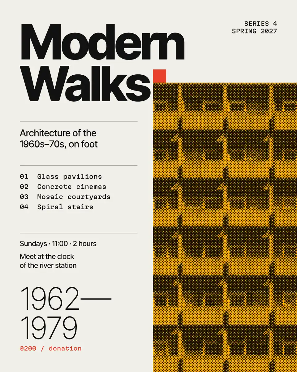
The font pairings of 2026–27 are built on contrast with a reason: a thin editorial serif over a neutral grotesk, a wide display over a calm geometric sans, a heavy grotesk with a monospaced face for labels and dates, or one variable family used at two extremes. The quickest way to choose is to see your own headline in each — so the tester below sets your words in forty pairs, every face open-licence and complete in Ukrainian (Ґ, Є, І, Ї) and Polish.
Under the tester: what each kind of pair is for, the three rules that make a pair work, and the steps to set a pair as text styles in Paletoo on «Modern Walks», a poster built on a grotesk and a mono. The pairs come from what designers shared and saved in November 2026 (the sources are listed); where the trending original is commercial or has no Cyrillic, we name it and use the closest open face.
Try the pairs on your own wordsLive
Type a headline and a line of text, then switch between the forty pairs. Every face is open-licence and sets Ukrainian and Polish.
- Magazine spreadNyght Serif Light + Overused Grotesk
- New classicPlayfair Display + Inter
- Italic accentNyght Serif Italic + Geist
- Wide gestureUnbounded ExtraBold + Manrope
- Warm serifLiterata Display Black + Inter
- Code and designGeist SemiBold + Geist Mono
- Condensed shoutOswald Bold + Inter
- Quiet luxuryCormorant Garamond Medium + Manrope
- Grotesk and typewriterOverused Grotesk Black + IBM Plex Mono
- Contrast and monoYeseva One + Geist Mono
- One familyFixel Display Black + Fixel Text
- Compressed and monoSofia Sans Extra Condensed Black + JetBrains Mono
- CyberTektur ExtraBold + Martian Mono
- Y2K bubblesNunito Black + Manrope
- Handwritten noteCaveat Bold + Inter
- BookishPT Serif Bold + Overused Grotesk
- SystemIBM Plex Serif SemiBold + IBM Plex Sans
- Future medievalSinistre Dark + Fixel Text
- Wide brutalRubik Mono One + Geist
- MarbleForum + Manrope
- Grotesk with a twistCommissioner Flared Black + Commissioner
- Bouba groteskRubik ExtraBold + Rubik
- Wide meets bookUnbounded Medium + Literata
- WeddingCormorant Garamond Light + Montserrat
- HeritageBrygada 1918 Bold + Inter
- Hand scriptPodil Script + Fixel Text Light
- Y2K pixelDeparture Mono + Geist
- Modern journalManrope ExtraBold + Literata
- InterfaceFixel Display Bold + JetBrains Mono
- GlossyYeseva One + Overused Grotesk
- SeventiesMontserrat Alternates Black + Nunito
- Serif and codeLiterata Display Black + JetBrains Mono
- Gig posterLe Murmure + Overused Grotesk
- Italic textManrope ExtraBold + Nyght Serif Italic
- NewsroomIBM Plex Mono Bold + Nyght Serif
- One serifNyght Serif Dark + Nyght Serif Light
- PsychedelicOuroboros + Fixel Text Light
- SwissGrotesk Gras + Grotesk Mince
- InvitationPinyon Kyiv + Nyght Serif
- TabloidFira Sans Condensed Black + Nyght Serif
Quiet
Good type makes people stop, read and remember. The second face does the quiet work.
A thin editorial serif over a neutral grotesk — the most-saved pair of the year, in open look-alikes with Cyrillic.
Stands in for: PP Editorial New + PP Neue Montreal
Use this pair in PaletooOpens a new document with exactly this setup — free, no sign-up.
The kinds of pairs that are trending
Most of the forty fall into a handful of families. Knowing which one you want narrows the choice from thousands of fonts to a few:
| Kind | Example in the tester | Use it for |
|---|---|---|
| Editorial serif + grotesk | Nyght Serif Light + Overused Grotesk | Magazines, portfolios, calm brands |
| Wide display + geometric sans | Unbounded + Manrope | Festivals, tech launches, bold posts |
| Grotesk + mono labels | Geist + Geist Mono | Product pages, data, event details |
| Condensed shout + Inter | Oswald + Inter | Sport, sales, news |
| Soft “bouba” type | Rubik ExtraBold + Rubik | Food, kids, friendly apps |
| One family, two extremes | Fixel Display + Fixel Text | Brand systems that must stay consistent |
Three rules that make a pair work
Contrast, not conflict. The two faces should differ clearly in one way — serif against sans, wide against narrow, heavy against light — and agree in another, such as proportions or mood. Two faces that are almost alike look like a mistake; two that differ in everything look like two brands.
One voice leads. The headline face can be loud because it is used for a few words; the text face has to be quiet, because people read paragraphs in it. If the text face has character of its own, keep the headline simple.
Check every letter you need. A pair that looks perfect in English can fall apart in Ukrainian when one face lacks Ґ or the apostrophe, and your browser silently swaps in another font. Every face in the tester was checked for the full Ukrainian and Polish alphabets; for your own fonts, type a sentence with ґ, є, ї, ą and ż before you commit.
Stand-ins for the fonts everyone saves
Many of the pairs in this year’s reels and moodboards use commercial faces — PP Editorial New, PP Neue Montreal, Druk, Swear — or free ones without Cyrillic, such as Instrument Serif and Fraunces. Where that is so, the tester says which pair it stands in for, and uses an open face with the same idea: Nyght Serif for the thin editorial serif, Overused Grotesk for the neutral grotesk, Literata for the soft display serif, Sofia Sans Extra Condensed for the poster condensed.
Stand-ins are not copies, and a brand with a licence for the original should use it. But for a poster, a post or a first logo, an open face that sets your language properly is the better choice: it is free to use commercially, it opens on every computer, and nobody gets a letter in the wrong font.
Made in Paletoo
Every picture on this page was made in Paletoo — these three with the same steps on other templates:
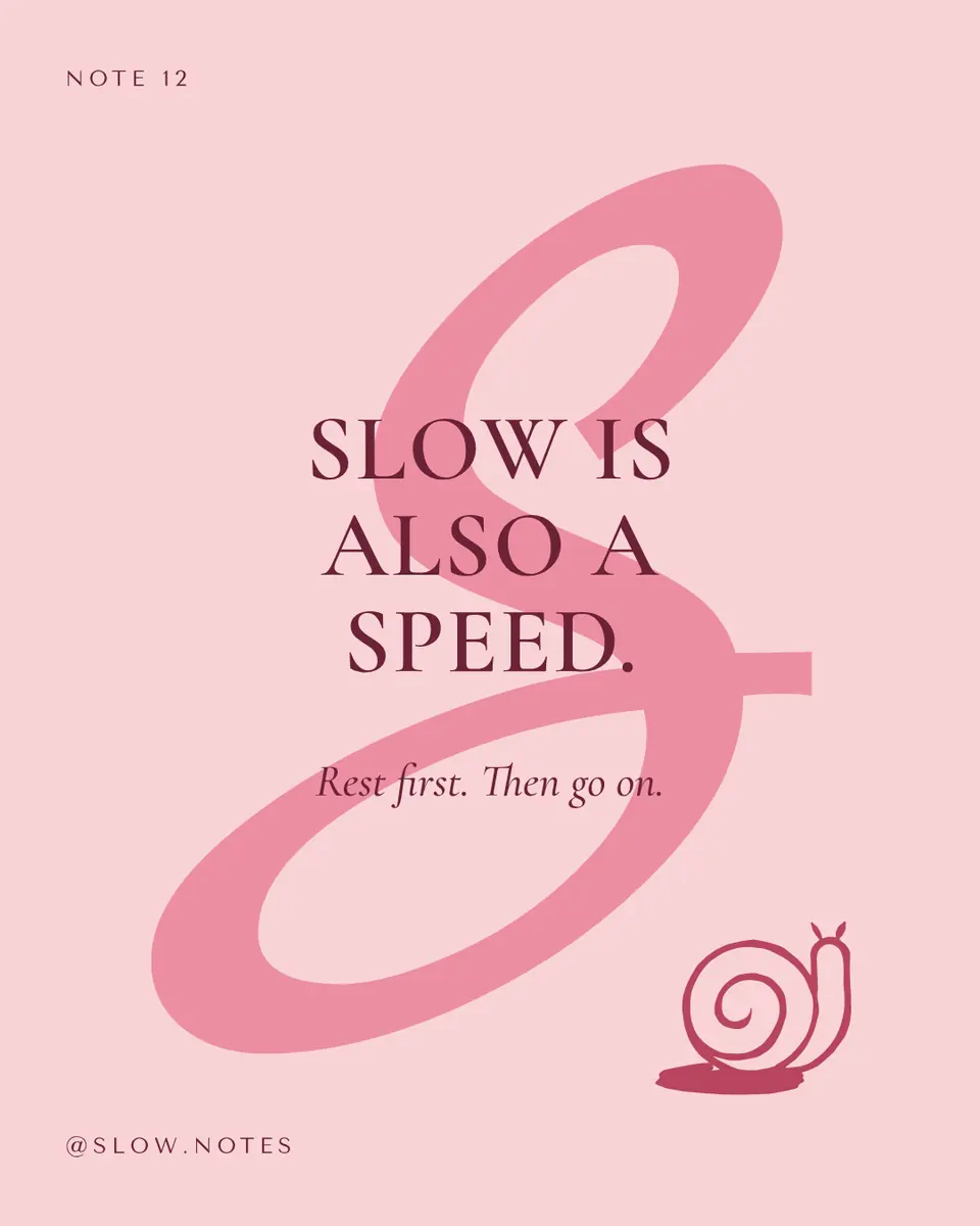
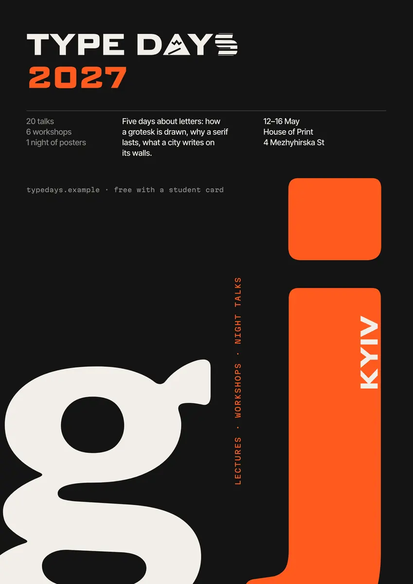
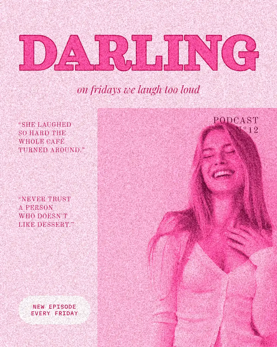
Step by step in Paletoo
Open the poster: press “Open in Paletoo” on this page, or “Use this pair in Paletoo” under the tester — that opens a new post with your pair already saved as two Text styles. «Modern Walks» sets its title in a heavy grotesk and its details in a mono.
Double-click the title and type your own words; with it selected, the Typography section of the Design tab shows its Font, Weight and Size.
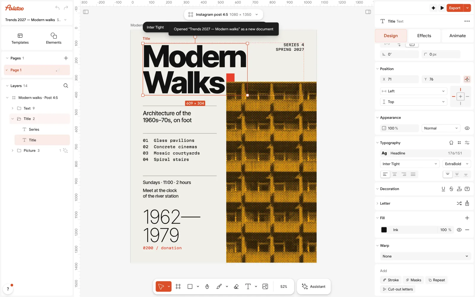
The «Modern Walks» poster open in Paletoo, the title selected: its font under Typography Press the font name to open the font list: Recommended for this design at its top suggests faces that pair with the fonts already in the document, the trending pairs among them.
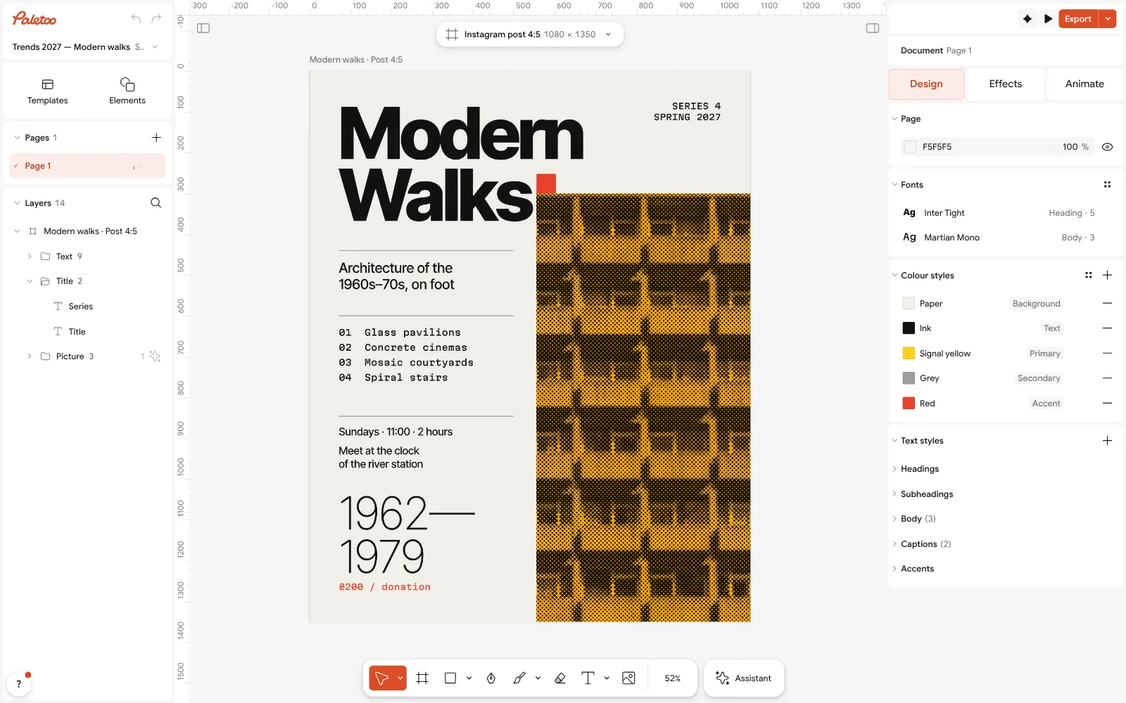
Nothing selected: the document’s text styles, one per role, ready to take another pair With nothing selected, the Design tab lists the document’s Text styles. Change the font of a style once, and every line that uses it changes — the fastest way to try another pair on the whole poster.
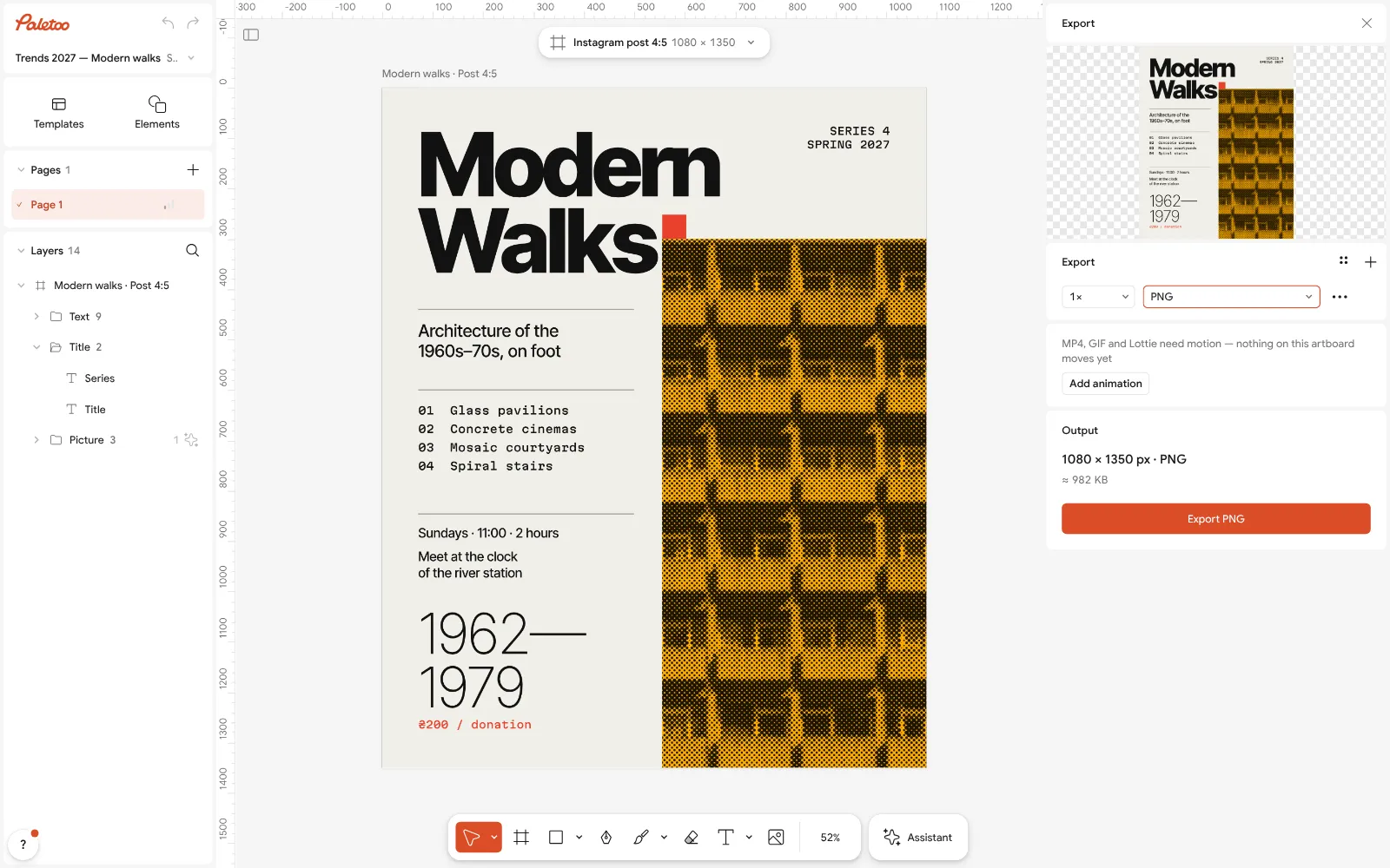
The Export window: the poster as PNG, free Fine-tune the headline: tighten Letter spacing on a big display face, loosen Line height on the text face, and keep the text at least 11–12 pt for print.
Press Export (Ctrl Shift E) and download a PNG or a PDF — free, without a watermark.
Make it your own
If the pair feels flat, push the contrast in one direction only: a heavier Weight for the headline, or a lighter one for the text — not both.
Keep a pair to two families. A third font for a single label is almost always better as the mono or the italic of one you already have, set as its own entry in Text styles.
For a long text in Ukrainian, give the body face a little more Line height than in English: Cyrillic has fewer ascenders, and lines look denser.
Sources
Questions
What are the best font pairings for 2027?
The pairs designers save most combine a thin editorial serif with a neutral grotesk, a wide display with a geometric sans, or a grotesk with a mono for labels. The tester on this page has forty of them, all open-licence.
Do these font pairs work in Ukrainian?
Yes. Every face in the tester sets the full Ukrainian alphabet, including Ґ, Є, І and Ї, and Polish letters. Where a trending font has no Cyrillic, the tester names it and uses an open stand-in.
How many fonts should a design use?
Two families are enough for almost everything: one for headlines and one for text. Use weights, italics or a mono from the same families before adding a third.
Can I use these fonts commercially?
They are open-licence (SIL Open Font License or similar), which allows commercial use in designs. Each family’s licence ships with the font files in Paletoo.
How do I open a pair in Paletoo?
Press “Use this pair in Paletoo” under the tester. A new post opens with the pair saved as two text styles and your headline and text already set in them — free, with no account.
Make it online
- Poster makerMake a poster from a template that already has the layout right, then export a print-ready PDF or an image for screens.
- Instagram post makerDesign a post at the right size from a real template, then export a sharp PNG or JPG — free, in your browser.
- Logo makerType your brand name, pick a logo, try fonts, colours and layouts, then download SVG, PNG and app icons — free, no watermark, no sign-up.
Free design templates for posts, stories and posters: Poster templates · Social media post templates · Brand guidelines templates
Try it on your own design
Paletoo opens in your browser, with no sign-up. Every effect here is live: change the picture or the words and the effect follows.
Open in PaletooOpens this design as your own copy — every layer and effect editable, free.
Read next
- 01
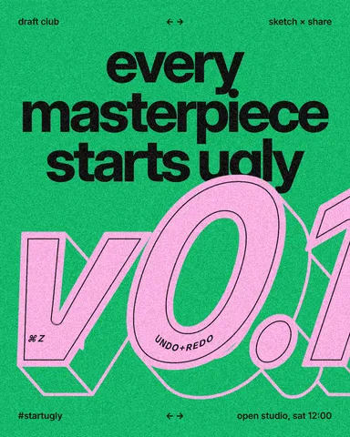 Font pairing for posters: six combinations that workOne loud voice, one quiet one, and a clear difference between them.
- 02
 How to keep brand fonts and colours consistent across every designName the colours and the type once, link every layer to them, and change them in one place.
- 03
 Typography poster: how to make the type the pictureNo photo needed: when the words are drawn big enough, they are the image.