Design trends 20276 min readFreeUpdated 2026-11-06Save to Pinterest
Typography trends 2027: five font looks and how to use them
Five ways type is changing on posters, posts and covers next year, each made on live, editable text.
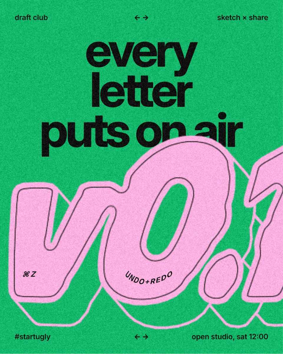
The big shift in typography heading into 2027 is not a new typeface everyone has to buy. It is what designers do to the letters after choosing them. Headlines swell, get cut, leave trails, bend along a line or punch a hole through the picture behind them — and they stay live text you can retype, not a flattened picture from a 3D app.
Below are five font trends worth knowing for 2027, each with a real design made in Paletoo on one of our templates, the steps to make it, and a live example you can open and change. None of them needs a special font: a heavy grotesk, a wide display face or a good condensed sans covers all five.
Every picture in this article is a real design made in Paletoo, on our own templates — exported from the editor, not stock.
Puffy, inflated letters
Soft, swollen letters that look pressed out of clay are still rising. They bring warmth without a photo, which is why they turn up on coffee and food packaging, kids’ brands, music covers and the big-number posts of small businesses. In the example the big “v0.1” of a design club’s post is puffed into round, pink figures over a flat, bright green background.
Use it on one word or one number, set big. Heavy, rounded typefaces puff best; thin serifs have nothing to swell, and small text fills in until the holes in a, e and 8 close. Keep everything around it flat, so the one soft object carries the design.
Make it in Paletoo
Select the headline or number, open the Effects tab and unfold Glitch & glass.
Press Inflate: the Puffy preset goes on under Applied and the letters swell at once.
Click the step to tune Amount and Roundness; keep Merge letters at 0 for separate letters.
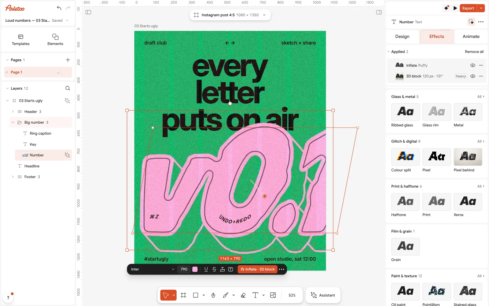
Open this example in Paletoo Step-by-step guide: Tactile 3D type: the clay trend of 2027, and how to make it
Stencil cuts and slits
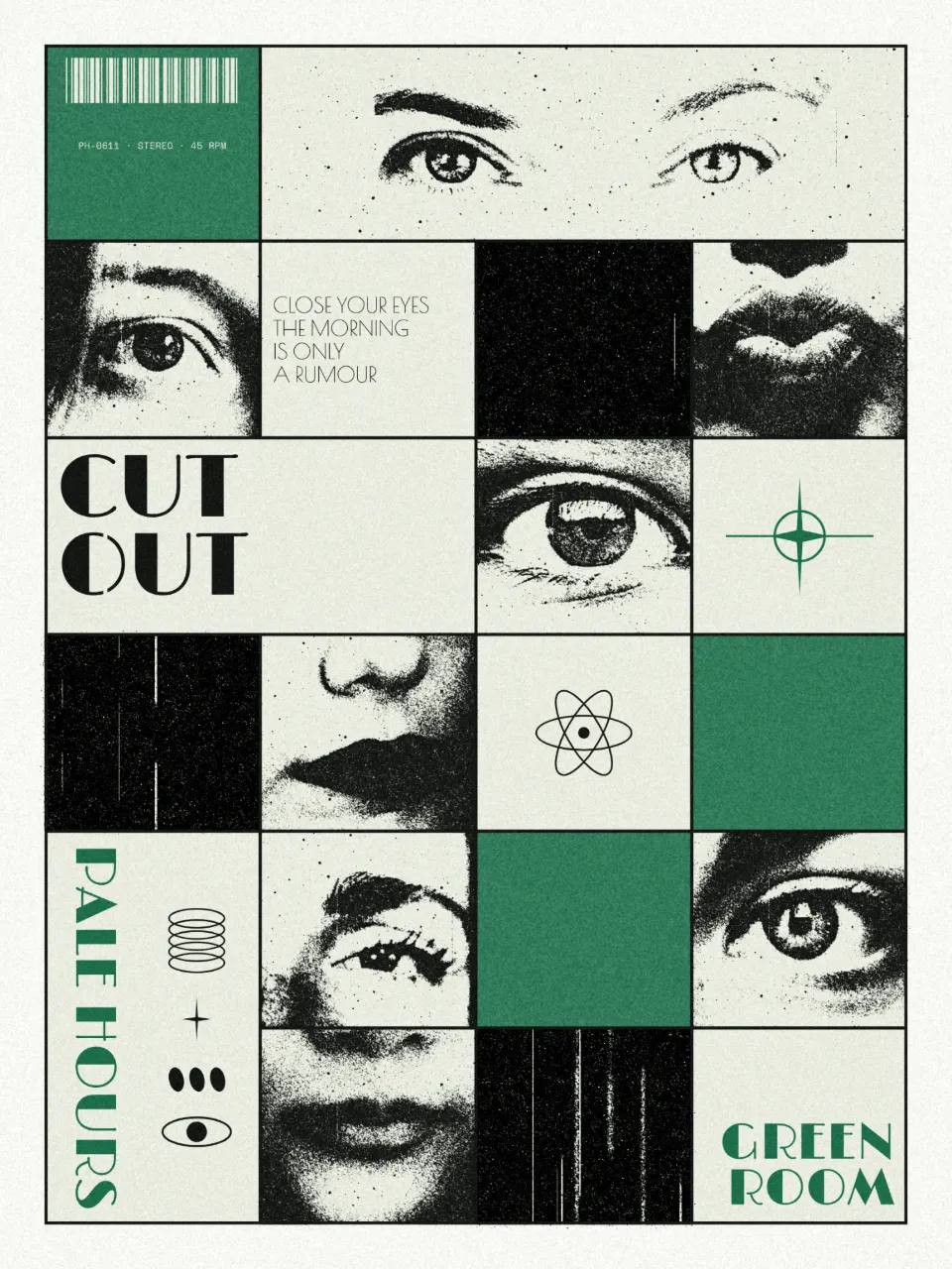
Stencil letters — thin bridges that break the strokes, as if the word were sprayed through a cut sheet — are moving from military and industrial signage into fashion, music and tech. Slits, the horizontal cousin, slice a headline into bands like a scan line. Both give a plain grotesk an edge without changing the font.
Keep the cuts thin and consistent, and use them on large type: at small sizes a bridge reads as a rendering fault. In the example the words “CUT OUT” on a grid poster of halftone eyes and lips get fine stencil bridges, quiet enough that the words still read first.
Make it in Paletoo
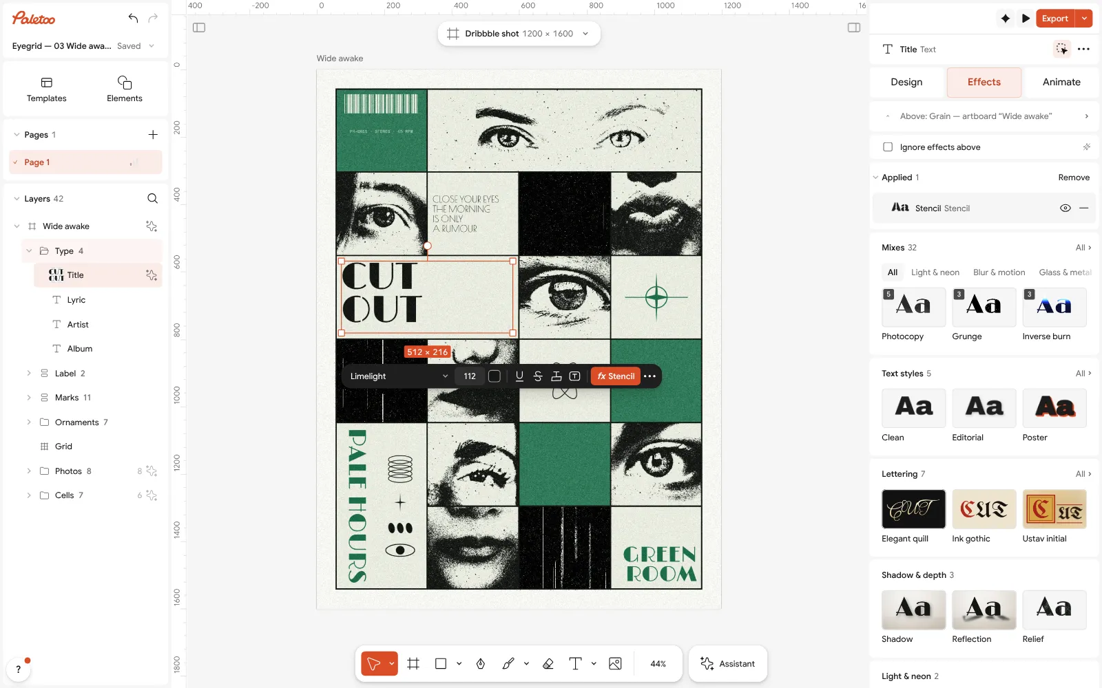
Select the text and unfold Glitch & glass in the Effects tab.
Press Stencil. The cuts are vector, so the text stays editable.
Open the step: switch Cuts between Stencil and Slits, set Width and Angle, or try the Scan lines and Cut-up presets.
Echo and motion type
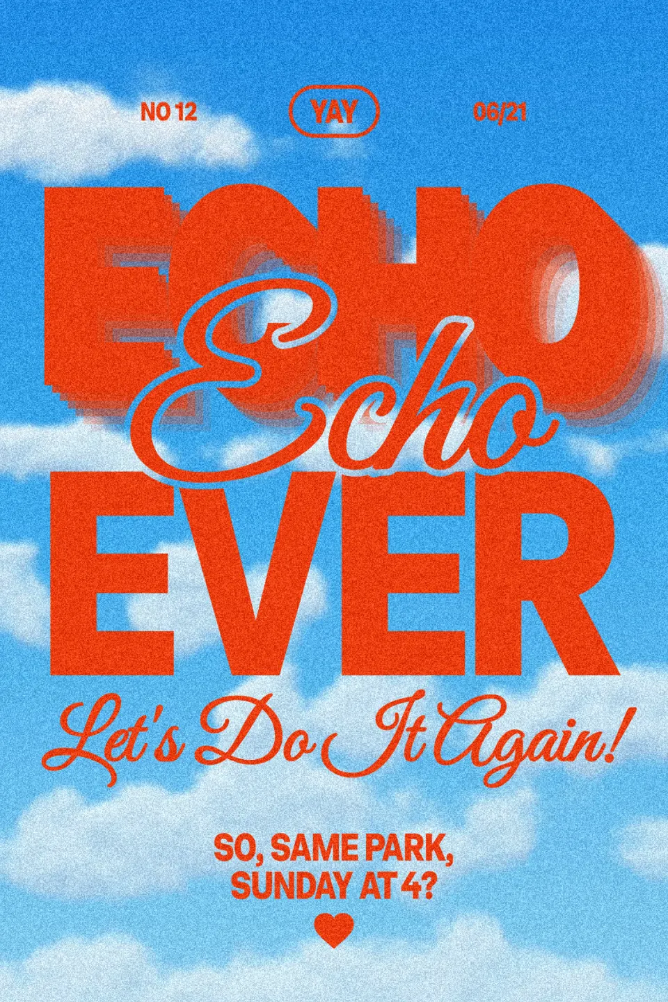
Type that seems to move — trails of copies, repeats, a word shaken off its baseline — comes from screens: film titles, stories and reels. Even on a still post it says “now”. In the example the big red-orange “ECHO” of a sky-blue party poster leaves a soft, blurred trail of copies behind it.
The trick is restraint. Keep the trail shorter than the height of a letter, so it reads as motion and not as a second headline, and give the copies a colour from the picture so they separate from the background. If the design will also be a video, animate the same text instead of faking more motion.
Make it in Paletoo
Select the headline, open Effects and unfold Blur & motion.
Press Echo: the Trail preset adds fading copies behind the letters.
Open the step and set Copies, Fade, X step and Y step; for real movement, use the Animate tab.
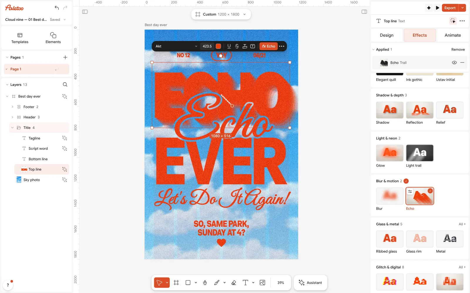
Open this example in Paletoo Step-by-step guide: Kinetic typography trend 2027: bold type that moves, even on a poster
Type on a path
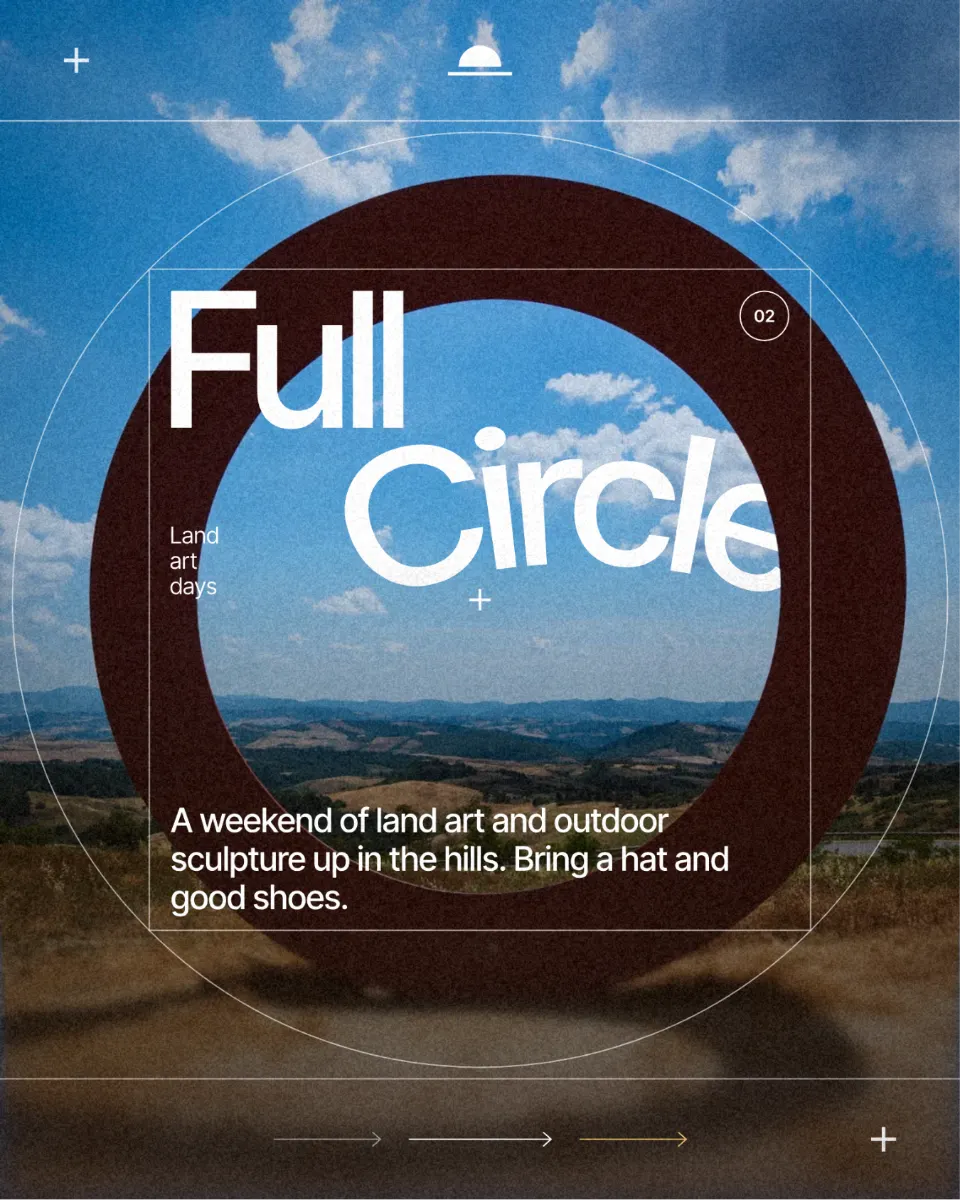
Words that follow an arch, a wave or the edge of a photo are back on record sleeves, badges, menus and merch. A curved line feels drawn by hand and guides the eye around the picture instead of across it. In the example the word Circle of a land-art poster bends along an arch, echoing the big ring sculpture behind it.
Curves stretch letters on the outside of a bend and crowd them on the inside, so loosen the spacing a little and avoid tight bends on long lines. One curved line is plenty: pair it with straight, calm text, and let the curve repeat a shape already in the picture.
Make it in Paletoo
Select the text and, in the Design tab, find its Warp section.
Choose On path: the words lie along an arch whose end points and handles you can drag on the canvas.
Use Align, Side and Offset to place the words; double-click the text to retype it.
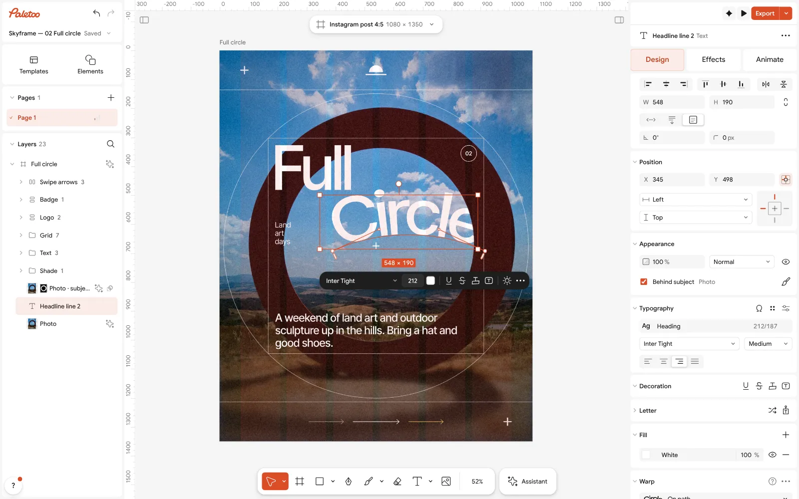
Open this example in Paletoo Step-by-step guide: How to put text on a path that stays editable
Knockout outlines
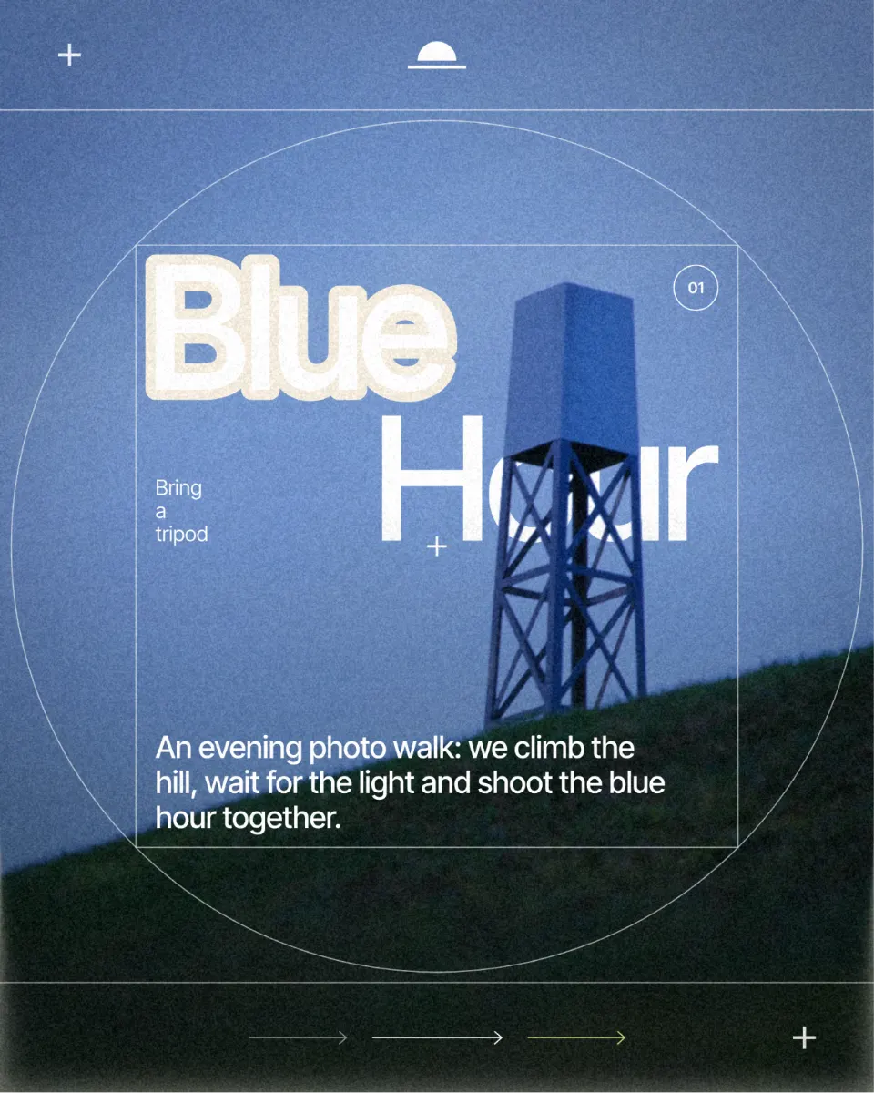
A knockout outline cuts a gap around the letters through everything under them, down to the background, so the type looks punched out of the picture. It is cleaner than a coloured stroke and reads well on busy photos, which is why editorial covers and streetwear posters use it.
Give the gap some width at poster size and keep the background plain, so the cut shows. In the example the word Blue on a photo-walk post is ringed by a gap that cuts through the dusk photo to a cream paper colour.
Make it in Paletoo
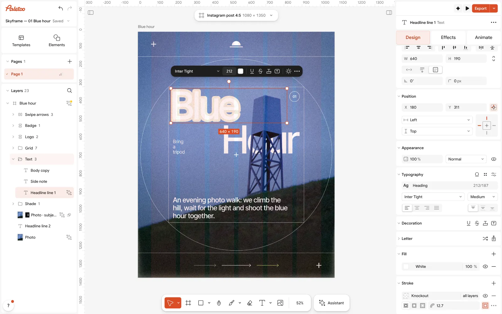
Select the text; in the Design tab go to Stroke and press Add a stroke.
Press the knockout button in the stroke’s row (its tip reads Cut through the layers below).
Set the gap with Width, then press Export.
Open this example in Paletoo Step-by-step guide: How to make a knockout outline that cuts through
Choosing a type trend for 2027
Pick by mood. Friendly and warm: inflated letters. Sharp and technical: stencil cuts. Fast and loud: echo type. Handmade and editorial: type on a path. Bold over a photo: a knockout outline. Use one per design, on the headline only, and keep the body text plain. Because each of these is a live effect on real text, you can retype, retranslate or tone it down next year in a minute.
The rest of next year’s looks are in Graphic design trends 2027; for the colours to set this type in, read Color trends 2027, and for where it goes, Poster design trends 2027.
Questions
What are the font trends for 2027?
Less a single typeface than treatments of type: inflated letters, stencil cuts and slits, echo and motion type, type on a path and knockout outlines, set mostly in heavy grotesks and wide display faces.
Do I need special fonts for these trends?
No. Each is an effect on ordinary text, so any heavy or condensed sans works, including Cyrillic ones. Thin, high-contrast serifs suit them least.
Can I still edit the text after the effect?
Yes. Inflate, Stencil, Echo, the path and the knockout outline all stay live: retype the words or change the font and the effect follows.
Will the type stay sharp when exported?
Stencil cuts, the path and the outline export as vectors in SVG and PDF. Shaded inflated letters and echo trails go into the file as part of the picture, so export at the size you need.
Is it free?
Yes. Every effect, mix and export is free and carries no watermark. Credits are only for AI image generation and materials.
Make it online
- Text effects onlineChrome, gold foil, emboss, cut-out letters, outlines and warps — and the words stay editable text.
- Poster makerMake a poster from a template that already has the layout right, then export a print-ready PDF or an image for screens.
Free design templates: Social media post templates · Poster templates
Try it on your own design
Paletoo opens in your browser, with no sign-up. Every effect here is live: change the picture or the words and the effect follows.
Open in PaletooRead next
- 01
 Tactile 3D type: the clay trend of 2027, and how to make itSoft, swollen letters that look pressed out of clay or blown up like a balloon.
- 02
 Kinetic typography trend 2027: bold type that moves, even on a posterBig, bold type that moves — or looks as if it just did.
- 03
 How to warp text on a mesh without rasterising itPull a grid over a headline; the words stay editable.