Fonts like…4 min readFreeUpdated 2026-11-12
Fonts like Stranger Things — free lookalikes
The red, glowing 80s-horror title look with ten open-licensed serifs — type your own title and see it on black right away.
By Paletoo’s designers · fonts checked
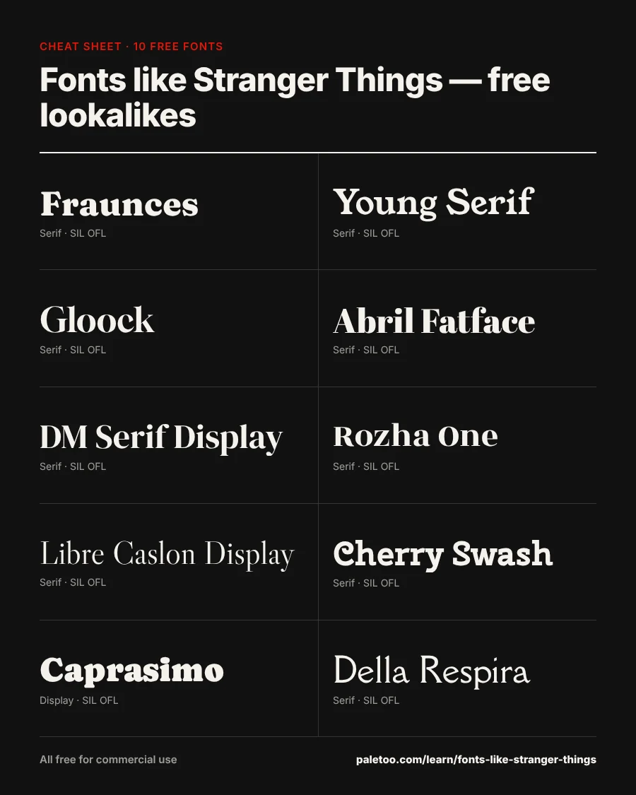
Short answer: the closest free font to the Stranger Things title is Fraunces at Black weight (its soft, wonky 70s serifs are the same family of ideas), followed by Young Serif and Gloock. Set your words in capitals, colour them red #e3170a on near-black, add a red outline and a glow — that is the whole trick.
Below are ten free serifs that get the look, live: type your own title, switch the background, then press «Use in Paletoo» to open a poster with that font, your words and the red-on-black palette. All ten are under SIL Open Font License — fine for party posters, merch and anything you sell.
Ten free Stranger Things lookalike fonts
Your title, in capitals, on black: every row sets it in its own font. The weight slider matters here — the look needs the heaviest weight each font has. «Use in Paletoo» opens a poster with that font, your words and the palette.
-
STRANGER DAYS
The closest free match: a «wonky» soft serif inspired by 70s display faces. Use Black (900), capitals, tight letter-spacing. Undercase Type, Phaedra Charles, Flavia Zimbardi
-
STRANGER DAYS
A heavy old-style serif with friendly, bulging curves — slightly more bookish, lovely in red outline. Bastien Sozeau
-
STRANGER DAYS
High-contrast and dramatic, with ball-shaped terminals; a sharper, more modern take on the look. Duarte Pinto
-
STRANGER DAYS
A fat-face serif with huge contrast: very bold, very poster, readable from across the room. TypeTogether
-
STRANGER DAYS
Elegant contrast and tight curves; set it in capitals and outline it for a refined version. Colophon Foundry
-
STRANGER DAYS
Heavy, contrasty and slightly condensed — strong for long titles that need to fit. Indian Type Foundry
-
STRANGER DAYS
A classic display serif: less retro, more literary. For «a Hawkins library» kind of poster. Impallari Type
-
STRANGER DAYS
Soft, rounded serifs with a little swash on some letters — retro and playful. Nataliya Kasatkina
-
STRANGER DAYS
Cooper-Black-style chunkiness: rounder and friendlier than Benguiat, very 70s. The DocRepair Project, Phaedra Charles, Flavia Zimbardi
-
STRANGER DAYS
An airy, classical display serif for the quieter credits line in the same spirit. Nathan Willis
The fonts load as you scroll to them: ours from this site, Google Fonts families as Google sends them to any website (only the letters you type). Each row’s «Use in Paletoo» opens a new design with that font, your words and the weight.
Pairs for a Stranger Things-style poster
The title font carries the poster; the credits, the date and the place want something calm. Choose a pair, type your lines, open it in Paletoo.
THE UPSIDE OF HAWKINS
A new season of the school play — Friday 7 pm, gym hall. Bring a flashlight.
Paletoo opens a new design with these two fonts as its heading and body text styles, your words already set in them.
About the original
The show’s title is set in ITC Benguiat, designed by Ed Benguiat in 1977 and licensed commercially by ITC / Monotype — not free, and not ours to ship. What makes the look is not one font anyway: a soft, heavy serif with bulbous curves, set in all capitals, outlined in red with a glow on black, the first and last letters drawn larger. Every font below gets you there under an open licence.
How to recreate the title look
1. Type the title in capitals, in the heaviest weight of a soft serif (Fraunces Black is the closest). 2. Make the first and last letters about 30 % larger, and run a thin rule over and under the middle letters. 3. Fill the letters with nothing (or near-black), give them a red #e3170a outline about 3 % of the letter height, and add a red outer glow. 4. Put it on black with a little grain.
In Paletoo the outline and the glow are one click each in the text’s effects; our text effect generator and the text effects maker do it in the browser too.
Why not just download the «Stranger Things font»?
Files named after the show on free-font sites are either copies of ITC Benguiat (which you would need a licence for) or fan-made fonts marked «personal use only» — so a party poster is fine, but a T-shirt you sell is not. The lookalikes here have no such catch: SIL OFL lets you sell what you make with them.
Do not use the show’s logo itself, its stills or its key art — those are Netflix’s. Your own words in a similar style are yours.
Download the cheat sheet
Every font of this article on one image, with its name and licence — save it for later or pin it.
How we picked and checked
Every font here is a Google Fonts family that Paletoo opens directly. Its designer and licence are read from Google Fonts’ own METADATA.pb (checked ); every one is SIL Open Font License or Apache 2.0, so you can use it for personal and commercial work, logos included. Lookalikes are chosen by eye for the vibe — none is a copy of a proprietary font.
Questions
What font is used in Stranger Things?
The title uses ITC Benguiat, a 1977 typeface by Ed Benguiat, licensed commercially by ITC / Monotype. The logo is that font customised: outlined, glowing, with enlarged first and last letters.
Is there a free Stranger Things font?
Not legally free for commercial use. Free lookalikes under SIL Open Font License include Fraunces, Young Serif, Gloock, Abril Fatface and DM Serif Display — you can use them for anything, including products you sell.
What is the closest Google Font to ITC Benguiat?
Fraunces at its Black (900) weight, with its soft, bulbous serifs. Young Serif and Gloock are close in spirit with a slightly cleaner finish.
How do I make the red glowing text?
Set the title in capitals in a heavy soft serif, give it a red outline and a red outer glow, and put it on black. In Paletoo both are text effects; «Use in Paletoo» on this page opens a poster with the font and palette ready.
Can I sell shirts with a Stranger Things-style font?
You can sell designs set in an open-licensed lookalike such as Fraunces. You may not use the show’s name, logo or images on products — those are trademarks and copyrighted art.
More font guides
- The best free bubble fontsPuffy, round, squishy — twelve free bubble fonts you can type in right here, then turn into a sticker, a shirt or a party invite in Paletoo.
- Tattoo fonts — test your name in 12 free fontsOld English, script, fine line, typewriter: type the name or date you want inked and see it in twelve free tattoo fonts before you commit.
- The best free wedding fontsTwelve scripts and serifs for invitations, signs and save-the-dates — type your names and see them in each, live.
- Fonts like Harry Potter — free wizard fontsAcceptance letters, spellbooks and great-hall banners: twelve open-licensed fonts with the wizarding look, live with your own words.
- The best free 70s fontsGroovy, chunky, soft — twelve free fonts that say 1970s, a mini timeline of the decade’s lettering, and a poster a click away.
- Taylor Swift eras fonts — a free font for every eraA font for each era, from Debut to the poets — free lookalikes for bracelets, signs and eras-party posters, live with your words.
- The best fonts for a small-business logoBakery, coffee shop, salon, gym, real estate and five more — a free font pair for each, live with your own business name.
- The best free 80s fontsArcade pixels, chrome sci-fi, neon scripts — twelve free 80s fonts on a black background, with a mini timeline of the decade.
Make it, and read on
- Poster makerMake a poster from a template that already has the layout right, then export a print-ready PDF or an image for screens.
- Font pairings 2027: 40 trending pairs to try on your wordsForty trending font combinations — editorial serifs, wide grotesks, mono labels, bouba type — live on your own words, and one tap to use the pair.
- Typography trends 2027: five font looks and how to use themFive ways type is changing on posters, posts and covers next year, each made on live, editable text.
- Ukrainian fonts: how to choose and where to get themEvery font on one page, for Ukrainian and Latin — tested with your words.
- Ukrainian font tester68 free fonts with every Ukrainian letter, on one page
Try it on your own design
Paletoo opens in your browser, with no sign-up. Every effect here is live: change the picture or the words and the effect follows.
Open in PaletooOpens this design as your own copy — every layer and effect editable, free.