How to keep brand fonts and colours consistent across every design
Name the colours and the type once, link every layer to them, and change them in one place.
Keeping brand fonts and colours consistent sounds like a matter of discipline, but it is mostly a matter of where the brand lives. If the colours are hex codes in a PDF and the fonts are whatever happens to be installed on someone’s laptop, every new post is a chance for the orange to drift a few points or for a headline to fall back to a default typeface.
The answer design tools have settled on is styles: named colours and named text settings that layers link to, so one change reaches every design. This guide covers how brands drift, the ways teams guard them today, how to set up styles that hold, and then the Paletoo way, on a coffee roaster’s post whose ten colours and type are already styles.
How a brand drifts
Drift is rarely one big mistake. A colour is picked by eye from a screenshot and comes out a shade off. A post is copied from last month’s and the old orange comes along with it. A font is missing on a new machine and a stand-in quietly takes its place. A story is made from a post and resized by hand, and its headline ends up a little lighter than the original. Each change is small; together they make a feed look like three different brands.
The pain grows with formats and with people. A brand that lives on posts, stories, carousels and print needs the same five colours and two typefaces everywhere, and everyone who touches a file needs them at hand — inside the file, not in a guideline they have to go and look up.
How teams guard a brand today
The classic answer is a brand guidelines document: the logo, the colour codes, the typefaces and the rules for using them. It is the reference everyone agrees on, but it cannot stop anyone from typing the wrong code.
Design tools add the enforcement. Canva has its Brand Kit for logos, colours and fonts; Figma has colour and text styles, variables and shared libraries; Adobe’s apps share colours and character styles through Creative Cloud Libraries. They all rest on the same idea — a named, shared value instead of a pasted one — and they all work only as well as the layers in a design are actually linked to those values, not just painted the same colour.
How to set up brand colour and text styles that hold
Keep the palette small and named: a handful of colours with clear jobs — the main colour, an accent, a background, the text colour — plus a few quieter tones for notes and lines. Name them so a colleague understands them at a glance, and give the main ones roles, so that when the palette changes everyone knows which colour is the accent.
Then link instead of painting. A layer filled with the right hex code looks correct today but will not follow tomorrow’s change; a layer linked to a style will. Do the same for type: a text style for each level — display, heading, body, caption — with its font, size, spacing and weight. Keep the font files with the brand, licensed for the way you use them, so a design never falls back to a stand-in. Then test it once: change one style and watch every design follow.
Made in Paletoo
Every picture on this page was made in Paletoo — these three with the same steps on other templates:


How to do it in Paletoo
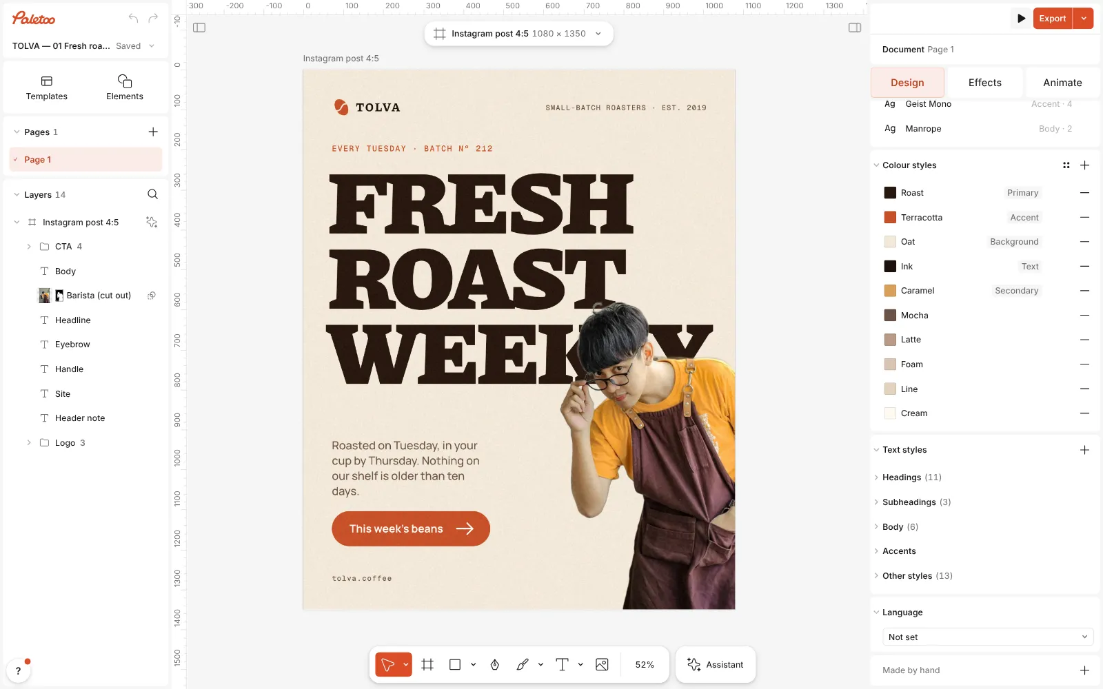
Press “Open in Paletoo” to open the roastery’s “Fresh roast weekly” post as your own document, then click an empty part of the canvas so that nothing is selected.
With nothing selected, the Design tab shows the document itself: Fonts, Colour styles and Text styles. This brand keeps ten colour styles — Roast, Terracotta, Oat, Ink, Caramel and five quieter tones — and five of them carry a Role: Primary, Accent, Background, Text and Secondary.
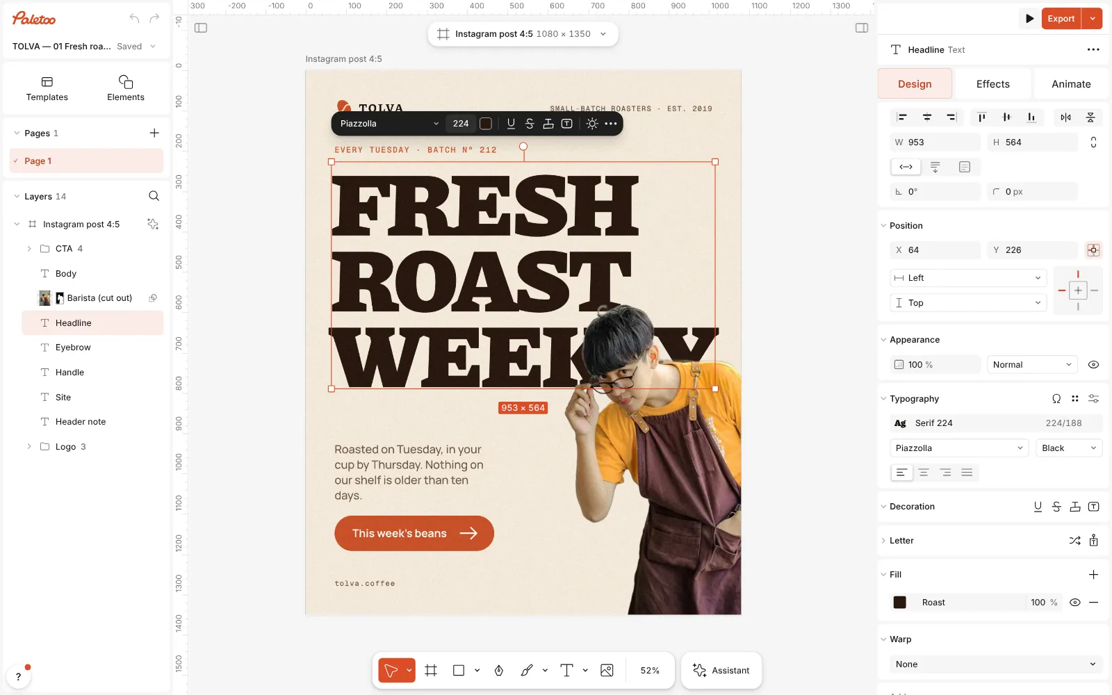
The roastery post open in Paletoo with nothing selected: the Design tab shows the document’s Fonts, Colour styles and Text styles Click the headline, “FRESH ROAST WEEKLY”. Its Fill row shows the style’s name, Roast, instead of a hex code: the colour is linked. Click the name to switch to another style, or press Detach style to turn it back into a plain colour. Under Typography the text is linked the same way, to the text style Serif 224 — Piazzolla at weight 900.
The headline selected: its Fill shows the colour style Roast, and Typography the text style Serif 224 Click the empty canvas again and then a row in Colour styles — Terracotta, say — to open Edit colour style. Change the colour and every layer linked to it follows at once: the logo bean, the eyebrow line and the button. The row’s ⋯ menu has Set role…, Select all using this style and Duplicate style.
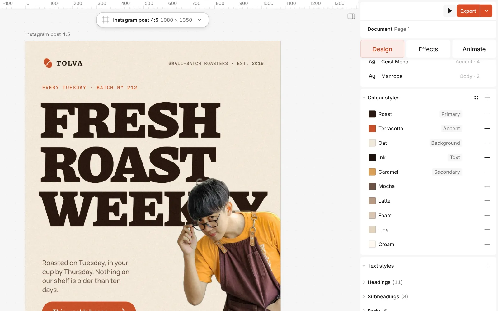
Close up: the Colour styles section — ten named colours, five of them with a role To move the whole palette, open Replace brand colours… with the icon in the section’s header, or with Ctrl K. Every style gets a New colour well; set the ones you want and press Replace. Under Similar colours it lists fills and strokes that are close to a style but not linked to it, and Link all ties them in.
Type works the same way. Change a linked text’s size or spacing and its style shows the change: Reset to style takes it back, and the update button beside it puts the change into the style, so every text using it changes too. The Fonts section lists every family in the document and can replace one everywhere, in every text and every text style.
For your own typeface, select a text, open Browse fonts and press Upload fonts for TTF, OTF, WOFF or WOFF2 files; they appear under My fonts. For a team, sign in, put a file with the brand’s styles in the team and choose Use as brand kit in its menu: its colour styles, text styles and components show up in Assets in every team file, and Use all styles brings them into the file you are in.
Make it your own
Roles make palette changes safe. Give each main style a Role — Primary, Secondary, Accent, Background or Text — with Set role… in its menu; when a style’s name already says it, such as “Accent”, the editor suggests that role. Leave the quieter tones without one, as this palette does with Mocha, Latte, Foam, Line and Cream.
Files made before the styles existed are the usual leak. Open Replace brand colours… and look under Similar colours: it lists unlinked fills and strokes within ΔE 6 of a style — close enough to have been meant as that colour — and nothing changes until you link them. Link all ties them to their nearest style, and from then on a replaced colour reaches them too.
For other formats, select the artboard and press Make all formats, or pick one size under Copy in another format: the copies sit in the same document and stay linked, so one change to a style recolours the post, the story and the rest together. A team admin can go a step further with Lock as brand template on a team file: members then work on their own copy and change only what the template opens — the words, a picture, a colour from its styles or a font from the team’s fonts.
Templates with this look
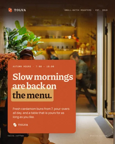

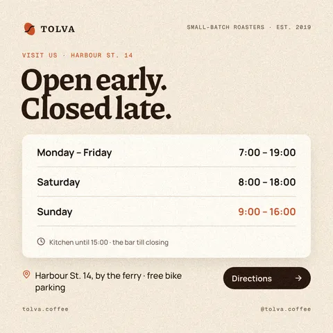
Questions
What is the difference between a colour style and a swatch?
A swatch is a colour you pick; a colour style is a named colour that layers link to. Change the style and every linked fill and stroke changes with it.
Can I use my brand’s own fonts?
Yes. Upload TTF, OTF, WOFF or WOFF2 files; they are kept in your browser under My fonts, and a .paletoo file you save carries them along. A team can also share fonts whose licence allows embedding.
How do I change a brand colour in many designs at once?
Within a document, edit the colour style or use Replace brand colours: every linked layer on every artboard follows. For separate files, a team brand kit keeps the current styles in one place, and Use all styles brings them into the file you are working on.
What happens if a brand font is missing?
The Fonts section says which fonts are missing and offers Replace, so you choose the stand-in instead of leaving it to chance. The Export window also names any text drawn in a stand-in before you export.
Do I need a team for any of this?
No. Colour styles, text styles, your own fonts and Replace brand colours work in any document without an account. Teams, which need you to sign in, add a shared brand kit and team fonts.
Make it online
- Logo makerBuild a wordmark or a badge from real type and shapes, and take it away as a sharp SVG or PDF.
- Instagram post makerDesign a post at the right size from a real template, then export a sharp PNG or JPG — free, in your browser.
Free design templates: Brand guidelines templates · Social media post templates
Read next

How to make a seamless Instagram carousel that lines up at every cut
One wide artboard, a picture that runs across the cuts, and a file for every slide.
A Canva alternative for designers who need real type and print files
Keep the speed of templates, and get back the controls a designer expects.
How to make a business card with a QR code
The right size, your details, a QR code that scans and a PDF for the printer.
Try it on your own design
Paletoo opens in your browser, with no sign-up. Every effect here is live: change the picture or the words and the effect follows.
Open in Paletoo