How to make a seamless Instagram carousel that lines up at every cut
One wide artboard, a picture that runs across the cuts, and a file for every slide.
A seamless Instagram carousel is a panorama cut into slides: a photo, a line or a shape starts on the cover and carries on to the next slide, so the post visibly continues off-screen and people swipe to see the rest. Each slide is a 4:5 picture of 1080 × 1350 px, so a strip of three is 3240 × 1350.
The idea is simple; making it is where it goes wrong. The panorama has to be cut at exactly the right places, every slide has to keep the same size, and no word should land on a cut. Change one word after slicing and the cutting starts again.
This guide covers why seamless carousels break, the ways people make them today, how to plan the seams, and then the Paletoo way, where the strip stays one design and is only cut when you export. The example is a coffee roaster’s three-slide carousel, “How we roast, in 3 steps”.
Where seamless carousels go wrong
The usual pain is not the design but the arithmetic. A carousel is posted as separate pictures, so the panorama has to be cut into slices of exactly 1080 px. If one slice comes out a few pixels wider, or one is cropped differently, the line that should flow across the seam jumps — and on Instagram the jump sits right in the middle of the swipe, where everybody is looking.
The second pain is that the cut is final. Once the panorama is sliced into three files, fixing a typo or swapping a photo means opening the original, changing it, cutting it again, exporting three new files and checking the seams once more. And because the slides are only seen together on a phone, mistakes such as a word split in half by a cut, or a headline too close to an edge, often show up only after posting.
The ways people make them today
In Photoshop the common way is one wide canvas with guides every 1080 px, then the Slice tool or one artboard per slide, and an export that writes each piece as a file. It is precise and copes with any photo you give it; the work is in the setting up, and in redoing the slices when the canvas grows by a slide.
Phone apps that split a wide picture into slides are the quickest route: drop in a panorama, get the pieces back. They are fine for a single photo, but what comes out is pixels, so the text has to be on the picture before splitting and every change means splitting again. Template editors with separate pages are the other common route: you place the same photo on each page and shift it by exactly one page width. That works well for one picture and gets fiddly when several lines and shapes have to cross several pages.
How to plan a seamless carousel
Design the strip as one picture at its final size: 1080 px of width per slide, 1350 px tall. Decide what crosses each cut before you place anything. One strong element per seam is enough — a photo hanging over the edge, a line, a curve or a large shape — and everything else should sit clearly on one slide.
Make slide one a hook that works on its own, since it is also the picture people see in the feed and on your profile. Keep words at least 60–80 px from every slide edge: Instagram lays its own dots and buttons over the slides, and the profile grid shows the cover cropped narrower than 4:5. End with one clear action on the last slide, and flip through the slides in order before posting, the way a thumb will.
Made in Paletoo
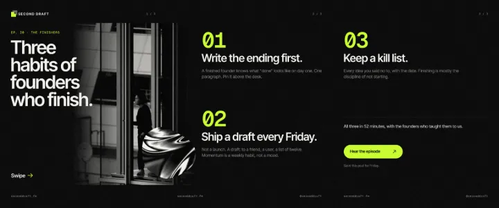
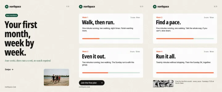
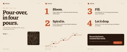
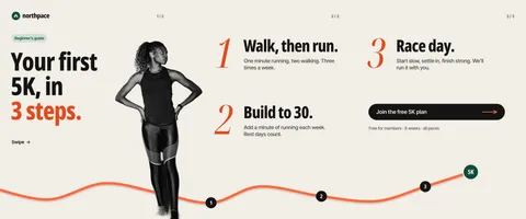
Every picture on this page was made in Paletoo — these three with the same steps on other templates:

How to do it in Paletoo
Press “Open in Paletoo” to open the roastery’s carousel as your own document. To start one of your own instead, choose Make a carousel on the home screen for a blank three-slide strip, or click the format button above any artboard and pick Instagram carousel, 3 slides under Resize this artboard, in Social media.
The three slides sit side by side on one 3240 × 1350 artboard, labelled “Instagram carousel, 3 slides”: dashed lines that never print mark where it will be cut, and the slides are numbered 1, 2, 3 under the artboard. The roast curve runs under all three and the roaster photo hangs over the first cut. Click the artboard’s name: the Design tab gets a Carousel section with the slide count and Preview carousel.
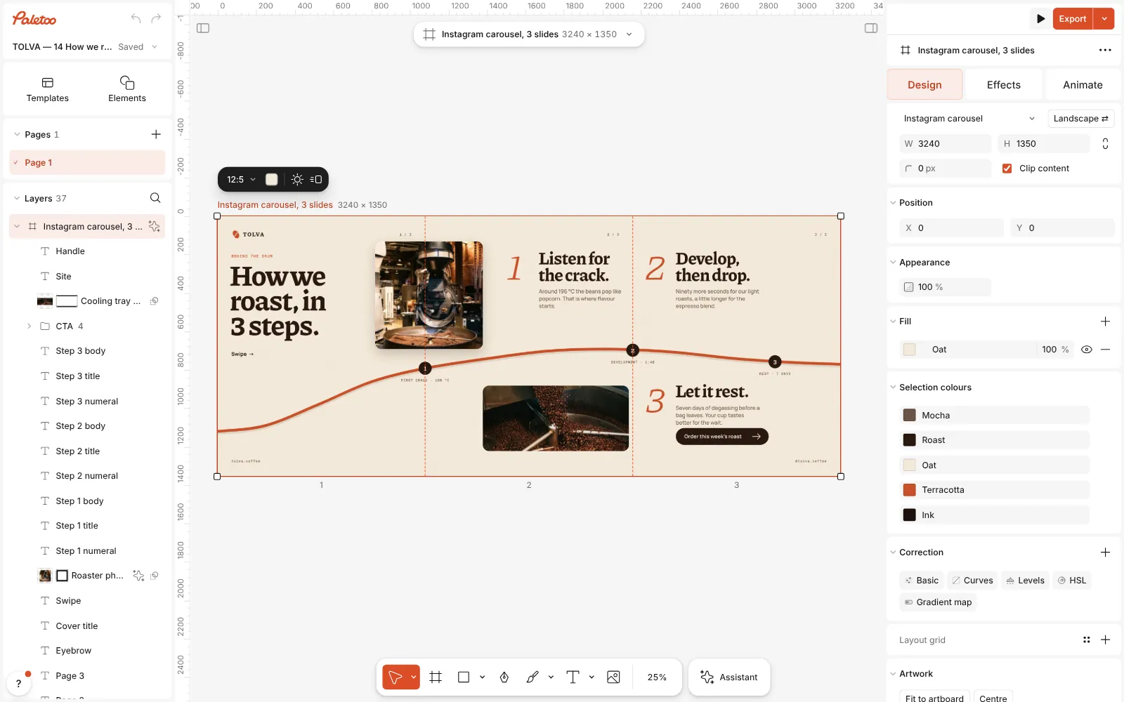
The roastery carousel open in Paletoo: one 3240 × 1350 artboard, dashed lines at the cuts and the slides numbered under it, the Design tab on the right Click the cover title, “How we roast, in 3 steps.”, to select it; the Design tab shows its font, size and colour. Double-click it to write your own hook, then change the step titles and notes on slides two and three. For your own photo, select the roaster picture and press Replace picture: the new one takes the same place across the seam.
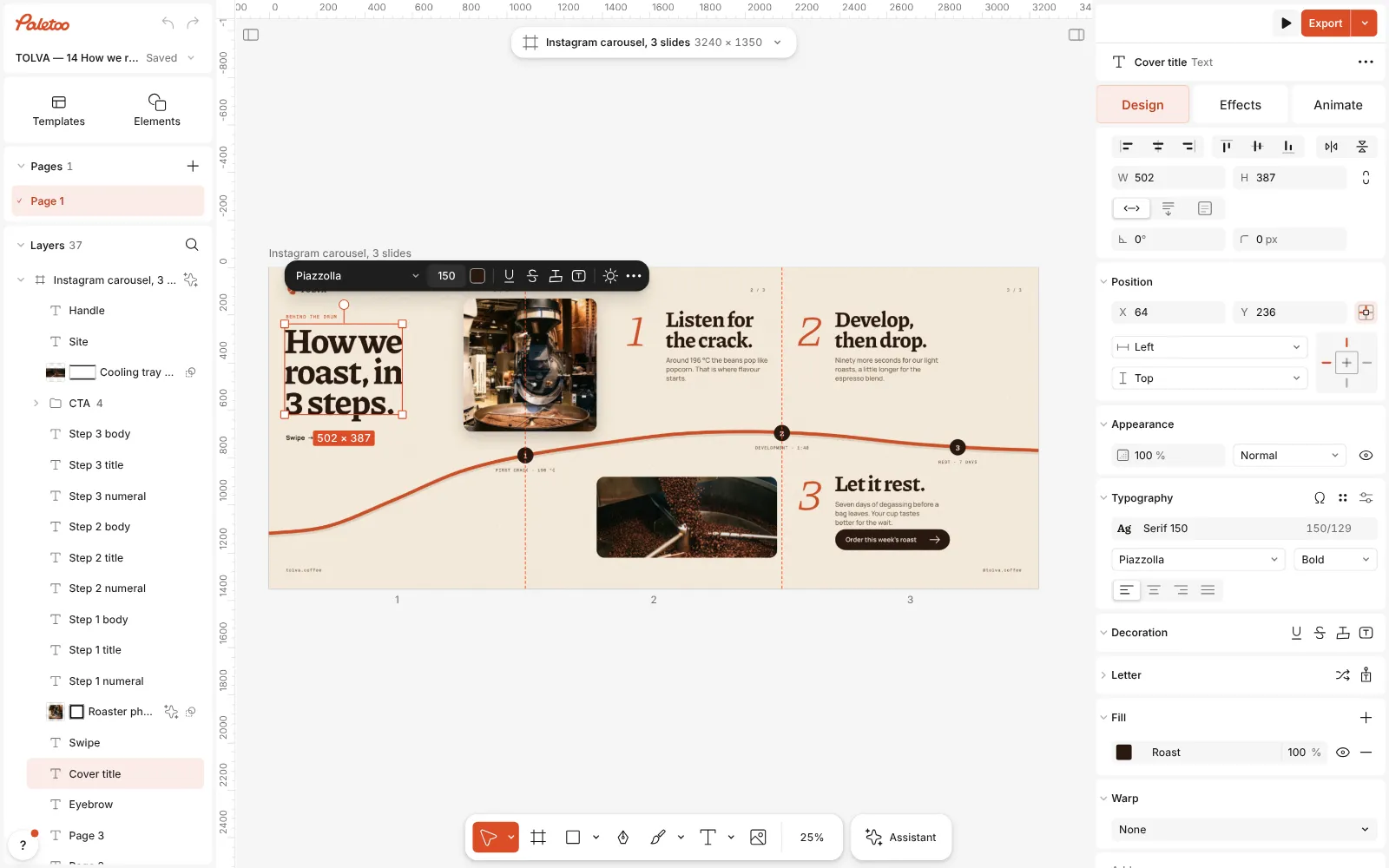
The cover title selected, its font, size and colour in the Design tab, the roaster photo hanging over the first cut Press Export and choose PNG or JPG. The preview shows the whole strip, the output line reads “3 slides · 1080 × 1350 px each · PNG”, and the button offers to export the three slides as one ZIP, the files numbered in order.
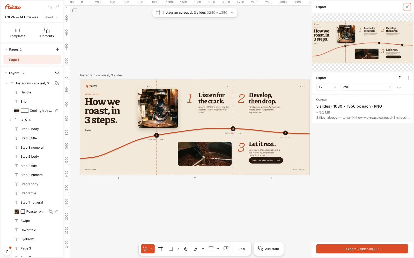
The Export window open: the whole strip in the preview, “3 slides · 1080 × 1350 px each” and the button to export them as a ZIP If you also want the single long picture — for a portfolio or a pitch — open the row’s Export settings and switch Carousel to Whole panorama.
Before you post, select the artboard and press Preview carousel: it flips through the slides one at a time, as they will be swiped. Upload the files in their numbered order.
Make it your own
Plan one crossing per seam. In this carousel the roaster photo hangs over the first cut and the roast curve runs under all three slides, while markers 1 and 2 sit exactly on the cuts, so half of each disc closes one slide and opens the next. Their small captions cross the cuts too — a deliberate tease; if you would rather keep words whole, drag each caption to one side. While you drag, objects snap to the slide edges, which makes both moves precise.
The strip is drawn once and only cut at export, so anything that covers the artboard — here a fine grain over the whole background — runs on without a seam, and a photo crossing a cut is never misaligned by a pixel. Keep text 60–80 px inside every slide edge, and check the result in Preview carousel rather than on the wide canvas: a seam that looks clever at full width can leave a slide that makes no sense alone.
To add a slide, select the artboard and make it 1080 px wider: the editor counts the slides from the size, from two to twenty, and the cut lines follow. Three to five slides usually read best. Swap pictures with Replace picture, press Export again, and switch the row to Whole panorama when you need the long version as well.
Templates with this look

Questions
What size is a seamless Instagram carousel?
Each slide is 1080 × 1350 px (4:5), side by side: 2160 × 1350 for two slides, 3240 × 1350 for three and 5400 × 1350 for five. Paletoo reads an artboard of such a size as a carousel and draws the cuts on it.
Why does my panorama jump at the seam?
Usually the slices were not cut at exactly the same width, or slides of different sizes were mixed. Instagram shows all slides of a carousel at one ratio, so every slide has to be the same 1080 × 1350.
Can I make one without Photoshop?
Yes. In Paletoo the carousel is one wide artboard in your browser, and the export writes one file per slide, numbered in order, in a ZIP.
Can text cross a cut?
It can, but each half is seen on a different screen, so a headline split by a cut is hard to read. Let photos, lines and shapes cross the cuts and keep words on one slide.
Is it free?
Yes. Designing the carousel and exporting its slides costs nothing, needs no account and adds no watermark. Only AI image generation and materials use credits.
Make it online
- Instagram post makerDesign a post at the right size from a real template, then export a sharp PNG or JPG — free, in your browser.
- Instagram story makerMake a full-screen 9:16 story from a template, add motion if you like, and export it as an image or a video.
Free design templates: Social media post templates · Story and Reels templates
Read next
How to make an Instagram carousel from a template
One wide artboard, a design that runs across the cuts, a file for every slide.
How to keep brand fonts and colours consistent across every design
Name the colours and the type once, link every layer to them, and change them in one place.
A Canva alternative for designers who need real type and print files
Keep the speed of templates, and get back the controls a designer expects.
Try it on your own design
Paletoo opens in your browser, with no sign-up. Every effect here is live: change the picture or the words and the effect follows.
Open in Paletoo