Chrome and liquid glass: the shiny trend of 2027, and how to make it
Mirror-bright metal and clear, bending glass: surfaces that reflect the world around them.
Chrome and liquid glass are the shiny side of design heading into 2027. Chrome lettering looks poured rather than set: thick, rounded strokes with mirror highlights, sometimes in plain silver, often in iridescent pastels. Liquid glass is its quieter sibling: a clear pane or letter with a bright, bent rim, the picture behind it frosted and refracted. Both are about surfaces that catch the light, and both have moved from tech keynotes and album art into everyday posters, posts and brand work.
This guide explains where the two looks come from, how to use them so they read as premium rather than plastic, what to pair them with and where they go wrong. Then the Paletoo way: the Y2K chrome mix on a big number, step by step, with the Metal step opened to show how the liquid look is built — and where to find the glass effects when you want the clear version.
Where chrome and liquid glass come from
Chrome type is a turn-of-the-millennium idea: rave flyers, CD covers, early 3D logos and the glossy gadgets of the late nineties. It came back with the Y2K revival in fashion and music, and it stayed because it is the opposite of flat design — loud, reflective and a little synthetic. Today you see it on album and single covers, streetwear drops, club posters and beauty packaging, usually as a single word or a logo rather than a whole layout.
Glass took a different route. Frosted panels lived in operating systems for years, but Apple’s liquid glass interface in 2025 gave them a thicker, more physical rim that bends what is behind it, and designers carried that look straight into posters, app promos and social feeds. Put the two side by side and they share one idea: a surface that shows the world around it. Chrome reflects; glass refracts.
How to use chrome and glass well
Both need room and contrast. Chrome reads best on big, heavy, rounded type on a dark or deeply coloured background, where the highlights can flash; on white it washes out. Use it on one element — a name, a number, a logo — and keep everything else quiet: a clean grotesk for the rest, flat colour or a dark photo behind. A hint of grain over the whole layout stops the metal looking like plastic.
Glass needs something behind it. The Glassmorphism mix frosts and bends what lies under the object and gives it a bright, rounded rim, so it suits a card, a price tag or a big word floating over a colourful photo; the Glass rim effect on its own turns letters into clear glass with a bright edge. Pairing works both ways: a chrome headline above a glass card, or a glass word over a photo with one chrome detail. Keep it to two materials at most.
Pitfalls of the shiny look
Thin type is the first trap: a light weight has no room for the bevel, so chrome turns into wire and glass into a faint outline. The second is too much seasoning — a big glow, a wide colour fringe and a busy photo together read as a cheap filter. Keep the glow soft and the colour split to a pixel or two. Watch legibility, too: very reflective letters can lose their shapes against a background of similar tones.
Glass has a pitfall of its own: on an empty or one-colour background there is nothing to frost, so the pane looks like a grey box. Move it over a photo or a gradient. And mind the light: if the chrome’s highlight comes from the top left, keep the glints on the glass on the same side. When both materials agree on where the light is, the layout feels like one scene.
Made in Paletoo
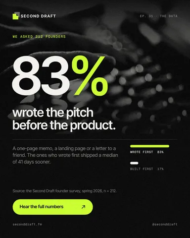
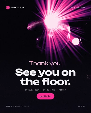
Every picture on this page was made in Paletoo — these three with the same steps on other templates:
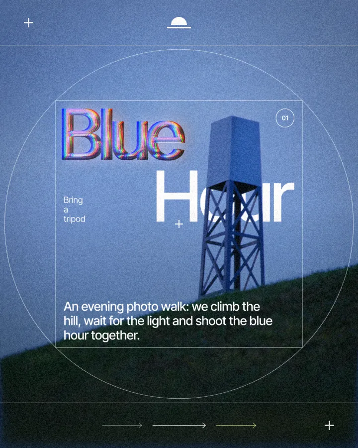
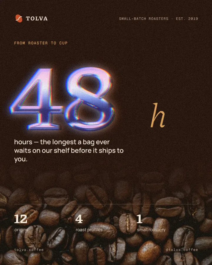
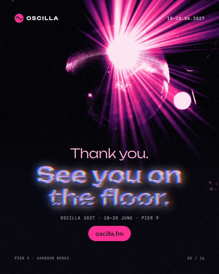
How to make it in Paletoo
Open your design and select the word or number that should turn to chrome. Heavy, rounded or wide type gives the metal room for its bevel; here it is the big 83% on a podcast post.
Open the Effects tab and go to Mixes; press All to unfold them and find Y2K chrome.
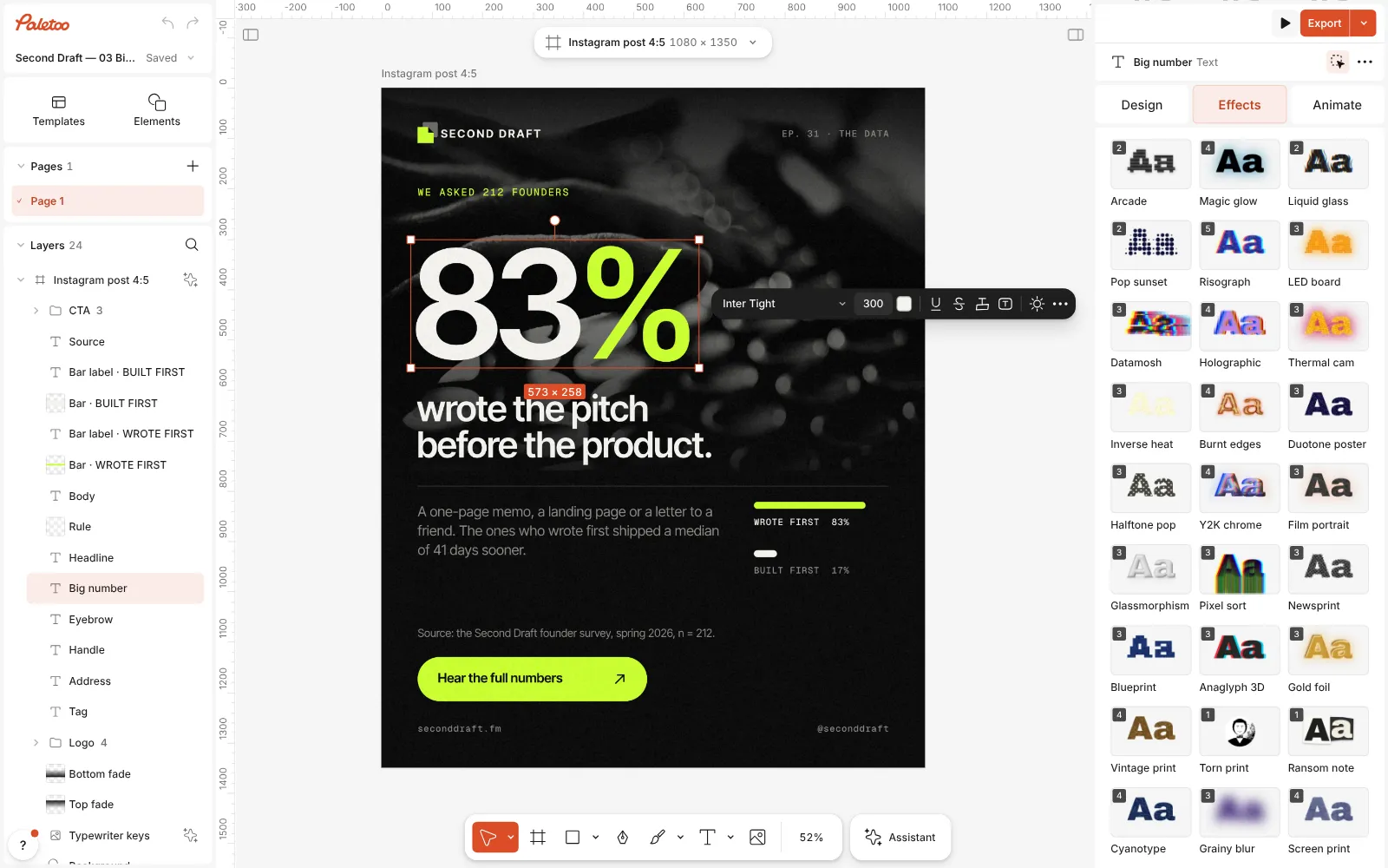
The podcast post open in Paletoo, the big number selected and the Mixes unfolded in the Effects tab, the Y2K chrome card in view Press Y2K chrome. Four steps go on under Applied: Metal pours the figures in thick chrome, a Gradient map turns the reflections to pearly pastels at 75 %, Glow adds a soft lilac bloom and Colour split a faint colour fringe.
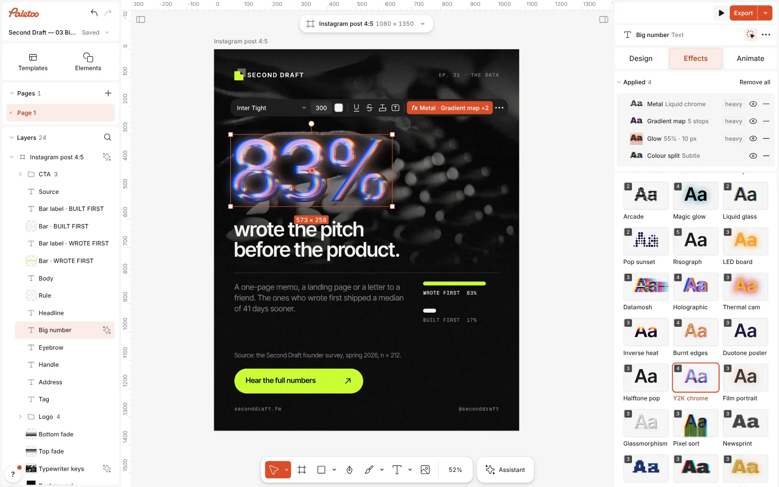
Y2K chrome pressed: Metal, Gradient map, Glow and Colour split under Applied, the 83% in iridescent liquid chrome Click the Metal row to open it. The presets are Chrome, Gold, Brushed and Liquid chrome (the mix’s); under them Light turns the light round the letters, Bevel sets how far the rounded edge reaches in and Shine how bright the highlights get.
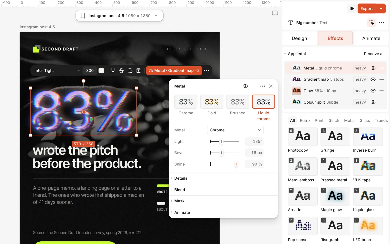
The Metal step open: Chrome, Gold, Brushed and Liquid chrome, with Light, Bevel and Shine Open Details for Bevel depth, Roll-off, which softens the highlight, and Brush for brushed lines. Change the pastels in the Gradient map step by recolouring the stops on its Gradient.
For clear glass instead, take the Glassmorphism mix, or the Glass rim card in Glitch & glass. Double-click the text to change the words — chrome and glass follow every letter — then press Export.
The one-click mix
Its steps: Metal · Liquid chrome Gradient map · pearly pastels Glow · Bloom Colour split · Subtle
Open this mix in PaletooMake it your own
The liquid look comes from the bevel. Liquid chrome sets Bevel to 16 px with a tall Bevel depth of 90 %, so every stroke is rounded all the way across. On smaller or thinner type, lower Bevel until the counters stay open, or the figures melt into blobs. A low Roll-off (15 % in the preset) keeps the highlights sharp and mirror-like; raise it for a softer, satin sheen.
Turn Light so the brightest streak falls where the light comes from in the rest of the layout — usually the top left. Shine is 90 % in the preset; on a light background lower it a little, and lower Brightness in Glow too, or the letters wash out. For plain silver, switch the Gradient map off with its eye or lower its Amount; for candy colours, raise it.
For a puffy kind of chrome there is a second way: on a text, the Inflate step’s Liquid chrome preset swells the letters and gives them a chrome finish, with a Tint for coloured metal. For glass, open the Glass rim step: Bevel sets the rim’s width, Refraction how far it bends the picture, Highlight the glints and Clear how much you see through.
Templates with this look
Questions
What is the difference between chrome and liquid glass?
Chrome is an opaque, mirror-like metal: the letters reflect an imaginary studio. Liquid glass is clear: you see the picture behind it, frosted and bent at a bright rim. In Paletoo chrome comes from the Metal step, glass from Glass rim and the Glassmorphism mix.
Can I get plain silver chrome without the pastels?
Yes. Turn off the Gradient map step with its eye, or lower its Amount: the Metal step underneath is neutral chrome.
Does it work on a logo or a shape?
Yes, on anything with clear edges. A flat logo works best; a detailed photo turns into a chrome plate rather than lettering.
Will the chrome survive editing the text?
Yes. Every step is a live effect on the text, so changing the words, the font, the size or the spacing redraws the chrome.
Why does my glass look like a grey box?
Glass shows what is behind it. On an empty or one-colour background there is nothing to frost or bend, so move it over a photo or a gradient.
Is it free?
Yes. Every effect, mix and export is free and carries no watermark. Credits are only for AI image generation and materials.
Make it online
- Text effects onlineChrome, gold foil, emboss, cut-out letters, outlines and warps — and the words stay editable text.
- Logo makerBuild a wordmark or a badge from real type and shapes, and take it away as a sharp SVG or PDF.
Free design templates: Social media post templates · Brand guidelines templates
Read next
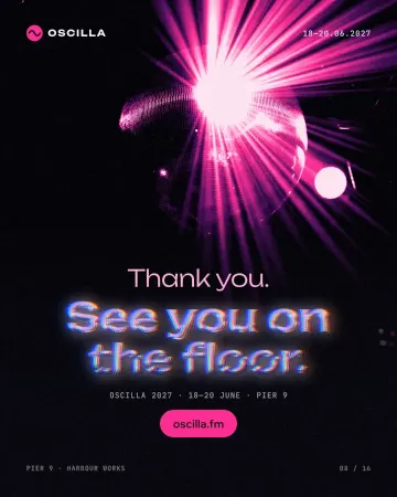
How to make a Y2K chrome text effect
Fat liquid chrome in pearly pastels, with a soft glow.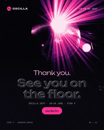
How to make a glassmorphism effect, like liquid glass
Thick, clear glass that bends the picture behind it, lit on one rim and shaded on the other.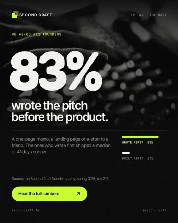
Tactile 3D type: the clay trend of 2027, and how to make it
Soft, swollen letters that look pressed out of clay or blown up like a balloon.
Try it on your own design
Paletoo opens in your browser, with no sign-up. Every effect here is live: change the picture or the words and the effect follows.
Open in Paletoo