Tactile 3D type: the clay trend of 2027, and how to make it
Soft, swollen letters that look pressed out of clay or blown up like a balloon.
Tactile 3D type — puffy, inflated, clay-like letters — is one of the looks heading into 2027 that you can spot from across the room. The words seem to have volume: round, swollen strokes, corners squashed soft, letters leaning into each other as if they were pressed out of modelling clay or blown up like a party balloon. It shows up on album covers, festival posters, toy-like packaging, app splash screens and the stickers people send each other every day.
This guide looks at why the look is rising, how to use it so it reads as confident rather than childish, what to pair it with and where it goes wrong. Then it shows the Paletoo way: one effect, Inflate, on live text you can still retype, with the controls that take it from a gentle puff to a liquid chrome blob.
Where the clay look comes from
Soft 3D lettering has a long family tree: the bubble letters of graffiti, the inflatable type of seventies and nineties pop graphics, the plasticine of stop-motion animation. What changed is how easy volume has become. Not long ago a puffed word meant a 3D app, a render and a round trip back to the layout; now 3D tools, browser renderers and effects on live text have made it part of an ordinary working day, so brands and musicians use it on everyday posts, not only on one big campaign piece.
It also answers a mood. After a long run of flat, minimal interfaces, people respond to things that look as if you could touch them: squishy, friendly, a little silly. Look at recent brand refreshes, merch drops and social feeds and you see the same move — mascots rendered as soft toys, logos that look like balloons, headlines that seem to wobble. Inflated type is the typographic version of that, and it works because it brings warmth without needing a photo.
How to use inflated type well
Treat it as a headline treatment, not a font. One word or a short line, set big, is where it shines — a name, a number, a call like SALE or OPEN. Heavy, rounded or wide typefaces give the swelling room to work; a hairline serif has nothing to puff, and its counters close up. Leave space around the word, because inflated letters grow outwards, and keep the body text flat and simple next to it so the contrast does the work.
For pairings, think in materials. Soft pastels on a flat background read as clay or candy; a dark ground and a chrome finish read as Y2K metal; one saturated colour on cream reads as packaging. A solid extrusion behind the puffed letters — the 3D block effect, which works after Inflate and sweeps back the swollen shapes rather than the original font — turns them into chunky toy letters. A soft shadow underneath helps them sit on the page.
Pitfalls to avoid
The common mistake is too much. Push the swelling on a long sentence and the letters merge into a lumpy cloud; push it on small text and the holes in a, e, o and 8 fill in until the word stops reading. Check the design at the size people will see it — a phone feed, not your full-screen canvas. If a word gets hard to read, lower the amount or pick a heavier, more open typeface rather than adding more effects.
Watch the light, too. A shaded, inflated word has a light direction; if the photo beside it is lit from the right and the letters from the top left, the eye notices even if it cannot say why. And the bubble look can tip into childish fast — fine for a kids’ brand or a party, less so for a law firm. A slight puff on a serious headline often gives the tactile feeling without the cartoon.
Made in Paletoo
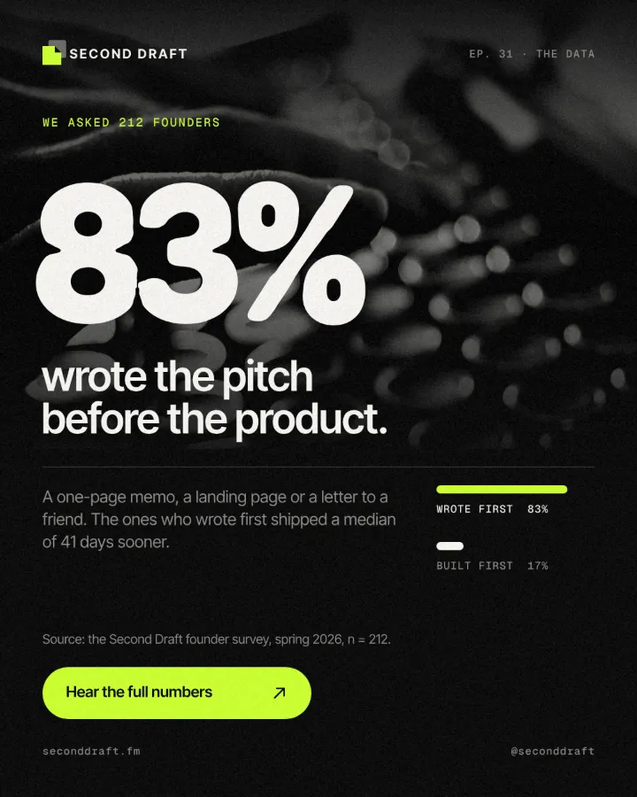
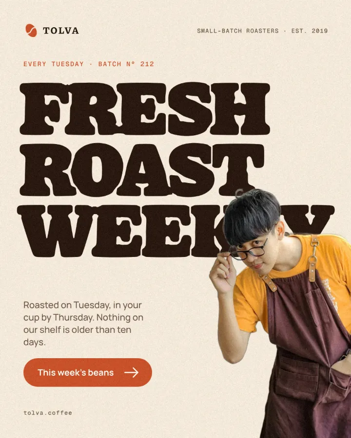
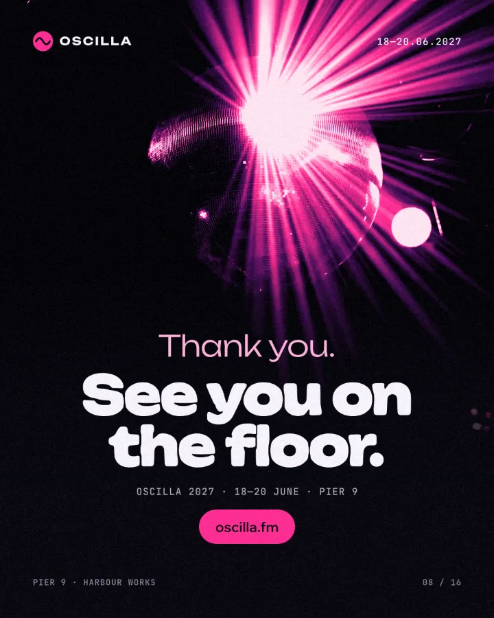
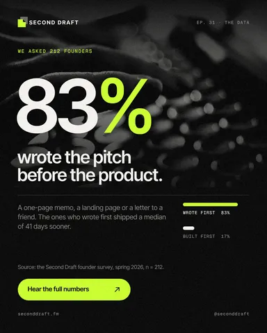
Every picture on this page was made in Paletoo — these three with the same steps on other templates:
How to make it in Paletoo
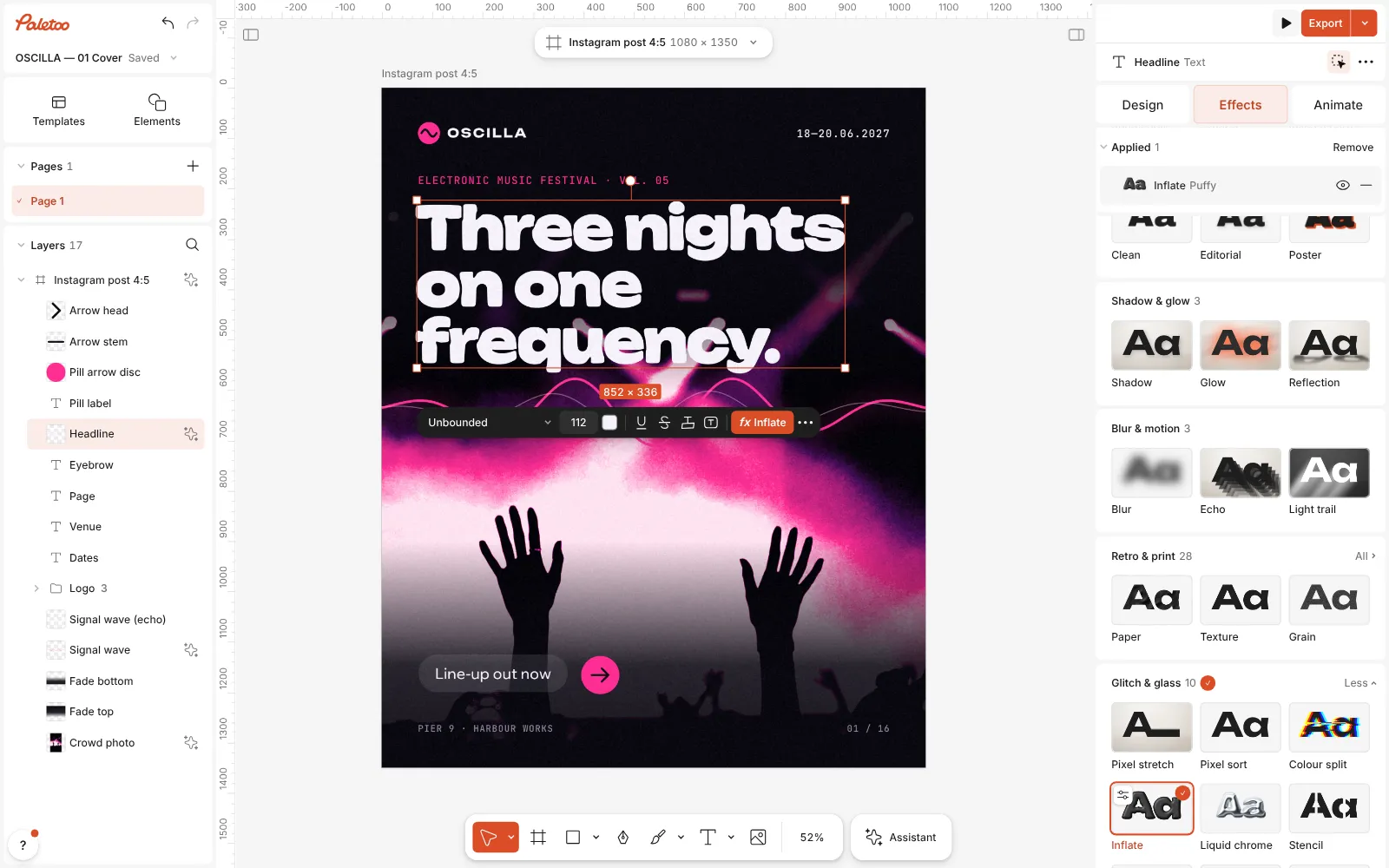
Open your design and select the heading. Inflate works on text — it reshapes the letters’ own outlines — so pick a word, not a photo. Heavy, rounded typefaces puff best; here it is the headline “Three nights on one frequency.” on an electronic music festival cover.
Open the Effects tab in the right panel and scroll down to Glitch & glass. On a text, the Inflate card is in the group’s first row, with Liquid chrome right after it; press All on the group to see every card in it.
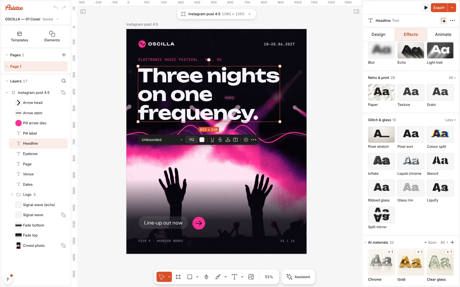
The festival cover open in Paletoo, the headline selected and Glitch & glass unfolded in the Effects tab, the Inflate card in view Press Inflate. One step goes on under Applied and the letters swell at once: the card puts on the Puffy preset, a 50 % swell with rounded corners. The text is still text — double-click it later and retype, and the new letters come out inflated too.
Inflate pressed: its step under Applied and the headline swollen into soft, rounded letters Click the Inflate row to open it. The presets are at the top: Liquid chrome first, then Puffy, Balloon, Liquid, Bubbly, Soft, Pinched and Liquid gold. Under them are Amount, Roundness and Merge letters.
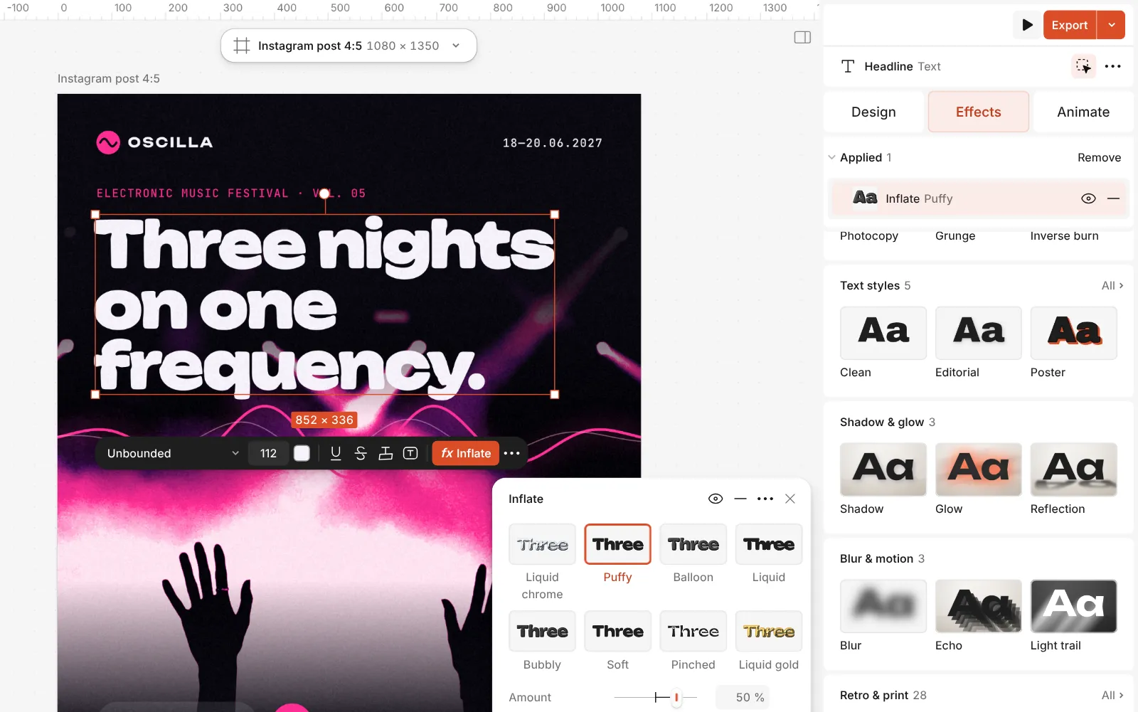
The Inflate step open: Liquid chrome, Puffy, Balloon and the other presets, with Amount, Roundness and Merge letters Open Details for the rest. Unevenness and its Seed make every letter a little different, like hand-pressed clay, and 3D shading lays light and shade over the letters, with a Light angle and a Finish of Soft or Chrome.
For chunky toy letters, add 3D block from Shadow & glow. It comes after Inflate in the stack, so it extrudes the puffed shapes, not the original font; its Depth and Angle set how far and which way.
Press Export. Without shading, the inflated letters are vector paths in an SVG or a PDF; with 3D shading on, the file carries them as a picture, so export at the size you need.
Make it your own
Amount runs from −100 to 100 %. Around 20–40 % gives a gentle, soft-edged puff that keeps the typeface recognisable; 50–70 % is the full balloon; above that, letters start to lose their shapes. Below zero the sides cave in — that is Pinched, a sharp, starry look that pairs well with chrome. Roundness decides whether corners stay crisp or melt into curves: high values read as clay, low ones as a stiff inflatable.
Merge letters lets neighbours flow into each other, which is what turns a word into one liquid shape; keep it at 0 for clean, separate letters, or 30–45 % for the melted look of Liquid. Under Details, a little Unevenness (15–25 %) stops the letters looking machine-made; change the Seed until no two neighbours look awkward together.
The tactile part is 3D shading. At 40–60 % the letters pick up soft highlights and shadows — the clay look; at 100 % with the Chrome finish they turn into the mirror metal of Liquid chrome, and its Tint colours the reflections (gold is Liquid gold). Turn Light angle to match the light in your photo, and if you add 3D block, give it a darker shade of the letter colour so the extrusion reads as the same material.
Templates with this look

Questions
Is inflated type the same as 3D text?
It is a kind of 3D look, but drawn on flat text. Inflate swells the outlines of the letters and, with shading on, lights them as if they had volume; it is not a 3D model you can rotate.
Can I still edit the text after inflating it?
Yes. Inflate is a live effect on the text layer, so you can retype the words or change the font, the size or the spacing, and the letters inflate again.
Does Inflate work on a logo or a photo?
It works on text only, because it reshapes the letters’ outlines. A wordmark set as text in Paletoo takes it well; for a picture, look at the chrome and glass mixes instead.
Why do my letters look like blobs?
The amount or the merge is too high for the size or the typeface. Lower Amount, set Merge letters to 0, or switch to a heavier, more open font so the holes in the letters stay open.
Can I export it as a vector?
Yes, as long as 3D shading is off: the SVG and the PDF write the inflated letters as paths. With shading on, the letters go into the file as a picture.
Is it free?
Yes. Every effect, mix and export is free and carries no watermark. Credits are only for AI image generation and materials.
Make it online
- Text effects onlineChrome, gold foil, emboss, cut-out letters, outlines and warps — and the words stay editable text.
- Logo makerBuild a wordmark or a badge from real type and shapes, and take it away as a sharp SVG or PDF.
Free design templates: Social media post templates · Brand guidelines templates
Read next
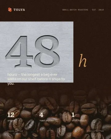
How to make an emboss effect: press text into metal or stone
The design pressed into a plate of metal or stone, its own colour gone.
Chrome and liquid glass: the shiny trend of 2027, and how to make it
Mirror-bright metal and clear, bending glass: surfaces that reflect the world around them.
How to make a Y2K chrome text effect
Fat liquid chrome in pearly pastels, with a soft glow.
Try it on your own design
Paletoo opens in your browser, with no sign-up. Every effect here is live: change the picture or the words and the effect follows.
Open in Paletoo