Grain and print textures: the riso trend of 2027, and how to make it
Flat inks, a coarse dot, toner grit and paper: the print look, on any photo.
Grain and print textures — risograph inks, screen-printed dots, photocopier grit, the tooth of real paper — are one of the clearest directions in design heading into 2027. Instead of a perfectly smooth digital image, the picture looks as if it went through a machine: a few flat inks, colours slightly out of register, specks and noise in the greys, the warm off-white of uncoated stock. You see it on gig posters, zine covers, record sleeves, café menus and the feeds of brands that want to feel made by people.
This guide covers where the print look comes from, how to use it without turning a layout to mud, which textures go together and the mistakes that make it look fake. Then the Paletoo way: the Screen print mix on a photo, step by step, with the halftone dot opened up so you can see what each control does.
Where the print-texture trend comes from
Each of these textures was once a limit. A risograph prints with a handful of soy-based inks, so a riso zine has two or three colours and a little misregistration; a screen print needs one screen per colour, so the palette stays flat; a photocopier crushes the greys into grit. Independent publishers, bands and art schools used these machines because they were cheap, and the look became shorthand for underground, small-batch and handmade.
It is rising again for a simple reason: much of what people scroll past now is polished, glossy and often generated. Texture is a quick signal that someone made choices — a limited palette, a visible dot, a bit of dirt. You can see it on the poster walls outside music venues, on the packaging of small coffee and beer brands, and in brand refreshes that add grain and paper to an otherwise clean system. It is not only nostalgia; it is a way to look specific.
How to use grain and print well
Pick one process and commit to it. A risograph look wants two or three inks and a soft grain; a screen print wants flat, opaque inks and a coarse dot; a photocopy wants black, grey and grit. All three on one poster usually read as noise. Keep the palette strict — one dark ink, one bright ink and the paper colour is a reliable start — and let the photo carry the texture while the type stays clean on top.
Scale the texture to the output. A dot or a grain that looks right at full screen can vanish on a phone or turn into moiré in print, so judge it at the final size. In Paletoo the dot is measured in document pixels, so a bigger poster can carry a bigger dot. As for type, condensed grotesks, typewriter monospaces and chunky slab serifs sit naturally on print textures; thin, high-contrast fashion serifs tend to fight them.
Other print mixes, and the pitfalls
Screen print is one of several print mixes in the Effects tab. Risograph gives two inks, blue and fluoro pink, with a line screen, a little misregistration, grain and riso paper. Photocopy turns a picture into grey toner with torn edges and copier streaks. Vintage print maps it to sepia on old, folded paper. Grainy blur melts it into a soft field of colour under heavy grain, the blurry-poster look. Halftone pop, Newsprint and Cyanotype cover comic dots, the newspaper and the blue sun print.
The usual pitfalls: a grain so fine that it turns to mush when a social app recompresses the image (a slightly coarser grain survives better); a dot laid over small body text, which then gets hard to read; skin that goes muddy because no light ink was chosen; and three textures stacked on top of each other. When in doubt, switch one step off and compare.
Made in Paletoo
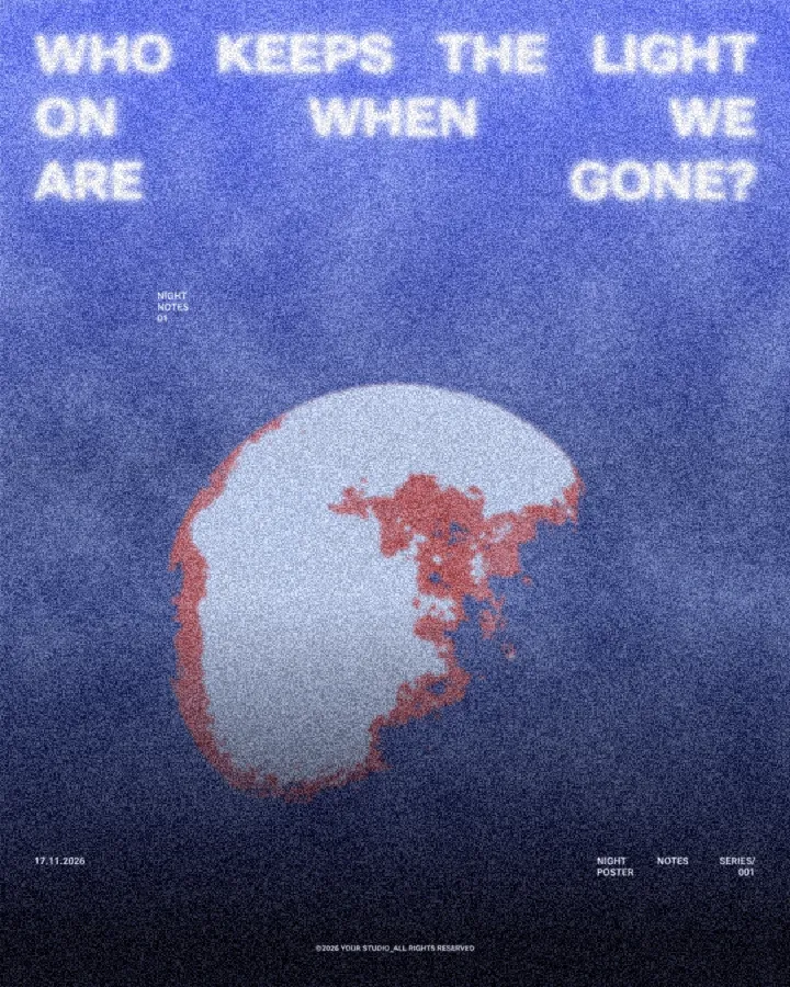
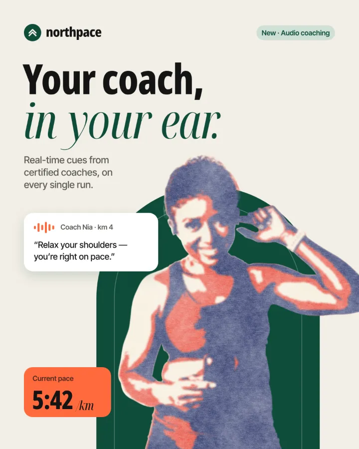
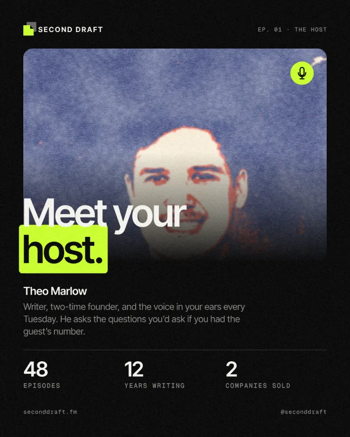
Every picture on this page was made in Paletoo — these three with the same steps on other templates:
How to make it in Paletoo
Open your design and select the photo. A clear subject with strong light and shadow separates best into inks; here it is the portrait on an autumn magazine cover, the woman reaching up in front of the tall REACH letters.
Open the Effects tab and go to Mixes; press All to unfold them and find Screen print among the print looks.
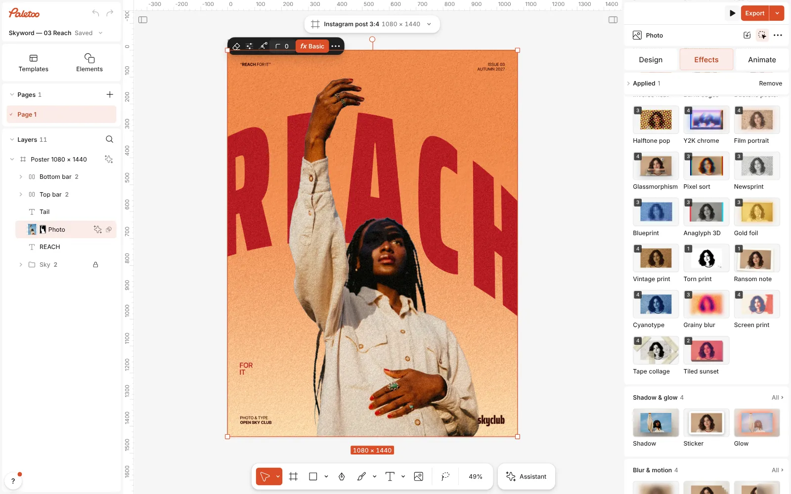
The autumn cover open in Paletoo, the photo selected and the Mixes unfolded in the Effects tab, the Screen print card in view Press Screen print. Four steps go on under Applied: Basic adds contrast, a Gradient map cuts every tone to one of three inks — navy, red and cream — a Halftone breaks the edges between them into a dot, and Print spreads the ink, shifts the screens and adds the paper.
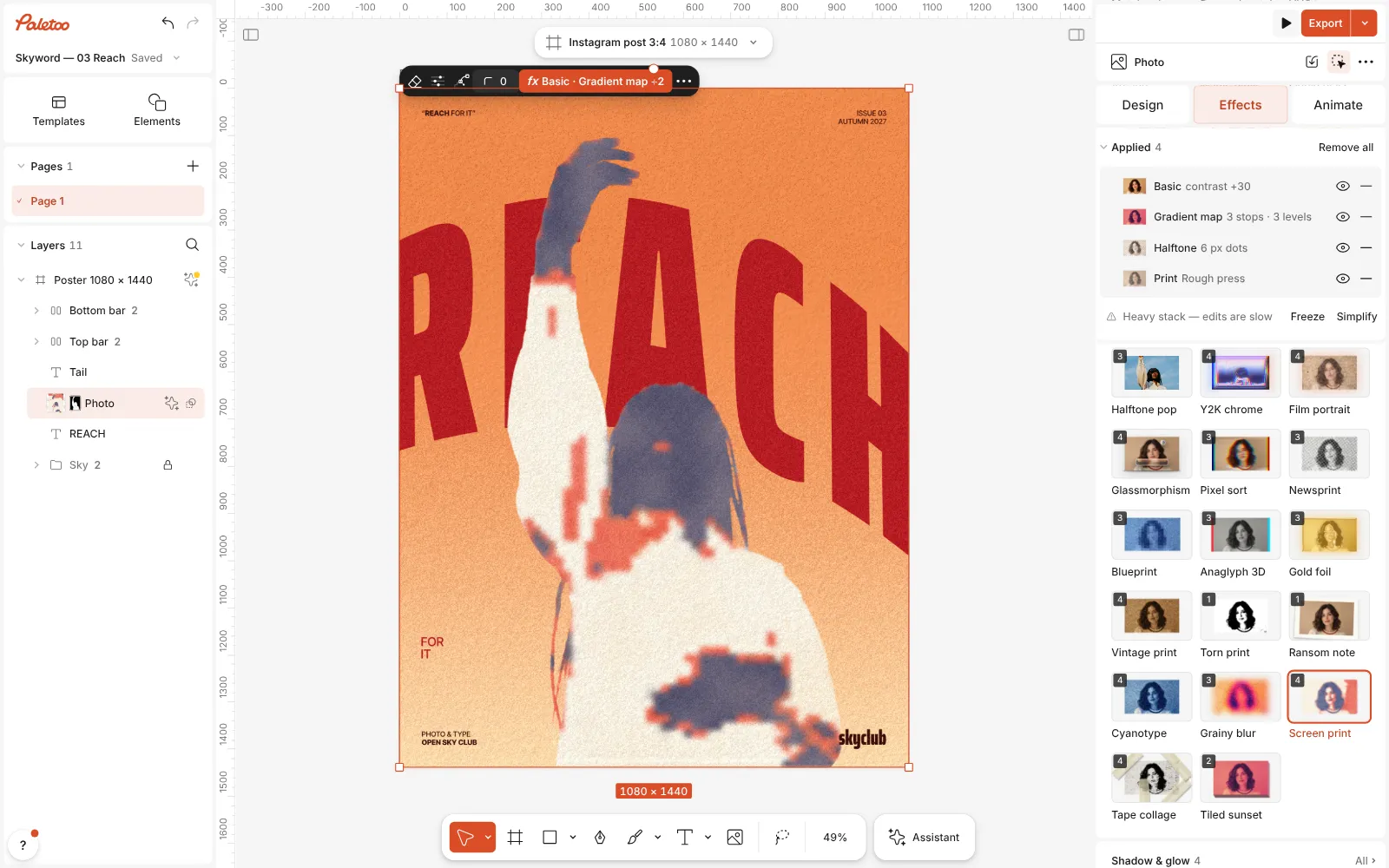
Screen print pressed: Basic, Gradient map, Halftone and Print under Applied, the portrait in navy, red and cream Click the Halftone row to open it. The presets are at the top — Comic (the mix’s), Newsprint, Pop art, Engraved and the CMYK ones — and under them Screen, Size, Angle and Shape: Dots, Lines or Grid.
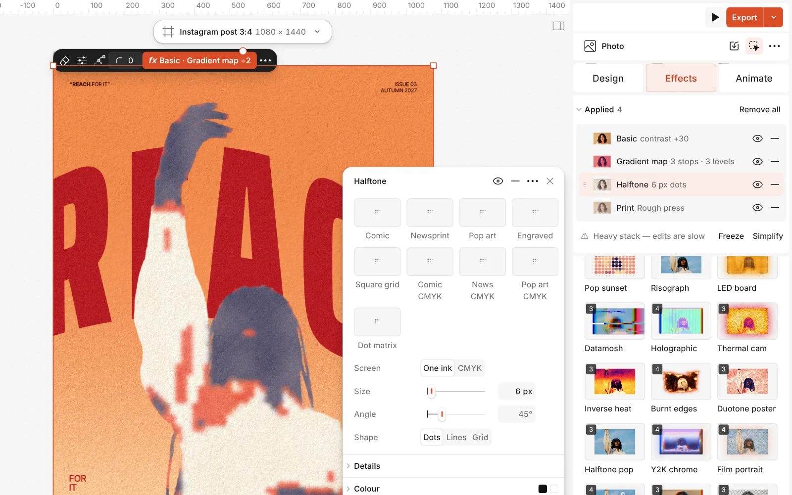
The Halftone step open: Comic, Newsprint, Pop art and the other presets, with Screen, Size, Angle and Shape Open Details for Weight, how heavy each dot is, Misregistration and the Paper colour. The step’s Amount and Blend — 45 % in Multiply in the mix — keep the dot inside the tones instead of over everything.
Then open Print: Ink spread, Misregistration and Paper texture decide how rough the press is. Press Export — a PDF keeps the full resolution for print.
The one-click mix
Its steps: Basic · contrast Gradient map · navy, red, cream in 3 levels Halftone · Comic Print · Rough press
Open this mix in PaletooMake it your own
Start with the scale of the dot. Size runs from 2 to 60 px, in document pixels; the mix uses 6, which reads as texture on a post. A poster for a wall can take 10–14, and above 20 the dot becomes a graphic pattern in its own right — the Pop art look. Angle matters more than it seems: 45° is the classic print angle and hides the grid best, while 0° looks deliberately digital.
Shape changes the character. Dots is the poster and the comic; Lines reads like an engraving or a riso line screen; Grid looks like a mosaic. Switch Screen to CMYK for four coloured dot screens that drift apart with Misregistration — the cheap-magazine look; leave it on One ink for the screen print.
Then balance the dot against the inks. Lower the step’s Amount if the dot is taking over the face, or raise it for a bolder print. The inks themselves live in the Gradient map: drag its red stop to choose how much of the subject falls in the bright ink, and keep Levels at 3 for flat, separated colours. In Print, a touch of Misregistration sells the look; too much just looks blurry.
Templates with this look
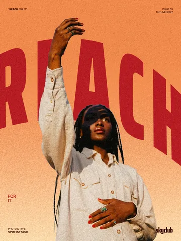
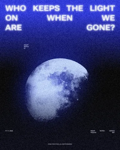
Questions
What is the difference between a riso look and a screen print?
Risograph uses two translucent inks, a fine line screen and grain, so it looks soft. Screen print uses three opaque, flat inks cut to exact levels and a coarser dot, so it looks bolder and more graphic.
Does it work on text as well as photos?
Yes. A heading takes the inks, the dot and the rough press, keeps its letter shapes and stays editable. Leave long body text without texture so it stays readable.
Why does my grain disappear on social media?
Very fine grain is the first thing lost when an app recompresses an image. Use a slightly coarser grain or a bigger dot, and export at the post’s full size.
Can I send it to a real printer?
You can export a high-resolution PDF or PNG for digital or offset printing. A real screen print or riso needs the artwork separated into one file per ink, which Paletoo does not do.
Is it free?
Yes. Every effect, mix and export is free and carries no watermark. Credits are only for AI image generation and materials.
Make it online
- Photo effects onlineGive a photo a film, print or glitch look in one click — and keep every step editable afterwards.
- Poster makerMake a poster from a template that already has the layout right, then export a print-ready PDF or an image for screens.
Free design templates: Poster templates
Read next
How to make a grainy gradient, the grainy blur look
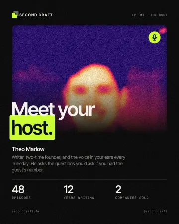
Melted into a violet-to-peach gradient under heavy grain.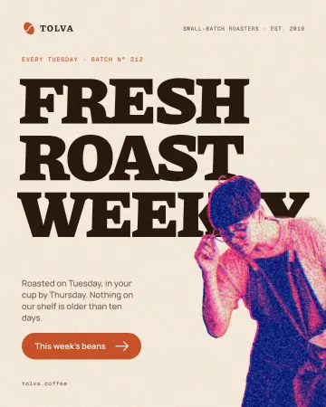
How to make a risograph effect in Photoshop — and in one click
Two inks, a coarse screen and a slight misprint: the Photoshop recipe, and the Mix that does it live.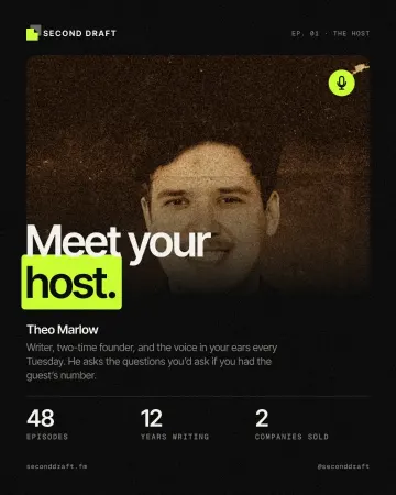
How to make a vintage sepia print effect
Sepia on yellowed, folded paper.
Try it on your own design
Paletoo opens in your browser, with no sign-up. Every effect here is live: change the picture or the words and the effect follows.
Open in Paletoo