How to make a risograph effect in Photoshop — and in one click
Two inks, a coarse screen and a slight misprint: the Photoshop recipe, and the Mix that does it live.
A risograph prints one ink at a time through a stencil, so a riso print is a stack of flat colour plates. Each plate is a screen of dots or lines, the inks are bright and a little see-through, and no two passes land in exactly the same place. That slight misregistration, the coarse screen and the soft, grainy uncoated paper are what people mean by a risograph effect.
In Photoshop you rebuild the machine by hand: split the picture into plates, screen each one, colour it, overlap the plates and push one out of line. This guide does that properly, the way you would prepare real riso masters. Then it shows Paletoo’s Risograph Mix, which stacks the same ideas as five live steps on a photo, so you can still change the inks, the screen or the photo afterwards.
The Photoshop way
Photoshop 2025 or 2026; nothing here is new, so older versions work too. Expect 30–60 minutes for the first image, because each plate is screened in a document of its own. You need a photo with a clear subject, two ink colours chosen in advance and, ideally, a scan of uncoated paper.
- Open the photo and turn it grey with Layer › New Adjustment Layer › Black & White; its colour sliders decide which parts of the picture end up dark. Add Curves to push the contrast.
- Make one document per ink: Image › Duplicate, then Image › Mode › Grayscale. Shape each copy with Curves — the dark ink holding the shadows, the bright ink the mid-tones. Copying the Red or the Blue channel from the Channels panel is a quick start, since they already differ like two separations.
- Screen each plate: Image › Mode › Bitmap, Output 300 pixels/inch, Method Halftone Screen. Set Frequency to 25–45 lines/inch for a coarse riso screen, Shape to Round or Line, and give each plate its own Angle — say 15° and 75° — to keep the screens from clashing.
- Convert each plate back with Image › Mode › Grayscale (Size Ratio 1), select all (Ctrl A), copy, and paste it into the main RGB document as its own layer.
- Colour the plates: set each plate layer to Multiply so its white disappears, and clip a Gradient Map to it (Ctrl Alt G) running from the ink colour to white. Blue under fluoro pink is the classic pair.
- Misregister: select the top plate, take the Move tool (V) and nudge it 2–6 px with the arrow keys; Shift moves it 10 px at a time.
- Add paper and grain: a warm off-white fill at the bottom, a paper scan in Multiply on top, and a layer filled with 50 % grey in Overlay with Filter › Noise › Add Noise, Monochromatic, for the speckle of soy ink.
- For a fast one-pass version, Filter › Pixelate › Color Halftone over a Gradient Map gives dots straight away, but it screens the RGB channels rather than your inks, so the result reads more like comic print than riso.
Done this way it looks convincingly printed, and the plates are ready for a real riso studio. The cost is that it is a one-way trip: Bitmap mode flattens each plate, the screen is baked into its pixels, and a new crop, a new photo or a finer screen means converting everything again. Smart Objects do not save you here, because Bitmap is a change of document mode, not a filter.
Made in Paletoo
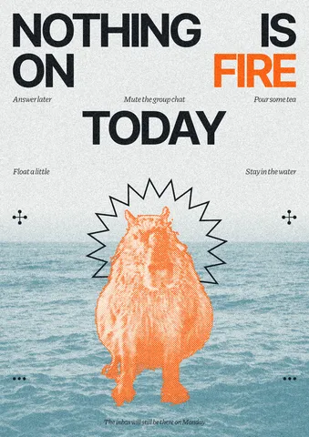
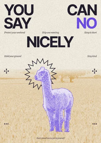
Every picture on this page was made in Paletoo — these three with the same steps on other templates:
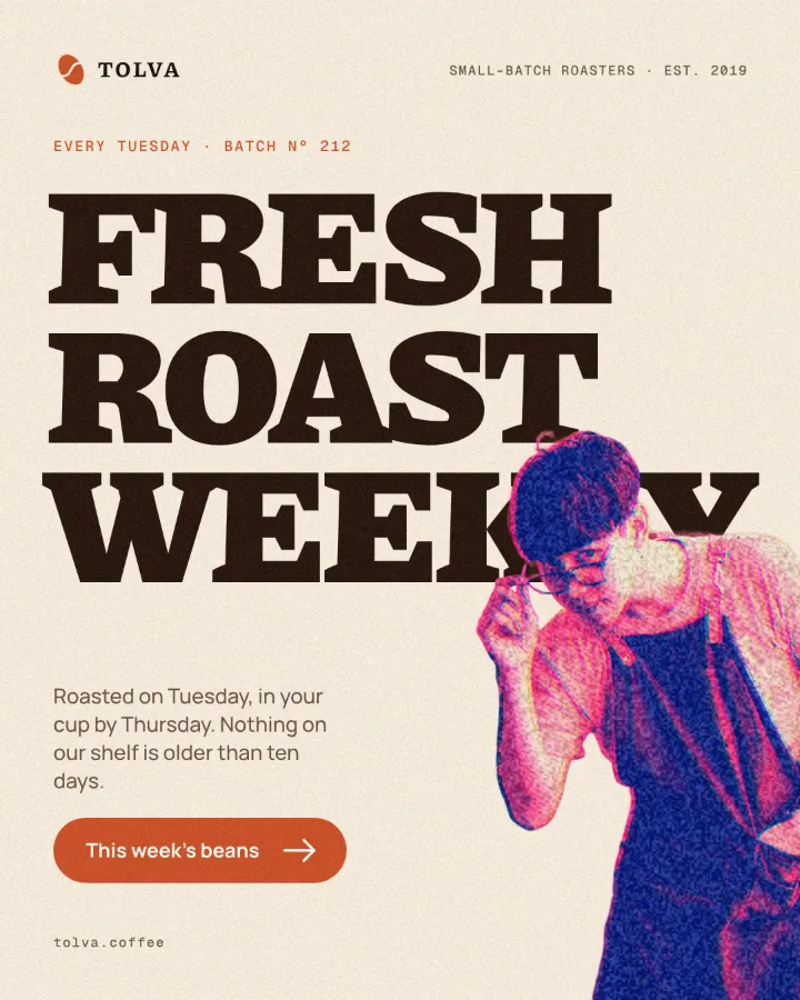
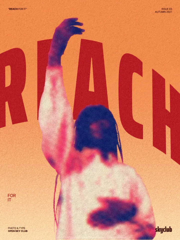
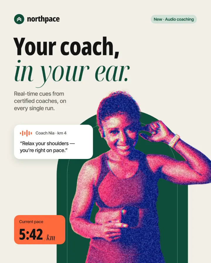
The one-minute way in Paletoo
Open your design and select the photo — in this guide, the crowd under the stage lights on an electronic music festival cover. The “Open in Paletoo” button on this page opens that cover with the Mix already on it.
Open the Effects tab. In Mixes, press All, or the Print chip for only the print looks, and find the Risograph card.
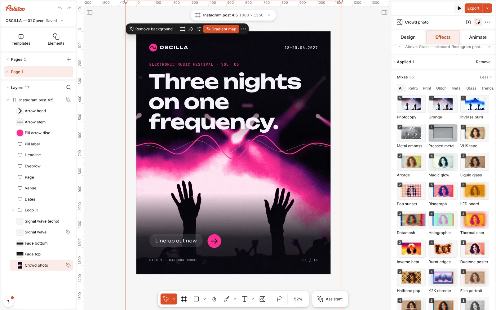
The festival cover open in Paletoo, the crowd photo selected and the Effects tab’s Mixes open with the Risograph card in view Press Risograph. Five steps land under Applied, in the order the Photoshop recipe builds them: a Gradient map for the two inks and the paper, Halftone for the screen, Colour split for the misregistration, then Grain and a Texture of riso paper.
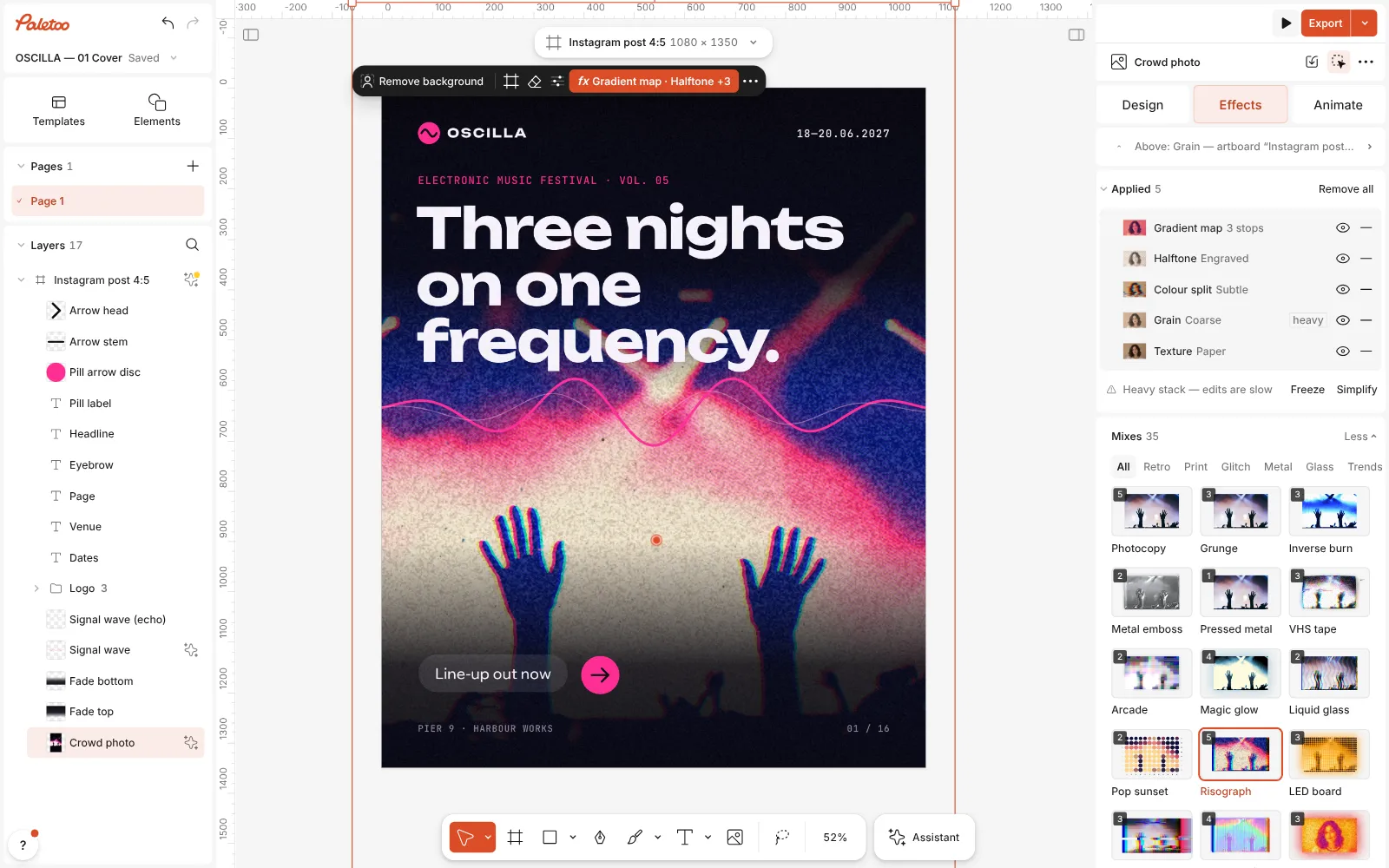
Risograph pressed: Gradient map, Halftone, Colour split, Grain and Texture under Applied, the crowd printed in two inks Click the Halftone row. It is on the Engraved preset: Lines 6 px apart at 30°, blended at half strength in Multiply, like a plate overprinting the sheet. The other presets — Comic, Newsprint, Pop art, Dot matrix — swap in a different screen.
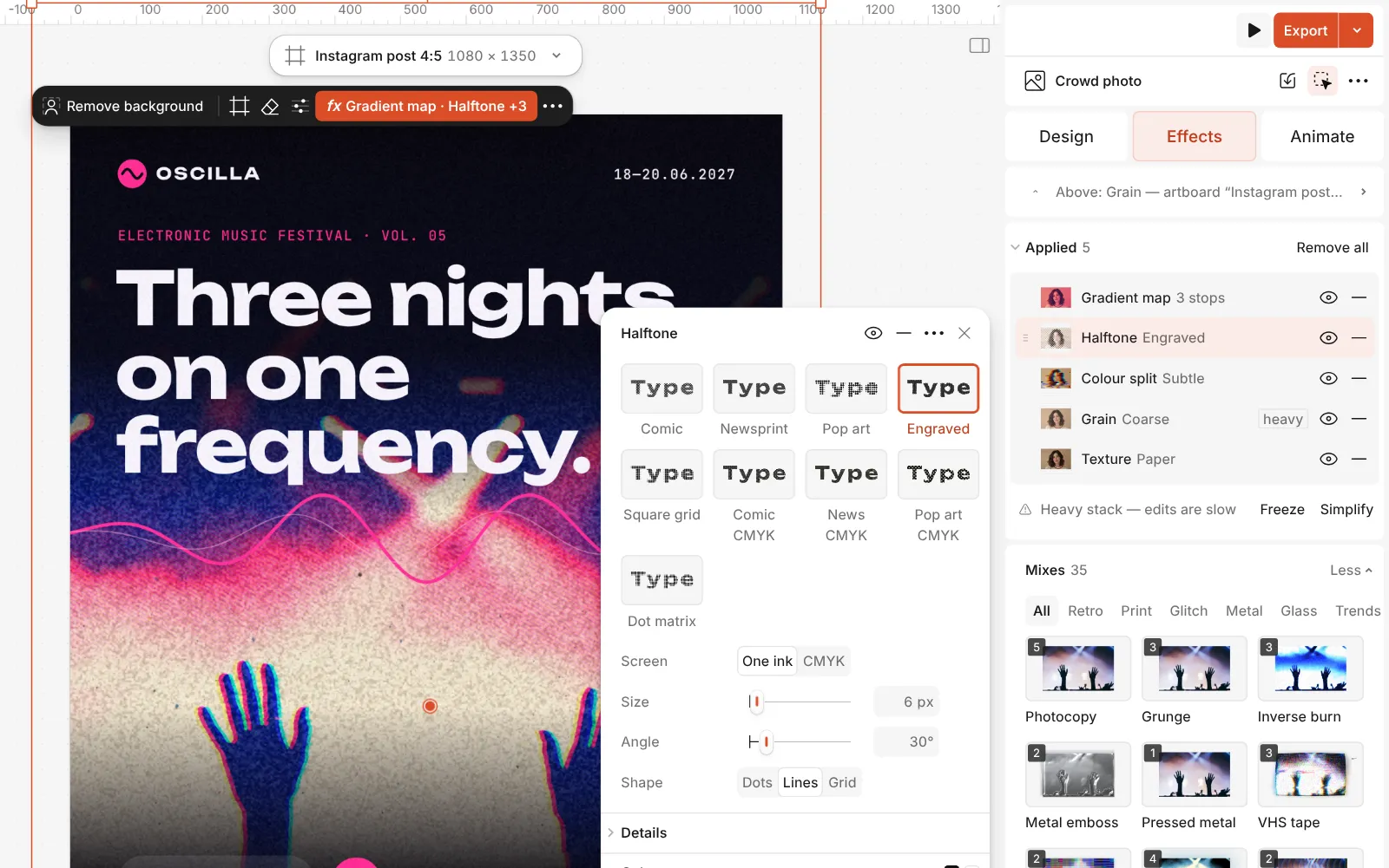
The Halftone step open: its presets and the Screen, Size, Angle and Shape controls Set the screen the way Bitmap mode’s dialog does: Size is the pitch, Angle the screen angle, and Shape picks Dots, Lines or Grid. Screen switches between One ink and CMYK.
Change the inks in the Gradient map step, and the drift in Colour split with Distance and Angle.
Press Export. The effects and the export are free, with no watermark.
The one-click mix
Its steps: Gradient map · blue and fluoro pink Halftone · Engraved Colour split · Subtle Grain · Coarse Texture · Risograph
Open this mix in PaletooMake it your own
Pick the inks before anything else. In the Gradient map step, the Gradient runs from the darkest ink to the paper: the first stop is your shadow ink, the middle stop the bright one, the last the sheet. Keep that last stop off-white — pure white reads as a screen, not paper. Blue and fluoro pink is the default; teal with orange or purple with yellow keep the same dark-plus-bright logic.
Coarser screens look more hand-made. In Halftone, raise Size (it goes from 2 to 60 px) to 8–12 px on a 1080 px post for a screen you can see from across the room, or switch Shape to Dots for a softer, rounder print. The step’s Amount decides how much the screen takes over the picture; the Mix uses half, so push it up for a starker plate.
Keep the misprint small. In Colour split, a few pixels of Distance is the millimetre or two a real riso drifts; much more starts to look like a glitch effect. Grain and Texture finish the paper: lower the texture’s Amount for a cleaner stock, or hide either step with its eye to compare.
Templates with this look
Questions
How do I make a risograph effect in Photoshop?
Split the image into one grayscale plate per ink, screen each with Image › Mode › Bitmap and Halftone Screen, colour the plates with a Gradient Map, set them to Multiply, offset one by a few pixels and add grain and paper.
What is the difference between riso and halftone?
Halftone is just the screen of dots or lines. Riso is a whole print: two or more inks, each screened, overlapping slightly out of register on soft paper.
Which colours look like real riso inks?
Fluorescent pink, blue, yellow, teal, green, red and black are among the most common riso inks. Using them keeps a screen design close to what a real riso print would look like.
Can I change the photo after applying the Mix in Paletoo?
Yes. The five steps are live effects on the layer, so a replaced photo is printed the same way, and each step can be edited, reordered or switched off.
Is it free?
Yes. The effects, the templates and every export are free, with no watermark. Credits are only for AI image generation and Materials.
Make it online
- Duotone, halftone and glitch photo effects onlineThree of the strongest looks for a photo, each one click away and every step still yours to tune.
- Poster makerMake a poster from a template that already has the layout right, then export a print-ready PDF or an image for screens.
Free design templates: Poster templates
Read next
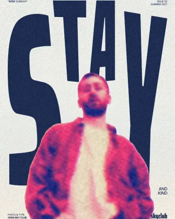
How to make a risograph effect
Two riso inks out of register, a coarse screen, riso paper.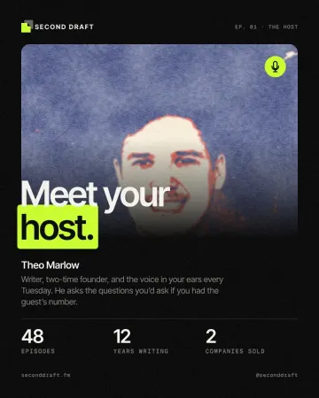
How to make a screen print effect
Three flat inks, a coarse dot and screens out of register.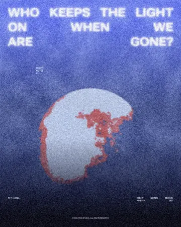
Grain and print textures: the riso trend of 2027, and how to make it
Flat inks, a coarse dot, toner grit and paper: the print look, on any photo.
Try it on your own design
Paletoo opens in your browser, with no sign-up. Every effect here is live: change the picture or the words and the effect follows.
Open in Paletoo