Kinetic typography trend 2027: bold type that moves, even on a poster
Big, bold type that moves — or looks as if it just did.
Kinetic typography is type that carries the motion of a design: words that rise, stretch, repeat, bounce in letter by letter or leave a trail behind them. Heading into 2027 it is one of the most visible design trends — on social video watched with the sound off, on event posters and festival line-ups, on product launches where the headline is the whole picture.
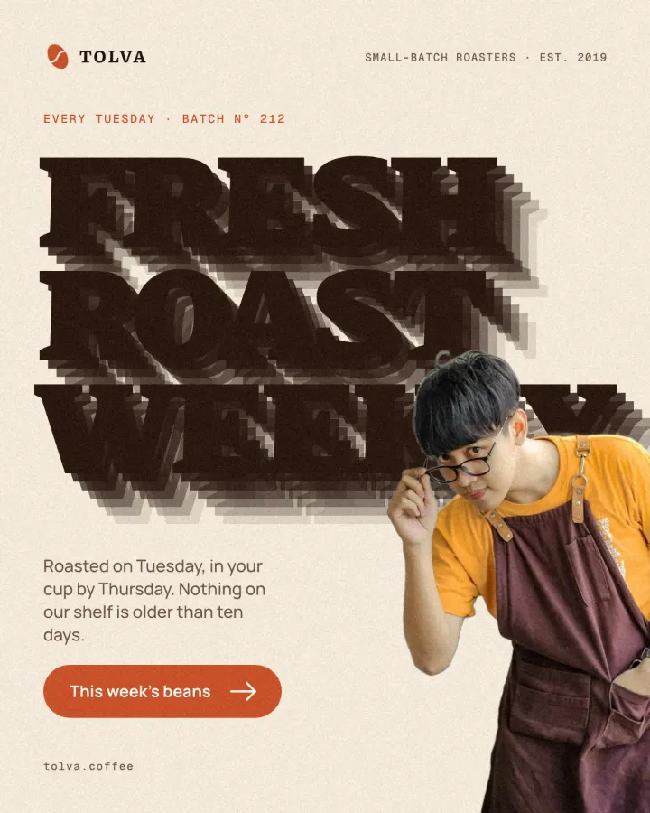
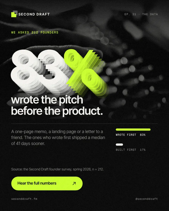
It works because the type is the message and the image at once. A single heavy headline that moves stops a scroll faster than a paragraph, and the same idea carries to print: a still poster can show motion with repeated, stepped or smeared letters, so it feels like a frame taken from an animation.
This guide covers where the trend comes from, how to make moving type readable and what goes wrong, then two Paletoo ways: the still version, with the Echo effect on a headline, and real motion from the Animate tab, exported as video or Lottie.
Where kinetic typography comes from
Moving type has a long history in film title sequences, where designers such as Saul Bass made the opening credits part of the story, and in television idents and music videos. The term kinetic typography grew up with motion graphics software, when a few words could be timed to a voice track and animated in hours instead of weeks.
What changed is where people meet it. Short vertical video is often watched without sound, so the words on screen do the talking, and brands build whole campaigns out of a headline and a beat. Variable fonts made weight and width animatable, so letters can swell and settle instead of only sliding. Print followed: posters borrow echoes, stepped copies and motion blur from animation, so a still image hints that it moves.
How to make moving type read
Pick one motion idea per piece and let it repeat. A headline that rises word by word, holds and then leaves is easier to follow than one where every letter does something different. Use heavy, simple faces — a bold grotesque or a wide display face — at a size that fills the frame, with strong contrast against the ground.
Timing is the whole craft. Give every word on screen long enough to be read twice before it moves on, and hold the final frame longer than feels necessary: that is the frame people remember and screenshot. Letter-by-letter entrances suit three or four words, not a sentence; for longer lines, split by words instead.
Pitfalls of kinetic type
Echoes and trails eat contrast. Copies of a white headline over a busy photo can turn into a grey smudge, so keep the trail short, fading and behind the letters, or tint it with a colour from the photo. Motion that never stops is tiring in a feed; a loop works best when it has a pause.
Check the format before you design for it. A video export records every frame as drawn, effects included. A Lottie file is vectors and keyframes, so anything Lottie cannot describe — a photo, an effect such as Echo, a style — goes in as a picture that still moves, and the Export window lists each one before you export. A transparent WebM plays with its transparency in Chrome, Edge and Firefox, while Safari and many video editors show a black background.
Made in Paletoo
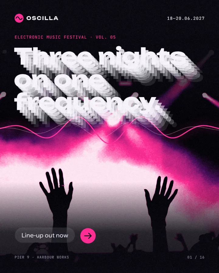
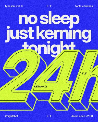
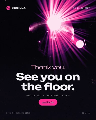
Every picture on this page was made in Paletoo — these three with the same steps on other templates:
How to make it in Paletoo
Open your design and select the headline. Heavy type on a dark, simple ground shows a trail best; here it is “See you on the floor.” on a festival’s closing post, white letters under a pink disco ball.
Open the Effects tab and unfold Blur & motion; press All if Echo is not in the first row.
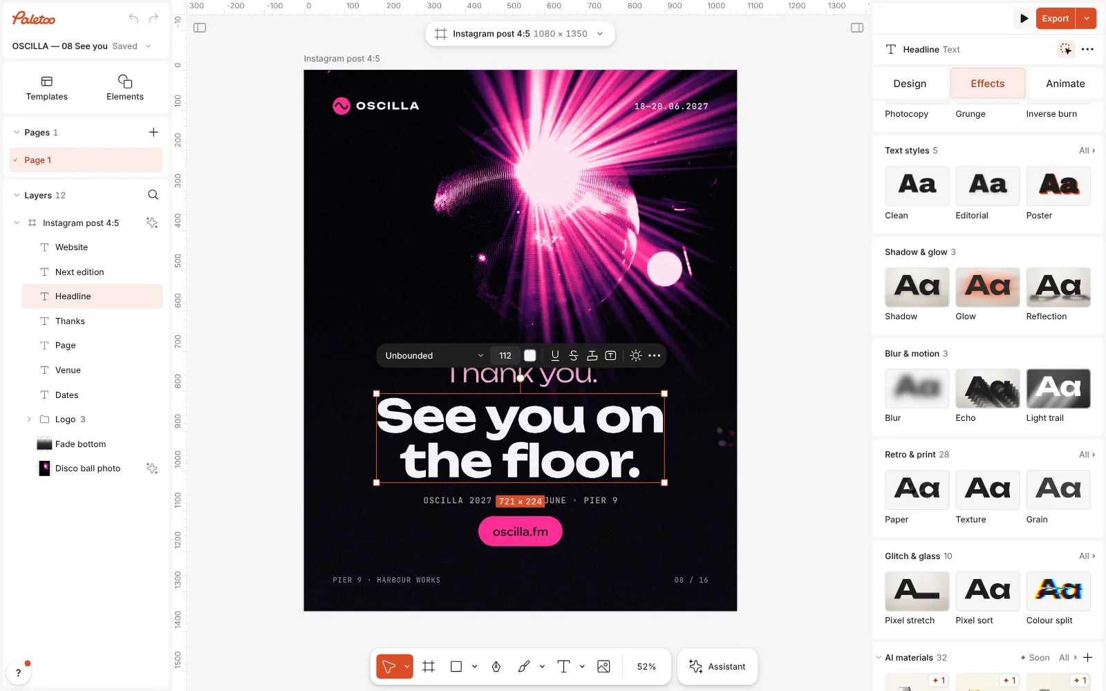
The festival post open in Paletoo, the headline selected and Blur & motion unfolded in the Effects tab, the Echo card in view Press Echo. One step goes on under Applied, with the Trail preset: six copies of the headline, each 14 px further down and to the right, fading behind the letters. They are not layers — edit the words and every copy follows.
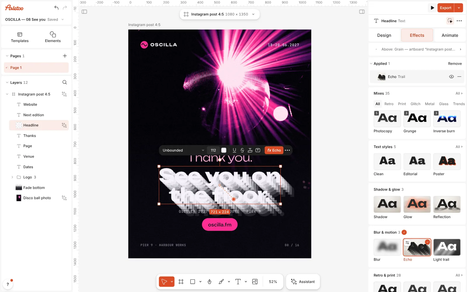
Echo pressed: the Echo step with its Trail preset under Applied, fading copies of the headline stepping down behind it Click the Echo row to open it. The presets are at the top — Trail, Echo trail (a long trail tinted in a gradient) and Zoom (copies growing larger behind the letters) — and under them Copies, Fade, X step, Y step and Place: Behind, In front or Both.
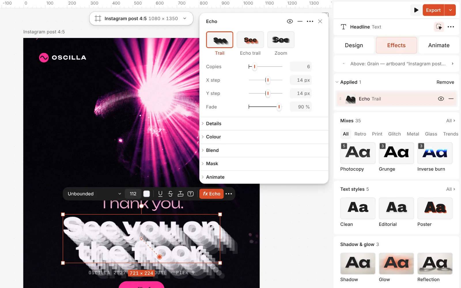
The Echo step open: the Trail, Echo trail and Zoom presets and its Copies, Fade, X step, Y step and Place controls Under Details, Scale step and Rotate step make each copy a little larger or turned, and Colour shift tints the copies one colour or a Gradient from the nearest copy to the last.
To make the type really move, open the Animate tab, pick an entrance such as Rise, Typing or Pop, set Split to Words or Letters, and press Play.
Press Export: PNG or PDF for the still poster; MP4, GIF or WebM for the motion — WebM with a Transparent background to lay over footage — or Lottie for a website or an app.
Make it your own
The direction of the trail is the direction the type seems to come from. X step and Y step run from −100 to 100 px per copy: 14 and 14 (the preset) is a short diagonal drop, 0 and 20 a straight fall, and a negative X step sends the trail to the left. Keep the total — copies times step — under the height of a letter, or the trail starts to read as a second headline.
Copies goes up to 30. Six to eight with a high Fade (80–90 %) gives a soft trail that dies away to almost nothing; 20 or more with small steps becomes a solid extruded block, the poster look of 3D type. Place set to Both spreads copies forward and back, which reads as vibration rather than travel.
Over a photo, colour the trail: open Details, set Colour shift to Gradient and pick two colours from the picture, so the copies separate from the background. For a burst, press Zoom and raise Scale step; a small Rotate step of 2–4° adds a spin. Then press Play on the Animate tab to see how the trail reads while the words move.
Templates with this look
Questions
What is kinetic typography?
Type that moves or carries motion: words animated in letter by letter or word by word, stretched, repeated or trailed. On a still poster the same idea shows as echoes, stepped copies and motion blur.
Can I export kinetic type as a video?
Yes. Animate it on the Animate tab and export MP4, GIF or WebM; WebM can have a transparent background to lay over footage. Export is free and carries no watermark.
Does Echo work in a Lottie file?
Lottie has no way to describe effects, so a headline with Echo goes into the file as a picture that still moves with its keyframes. For pure vector Lottie, animate plain text and shapes; the Export window lists every layer that becomes a picture and why.
Does the echo stay editable?
Yes. The copies are drawn from the text itself, so change the words, the font or the colour and every copy follows.
Which fonts work best for kinetic type?
Heavy, simple faces with open shapes: bold grotesques, wide display faces and variable fonts whose weight can be animated. Thin or detailed letters blur and disappear when they move fast.
Why does my trail look like a grey smudge?
The copies fade over whatever is behind them. Lower Copies, raise Fade, or set Colour shift to a colour that contrasts with the background.
Make it online
- Lottie animation makerAnimate type and shapes in one click each and export a light Lottie file for websites and apps.
- Text effects onlineChrome, gold foil, emboss, cut-out letters, outlines and warps — and the words stay editable text.
Free design templates: Social media post templates
Read next
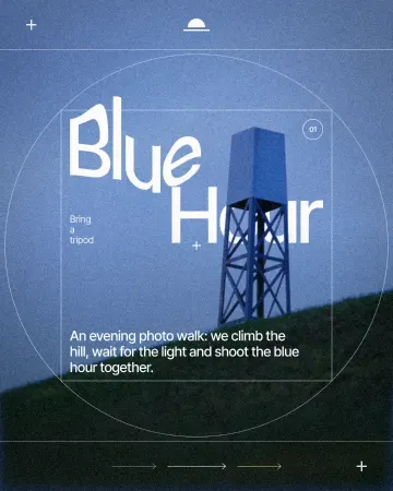
How to warp text on a mesh without rasterising it
Pull a grid over a headline; the words stay editable.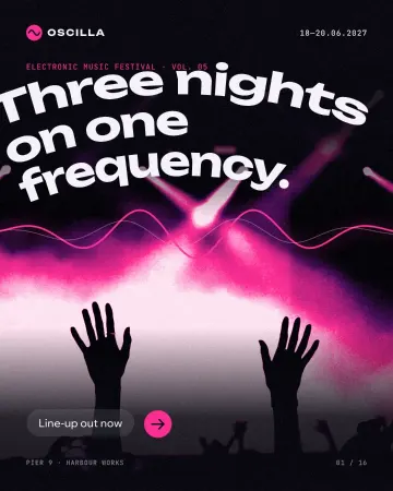
How to warp text and put it on a path in Photoshop — and in one minute
Three Photoshop ways to bend a headline, and one Warp section that keeps the words live.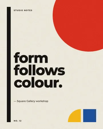
How to export an animation with a transparent background
Animated type with nothing behind it: WebM with real alpha for video, Lottie for websites and apps.
Try it on your own design
Paletoo opens in your browser, with no sign-up. Every effect here is live: change the picture or the words and the effect follows.
Open in Paletoo