How to make debossed metal text in Photoshop — and in one minute
The full Photoshop recipe for type pressed into a metal plate, and the one-step version that stays live.
Debossed metal text is lettering pressed into a sheet of metal. The letters sink below the surface: one inner wall catches the light, the opposite wall falls into shade, and the brushed grain of the plate runs straight across them. It is the look of engraved nameplates, stamped aluminium tags, machine badges and premium packaging, and it turns a plain number or a short word into something that feels manufactured rather than typed.
Most people look for it as a Photoshop technique, because that is where the classic recipe lives: a type layer, a stack of layer styles and a photo of metal. This guide walks through that recipe honestly, setting by setting, with the values that work. Then it shows the same result in Paletoo, where the whole stack is a single effect called Emboss and the text stays text you can retype.
If you know the Bevel & Emboss dialog, the second half will feel familiar. Paletoo’s step is built from the same ideas — depth, size, soften, light angle and altitude, inner shadow, satin, fill — so your Photoshop instincts carry straight over.
The Photoshop way
This works the same in Photoshop 2025 and 2026; layer styles have hardly changed in many versions. Plan on 15–25 minutes the first time. You need a heavy typeface, a photo or scan of brushed metal you are allowed to use, and a document at its final size, because layer style values are measured in pixels.
- Make the plate: File › Place Embedded a brushed aluminium or steel photo, scale it to fill the canvas and press Enter to commit it.
- Take the Horizontal Type tool (T) and set the number or word in a heavy weight, large. Below roughly 150 px tall, a bevel has no room to read.
- Open Layer › Layer Style › Bevel & Emboss (or double-click the empty part of the type layer in the Layers panel). Set Style to Inner Bevel, Technique to Chisel Hard for a machined edge or Smooth for a cast one, and Direction to Down — that is what makes it a deboss.
- Still in Bevel & Emboss, set Size to about 6–12 px, Soften to 0–2 px and Depth to 150–300 %. In Shading, turn the Angle to match the light in the metal photo and keep Altitude around 25–35°. Leave Highlight Mode on Screen in white and Shadow Mode on Multiply in black.
- Add Inner Shadow: Multiply, black, 30–50 %, Distance 5–15 px, Size 10–20 px. It darkens the floor of each letter so it sits lower than the sheet around it.
- Add Satin in Multiply at 20–40 % with Invert ticked. It lays the soft, uneven sheen of polished metal across the pressed face.
- Add a Gradient Overlay in Soft Light or Overlay at 30–50 %, a grey-white-grey gradient, Style Linear or Reflected, angled with the light. It gives the floor a band of reflection.
- Now decide what the pressed face is made of. Either drop Fill Opacity to 0 % in Blending Options, so the plate itself shows through the letters under the bevel, or keep the fill and clip a copy of the plate to the type: Ctrl J, drag the copy just above the type, then Layer › Create Clipping Mask (Ctrl Alt G, Cmd Option G on a Mac). Rotate or darken that copy so the floor reads as a different cut of the same metal.
- If other layers carry styles, set Layer › Layer Style › Global Light once so every bevel agrees on where the light comes from, and save the finished style in the Styles panel to reuse it.
It works well, and the text stays editable: layer styles are live on a type layer, so you can retype the number and the bevel follows. What slows it down is everything around that. The values are in pixels, so a style made for 400 px type looks wrong on 120 px type until you run Layer › Layer Style › Scale Effects. The plate is a photo you have to find and license. And five dialogs interact, so moving the light means revisiting Bevel & Emboss, Satin and the gradient. Fine for one hero image, tiring for a series of posts.
Made in Paletoo
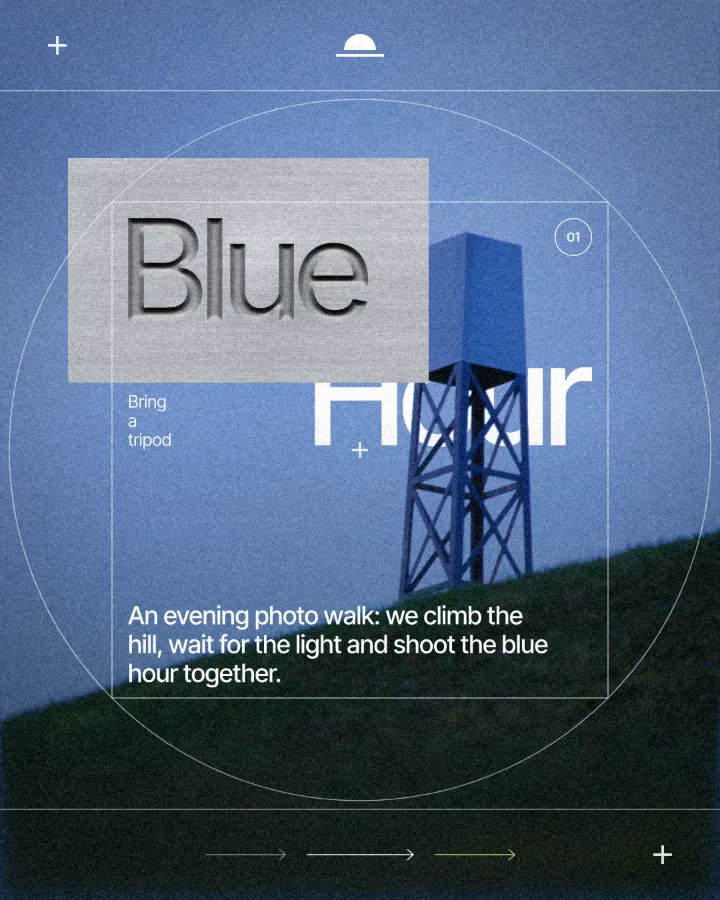
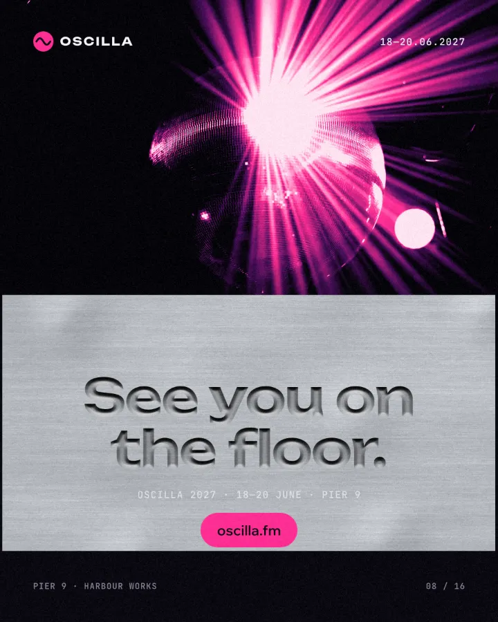
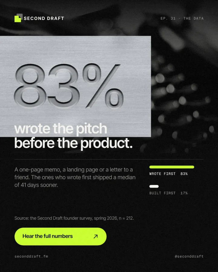
Every picture on this page was made in Paletoo — these three with the same steps on other templates:
The one-minute way in Paletoo
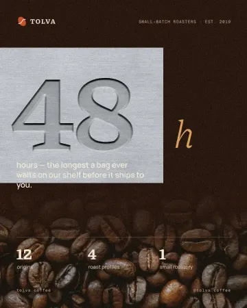
Open your design and select the text that should be pressed in — in this guide, the big “48” on a coffee roaster’s post. The “Open in Paletoo” button on this page opens that exact document with the effect already on it.
Go to the Effects tab in the right panel. Under Mixes, press All, or the Metal chip to see only the metal mixes, and find the card.
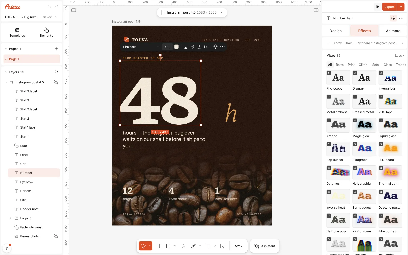
The coffee roaster’s post open in Paletoo, the big 48 selected and the Effects tab’s Mixes unfolded, the Pressed metal card in view Press Pressed metal. One step appears under Applied — Emboss on its Aluminium preset — and the number sinks into a plate of brushed aluminium. Bevel, inner shadow, satin and the metal photo from the Photoshop recipe are all in that one row.
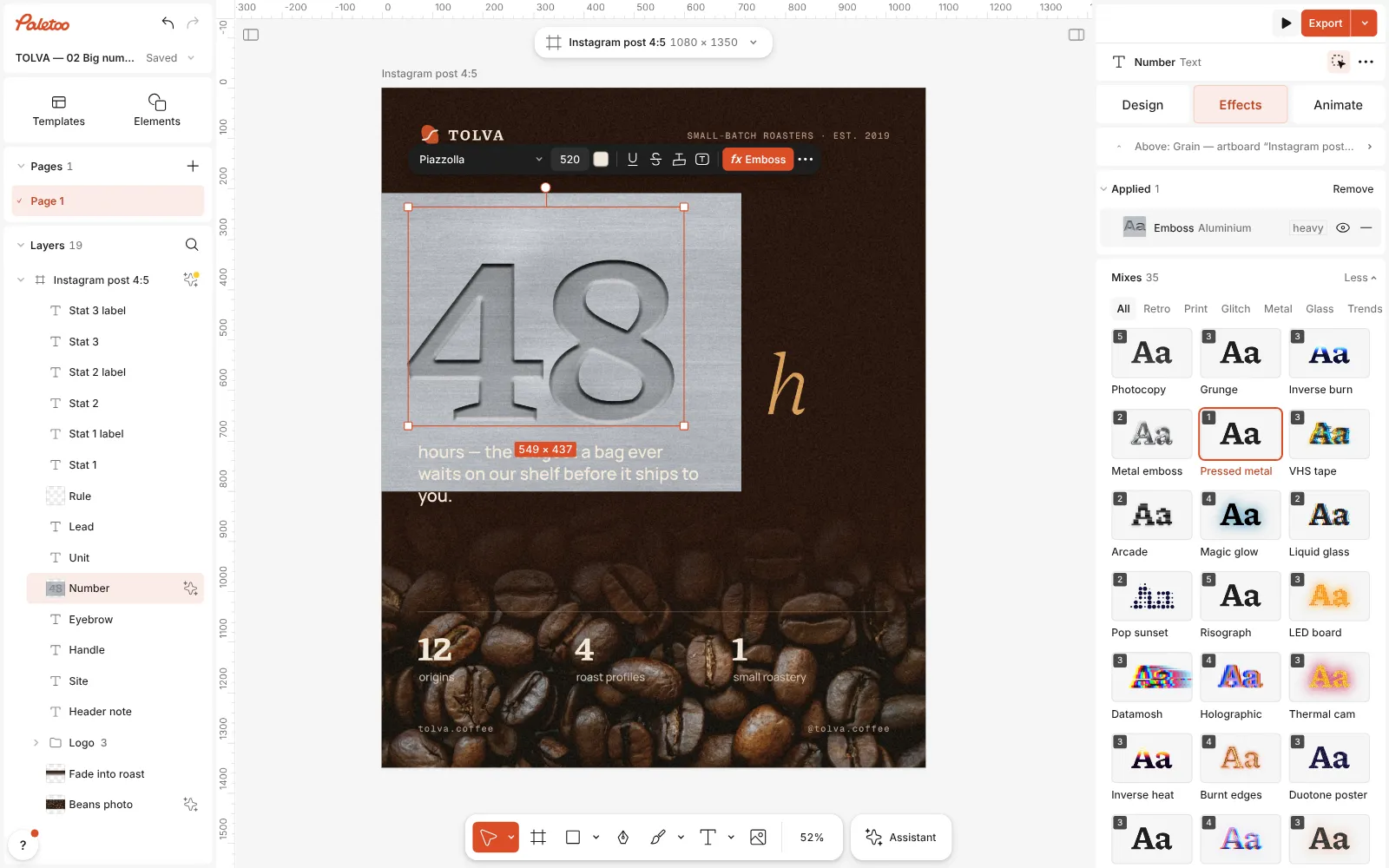
Pressed metal pressed: one Emboss step under Applied, the 48 sunk into a plate of brushed aluminium Click the Emboss row to open it. Direction is already Down: debossed. Surface chooses the plate — Aluminium, Steel, Silver foil, or Beneath to press the letters into whatever lies under them.
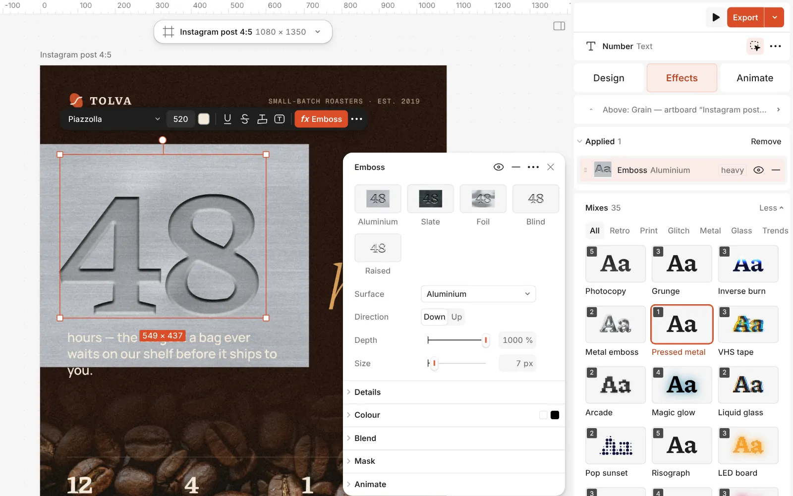
The Emboss step open: its presets, Surface, Direction and the controls for the walls and the light Carry your Photoshop habits straight across: Depth, Size and Soften shape the walls as Bevel & Emboss does; Light and Altitude are its Angle and Altitude; Inner shadow and Satin darken the floor; Fill is Fill Opacity.
Double-click the text and retype it. The plate and the walls are redrawn around the new characters as you type, with no style to copy or rebuild.
Press Export for PNG, JPG or PDF. The effects and the export are free, with no watermark.
The one-click mix
Its steps: Emboss · Aluminium
Open this mix in PaletooMake it your own
Start with Size, the width of the walls in pixels. On a heavy number keep it to about a third of the stroke thickness, so the floor of each letter stays visible; past half, the two walls meet and the letter turns into a ridge. Then use Depth for contrast — higher makes the walls darker and sharper — and add a pixel or two of Soften for a cast, slightly worn edge instead of a machined one.
Light the plate like the scene around it. Light turns the light round the letters from 0 to 360°; Altitude raises it from 0 to 90°. Around 20–30° gives long, raking shade on the walls; 50° and up gives a flatter, quieter dent. If the pressed face goes too dark, ease off Inner shadow before you touch Satin — Pressed metal sets Satin to 35 %, a fair middle.
When the mood is wrong, change the material rather than the walls. Steel is cooler and darker than Aluminium; the Slate preset swaps metal for dark stone and lowers the light; Plate sets how far the sheet reaches past the text, from a tight tag to a wide panel. For letters that rise instead of sink, pick the Raised preset or set Direction to Up.
Questions
What is the difference between embossed and debossed text?
Embossed letters rise above the surface; debossed letters are pressed into it. In Photoshop it is the Direction setting of Bevel & Emboss, Up or Down; in Paletoo it is Direction in the Emboss step.
Which Photoshop layer styles make text look like metal?
Bevel & Emboss for the edges, Satin and a Gradient Overlay for the reflections, an Inner Shadow for depth, and a metal photo either under the text at Fill 0 % or clipped to it.
Does the text stay editable?
In both. Photoshop layer styles stay live on a type layer, and Paletoo’s Emboss is a live effect on the text layer, so retyping redraws the relief.
Can I press the text into my own metal photo in Paletoo?
Yes. Put your metal photo under the text and set Surface to Beneath, or pick the Blind preset: the letters are pressed into that photo instead of the built-in plate.
Is it free?
Yes. The effects, the templates and every export are free, with no watermark. Credits are only for AI image generation and Materials.
Make it online
- Text effects onlineChrome, gold foil, emboss, cut-out letters, outlines and warps — and the words stay editable text.
- Logo makerBuild a wordmark or a badge from real type and shapes, and take it away as a sharp SVG or PDF.
Free design templates: Social media post templates · Brand guidelines templates
Read next
How to make an emboss effect: press text into metal or stone
The design pressed into a plate of metal or stone, its own colour gone.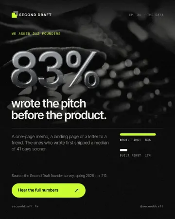
How to make an embossed metal effect
Live text pressed into the sheet and turned to chrome.
Chrome and liquid glass: the shiny trend of 2027, and how to make it
Mirror-bright metal and clear, bending glass: surfaces that reflect the world around them.
Try it on your own design
Paletoo opens in your browser, with no sign-up. Every effect here is live: change the picture or the words and the effect follows.
Open in Paletoo