How to make a duotone in Photoshop — and the one-minute way
Duotone mode, a Gradient Map layer, and the same two inks as one live mix.
A duotone in Photoshop shows a photo in two inks instead of full colour: one carries the shadows, the other the highlights, and every tone in between is a blend of the two. Printers invented it to get richer black-and-white photos out of a second ink; designers turned it into a style of its own when they swapped the inks for bright, unexpected pairs.
It is the quickest way to make photos from different shoots look like one brand. A beach, a street and a portrait all come out in the same two colours, so a feed, a festival campaign or a website hero suddenly reads as a set — even when the pictures came from ten different places.
Photoshop gives you two real routes, and they are not the same thing. Below are both, with where each one shines and where it slows you down. Then the same look in Paletoo: one mix on the photo, its colours changeable at any time.
The Photoshop way: Duotone mode or a Gradient Map
Both routes work in Photoshop 2025 and 2026. Duotone mode is the print route — a true two-ink file with Pantone inks and a curve per ink — and takes about ten minutes. The Gradient Map is the screen route, a non-destructive adjustment layer, about five minutes plus however long you spend choosing colours. Either way, start from a photo with a good range from deep shadow to bright light.
- For the print route, work on a copy: Image › Duplicate. Duotone is a colour mode, so it changes the whole document rather than one layer.
- Convert the copy with Image › Mode › Grayscale and confirm that the colour information is discarded. Duotone is offered only for an 8-bit grayscale image, so if the menu stays grey, set Image › Mode › 8 Bits/Channel as well.
- Choose Image › Mode › Duotone and set Type to Duotone. Click the swatch of Ink 1 for the dark ink and Ink 2 for the light one; the Color Libraries button in the picker lists Pantone inks.
- Click the small curve square beside each ink to shape where it prints. Pull Ink 2 down in the shadows so the light ink stays in the highlights; use Overprint Colors to check how the two mix.
- Save as PSD or PDF for the printer. For the screen, convert with Image › Mode › RGB Color — after that it is an ordinary RGB picture, no longer a two-ink file.
- For the screen route, keep the colour photo and add Layer › New Adjustment Layer › Gradient Map. Clip it to the photo with Ctrl + Alt + G (Cmd + Opt + G on a Mac) so it touches nothing else.
- In the Properties panel, click the gradient to open the Gradient Editor. The left stop maps the shadows and the right one the highlights: set the dark ink on the left and the light ink on the right. Add a third, lighter stop at the right end if the highlights turn into a flat block of colour.
- Drag the stops and the small midpoint diamonds to move where one ink gives way to the other. Add a Curves adjustment layer between the photo and the Gradient Map, clipped as well, to set the contrast that goes into it.
- For a printed feel, add grain: a new layer filled with 50 % grey through Edit › Fill, then Filter › Noise › Add Noise with Monochromatic ticked, and the layer set to Overlay.
- Export with File › Export › Export As. Save the gradient as a preset in the Gradient Editor, so the next photo gets the same two inks.
Both routes are solid. Duotone mode is the right tool when a printer will really run two inks: per-ink curves and Pantone colours are exactly what that job needs. For anything on a screen it is a detour — grayscale first, a document-wide mode, then back to RGB at the end. The Gradient Map is non-destructive and quick, but picking colours in the Gradient Editor is slow, the contrast lives in a separate Curves layer, the grain in a third, and matching ten photos means building or copying that little stack onto each of them.
Made in Paletoo
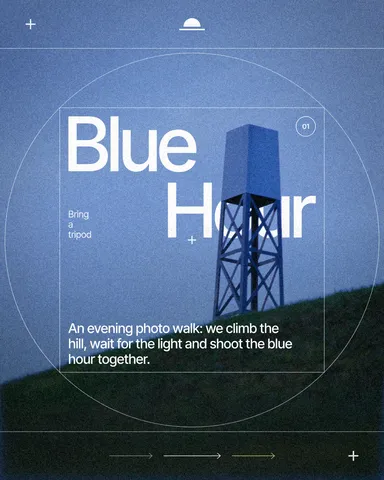
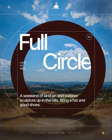
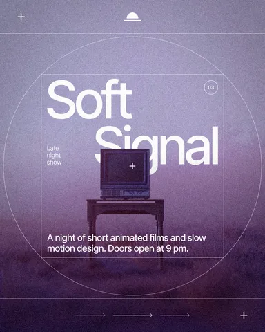
Every picture on this page was made in Paletoo — these three with the same steps on other templates:
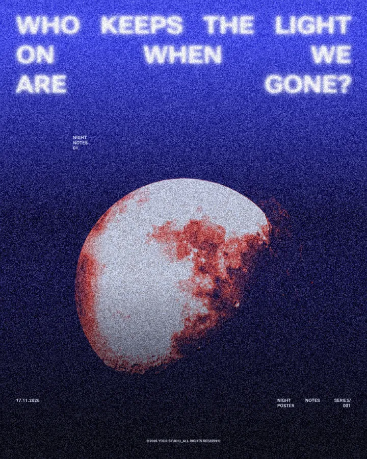
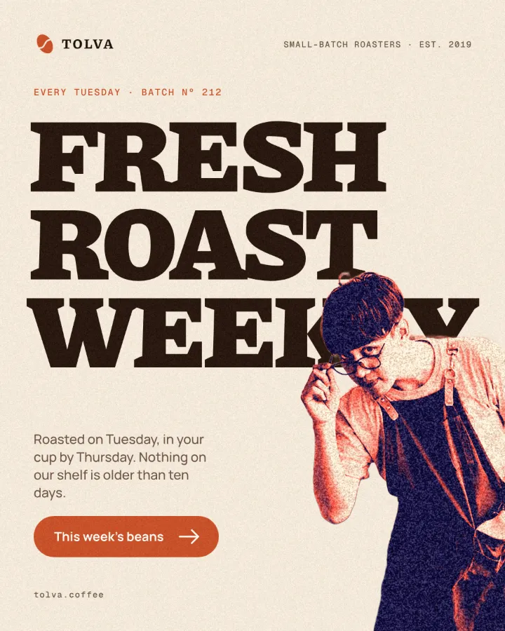
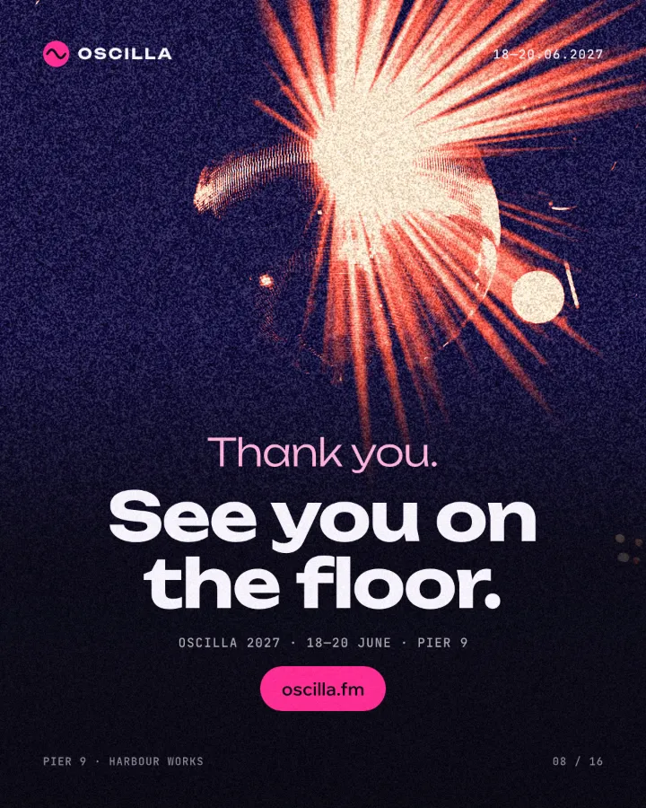
The one-minute way in Paletoo
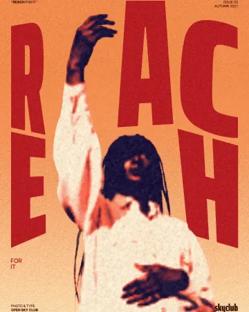
Open the design in Paletoo — here the magazine cover with the man in the orange jacket — and click the photo to select it. The jacket, the white T-shirt and the dark beard give the two inks a full range to work with.
Open the Effects tab in the right panel, go to Mixes and press All to show every mix, then find Duotone poster.
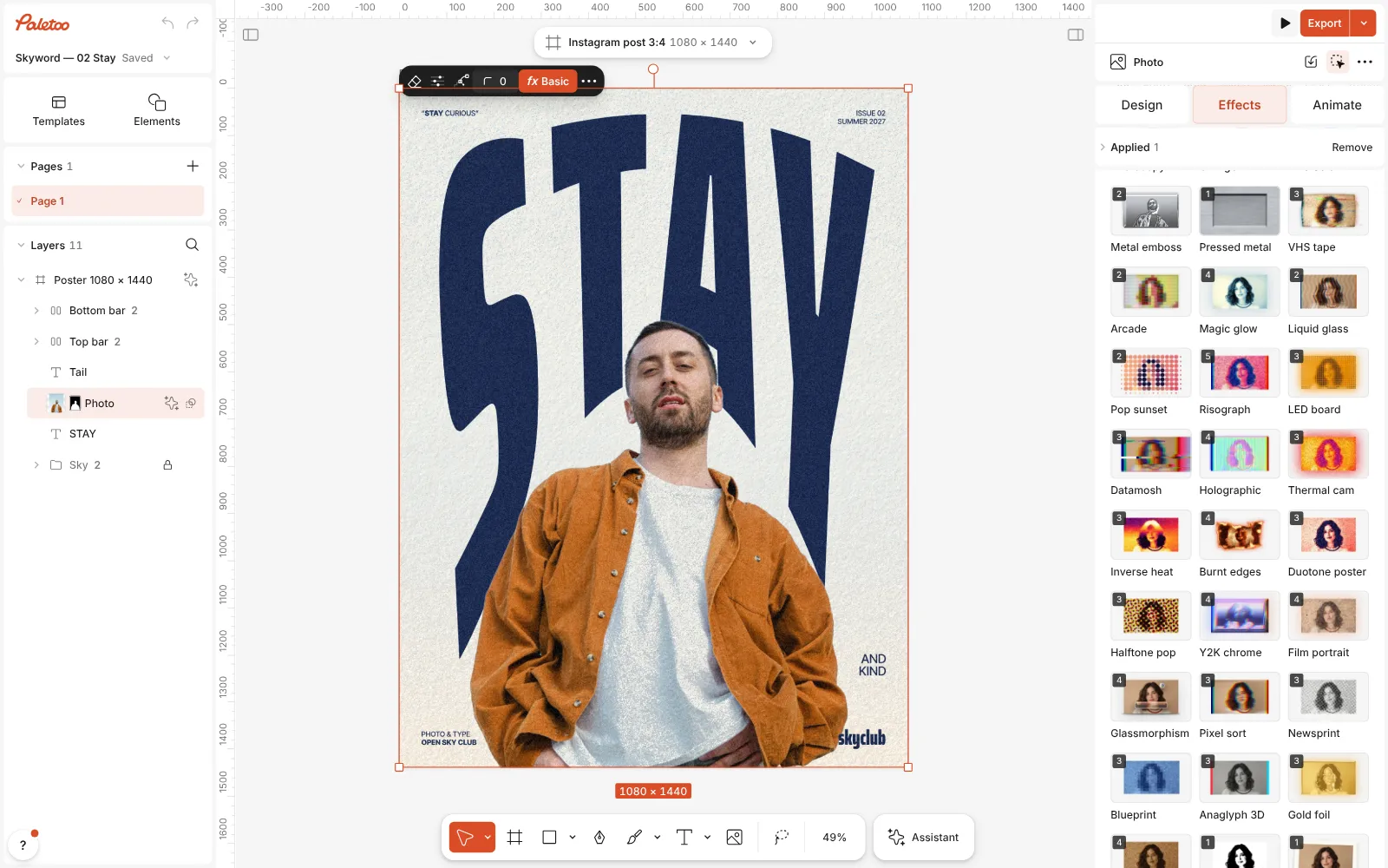
The magazine cover open in Paletoo, the photo selected and every Mix shown in the Effects tab, Duotone poster in view Press Duotone poster. Three steps go on under Applied: Basic adds contrast and clarity (your Curves layer), Gradient map sends the shadows to navy and the lights to coral and cream, and Grain on its Fine film preset adds the poster texture (your noise layer). The original photo stays underneath, untouched.
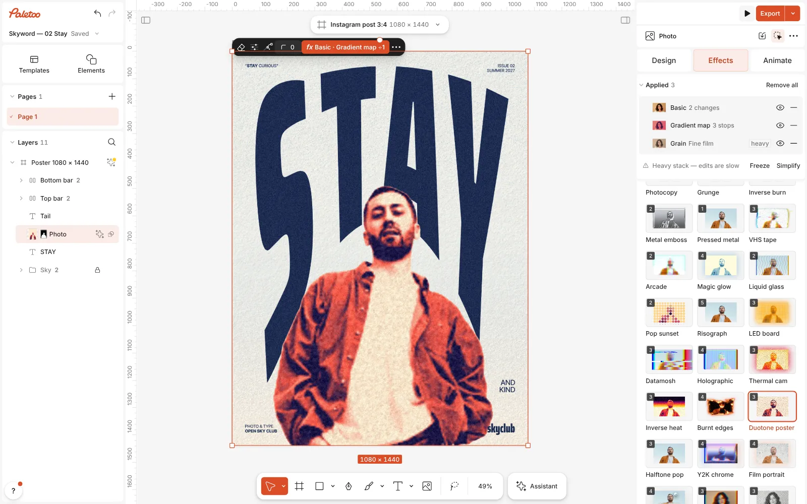
Duotone poster pressed: Basic, Gradient map and Grain under Applied, the man and his jacket in navy, coral and cream Click the Gradient map row to open it. Its Gradient runs from the shadows on the left to the highlights on the right: click a stop to change its colour, drag it to move where one ink takes over from the other. Contrast sets how hard the inks meet; the mix uses 30 %.
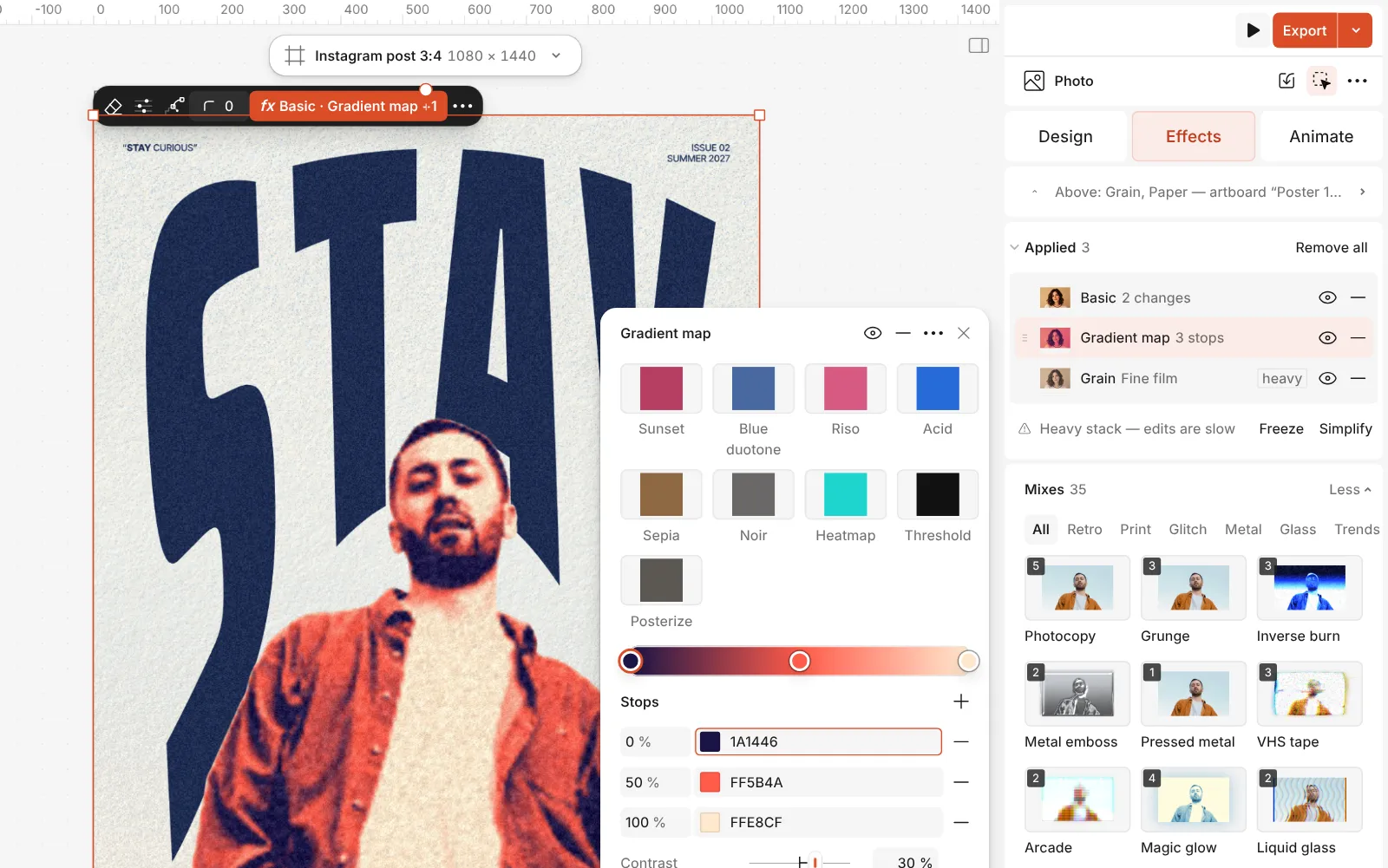
The Gradient map step open: its presets, the Gradient with its three stops and the Contrast slider Try the presets at the top of the step for other pairs — Blue duotone, Sunset, Riso, Noir. Open Details for Reverse, which swaps light and dark, and Levels, which cuts the gradient into flat bands like a screen print.
Press Export for PNG, JPG or PDF. Nothing was flattened or converted, so next week you can change the inks and the cover follows.
The one-click mix
Its steps: Basic Gradient map · navy, coral, cream Grain · Fine film
Open this mix in PaletooMake it your own
Start with the dark end of the Gradient. It carries the shape of the picture, so it has to be genuinely dark — navy, aubergine, forest green, near-black. The light end sets the mood: coral and peach feel warm, mint and sky blue fresh, acid yellow loud. Two colours of similar lightness, such as red and green, lose the face entirely.
Use Contrast before you touch the colours. At 0 the inks blend softly through every tone; from about 60 % the picture snaps into two areas, much closer to a screen print. If the photo is dark overall, raise Brightness in the Basic step instead of lightening the ink, so the dark ink stays dark.
The cream third stop keeps the highlights from turning into a flat patch of coral. Remove it for a strict two-ink look, or set Levels to 3 or 4 for flat posterised bands. If the poster will be seen close up on a phone, lower the Density of the Grain step so the texture stays in the background.
Templates with this look
Questions
Should I use Duotone mode or a Gradient Map in Photoshop?
Duotone mode when a printer will run two real inks, because it keeps a curve per ink and Pantone colours. A Gradient Map for anything on a screen, because it stays editable on top of the colour photo.
Why is Image › Mode › Duotone greyed out?
Duotone needs an 8-bit grayscale image. Convert with Image › Mode › Grayscale first, and choose 8 Bits/Channel if the file is 16-bit.
How do I pick good duotone colours?
One dark, one light, with a clear difference in brightness between them. Squint at the result: if the face disappears, the two colours are too close in lightness.
Can I use my brand colours in Paletoo?
Yes. Click a stop of the Gradient map and type the hex value; if your brand colours are saved as colour styles, pick them from there.
Is it free?
Yes. The effects, the templates and export are free and carry no watermark. Credits are only for AI image generation and materials.
Make it online
- Duotone, halftone and glitch photo effects onlineThree of the strongest looks for a photo, each one click away and every step still yours to tune.
- Photo effects onlineGive a photo a film, print or glitch look in one click — and keep every step editable afterwards.
Free design templates: Poster templates
Read next
How to make a duotone effect
Two bold inks, punchy contrast and a fine poster grain.
How to make a cyanotype effect from a photo
A sun print in Prussian blue on cream watercolour paper.
How to make a halftone effect in Photoshop — and in one minute
Color Halftone, a Bitmap screen and a Smart Object — then the same dots as one live mix.
Try it on your own design
Paletoo opens in your browser, with no sign-up. Every effect here is live: change the picture or the words and the effect follows.
Open in Paletoo