Techniques6 min readFreeUpdated 2026-11-17
Presentation design tips: how to make slides look good
Eight rules that make any deck look designed, shown on a real three-slide pitch.
By the Paletoo team · steps tested in Paletoo on

To make a presentation look good, give every slide one idea and say it in a big title, use two fonts and three colours across the whole deck, leave a wide margin, show numbers large instead of in a table, and let photos run to the edge. In Paletoo you can start from a designed deck, change the words and colours, and save it as PowerPoint with editable text or as a PDF — free, in the browser, with no sign-up.
Below: the eight rules designers follow, a table of type sizes that read from the back of a room, the mistakes that make slides look home-made, and the whole thing done on a real deck — «Sprigly», a three-slide seed pitch on deep green with a cover, three market figures and a closing ask — from opening it to a .pptx your colleagues can edit.
Eight rules that make slides look designed
One idea a slide. A slide is not a page of notes: it is the one thing the room should remember while you talk. If a slide needs two titles, it is two slides. Ten clear slides take less time to present than five crowded ones, because nobody has to read ahead of you.
The title says the point. «Market» is a label; «A big, hungry market» is a point. Write the title as the sentence you want repeated after the meeting, set it large — the biggest thing on the slide — and keep it to one or two lines. Everything else on the slide proves the title.
Two fonts, used the same way everywhere. One for titles, one for text, or one family in two weights. Set the title size, the body size and the small label once, and reuse them on every slide: the eye learns the system on slide two and stops noticing it, which is what you want.
A palette of three. A background colour, a text colour with strong contrast against it, and one accent for the thing that matters — a number, a button, a word. Use the accent sparingly: if everything is orange, nothing is. Pick the palette from the photo or the logo you already have.
Room to breathe. Keep a margin of about 5–8 % of the slide’s width on every side and align everything to it. White space is not wasted space: it is what makes the title look confident and the slide easy to scan.
Numbers you can see. A figure the room should remember goes on the slide in huge type with one line of label under it; three such figures in a row beat a table of twenty. Put the full table in the appendix or the PDF you send afterwards.
Pictures that fill. A photo either fills the slide (or half of it, edge to edge) or it is not there. Small photos floating in the middle with a border look like clip art. Put the words on the calm part of the photo, or on a solid band beside it.
An ending that asks. The last slide is not «Thank you» or «Questions?»: it is what you want — the amount, the date, the next step — with a contact and a button-like call to action. That is the slide people photograph.
Type sizes that read from the back of the room
Slides are read from three to ten metres away, on screens that are rarely as sharp as your laptop. These sizes are for a 1920 × 1080 slide (16:9), the size PowerPoint, Keynote and Google Slides use by default; they are the ones the deck below uses.
| Text | Size | How much |
|---|---|---|
| Cover or closing title | 96–120 px | One sentence, two lines at most |
| Slide title | 56–72 px | One line, the point of the slide |
| Big number | 100–140 px | One to three per slide |
| Body text | 26–34 px | Three short lines, or three bullets |
| Labels and footers | 16–20 px | Page number, chapter, source |
Mistakes that make a deck look home-made
Most decks look home-made for the same few reasons: a different layout on every slide, a title font that changes halfway through, text set at the default size and crammed to the edges, bullet points that are full paragraphs, low contrast (grey text on a photo, pale yellow on white), and a stock template’s decorations left in where they do not belong. Fixing those six does more than any new font.
Animation is the other one. A slide that flies in, a word that spins, a transition on every click — they slow the talk down and look dated. If something moves, let it be one thing that builds an argument: the second figure appearing after you have explained the first.
Made in Paletoo
Every picture on this page was made in Paletoo — these three with the same steps on other templates:

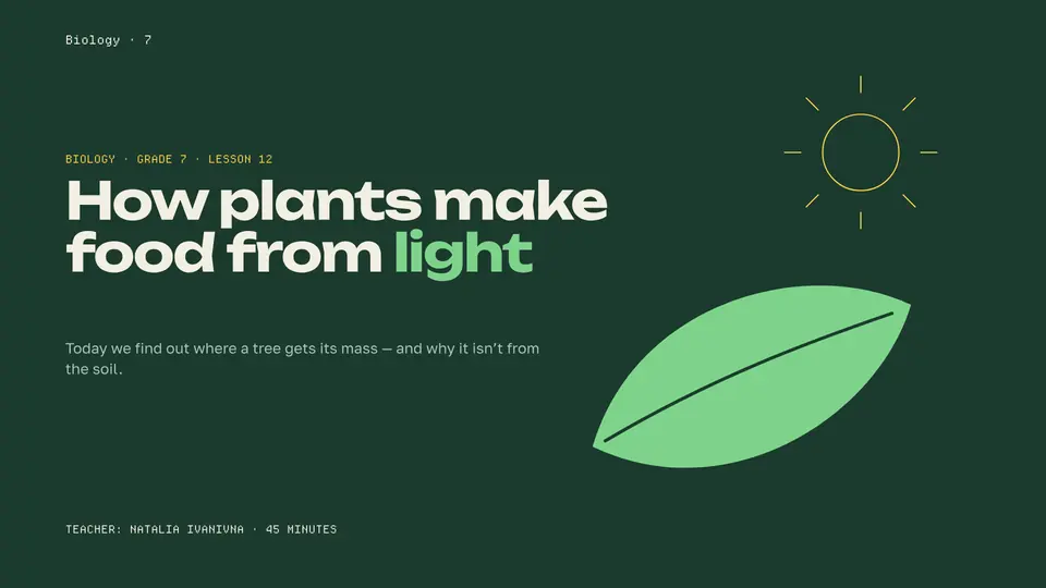
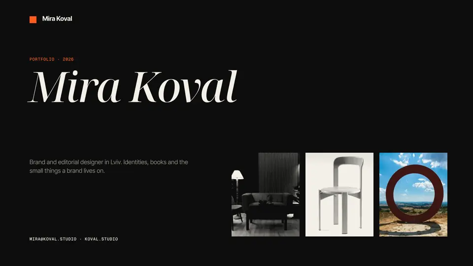
Step by step in Paletoo
Press “Open in Paletoo” on this page. «Sprigly» opens as your own three-slide deck at 1920 × 1080, with no account and nothing to install: a cover with «Grow food where people live.», the market slide with three figures, and the ask, «€2.5M to put 220 roofs to work.»
Click the cover’s title, the layer «Title». Under Typography on the Design tab you see its font, size and line height: the deck uses one size for both big titles and one for every slide title. Double-click and type your own point; keep it to two lines.
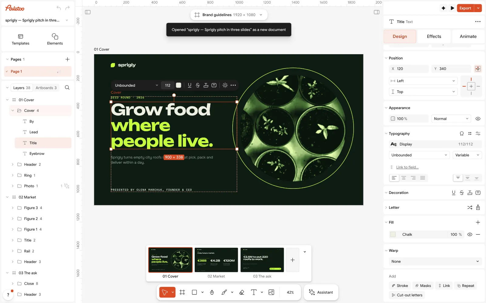
The Sprigly deck open in Paletoo: the cover’s title selected, its type under Typography in the Design tab Press Select all (Ctrl A). Selection colours lists the deck’s whole palette — Chalk for the text, the Lime accent, Lichen grey and the dark lines. Click Lime and choose your brand’s colour: every slide changes at once, so the deck stays a system.
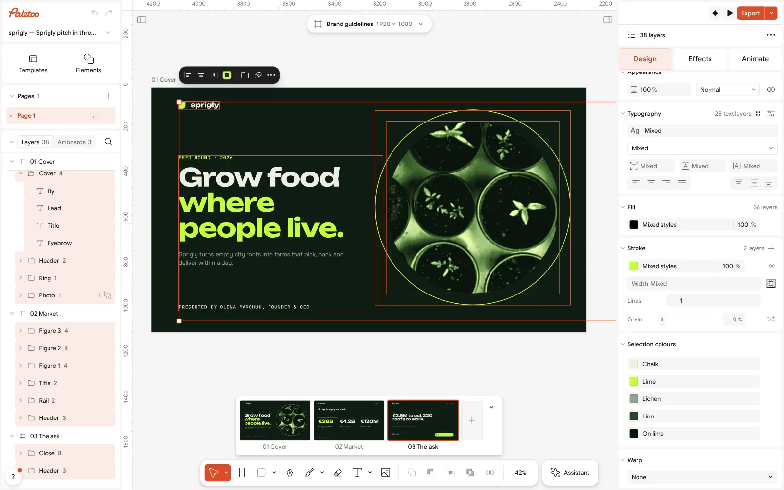
Everything selected: the deck’s palette under Selection colours Change the three figures on the market slide to your own. Keep each one to a number, a label and one short note, as they are: the size does the work, not the words.
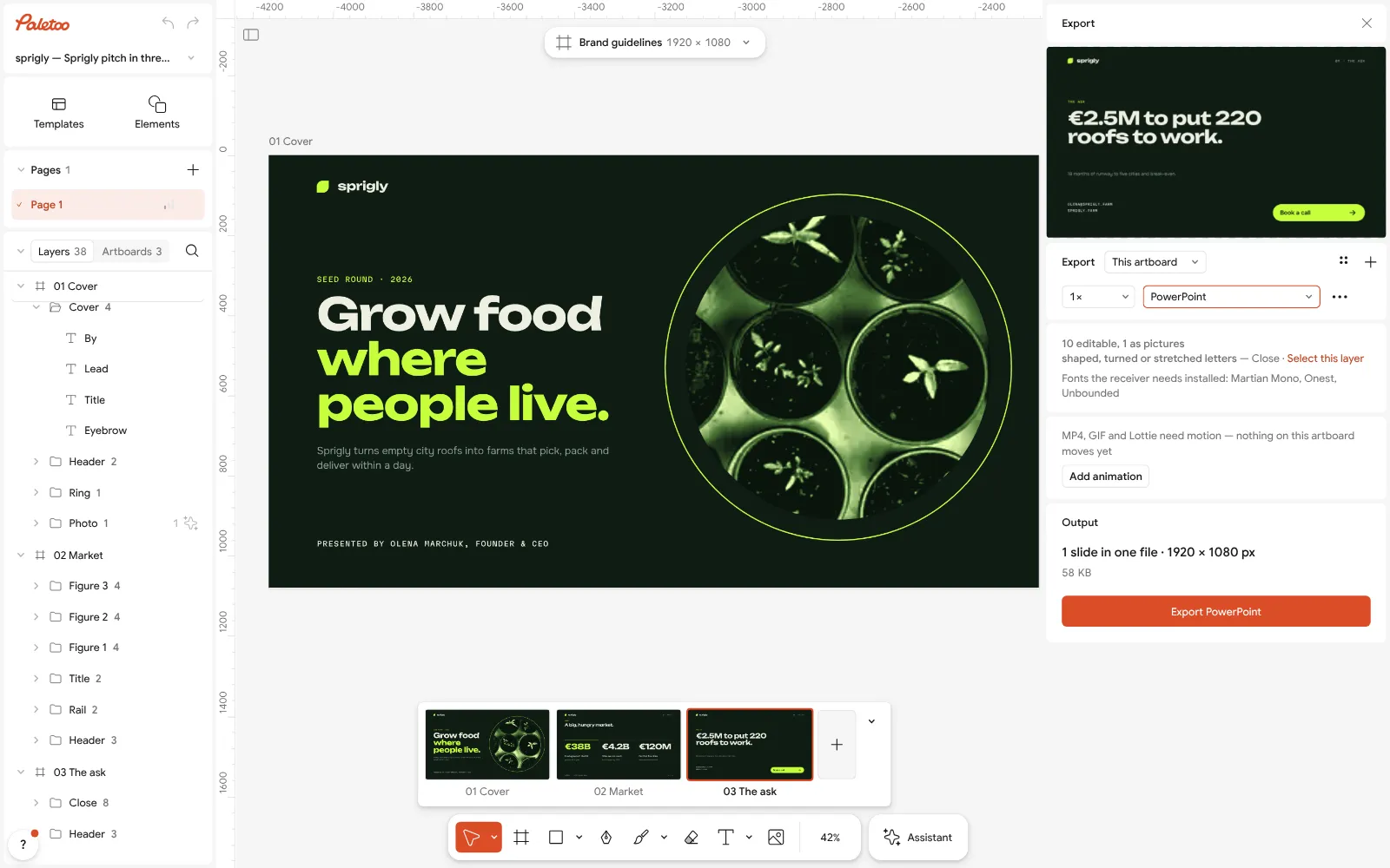
The Export window with PowerPoint chosen: the slide, its editable text and the fonts the receiver needs On the last slide, write your ask in the big line and your contact under it. Leave the button: it is the one thing people photograph.
Press Export (Ctrl Shift E) and choose PowerPoint in the format list; the list beside Export starts at the selected slide, so pick all three there. Every slide is saved with its text still editable in PowerPoint, Keynote or Google Slides — the window lists the fonts the receiver needs installed. Choose PDF instead for a file to send that looks the same everywhere.
Make it your own
If a slide feels crowded, split it: duplicate the slide and keep one idea on each. Two calm slides beat one busy one.
If the text is hard to read on a photo, move it to the photo’s calm side or put a solid band behind it; check it from across the room, or with the window made small.
If you present from Google Slides or Keynote, open the PowerPoint file there: the text stays text, and the fonts you used should be installed on that computer, or chosen from that app’s own list.
Sources
Questions
How do I make my presentation look good?
Give each slide one idea and a title that says it, use two fonts and three colours across the whole deck, leave wide margins, show key numbers big, and let photos fill the slide. Starting from a designed deck and changing the words is the quickest way there.
How many words should a slide have?
As few as the point needs: a title of one sentence and at most three short lines under it. The rest belongs in what you say, or in a PDF you send afterwards.
What font size should I use on slides?
On a 1920 × 1080 slide: titles 56–72 px, a cover title up to 120 px, body text 26–34 px and labels no smaller than 16 px. Bigger is almost always better than smaller.
Can I make a presentation for free and open it in PowerPoint?
Yes. In Paletoo, open a deck, change it and press Export, then choose PowerPoint: you get a .pptx whose text stays editable. It is free, in the browser, with no sign-up and no watermark; PDF is there too.
What colours look professional on slides?
Three: a background, a text colour with strong contrast against it, and one accent for what matters. Dark backgrounds with light text read well on screens; for a printed handout, use the light version.
Make it online
- Presentation makerOpen a designed deck, change the words, present it full screen or send it as a PDF or PowerPoint — the first slide is yours in a minute.
- Pitch deck makerOpen a designed 30-slide seed deck, write your story into it, and send it as PowerPoint or PDF — free, no sign-up, no AI filler.
Free design templates for posts, stories and posters: Presentation templates
Try it on your own design
Paletoo opens in your browser, with no sign-up. Every effect here is live: change the picture or the words and the effect follows.
Open in PaletooOpens this design as your own copy — every layer and effect editable, free.
Read next
- 01
 How to make a pitch deck: the slides, the order, a free templateThe story investors expect, slide by slide, on a designed deck you can send today.
- 02
 Best fonts for presentations: 12 pairs that readTwelve font pairs that stay readable from the back of the room — on your own slide title, with sizes, and one tap to a new presentation set in them.