Techniques5 min readFreeUpdated 2026-11-14
Best fonts for presentations: 12 pairs that read
Twelve font pairs that stay readable from the back of the room — on your own slide title, with sizes, and one tap to a new presentation set in them.
By the Paletoo team · steps tested in Paletoo on
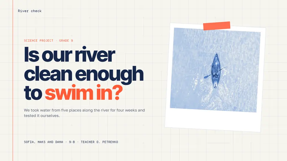
The best fonts for presentations are plain, open sans serifs with large letter shapes — Inter, Manrope, IBM Plex Sans, Fixel, Geist — used at 18 pt or larger, with one bolder face or a calm serif for titles. Microsoft’s own accessibility advice for PowerPoint says the same: sans serif fonts, 18 pt or more, and plenty of white space.
The tester below sets your slide title and a line of text in twelve pairs picked for slides, every face open-licence and complete in Ukrainian (Ґ, Є, І, Ї) and Polish; «Use this pair» opens a new 16:9 presentation with the pair saved as text styles. After it: the sizes that read from the back row, which faces survive a projector, how to keep fonts from breaking on someone else’s laptop, and the steps in Paletoo on «Is our river clean enough to swim in?», a ten-slide school project deck.
Try the pairs on your own wordsLive
Type a headline and a line of text, then switch between the pairs picked for this page. Every face is open-licence and sets Ukrainian and Polish.
- One familyFixel Display Black + Fixel Text
- SystemIBM Plex Serif SemiBold + IBM Plex Sans
- New classicPlayfair Display + Inter
- Wide gestureUnbounded ExtraBold + Manrope
- Grotesk with a twistCommissioner Flared Black + Commissioner
- Modern journalManrope ExtraBold + Literata
- HeritageBrygada 1918 Bold + Inter
- Bouba groteskRubik ExtraBold + Rubik
- Warm serifLiterata Display Black + Inter
- Code and designGeist SemiBold + Geist Mono
- Condensed shoutOswald Bold + Inter
- BookishPT Serif Bold + Overused Grotesk
Quarterly results
Revenue grew 18 % in the third quarter, led by the new subscription plan.
Display and text cuts of one super-family (the Bricolage way), drawn in Ukraine by MacPaw.
Stands in for:
Use this pair in PaletooOpens a new document with exactly this setup — free, no sign-up.
What makes a font good on a slide
A slide is read from far away, quickly, often on a dim projector or a shared screen squeezed into a video call. The fonts that survive have a large x-height (tall lowercase letters), open shapes in letters like a, e and c, clear differences between I, l and 1, and no hairline strokes that a projector washes out. That rules out thin display serifs, condensed faces for body text and most scripts — keep those for a single word on a title slide, if at all.
Pair two faces with one clear difference: a bold or wide face for titles and a quiet one for text, or a serif for titles and a sans for everything else. Two families are enough for a whole deck; use their weights for emphasis instead of adding a third.
| Text on the slide | Size (16:9, 1920 × 1080) | Why |
|---|---|---|
| Title | 40–60 pt | Read in one glance from the back row |
| Body text and bullets | 24–32 pt | Comfortable; never below 18 pt |
| Labels, chart axes, captions | 18–20 pt | The smallest size Microsoft recommends |
| Source line, footer | 14–16 pt | Only for text nobody has to read live |
| Big number or quote | 96–200 pt | One idea per slide, set huge |
Fonts that will not break on another computer
The most common presentation disaster is a font that is missing on the laptop in the meeting room: PowerPoint quietly swaps in another face, lines reflow and titles spill off the slide. There are three safe ways around it. Present from a PDF, which carries its fonts inside. Use Google Fonts in Google Slides, which only offers fonts it can serve to every viewer. Or, in PowerPoint for Windows, turn on embedding of fonts in the file’s save options before you send it.
Open-licence fonts help with all three: you may embed them, share them and use them commercially. Every face in the tester is open-licence, and a deck exported from Paletoo as a PDF keeps them exactly.
Serif or sans serif for a presentation?
For text, a sans serif — it holds up better at a distance and in low resolution. For titles, either works: a serif such as Literata, PT Serif or Playfair makes a deck feel editorial, academic or premium; a bold grotesk such as Unbounded or Fixel Display feels modern and direct. Choose by the audience, then keep the same pair through every slide.
In Ukrainian and other Cyrillic text, check the whole alphabet before you commit: a pair that looks perfect in English can drop Ґ or the apostrophe and fall back to another font in the middle of a word. The tester only shows faces that pass.
Made in Paletoo
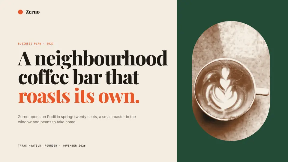
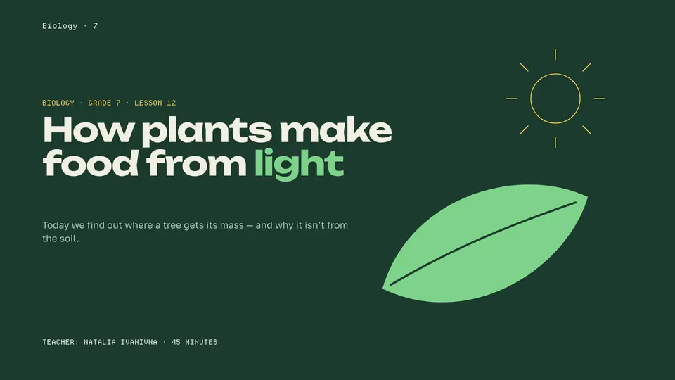
Every picture on this page was made in Paletoo — these three with the same steps on other templates:

Step by step in Paletoo
Open the deck: press “Open in Paletoo” on this page, or “Use this pair in Paletoo” under the tester — that opens a new presentation with your pair saved as two Text styles. «Is our river clean enough to swim in?» is a ten-slide deck with a display title, numbered chapters and body text.
Double-click the title on the first slide and type your own; with it selected, the Typography section of the Design tab shows its Font, Weight and Size.
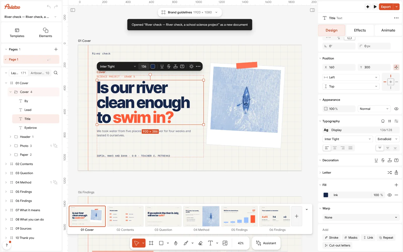
The «Is our river clean enough» deck open in Paletoo, the title selected: its font under Typography With nothing selected, the Design tab lists the deck’s Text styles — Display, Title, Body, Label and the rest. Change a style’s font once, and every slide that uses it changes.
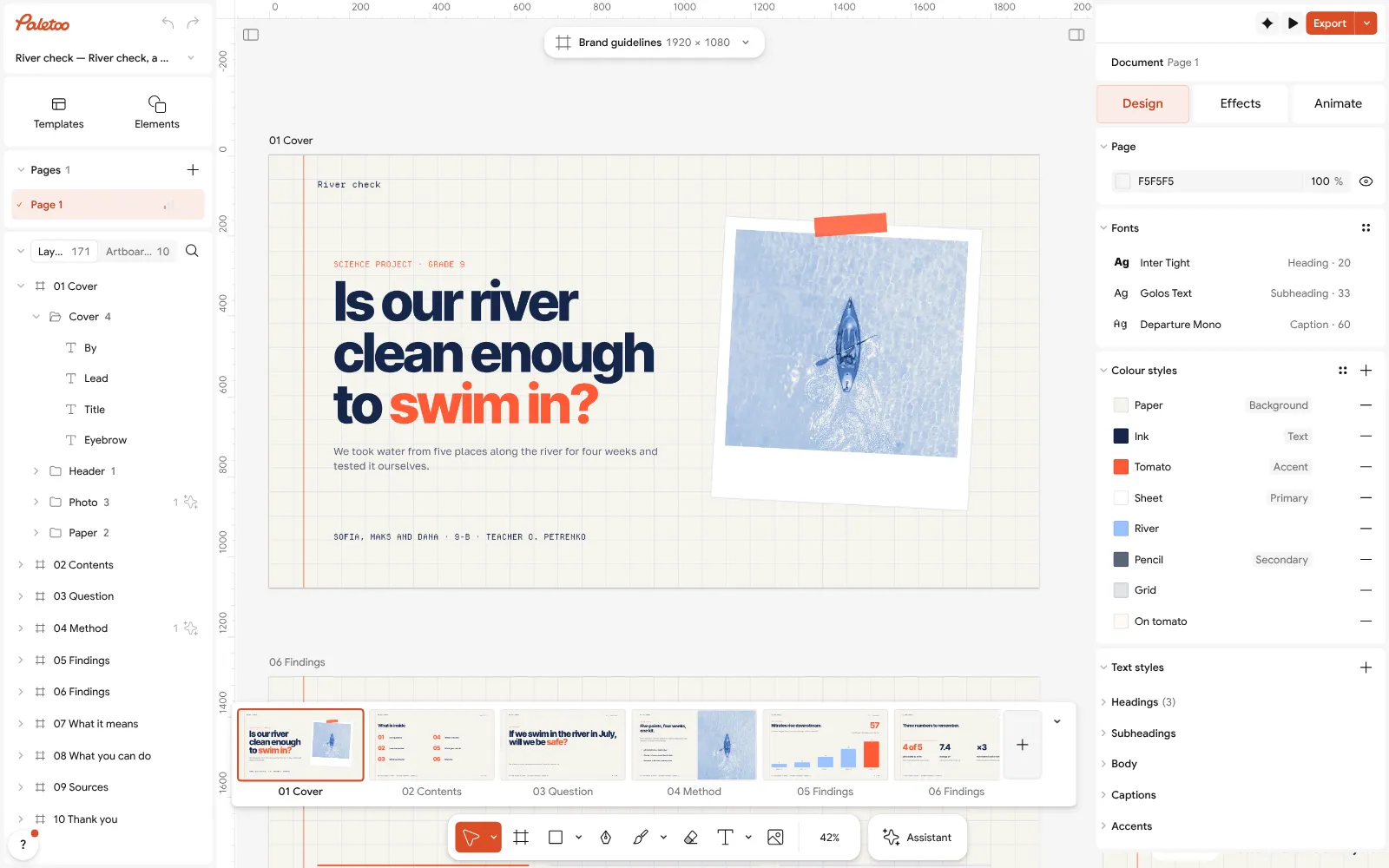
Nothing selected: the deck’s text styles, one per role, ready to take another pair Keep body text at 24 pt or more: select a text box and check its Size; if the words do not fit, cut words or split the slide rather than shrinking the type.
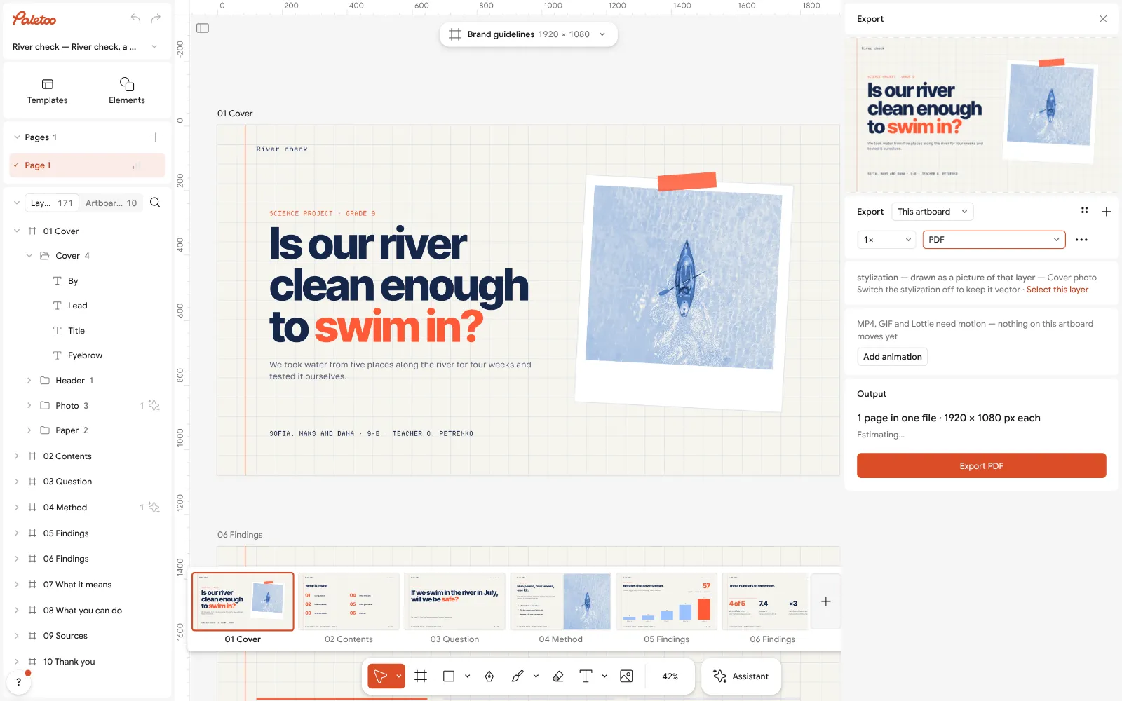
The Export window: the deck as a PDF, fonts and all Loosen Line height a little for bullets and tighten Letter spacing on big titles, so long titles hold together as one shape.
Press Export (Ctrl Shift E) and download the deck as a PDF — every font travels inside it, so it looks the same on any laptop, free.
Make it your own
If a title runs to three lines, do not shrink it: rewrite it shorter, or lower Letter spacing slightly and let it take two lines.
For numbers in tables and charts, pick a face with even figures; a mono or the text face at a bolder Weight keeps columns aligned.
Make the whole deck consistent in one move: edit the entries in Text styles, not individual text boxes.
Sources
Questions
What is the best font for a presentation?
A clear, open sans serif with a large x-height — such as Inter, Manrope, IBM Plex Sans, Fixel or Geist — at 18 pt or larger. Pair it with a bolder face or a calm serif for titles.
What font size should I use on slides?
Titles 40–60 pt, body text 24–32 pt, and nothing people must read below 18 pt. If the text does not fit, cut words or split the slide.
Serif or sans serif for PowerPoint?
Sans serif for body text, because it reads better at a distance and on projectors. A serif works well for titles if you want an editorial or academic feel.
How do I stop fonts changing on another computer?
Present from a PDF, use Google Fonts in Google Slides, or embed the fonts in PowerPoint’s save options on Windows. Open-licence fonts may be embedded and shared.
Which presentation fonts support Ukrainian?
Every face in the tester on this page sets the full Ukrainian alphabet, including Ґ, Є, І and Ї: Fixel, IBM Plex, Manrope, Inter, Commissioner, Literata, Unbounded and others.
How many fonts should a presentation use?
Two families: one for titles, one for text. Use their weights and italics for emphasis before adding a third font.
Make it online
- Presentation makerOpen a designed deck, change the words, present it full screen or send it as a PDF or PowerPoint — the first slide is yours in a minute.
- Pitch deck makerOpen a designed 30-slide seed deck, write your story into it, and send it as PowerPoint or PDF — free, no sign-up, no AI filler.
- Poster makerMake a poster from a template that already has the layout right, then export a print-ready PDF or an image for screens.
Free design templates for posts, stories and posters: Presentation templates · Poster templates
Try it on your own design
Paletoo opens in your browser, with no sign-up. Every effect here is live: change the picture or the words and the effect follows.
Open in PaletooOpens this design as your own copy — every layer and effect editable, free.
Read next
- 01
 How to make a pitch deck: the slides, the order, a free templateThe story investors expect, slide by slide, on a designed deck you can send today.
- 02
 Font pairings 2027: 40 trending pairs to try on your wordsForty trending font combinations — editorial serifs, wide grotesks, mono labels, bouba type — live on your own words, and one tap to use the pair.
- 03
 Font pairing for posters: six combinations that workOne loud voice, one quiet one, and a clear difference between them.