Art for designers · 4 min read · Save to Pinterest
Art movements for graphic designers: seven styles, their palettes and a poster for each
Not a history lecture: what makes each style recognisable, the colours its real works use, the type that fits and a poster idea you can start in a minute.
The movements designers borrow from most are Ukiyo-e, Arts and Crafts, Art Nouveau, the Vienna Secession, the Ukrainian and Russian avant-garde (Suprematism), De Stijl and Impressionism. Each has a few rules you can copy — a palette, a layout habit, a kind of type — and all their key works are in the public domain, so you can use the originals too.

- #001356
- #0B7E3E
- #D88313
- #CFB6A3
- #E4E4E2
Every style below is shown through real works from museum collections, each free to use. Pick a movement: its palette is taken from its lead work, the type and layout notes are what to copy, and the button opens a poster with that palette and the work already placed.
The seven, one at a time
Ukiyo-e Japan, 1680s–1900
Woodblock prints for the city’s crowds: actors, courtesans, roads and waves, printed in editions. Flat colour, a black outline, a big empty sky and a cropped, daring view. Europe saw them in the 1860s and modern design began to copy. More on ukiyo-e.


- Palette
- #293A52
- #7D817C
- #C4B08F
- #D9C4A2
- #EBDFCC
- Look for
- flat colour areas, a key outline, gradations of Prussian blue, text in a cartouche, diagonal crops
- Type to match
- a brush-like display face for the title and a quiet grotesque for the rest; vertical lines of text
- Poster idea
- one huge wave or mountain filling a narrow poster, the title in a coloured cartouche
Arts and Crafts Britain, 1860s–1910s
William Morris wanted ordinary things made beautifully by hand. His wallpapers and textiles are dense repeating plants and birds in a few dyed colours — the ancestor of every botanical pattern on packaging today.


- Palette
- #3E4A4A
- #4B534E
- #685F51
- #8B8886
- #A8A4A5
- Look for
- a repeating pattern that hides its repeat, leaves that overlap, earthy dyes: indigo, madder, weld
- Type to match
- an old-style serif with a strong italic; initials and ornaments used once
- Poster idea
- a pattern edge to edge with one framed panel for the name — a label, a book cover, a tea tin
Art Nouveau Europe, 1890–1910
Posters became art on the street. Mucha framed his women in halos and arches, hair flowing in the whiplash line; Vienna’s Koloman Moser turned the same curves into stencils. The Art Nouveau poster article.


- Palette
- #816035
- #C48B32
- #B08F5E
- #D2B78B
- #EDE9D6
- Look for
- a figure inside a circle or arch, hair and plants as line, pale gold and sage, lettering drawn to fit
- Type to match
- a decorative display face for one word, an elegant serif or a light sans for the rest
- Poster idea
- a portrait in a halo, a frame of flowers, the name in hand-fitted letters across the top
Vienna Secession Vienna, 1897–1918
Klimt and his friends left the academy and made gold, pattern and the square their own. Flat ornament next to a realistic face; a frame as part of the picture.


- Palette
- #836F37
- #8F7E46
- #979257
- #AFA682
- #C2A84D
- Look for
- square formats, gold against olive and black, flat patterns of circles and rectangles, a lot of margin
- Type to match
- geometric capitals with tight spacing; a square block of text
- Poster idea
- a square post with a gold field, one patterned shape and a small, precise headline
Suprematism and the avant-garde Kyiv, Moscow, 1913–1930
Kazimir Malevich, born in Kyiv, painted a black square and then shapes that float and tilt on white. Kandinsky made colour sound like music. Their geometry still powers posters, logos and interfaces.


- Palette
- #001356
- #0B7E3E
- #D88313
- #CFB6A3
- #E4E4E2
- Look for
- pure shapes on white, red and black with one blue, tilted bars, dynamic diagonals
- Type to match
- a bold grotesque, set large and at an angle; numbers as shapes
- Poster idea
- three shapes and a diagonal headline on white — a concert, a talk, a launch
De Stijl Netherlands, 1917–1931
Piet Mondrian cut painting down to black lines, white planes and the three primaries. It is a grid you can see, and the reason a page of rectangles can feel alive.


- Palette
- #151818
- #065C9B
- #D92519
- #D1B28C
- #E7E6E5
- Look for
- a visible grid, primaries in small doses, lots of white, nothing curved
- Type to match
- a geometric or neo-grotesque sans, all lower case or all caps, flush left
- Poster idea
- a poster laid out on a 4×4 grid, colour in two cells only, the title in the biggest white cell
Impressionism and Pointillism France, 1870s–1890s
Light over line: Monet painted the moment, Seurat built it from dots of pure colour. For a designer it means texture, soft gradients and palettes that glow without being loud.


- Palette
- #4A514E
- #5C5F5E
- #777372
- #999268
- #B2A899
- Look for
- broken colour, visible strokes or dots, blue shadows and orange light, no black
- Type to match
- a humanist serif, generous leading; script only for a signature
- Poster idea
- a painted field as the background, a small framed title, a dotted halftone over a photo
How to borrow a style without copying a painting
- Take the rule, not the picture. Ukiyo-e is flat colour and a bold outline; De Stijl is a grid with two coloured cells. Apply the rule to your own subject.
- Take the palette. Five colours from one work are a ready-made brand palette that has already worked for a century. The palette widget does it for any painting.
- Use the original as an ingredient. Because these works are public domain, you can crop a corner of a Morris textile as a background, or put a Mucha frame around your own photo.
- Match the type. A style is half lettering. The notes above say which kind of face fits; Paletoo’s font library has free faces for each, Ukrainian included.
Movements you cannot copy from museums yet
Some styles everyone loves are still in copyright: Art Deco posters by Cassandre (he died in 1968), Swiss style by Josef Müller-Brockmann (1996), Pop art by Warhol and Lichtenstein. You can learn from their rules, but not use their works. Search for them in the Art tab and Paletoo tells you until when they are protected and suggests public-domain artists with a similar look.
Find any movement’s works in Paletoo
- Open Paletoo — free in your browser, no sign-up — and start any document.
- Click Place an image in the toolbar and choose the Art tab (or press ⌘K / Ctrl K and type Search art…).
- Type an artist, a title or a subject; the chips narrow it to Painting, Prints, Botanical, Japan, Maps or Photos.
- Click a work to place it at the museum’s full size; its credit stays with the layer, ready for your caption.
Search by artist name, not by movement: museums catalogue by maker. “Mucha”, “Hiroshige”, “Mondrian” or “William Morris” fill the grid at once; the Prints and Japan chips help with the graphic ones.
Questions
Which art movement is best for graphic design?
It depends on the message. De Stijl and the avant-garde suit tech and architecture; Art Nouveau suits beauty, food and events; Ukiyo-e suits anything with nature or craft; Impressionism suits calm, light brands.
What are the main art styles in graphic design?
Besides the seven here, designers talk about Bauhaus, Art Deco, Swiss (International) style, Psychedelic and Pop. The last four are mostly still in copyright, so you can learn their rules but not use their works.
Can I use Mondrian or Malevich in commercial design?
Yes. Mondrian died in 1944 and Malevich in 1935, so their paintings are public domain in the EU and Ukraine, and the museum files shown here are marked free on their records.
How do I get the colour palette of an art style?
Take it from a key work. Each movement above shows the palette Paletoo’s colour engine finds in its lead painting, and the button opens it as colour styles in a new design.
The works on this page
Every picture is the museum’s own file, shown from its site at the size this page needs. The institutions mark each one public domain or CC0 on its record; this is how they ask to be credited.
- Kazimir Malevich, Suprematist Composition, 1916. Wikimedia Commons, public domain — www.wikidata.org
- Art Institute of Chicago, Clarence Buckingham Collection — www.artic.edu
- Art Institute of Chicago, Gift of H. R. Warner — www.artic.edu
- Art Institute of Chicago, Gift of Chester W. Wright — www.artic.edu
- Art Institute of Chicago, Purchased with funds provided by Natalie Henry — www.artic.edu
- Art Institute of Chicago, Purchased with funds provided by Mrs. Theodore D. Tieken — www.artic.edu
- Art Institute of Chicago, Gift of Mrs. Charles F. Batchelder — www.artic.edu
- Art Institute of Chicago, Mrs. Victor F. Lawson Collection — www.artic.edu
- Art Institute of Chicago, Gift of Michael Searle — www.artic.edu
- Art Institute of Chicago, Purchased with funds provided by Edwin A. Bergman — www.artic.edu
- Gustav Klimt, The Kiss, 1907. Wikimedia Commons, public domain — www.wikidata.org
- Gustav Klimt, Portrait of Adele Bloch-Bauer I, 1907. Wikimedia Commons, public domain — www.wikidata.org
- Art Institute of Chicago, Purchased with funds provided by Mrs. Julian Armstrong, Jr. — www.artic.edu
- Kazimir Malevich, Black Square (1915), 1915. Wikimedia Commons, public domain — www.wikidata.org
- Wassily Kandinsky, Composition VII, 1913. Wikimedia Commons, public domain — www.wikidata.org
- Piet Mondrian, Composition II in Red, Blue, and Yellow, 1930. Wikimedia Commons, public domain — www.wikidata.org
- Art Institute of Chicago, Gift of Edgar Kaufmann, Jr. — www.artic.edu
- Wassily Kandinsky, Yellow-Red-Blue, 1925. Wikimedia Commons, public domain — www.wikidata.org
- Art Institute of Chicago, Helen Birch Bartlett Memorial Collection — www.artic.edu
- Claude Monet, Impression, Sunrise, 1872. Wikimedia Commons, public domain — www.wikidata.org
- Art Institute of Chicago, Mr. and Mrs. Martin A. Ryerson Collection — www.artic.edu
More art for designers

Art Nouveau posters: Mucha’s grammar for today’s posters and labels
In 1895 an unknown Czech illustrator made a poster for Sarah Bernhardt and Paris queued to tear copies off the walls. His rules still sell perfume, beer and concerts.
Free art for commercial use: a million museum works, and how to use them safely
Great museums give away high-resolution files of works whose copyright has ended. Here is where they are, what the labels mean, and how to put one in your design in a minute.
Palette from a masterpiece: pick a painting, get its colours, use them
Old masters solved colour harmony long before colour wheels. Take their answer: five colours from one painting, tested on a poster, opened in your design.
Ukiyo-e for designers: what Hokusai and Hiroshige can teach a poster
Japanese woodblock prints were the posters and magazines of 19th-century Edo. Their rules — flat colour, a bold line, a daring crop — still make the strongest layouts.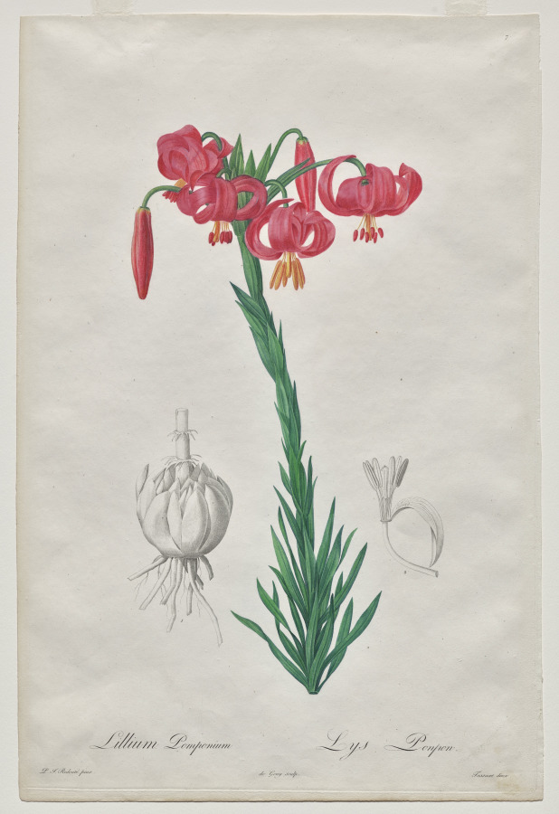
Vintage botanical illustrations: free plates for labels, packaging and posters
Two hundred years ago the best botanical artists drew roses and lilies leaf by leaf for kings and scientists. Today their plates are free, and they make the most beautiful labels.
Make it: Poster maker · Graphic design trends · Text effects · Templates
Five museums in one search box
Paletoo’s Art tab searches the Art Institute of Chicago, the Met, the Cleveland Museum of Art, SMK, the Wellcome Collection and Wikimedia Commons at once, keeps only what they mark public domain or CC0, and places the work with its credit. Free, in your browser.
Open in Paletoo