Art for designers · 4 min read · Save to Pinterest
Palette from a masterpiece: pick a painting, get its colours, use them
Old masters solved colour harmony long before colour wheels. Take their answer: five colours from one painting, tested on a poster, opened in your design.
To get a colour palette from a painting, pick the work below: Paletoo’s colour engine sorts its pixels into five colours, live in your browser, and shows them on a poster. Click a colour to copy its code, or open the palette in Paletoo as colour styles with the painting placed beside them.

- #1D2222
- #304275
- #45608F
- #657F97
- #A6A460
Pick a painting
Its five colours — found live by Paletoo’s colour engine
- #1D2222
- #304275
- #45608F
- #657F97
- #A6A460
Click a colour to copy its code.
Opens a new post with the five colours as colour styles and the work placed from the museum, the Art tab open beside it.
Why a painting makes a better palette than a colour wheel
A colour wheel gives you colours that should work together. A painting gives you colours that already did — in the right proportions, with the dark that holds them and the light that lets them breathe. Van Gogh’s night has two blues, a greenish yellow and almost-black; nothing here is pure, and that is why it feels rich.

One painter at night, one in snow: the same idea — a big field of one hue, a small spark of its opposite.
How the colours are found
The widget draws the museum’s picture at a small size and runs Paletoo’s own colour quantiser on it — the one that powers Vectorize: median cut finds eight groups of similar pixels, then k-means settles each on the colour the picture really has there. Five of the eight are then chosen for a designer: the biggest first, then each time the one furthest from those taken, weighted by how much of the picture it covers and how colourful it is. That is why the Great Wave gives you its Prussian blue and not five shades of old paper.
Five ways to use a painting’s palette
- Brand colours. The darkest is your text, the lightest your background, the most colourful your accent; the two in between are for charts and secondary buttons.
- A social series. One painting per month, its palette for every post — the feed changes, the look stays.
- Packaging. A Redouté lily gives you a label palette that already feels botanical; see vintage botanical plates.
- A poster with the painting in it. Put the work in a frame and build the type in its own colours, so the two read as one.
- Recolour an icon set or illustration. In Paletoo, colour styles update every layer that uses them at once.
Get the palette of any museum work
- Open Paletoo — free in your browser, no sign-up — and start any document.
- Click Place an image in the toolbar and choose the Art tab (or press ⌘K / Ctrl K and type Search art…).
- Type an artist, a title or a subject; the chips narrow it to Painting, Prints, Botanical, Japan, Maps or Photos.
- Click a work to place it at the museum’s full size; its credit stays with the layer, ready for your caption.
Once a work is on the canvas, the widget’s button has already put its five colours in Colour styles; for a work you placed yourself, run Vectorize with five colours and keep the styles it makes. Want a painting matched to your brand first? Take the quiz. For building a palette from scratch — harmonies, contrast, brand rules — see how to make a colour palette.
Questions
How do I extract a colour palette from a painting?
Pick it in the widget above: it reads the museum’s image in your browser and sorts its pixels into five colours with Paletoo’s colour engine. Click a colour to copy its hex code, or open the palette in Paletoo.
Can I use the colours of a famous painting for my brand?
Yes. Colours cannot be copyrighted, and the paintings here are public domain anyway. A palette from a painting is a common and respected way to build a brand palette.
Why does my palette look muddier than the painting?
Paintings mix colours optically: dots and strokes of bright paint read as one tone from afar. The engine reports the mean colour of each area, which is often duller than what you remember. Push the accent’s saturation a little if you need it to sing on a screen.
How many colours should a palette have?
Five is a good working set: one dark for text, one light for background, one accent, and two supporting tones. Use the accent on no more than about a tenth of the design.
The works on this page
Every picture is the museum’s own file, shown from its site at the size this page needs. The institutions mark each one public domain or CC0 on its record; this is how they ask to be credited.
- Vincent van Gogh, The Starry Night, 1889. Wikimedia Commons, public domain — www.wikidata.org
- Art Institute of Chicago, Clarence Buckingham Collection — www.artic.edu
- Gustav Klimt, The Kiss, 1907. Wikimedia Commons, public domain — www.wikidata.org
- Kazimir Malevich, Suprematist Composition, 1916. Wikimedia Commons, public domain — www.wikidata.org
- Art Institute of Chicago, Helen Birch Bartlett Memorial Collection — www.artic.edu
- Johannes Vermeer, Girl with a Pearl Earring, 1665. Wikimedia Commons, public domain — www.wikidata.org
- Piet Mondrian, Composition II in Red, Blue, and Yellow, 1930. Wikimedia Commons, public domain — www.wikidata.org
- Art Institute of Chicago, Mr. and Mrs. Martin A. Ryerson Collection — www.artic.edu
- The Cleveland Museum of Art, Nancy F. and Joseph P. Keithley Collection Gift — clevelandart.org
- Arkhip Kuindzhi, Moonlit Night on the Dnieper, 1880. Wikimedia Commons, public domain — www.wikidata.org
- Art Institute of Chicago, Mrs. Victor F. Lawson Collection — www.artic.edu
- Pieter Brueghel the Elder, The Hunters in the Snow, 1565. Wikimedia Commons, public domain — www.wikidata.org
More art for designers

Art movements for graphic designers: seven styles, their palettes and a poster for each
Not a history lecture: what makes each style recognisable, the colours its real works use, the type that fits and a poster idea you can start in a minute.
Free art for commercial use: a million museum works, and how to use them safely
Great museums give away high-resolution files of works whose copyright has ended. Here is where they are, what the labels mean, and how to put one in your design in a minute.
Ukiyo-e for designers: what Hokusai and Hiroshige can teach a poster
Japanese woodblock prints were the posters and magazines of 19th-century Edo. Their rules — flat colour, a bold line, a daring crop — still make the strongest layouts.
Art Nouveau posters: Mucha’s grammar for today’s posters and labels
In 1895 an unknown Czech illustrator made a poster for Sarah Bernhardt and Paris queued to tear copies off the walls. His rules still sell perfume, beer and concerts.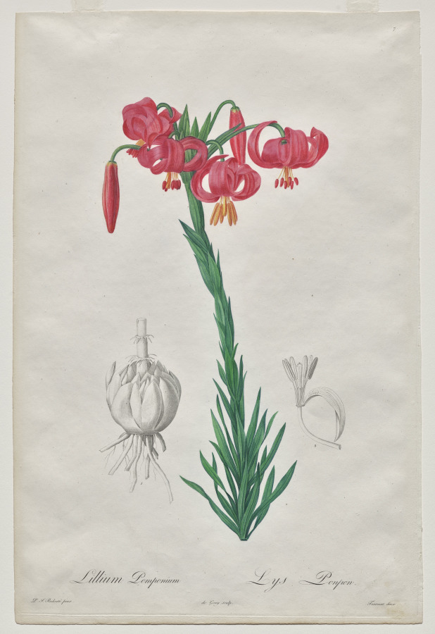
Vintage botanical illustrations: free plates for labels, packaging and posters
Two hundred years ago the best botanical artists drew roses and lilies leaf by leaf for kings and scientists. Today their plates are free, and they make the most beautiful labels.
Make it: Instagram post maker · Logo maker · Poster maker · Templates
Five museums in one search box
Paletoo’s Art tab searches the Art Institute of Chicago, the Met, the Cleveland Museum of Art, SMK, the Wellcome Collection and Wikimedia Commons at once, keeps only what they mark public domain or CC0, and places the work with its credit. Free, in your browser.
Open in Paletoo