How to make a concert poster from a template
A ready-made gig flyer, your bands and your date, a file for print and one for social.
What it is
A good concert poster does one job: it tells a passer-by who is playing, where and when, before they have walked past. The headliner is the biggest thing on it, the supporting acts come next in a clearly smaller size, then the date, the venue and the door price in plain, readable type. A poster that gives every line the same weight reads as a wall of words and gets ignored.
Starting from a template takes care of the hardest part, the layout. The grid, the type sizes, the colours and the texture are already balanced, so you only replace the words. The zine-style gig flyer used here is built that way: a short kicker, a three-line title, three band names on cut-out strips, the venue, the door price and a small tag at the bottom, every one of them a live text layer you can retype.
Where it is used
Concert posters go on venue doors, record-shop windows, lamp posts and noticeboards, and the same design usually goes out again as an Instagram post or story. Small promoters, bands, DJs, clubs and student societies need one for every date, often by tomorrow — which is why a layout you can reuse matters more than a one-off masterpiece.
Made in Paletoo with this mix:
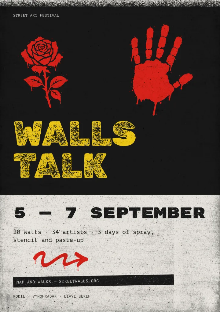
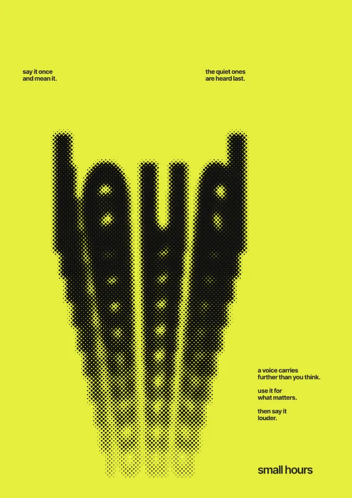
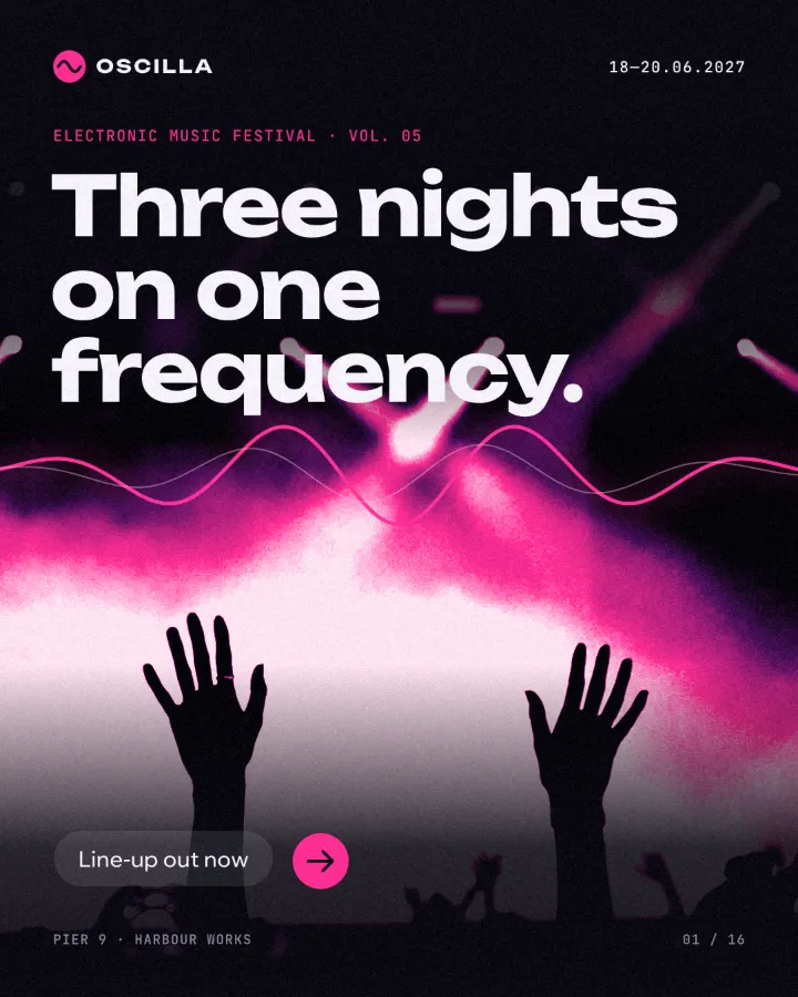
How to make it, step by step
In the editor, press Templates at the top of the left panel. Type “gig” into Search templates, or scroll down to the posters and art series and find “Gigs and zines”; the flyer is called “Poster: gig flyer”.
Open the card’s ⋯ menu and choose Open as new document (⌥-click does the same), so you work on your own copy. Click the big title to select it: the Design tab shows its font, size and colour.
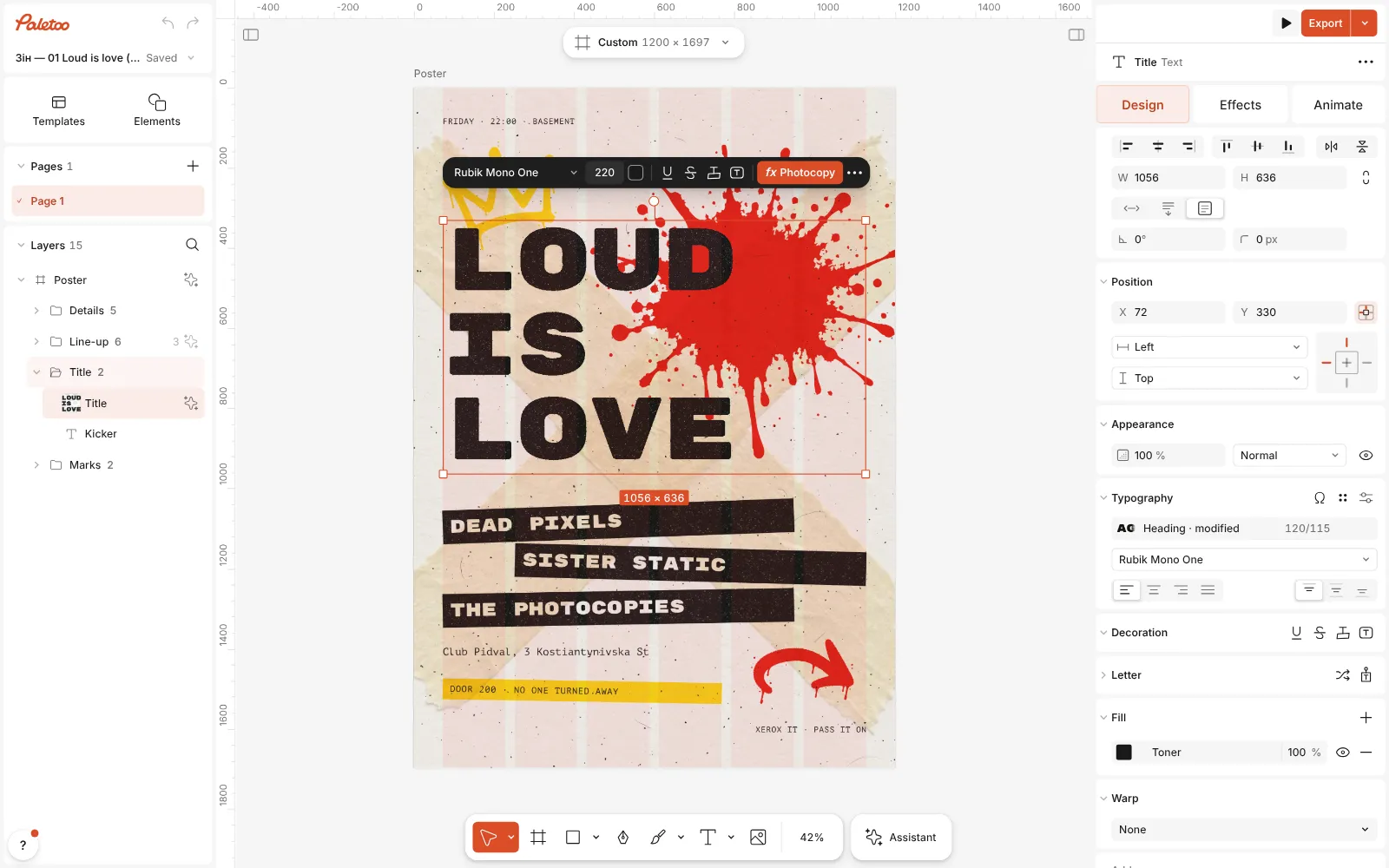
The gig flyer template open in Paletoo, its title selected, the Design tab on the right Double-click the title and type your headliner; Enter starts a new line. Do the same for the three band names, the date line at the top, the venue and the door price. The layout stays put, because each line is its own text layer; if a name outgrows its strip, select the strip and stretch it.
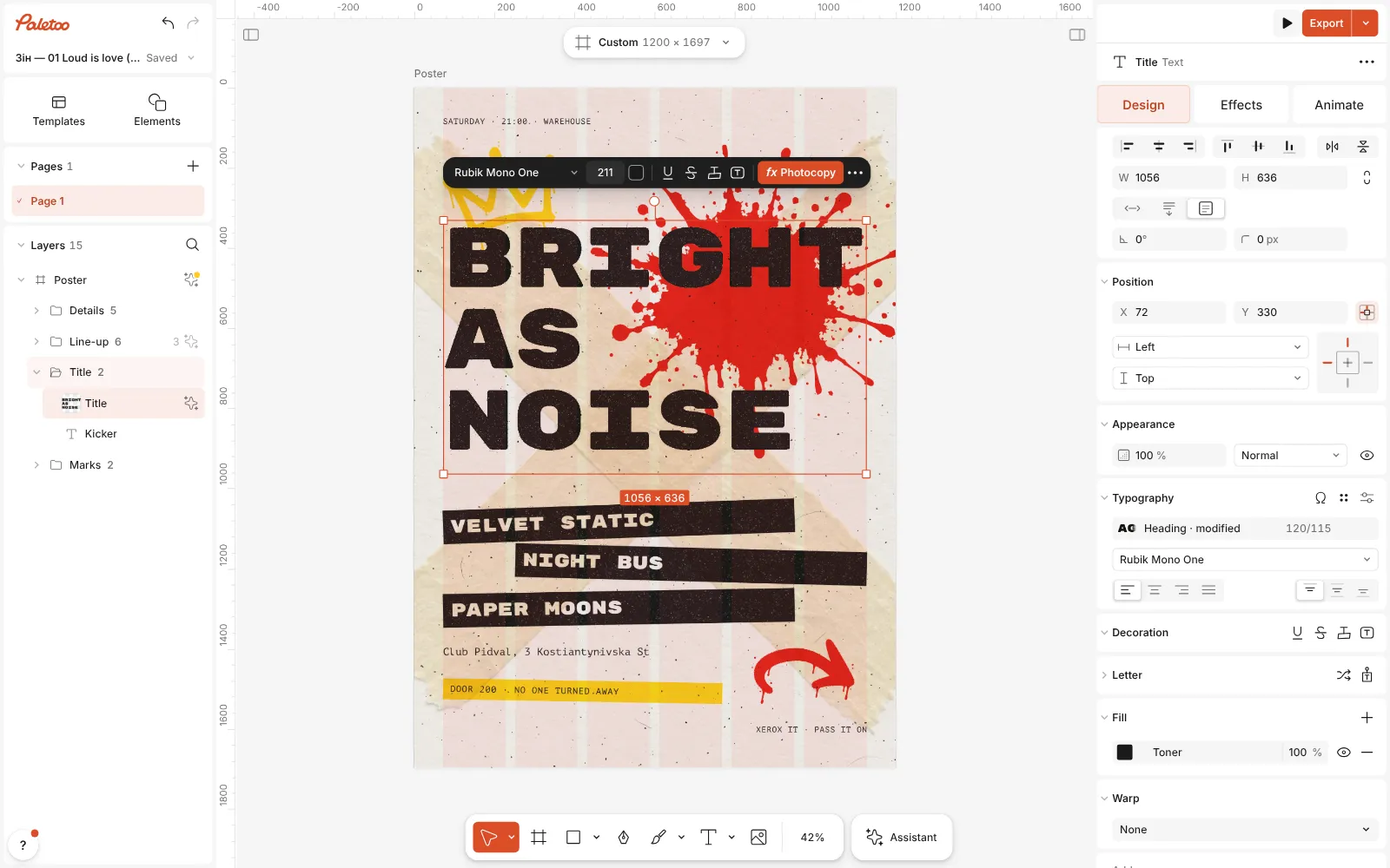
The words changed — a new title, three band names and the date — and the layout as it was Press Export in the top bar (⇧ ⌘ E). The window opens on one row: pick the file in its menu — PDF for the printer, PNG or JPG for screens — and check the preview.
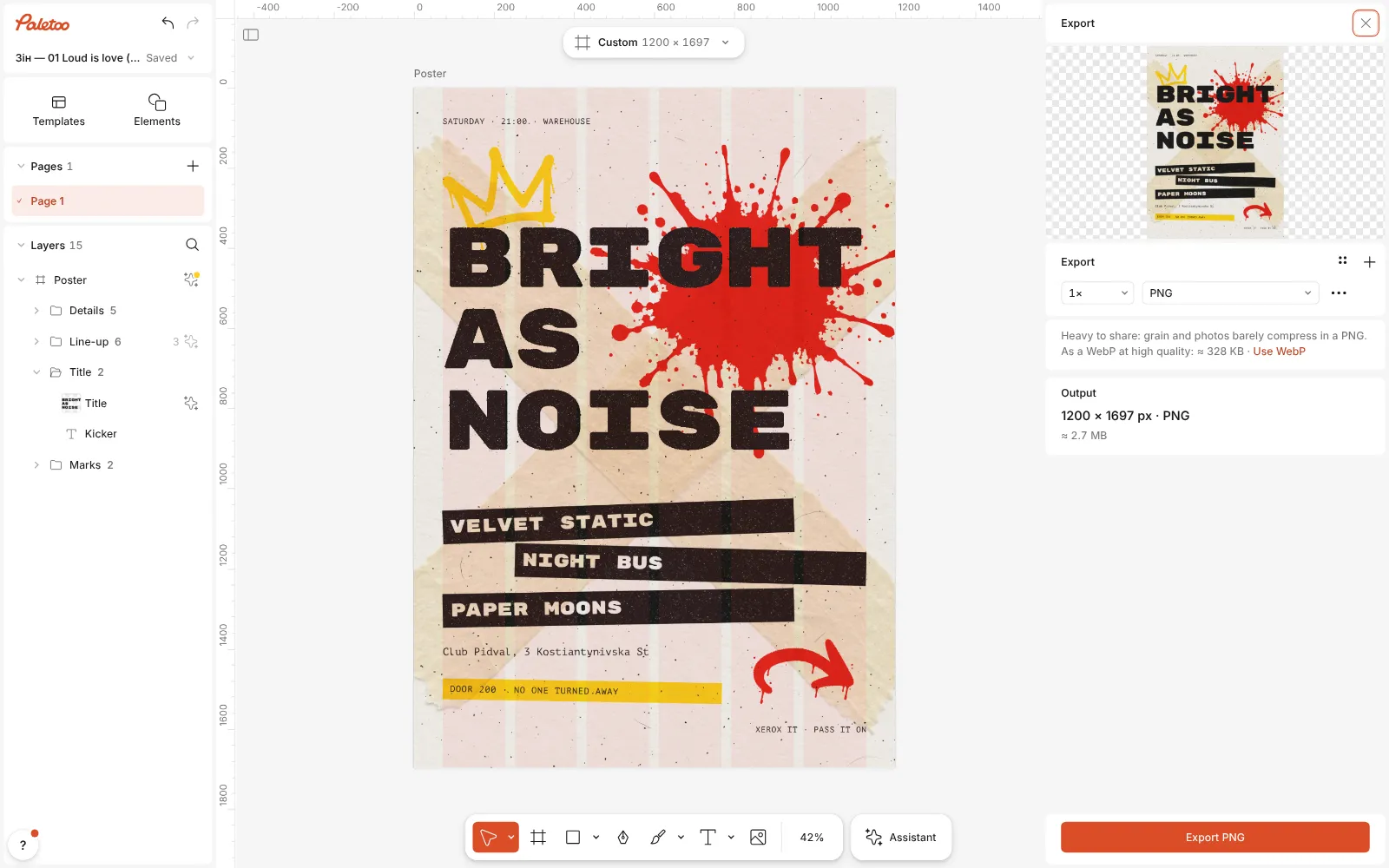
The Export window open: the poster’s preview, its PNG row and the size of the file For print, choose PDF and open the row’s ⋯: tick Include bleed and Crop marks, and switch to CMYK print if your print shop asks for it. The Print check under the row warns about low-resolution pictures and a missing bleed, and can add 3 mm of bleed for you.
For Instagram, export a PNG at 2×. The poster stays editable: open it next month, change the date and the line-up, and export again.
Watch it
Make it your own
Keep the hierarchy before anything else: headliner, then support acts, then date and venue, then price. If you add a fourth act, make it smaller rather than squeezing four names into the same size. A sign-maker’s rule of thumb is about 2.5 cm of letter height for every 3 m of viewing distance, so on an A3 sheet the headliner should be several centimetres tall to read from across the street, and the date at least half of that.
Print at a real size. The flyer has the proportions of an A-series sheet, so it scales to A3 (297 × 420 mm) or A2 (420 × 594 mm) without cropping: click the format button above the canvas, keep Scale artwork ticked, and under Resize this artboard pick A3 portrait. Keep the words at least 5 mm inside the trim and let the background run into the 3 mm bleed.
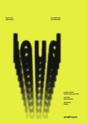
Contrast sells a poster from far away: dark type on a light sheet or the reverse, never mid-grey on mid-grey. To sell tickets from the wall, add a code: press ⌘ K, run QR code, paste the ticket link into Link and wait for ✓ Scans. Print it at least 2–3 cm wide, on a light patch, and test it with your phone before the print run.
Templates with this look
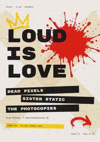
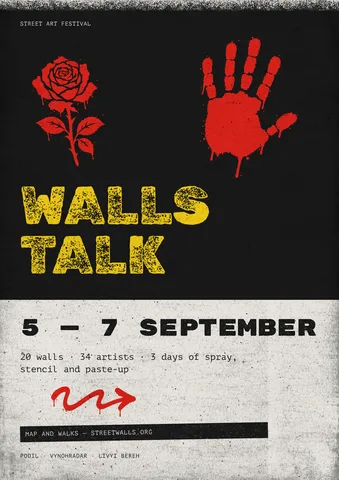
Questions
Can I use a photo of the band instead of the artwork?
Yes. Drag a photo onto the canvas and send it behind the type, or select a picture in a template and use Replace picture in the Design tab. Keep the title over a calm part of the image so it still reads.
Will the PDF be sharp enough to print?
Text and shapes stay vector in the PDF, and effects are drawn at the export’s own resolution. For a large print, resize the artboard to A3 or A2 with Scale artwork on before you export, so the file has real print dimensions.
How do I make a version for Instagram?
Use Make a copy as in the format button’s menu to add a 4:5 post or a story next to the poster, then move the title and the line-up until they fit. Each copy is its own artboard and exports on its own.
Is there a Ukrainian version of the flyer?
Yes, “Гучно — це любов”. The card’s ⋯ menu opens it, and you can also type Ukrainian straight into the English one: both fonts have Cyrillic.
More effects
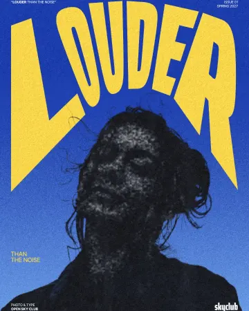
How to make a photocopy effect
Dense toner blacks, greys in scan lines and grey copier paper, from any photo.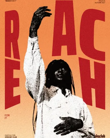
How to make a grunge effect with torn edges
Pure black and white, a ragged torn edge and spatter in the shadows.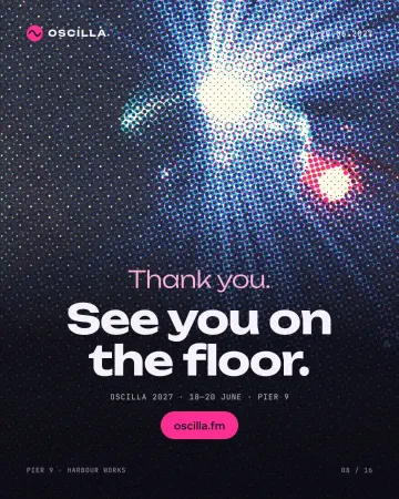
How to make a halftone effect
Comic-book CMYK dots, newspaper screens or one ink.
Read the overview: graphic design trends 2026
Make it online: Poster maker · Flyer maker · QR code generator · Mockup generator · Poster templates · Event and launch templates · Contact and call-to-action templates
Try it on your own design
Paletoo opens in your browser, with no sign-up. Every effect here is live: change the picture or the words and the effect follows.
Open in Paletoo