Techniques6 min readFreeUpdated 2026-11-06
Font pairing for posters: six combinations that work
One loud voice, one quiet one, and a clear difference between them.
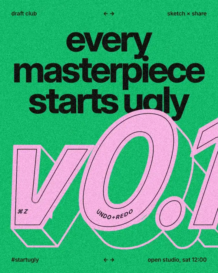
The simplest rule for font pairing on a poster: give it two voices. A loud display face for the few big words, and a quiet text face or a mono for everything else, made clearly different in size, weight, width or style. Fonts that are almost the same look like a mistake; fonts that are clearly different look like a decision. You can even use one family at two extremes.
That is what this poster does. “every masterpiece starts ugly” is set in Inter at a heavy weight and 182 px, a giant pink “v0.1” in Inter Italic sits below it, and every small line — “draft club”, “open studio, sat 12:00” — is Inter again at 28 px. One family, five text styles, and the hierarchy is perfectly clear.
Two voices, and what makes them different
Every poster has two kinds of text: the words people see from across the room, and the words they read once they come closer. The first need character and weight; the second need to be calm and legible at a small size. Give each its own face, or its own weight of one face, and never let a third voice in without a clear job, such as a mono for dates and codes.
Contrast can come from several places: weight (black against regular), width (condensed against wide), style (serif against sans, a script against a grotesque), case (capitals against lower case) and size. Pick one or two of these and push them hard. A bold sans with a slightly bolder sans is not a pairing; a heavy condensed sans with a light book serif is.
One family, many voices
Pairing within one big family is the safest start, because the shapes already agree. Here the headline is Inter at weight 740 with a line height of 84 % and tight negative letter spacing, so three lines lock into one block. The small lines are Inter at weight 600 and 28 px: the headline is 6.5 times their size. The arrows are in Inter Tight, a narrower cut of the same design.
A useful ratio for posters: the headline at least four to six times the size of the small type, and the small type no smaller than 1.5 % of the poster’s width. Below that ratio, the two voices start to blur into one.
Six pairings that work, with Cyrillic
All of these are in Paletoo’s font library and set Ukrainian properly, with ґ, є, і, ї and the apostrophe. 1. Inter Black with Inter Regular: one family, extreme weights, as on this poster. 2. Unbounded with Fixel Text: a wide, round, loud display face over a calm Ukrainian grotesque. 3. Oswald with Lora: a tall condensed gothic for long headlines, a book serif for the text. 4. Playfair Display with Manrope: a high-contrast serif with a tidy modern sans, for menus, fashion and events. 5. Fixel Display with IBM Plex Mono: a grotesque headline with technical mono captions, for tech, data and timetables. 6. Pinyon Kyiv with Cormorant: a formal script for one or two words, with a refined serif under it, for invitations and concerts.
For more fonts with a real Ukrainian Cyrillic, each shown on a specimen, see Ukrainian fonts for design, and for how type alone can carry a poster, the typography poster guide.
Common mistakes
Two similar sans serifs side by side. Two display faces fighting for attention. A script in all capitals, or used for a paragraph. Five weights where two would do. Loose letter spacing on big type, which needs it tighter. And a font without the letters you need: if a Ukrainian word suddenly shows in a different font, the face has no Cyrillic, so pick one that does before you go further.
Made in Paletoo
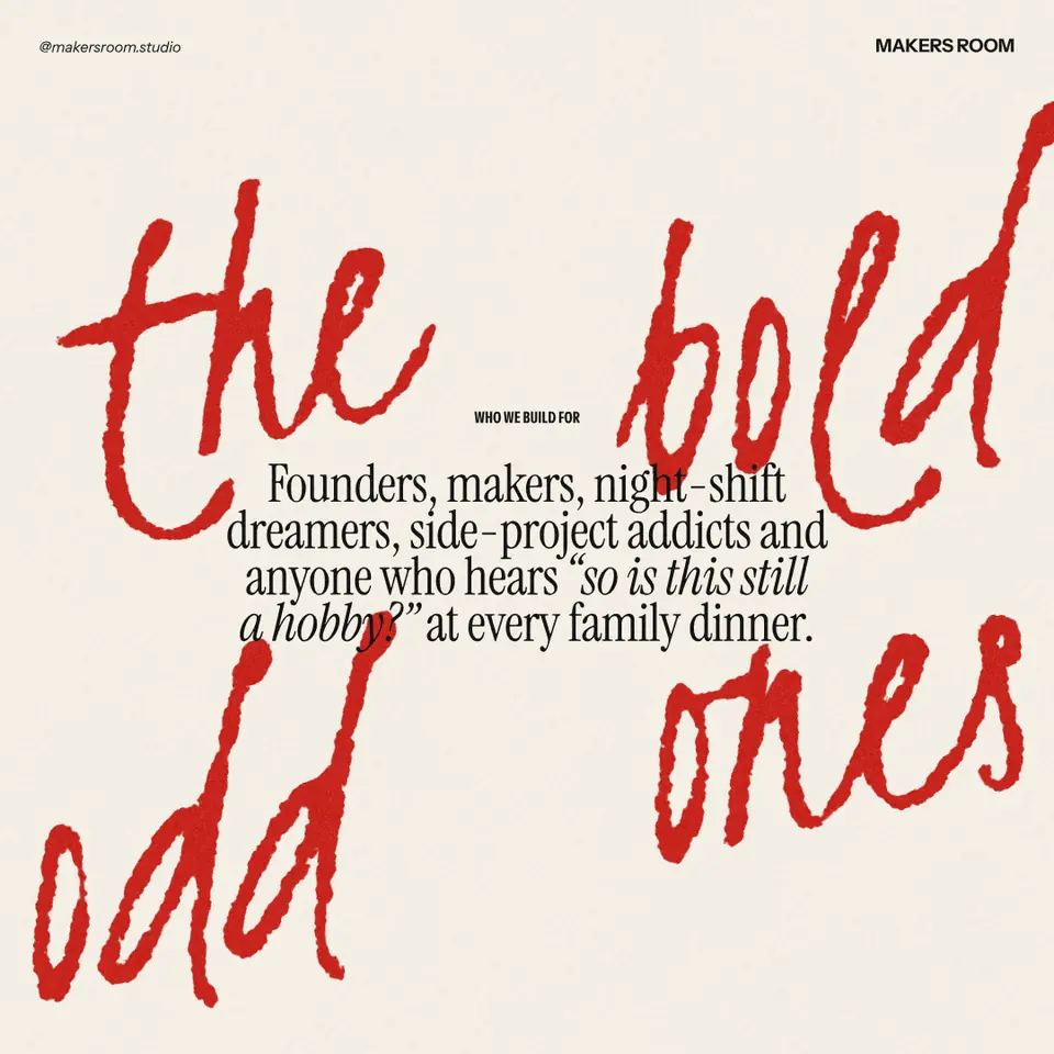
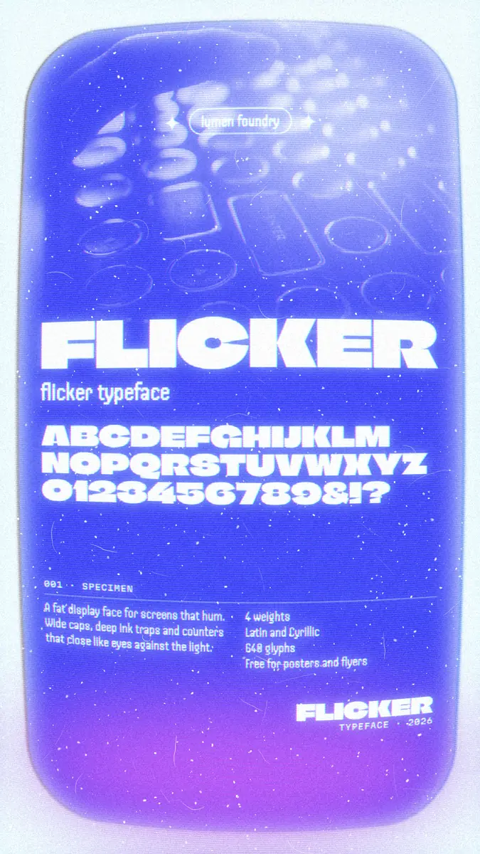
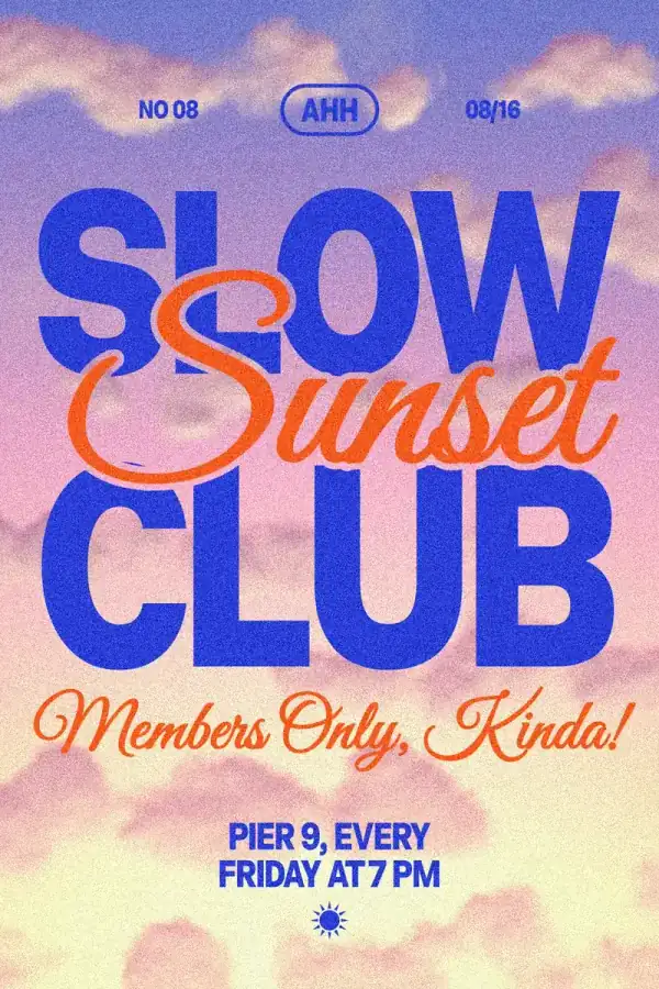
Every picture on this page was made in Paletoo — these three with the same steps on other templates:
Step by step in Paletoo
Press “Open in Paletoo” to open the post as your own document. Layers shows a header row, the headline, the big “v0.1” with its block shadow, two small captions on the ring, and a footer row.
Click the headline to select it. The Design tab shows its place, and Typography its font, Inter, at 182 px with a Weight of 740, a Line height of 84 % and a tight negative Letter spacing.
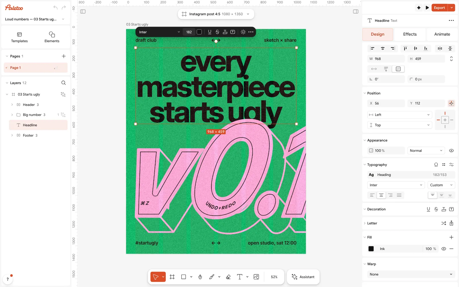
The starts ugly post open in Paletoo: the headline selected, Inter at 182 px under Typography in the Design tab Click the small line at the bottom right, “open studio, sat 12:00”. Typography shows the same family, Inter, at 28 px and a Weight of 600: the quiet voice, linked to the text style called Label.
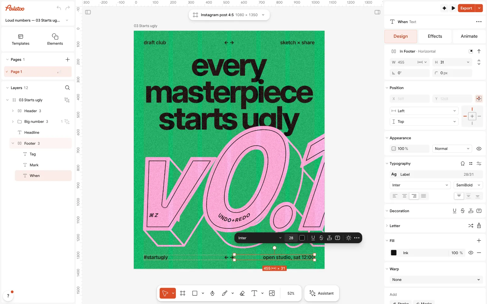
The small line “open studio, sat 12:00” selected: Inter at 28 px, weight 600 Click an empty part of the canvas so nothing is selected. The Design tab lists the document’s Text styles: Number, Heading, Label, Symbols and Ring caption, each with its font and size.
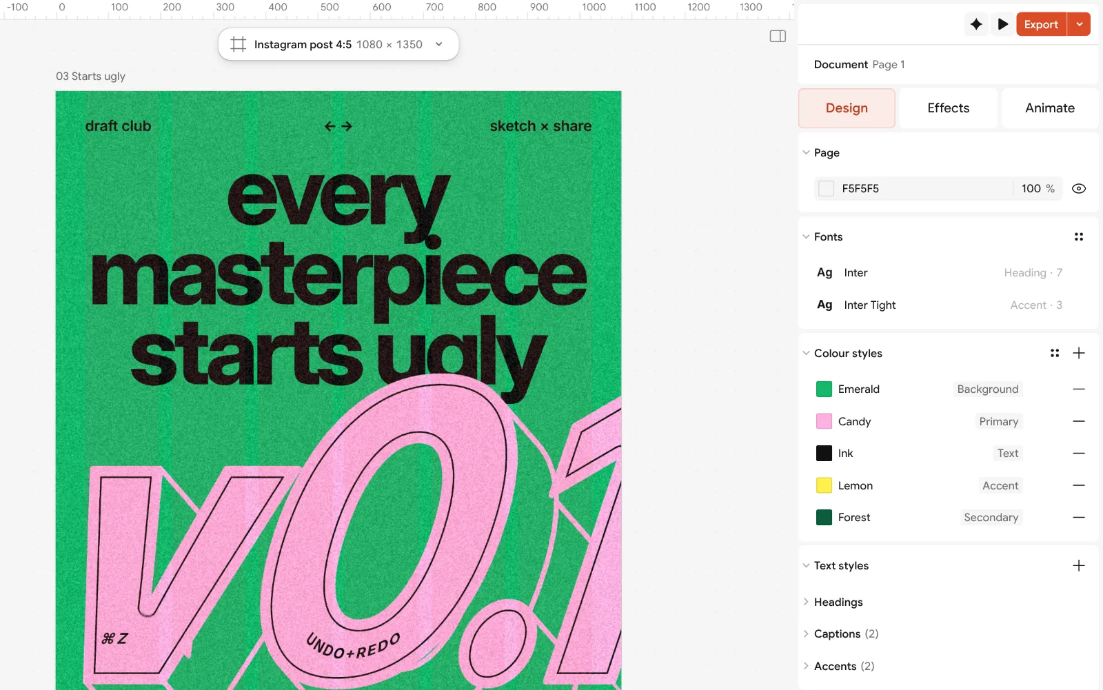
Nothing selected: the document’s text styles listed in the Design tab Double-click the headline to write your own words. To try another pairing, open a style with Edit style and choose a new font: every line linked to it changes at once, so you can compare pairings in seconds.
When the pairing feels right, press Export for a PNG of 1080 × 1350 for the feed, or a PDF with Include bleed to print it as a poster.
Make it your own
Change the Heading style’s font in Edit style and leave Label alone: you are testing only the loud voice, which is the one that changes the poster’s character.
If a new headline font looks too loose at 182 px, lower its Letter spacing a few steps; big type almost always wants less space than its default.
For a three-voice version, give the dates and the hashtag a mono such as IBM Plex Mono, at the same 28 px Font size, so the third voice changes texture, not size.
Questions
How many fonts should a poster have?
Two is the usual answer: a display face for the big words and a text face for the rest. A third, often a mono, is fine if it has a clear job such as dates or captions.
What fonts go well together?
Fonts that are clearly different in one way and similar in feel: a heavy condensed sans with a book serif, a high-contrast serif with a clean sans, a script with a calm serif, or one family at two extreme weights.
Can I use two weights of the same font instead of a pair?
Yes, and it is the safest choice for beginners. Use weights far apart, such as black and regular, and a big size difference.
What size should poster text be?
Make the headline at least four to six times the small type. On a 1080 px post, small lines of 24–32 px read well; on an A3 print, keep body text above about 9 pt.
Which poster fonts support Ukrainian?
Inter, Unbounded, Fixel, Oswald, Lora, Playfair Display, Manrope, IBM Plex Mono, Cormorant and Pinyon Kyiv all set Ukrainian, and all are in Paletoo’s library for free.
Make it online
- Poster makerMake a poster from a template that already has the layout right, then export a print-ready PDF or an image for screens.
- Text effects onlineChrome, gold foil, emboss, cut-out letters, outlines and warps — and the words stay editable text.
- Instagram post makerDesign a post at the right size from a real template, then export a sharp PNG or JPG — free, in your browser.
Free design templates: Poster templates · Social media post templates
Try it on your own design
Paletoo opens in your browser, with no sign-up. Every effect here is live: change the picture or the words and the effect follows.
Open in PaletooRead next
- 01
 Typography poster: how to make the type the pictureNo photo needed: when the words are drawn big enough, they are the image.
- 02
 How to keep brand fonts and colours consistent across every designName the colours and the type once, link every layer to them, and change them in one place.
- 03
 Swiss grid poster: how to design with a modular gridColumns, rows, a margin and one accent: the oldest system in poster design, built on a real poster.