Techniques6 min readFreeUpdated 2026-11-06
Swiss grid poster: how to design with a modular grid
Columns, rows, a margin and one accent: the oldest system in poster design, built on a real poster.
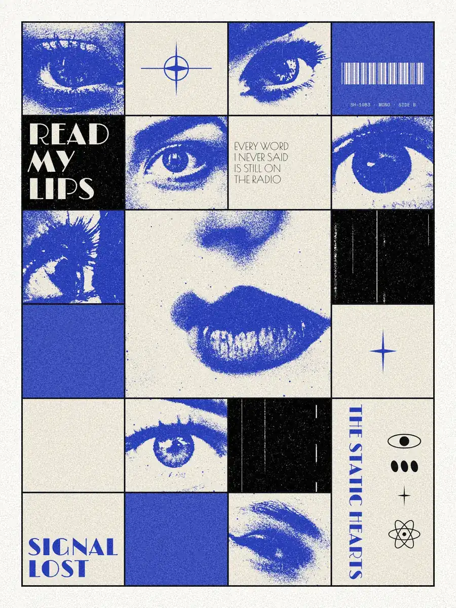
A Swiss grid poster is built on a modular grid: the page is divided into equal columns and rows, every picture and every block of type fills one or more of those cells, and the type is set flush left in two or three sizes. It comes from the International Typographic Style of 1950s Switzerland — Josef Müller-Brockmann, Armin Hofmann, Emil Ruder — and it still works because the reader feels the order before reading a word.
This guide explains the parts of the grid with real numbers, gives a six-step way to build one, and then shows it all on a record poster made in Paletoo: READ MY LIPS, photocopied eyes and lips in a 4 × 6 grid with ultramarine cells. The grid on it is a live element, so you can change the columns and watch the pictures follow. For the wider set of habits, read Poster design tips too.
The parts of a modular grid
Margins are the empty frame around everything. On a poster they are usually generous, about 4–6 % of the short side: 12–18 mm on A3 (297 × 420 mm), or 48–72 px on a 1080 px post. This poster keeps 56 px on 1200 × 1600.
Columns divide the width. Four, six or twelve are the usual choices: four is bold and easy, twelve gives you the most ways to split the page into halves, thirds and quarters. Rows divide the height the same way, and where a column meets a row you get a module, the basic cell everything is measured in.
Gutters are the gaps between modules. A common rule is to make them equal to the line height of your small text, so 4–6 mm on A3. You can also set the gutter to zero and draw the lines instead, which is what this poster does: a 4 px black rule around every cell turns the grid into a table you can see.
Make the modules roughly the shape of your pictures. Here the cells are 272 × 248 px, nearly square, which suits faces cropped close. Tall portraits want tall modules; landscapes want wide ones.
Six steps to build one
1. Choose the format and set the margin before anything else. 2. Divide the inner area into columns, then rows, and look at the module: if it is a thin sliver, change the counts. 3. Place the one big thing across several modules — the lips here span two by two — so it dominates without leaving the system.
4. Fill other cells with pictures cropped to the cell, not floating in it, and treat them all the same way, here with one photocopy look, so eight different photos read as one set. 5. Set the type flush left and ragged right, and hang every block from a module edge: one family, or two at most, in two or three sizes. 6. Add one accent colour on a few cells, then break the grid once, on purpose: a name turned on its side, a word running past its cell.
Common mistakes and a checklist
Centring everything: Swiss layouts are asymmetric, and a centred block hides the grid. Too many sizes of type: three is plenty. Pictures that almost fit a cell, a few pixels off, look worse than pictures that clearly break out of it. And a grid with no rest: leave a few cells empty or in flat colour, so the full ones have room to breathe.
Before you export, check: every edge sits on a grid line; one thing is clearly the biggest; the type is flush left in no more than two families; there is one accent, used sparingly; at least one cell is empty or flat; and the one rule-break looks deliberate, not accidental.
Made in Paletoo
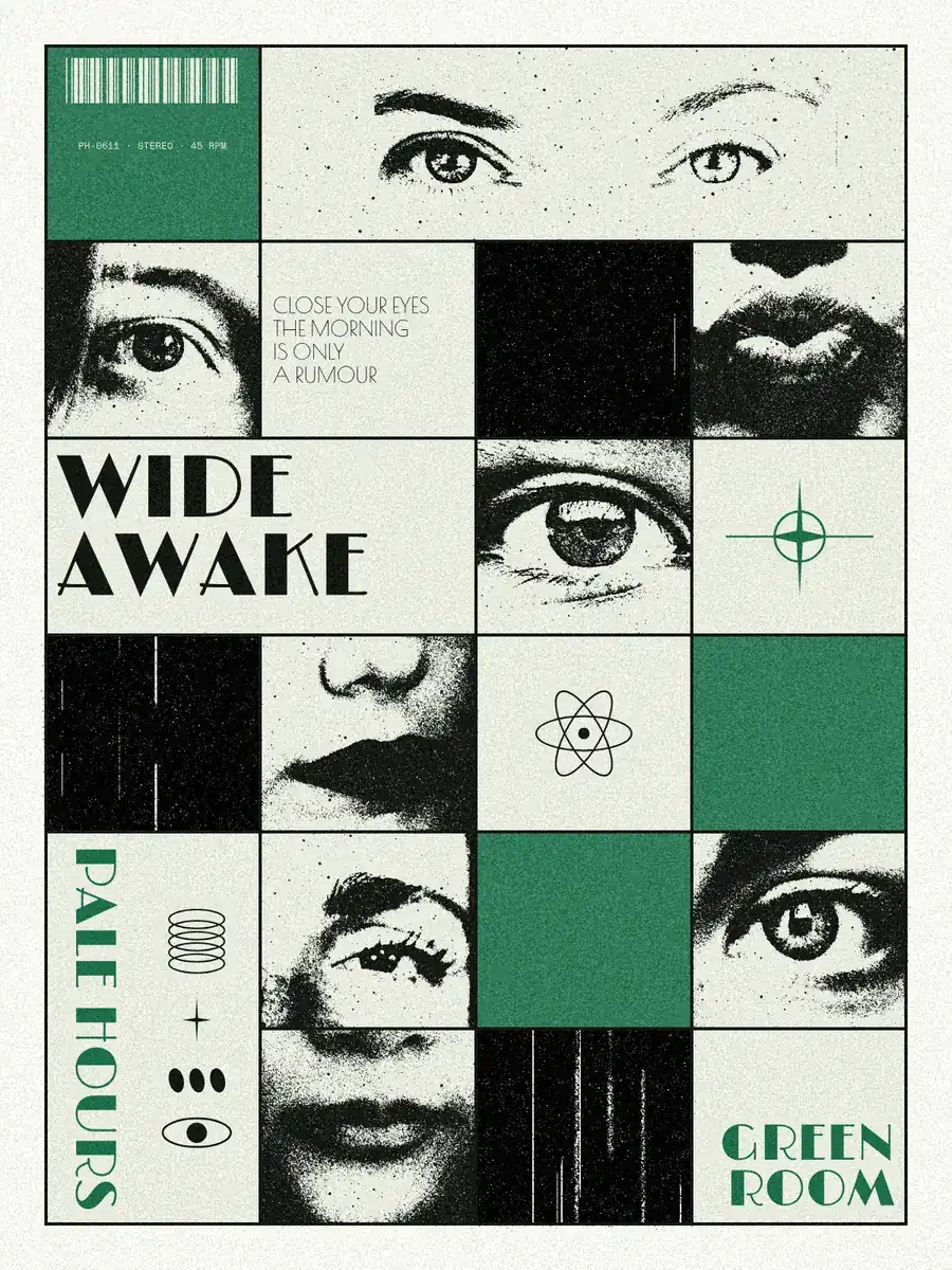
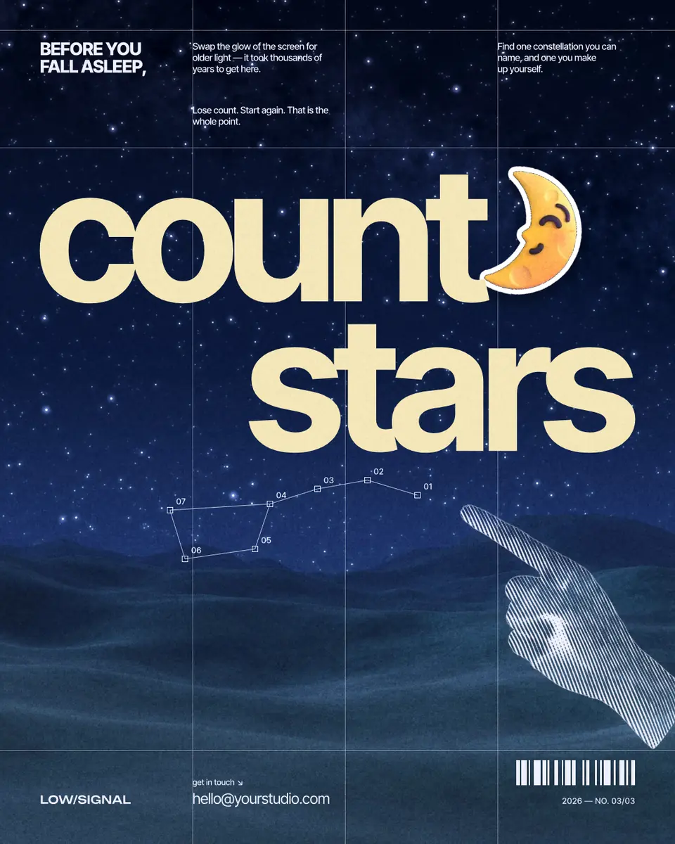
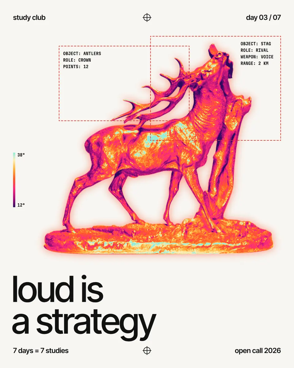
Every picture on this page was made in Paletoo — these three with the same steps on other templates:
Step by step in Paletoo
Press “Open in Paletoo” to open the Read my lips poster as your own document. Layers shows the type, a few small symbols, eight photos, six coloured cells and the Grid that holds them all.
Click a line of the grid to select it. The Design tab shows four Columns and six Rows, a Gap of 0 with a Frame around the whole, and 4 px black lines. Two groups of cells are joined with Merge: a large one for the lips and a tall one for the band’s name.
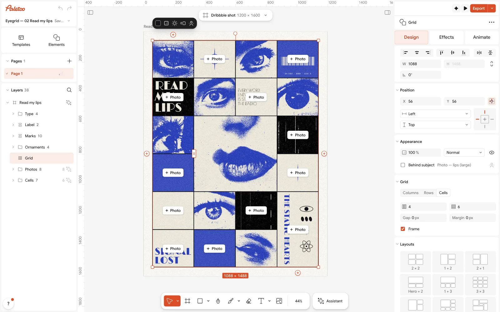
The Read my lips poster open in Paletoo: the grid selected, four columns and six rows in the Design tab Click the large photo, “Photo — lips (large)”, and open the Effects tab. Under Applied are two steps: Tone, which turns it black and white, a little brighter and harder, and Xerox, which prints it like a photocopy in blue toner.
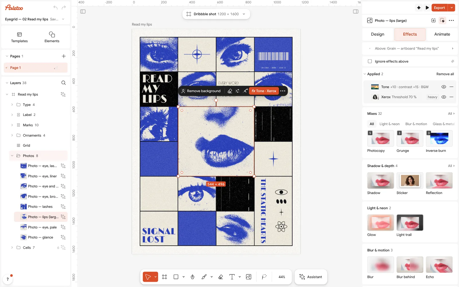
The large lips photo selected: Tone and Xerox under Applied in the Effects tab Click the Xerox row to open it. Threshold decides where grey turns to toner, Toner and Paper are its two colours, ultramarine and bone, and Specks and Streaks add the dirt of an old copier.
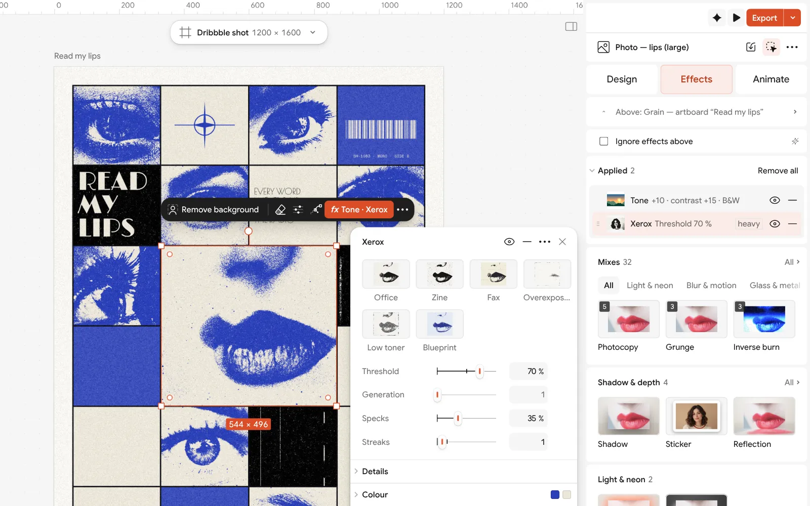
The Xerox step open: threshold, toner and paper colours, specks and streaks beside the poster To use your own pictures, select a photo and press Replace picture: the new one takes the cell and keeps the Tone and the Xerox, so it matches the other seven at once. Double-click a picture to recrop it inside its cell.
Double-click the title to write your own words, then press Export: a PNG of 1200 × 1600 for the screen, or a PDF with Include bleed and Crop marks for print.
Make it your own
The ultramarine is a colour style, linked to the accent cells and to the toner of all eight photos. Click an empty part of the canvas, change it once under Colour styles in the Design tab, and the whole poster changes key. Keep to one accent; a second one breaks the calm.
If the photos come out too dark, lower the Threshold a little; if faces lose their shape, raise Contrast in the Tone step first. Faces cropped tight to eyes and lips survive photocopying far better than whole heads.
To try another grid, change Columns or Rows: the photos stay in their cells and resize with them. Distribute evenly makes uneven columns equal again, and a Gap of 16–24 px turns the single rules into separate framed cells.
Questions
What is a Swiss grid poster?
A poster laid out on a modular grid in the International Typographic Style: columns and rows that every element lines up to, flush-left sans-serif type, objective photographs and plenty of white space.
How many columns should a poster grid have?
Four to six suits most posters; twelve if you need many ways to split the page. Choose the rows so that each module is close to the shape of your pictures.
Which fonts are used in Swiss design?
Classic Swiss posters used grotesques such as Akzidenz-Grotesk, Helvetica and Univers, set flush left. Any clean grotesque works; this poster swaps in a display face, Limelight, for a record-sleeve feel.
What is the difference between a column grid and a modular grid?
A column grid divides only the width. A modular grid divides the height too, giving cells, which suits posters with many pictures or separate blocks of text.
Can I make a grid poster without InDesign?
Yes. Paletoo has a live Grid element and layout grids with columns, gutters and margins, in the browser and free, with PDF export for print.
Make it online
- Poster makerMake a poster from a template that already has the layout right, then export a print-ready PDF or an image for screens.
- Photo collage makerDrop your photos into a ready grid — two, three, four or five frames — and every picture fills its frame without stretching.
- Photo effects onlineGive a photo a film, print or glitch look in one click — and keep every step editable afterwards.
Free design templates: Poster templates · Social media post templates
Try it on your own design
Paletoo opens in your browser, with no sign-up. Every effect here is live: change the picture or the words and the effect follows.
Open in PaletooRead next
- 01
 Poster design tips: 9 tricks that make a poster look designedNine habits that separate a designed poster from an assembled one.
- 02
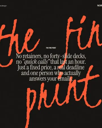 Typography poster: how to make the type the pictureNo photo needed: when the words are drawn big enough, they are the image.
- 03
 How to make a photocopy effectDense toner blacks, greys in scan lines and grey copier paper, from any photo.