Techniques5 min readFreeUpdated 2026-11-06Save to Pinterest
Typography poster: how to make the type the picture
No photo needed: when the words are drawn big enough, they are the image.

A typography poster has no picture to hide behind. The words are the image, so every decision shows: the size, the face, the angle, the space between letters, the texture of the ink. That is exactly why type-only posters look so good on a wall and in a feed — and why they are a great way to learn design.
This guide shows how type becomes the picture, on a studio poster from the Scrawl series: three red brushed words, “the fine print”, sprawling over black around a short manifesto set in a serif. Every word on it is live text; the brushed edge is an effect, not a drawing.
Five ways type becomes the image
Scale and crop. Set one word so big that it runs off the edge. A word cut by the frame stops being a label and becomes a shape, and the reader’s eye completes it.
Two voices. Put a hand-made face — a brush, a scrawl, a script — against a set one, a serif or a grotesque. The contrast between a gesture and a system is the oldest trick in typographic posters, and it works every time.
Texture on the letters. Clean vector type reads as digital. A rough edge, a photocopy, a halftone or a little grain on the letters makes them feel printed, painted or worn.
Angle and rhythm. Tilt one word a few degrees and leave the rest straight, or let three words climb across the page in a zigzag. Movement in the layout reads as energy.
Layering. Let a big word sit behind smaller text, or cross over it. On this poster the brushed words run under and around the manifesto, so both read and neither is a background.
Hierarchy and pairing
Every typographic poster still needs a reading order: what you see first, what you read second, what you find last. Usually that is the big word, then a short paragraph or a date, then the small print — a name, an address, a handle — in the corners.
Keep the pairing to two families, three at most. A brush with a serif, a heavy grotesque with a mono, a script with a condensed sans: each pair has one loud face and one quiet one. Give the quiet text a comfortable size and line length, about 8 to 12 words a line, so it is a pleasure to read rather than a texture.
Common mistakes
Too many effects: a shadow, a glow, a gradient and an outline on the same word. Pick one. Words too evenly sized, so nothing leads. Letters too loose: big type needs tighter spacing than body text, often negative. And text crammed into the safe centre when it wanted to break the edge.
Made in Paletoo
Every picture on this page was made in Paletoo — these three with the same steps on other templates:
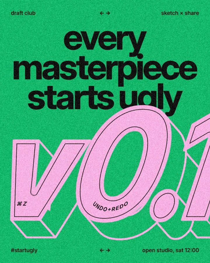
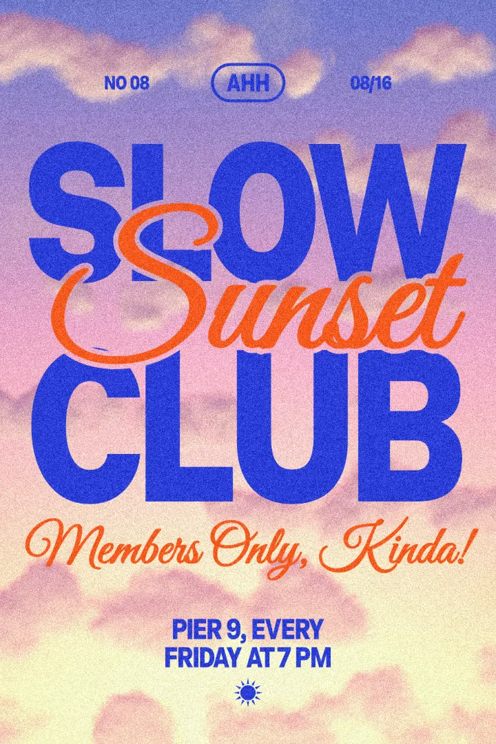
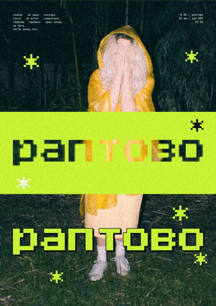
Step by step in Paletoo
Press “Open in Paletoo” to open The fine print as your own document. Layers shows a header, a statement block, three brush words and a paper background.
Click “the” in the top-left corner to select it. The Design tab shows it tilted by −12°, and Typography its brush font, Kristi, at 460 px, with the same red as both fill and stroke.
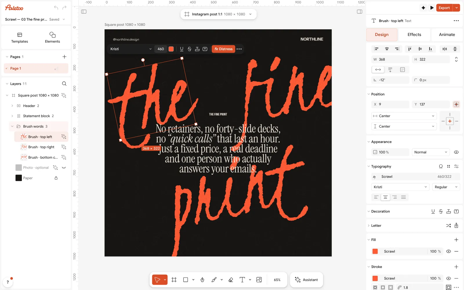
The fine print open in Paletoo: the brush word “the” selected, tilted, its font and size under Typography in the Design tab Open the Effects tab. Under Applied is one step, Distress, which roughens the edges of the letters as if painted on rough paper.
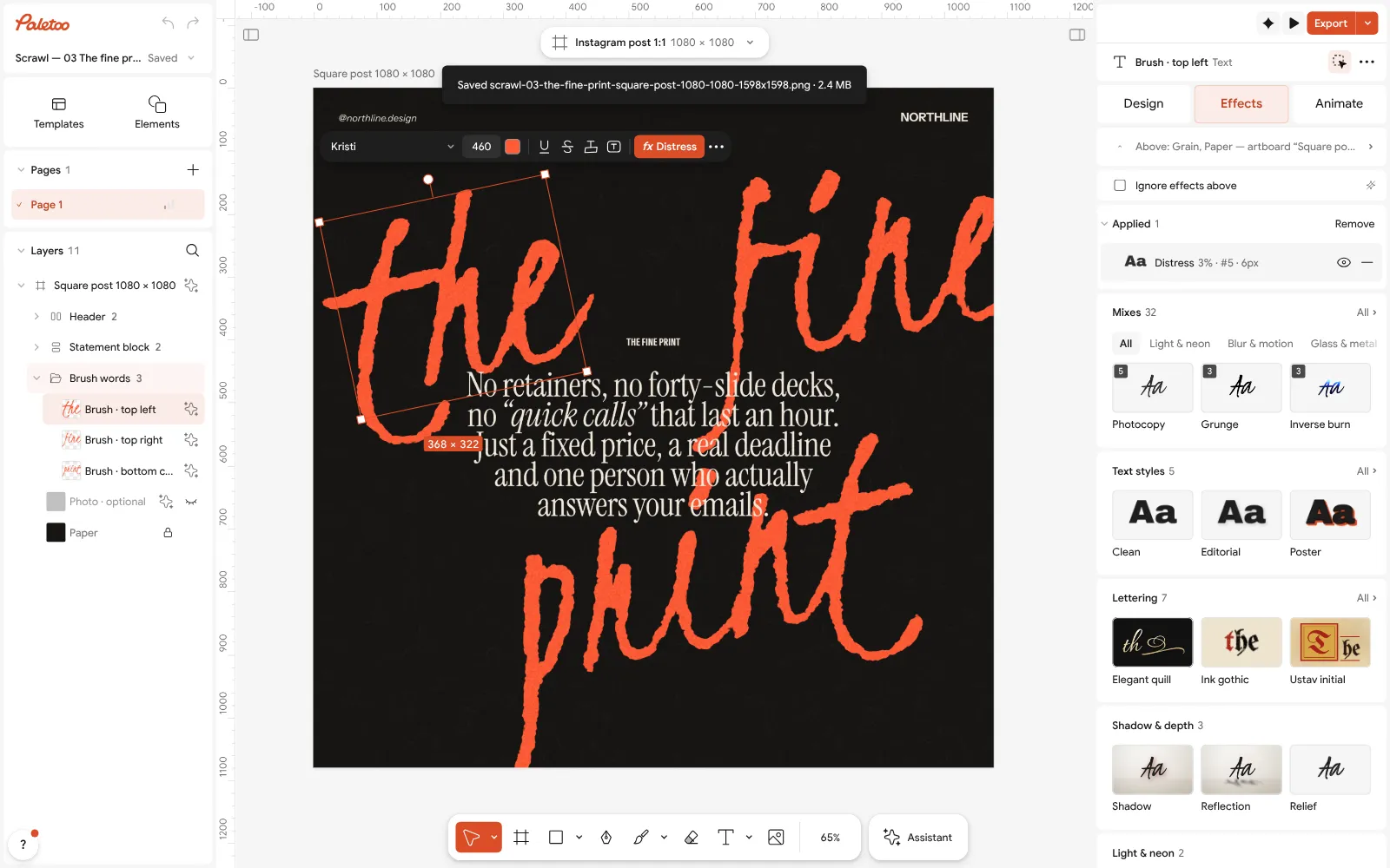
The word in the Effects tab: one Distress step under Applied, the Mixes and Lettering below Click the Distress row to open it. Roughness, Size and Edge decide how worn the letters look, and the cards above them offer other kinds of wear, from torn to stamped.
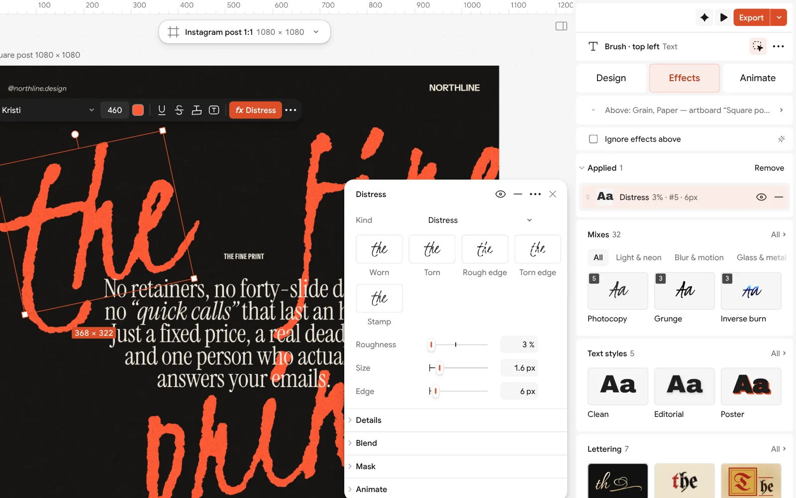
The Distress step open: Roughness, Size and Edge beside the poster Double-click any brush word to write your own; the effect follows the new letters. Then click the manifesto and write yours in its place — a short paragraph reads best.
Press Export for a square PNG for the feed, or a PDF with Include bleed to print it. To make the words move, use Add animation in the Export window and export MP4 or GIF.
Make it your own
Keep Roughness low on big type. A few per cent is enough at 460 px; more and the edges start to look like a filter rather than ink. On small type, switch the effect off: it only blurs the text.
Turn all three brush words together for a consistent rhythm, or give each its own angle for a looser one. Use the corner handles or Rotation in the Design tab, and keep the angles small, under 15°.
The statement is set in a quiet serif so the brush can be loud. If you change the font, keep that balance: a calm, readable face at a size that fits about eight words a line.
Questions
What is a typography poster?
A poster where the words are the main image, with no photo or illustration doing the work. The size, the font, the layout and the texture of the type carry the whole design.
Which fonts work for a typographic poster?
A loud display face for the big words — a brush, a heavy grotesque, a condensed or a high-contrast serif — paired with a quiet text face or a mono. Two families are usually enough.
How do I make text look hand-painted or printed?
Use a brush or script font, then add a texture to the letters: Distress or Torn edges for paint, Xerox for photocopy, Halftone for print. Keep it subtle on large type.
Can I animate a typography poster?
Yes. In Paletoo, Add animation in the Export window gives the type motion, and you can export it as MP4, GIF, WebM or Lottie.
Do I need Illustrator for typographic posters?
No. Illustrator is excellent for it, but a browser editor with real type controls — kerning, variable fonts, text on a path and live effects — is enough for most posters.
Make it online
- Poster makerMake a poster from a template that already has the layout right, then export a print-ready PDF or an image for screens.
- Text effects onlineChrome, gold foil, emboss, cut-out letters, outlines and warps — and the words stay editable text.
- Animated text makerMake words move in one click — rise, typing, pop, wave — and export a video for Reels, a GIF for chats or a Lottie file for the web.
Free design templates: Poster templates · Social media post templates · Story and Reels templates
Try it on your own design
Paletoo opens in your browser, with no sign-up. Every effect here is live: change the picture or the words and the effect follows.
Open in PaletooRead next
- 01
 Poster design tips: 9 tricks that make a poster look designedNine habits that separate a designed poster from an assembled one.
- 02
 A Kittl alternative for type posters, merch and printBold type, 3D numbers and print-ready files, compared fairly with Kittl.
- 03
 How to make knockout text in Photoshop — and the one-click wayA headline cut out of the photo, with a clean band of background around every letter.