Techniques5 min readFreeUpdated 2026-11-06Save to Pinterest
Graphic design for beginners: your first poster in 30 minutes
Four basics, two rules for type and colour, and a first design you can post today.

Graphic design looks like a talent from the outside, but most of it is a few principles applied with patience. You can learn the basics in an evening and see the difference in your very next post. You do not need expensive software either: everything in this guide is free.
We will start with four basics, add two short rules for type and colour, and then make a real post: an invitation to an evening photo walk, “Blue hour”, built from a template in Paletoo. By the end you will have changed its words and picture, checked it like a designer, and exported it.
The four basics
Hierarchy: decide what is read first, second and third, and make it obvious with size and weight. On the Blue hour post, the two big words come first, the short invitation second, the small note and the number last.
Contrast: things that are different should look clearly different — big against small, dark against light, bold against thin. Half-differences look like mistakes.
Alignment: every element lines up with something else. Pick one or two edges and put things on them; a design where everything is centred by eye rarely looks tidy.
Space: leave room around things. Beginners fill every gap; designers leave gaps on purpose so the important things can breathe.
Type and colour, the short version
Type: use one or two fonts. A clean sans for most things is never wrong; add a second only for contrast. Make the headline at least three times the size of the text, keep body lines to about 8 to 12 words, and do not stretch or squash letters — choose a condensed or a wide font instead.
Colour: two or three colours plus one accent is plenty. The easiest way to pick them is to take them from your photo: on this post the blues come from the evening sky, and the white type is the brightest thing in the picture. Check that text has enough contrast with what is behind it.
A 30-minute plan for your first design
Minutes 0–5: write the message in one sentence and list what must be on it — a title, a date, a place, a link. Minutes 5–10: pick a template whose layout fits that amount of text, not just its colours. Minutes 10–20: replace the words and the picture, and delete anything you do not need. Minutes 20–25: check it — squint at it, look at it small, read it aloud. Minutes 25–30: export it at the right size and post it.
Starting from a template is not cheating. It is how you learn what good spacing and good sizes feel like. After a few designs, start from a blank artboard and try to rebuild a layout you liked from memory.
What to learn next
Once the basics feel natural, learn a grid properly, learn to pair two fonts, and learn one effect deeply — halftone, duotone, grain — rather than ten superficially. Copy posters you admire for practice, never for publishing, and collect the ones that stop you scrolling. Read the next guide, Poster design tips, when you are ready.
Made in Paletoo
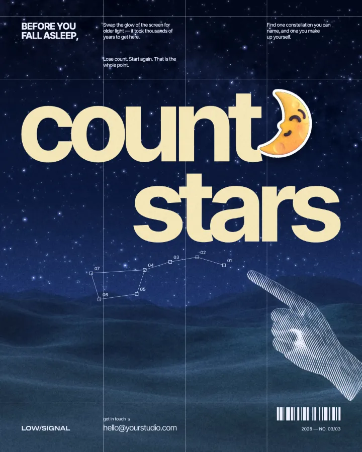
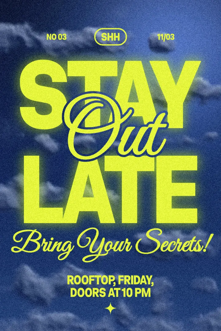
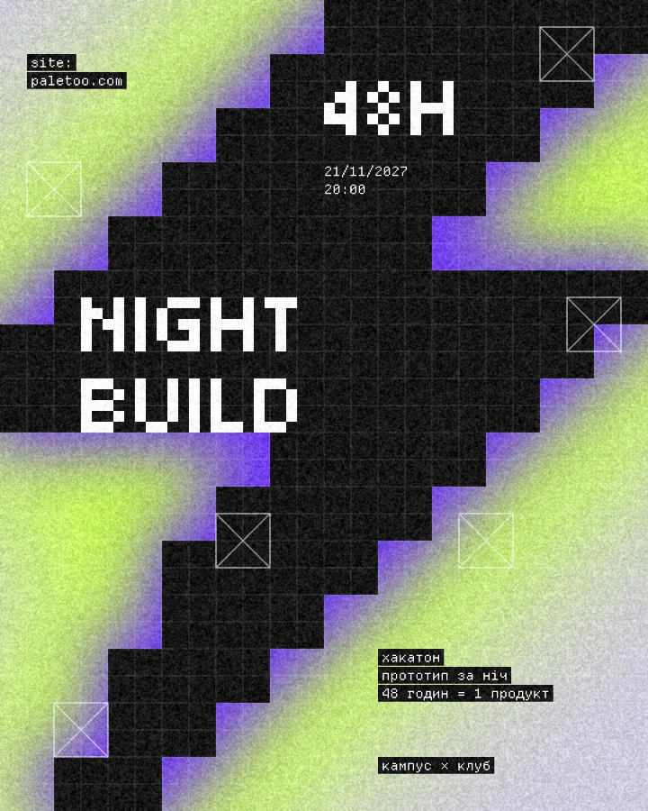
Every picture on this page was made in Paletoo — these three with the same steps on other templates:
Step by step in Paletoo
Press “Open in Paletoo” to open the Blue hour post as your own document — no installation and no account. On the left, Layers lists every piece: two photos, the two headline words, the texts and the small shapes.
Click the first big word, “Blue”, to select it. The Design tab shows its size and place, and Typography its font and size. Double-click it and type your own word; do the same with the second word and the invitation.
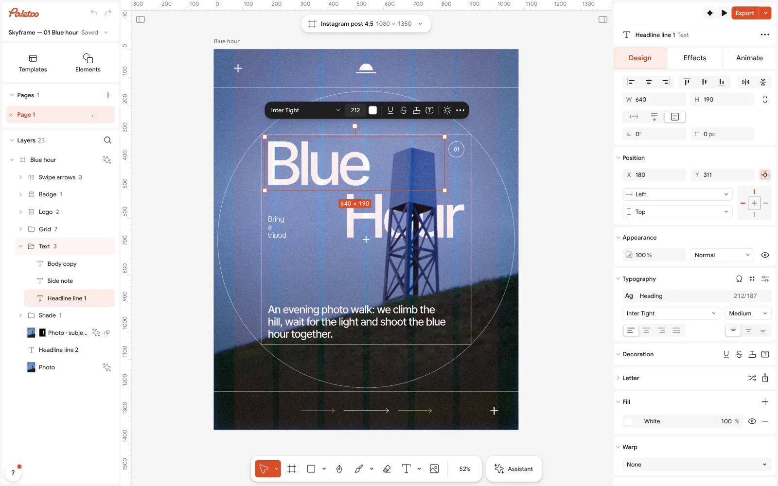
The Blue hour post open in Paletoo: the word “Blue” selected, its font and size under Typography in the Design tab Click the photo to select it. In the Design tab, Replace picture puts your own photo in its place, keeping the blue colouring the post already has.
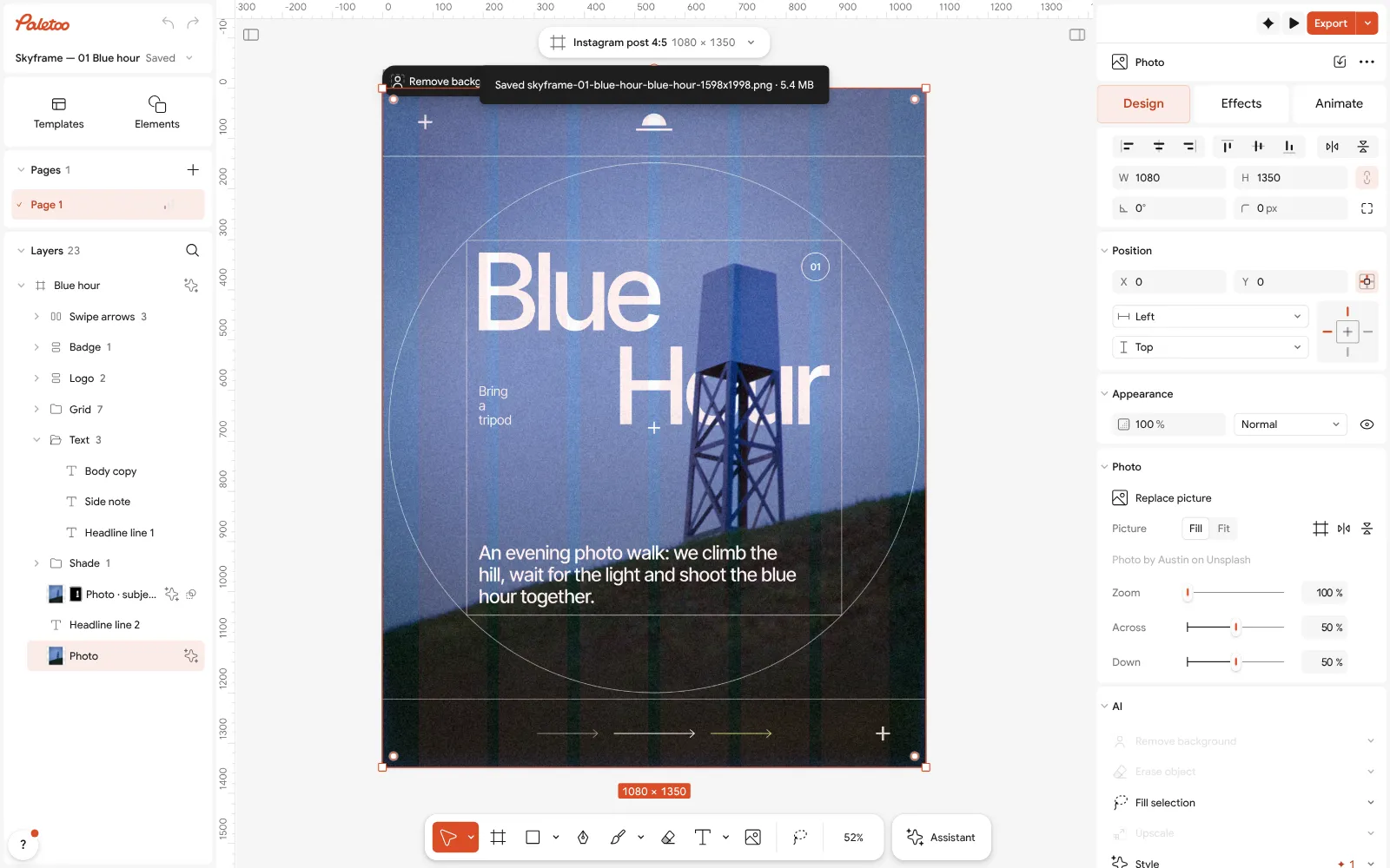
The photo selected: Replace picture and the photo’s settings in the Design tab Move things only along the lines that are already there. When you drag, Paletoo shows red guides as edges and centres line up; let things snap to them, and keep the margins the template gives you.
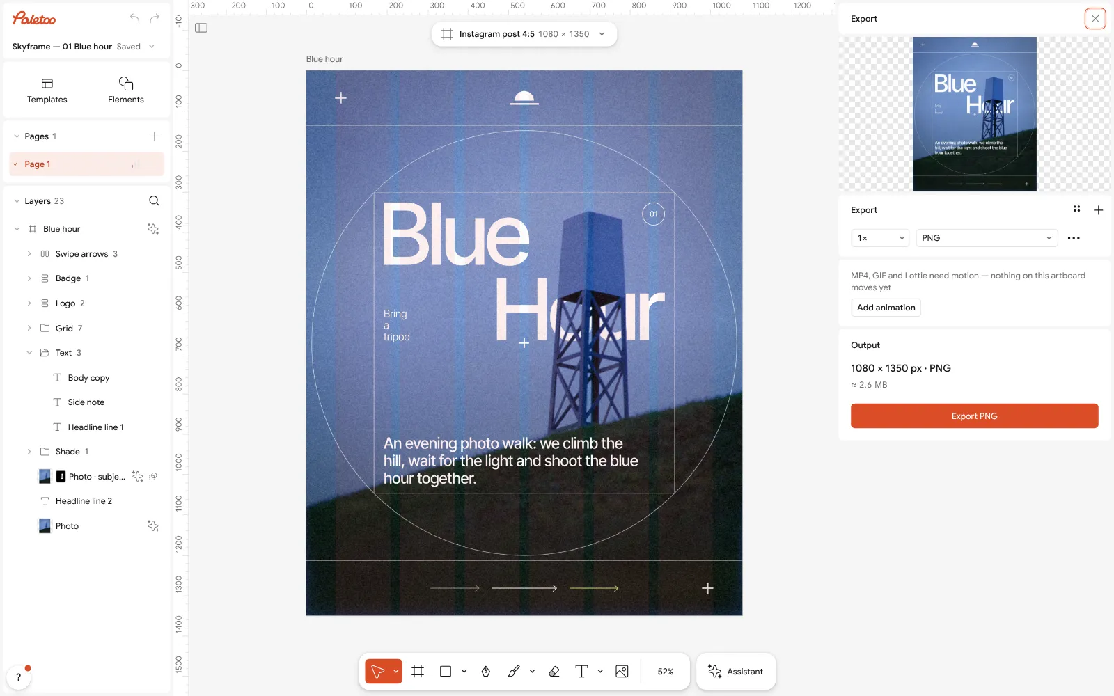
The Export window: the whole post in the preview, a PNG of 1080 × 1350 px Check your design: zoom out until it is the size of a phone thumbnail. Can you still read the big words? Is there one thing that leads? If not, make it bigger or remove something.
Press Export. The window shows the size and format; a PNG of 1080 × 1350 is right for an Instagram post. Press the button and the file is saved, with no watermark.
Make it your own
If your words are longer than the template’s, make the font a little smaller in Typography rather than letting the line run into the margin. Keep the two big words the same size so they read as one title.
A darker or busier photo may need more contrast behind the text. Select the photo and open the Effects tab: the steps under Applied already colour it blue, and you can switch one off with its eye to compare.
When it looks right, save the document with Save to file… as well as exporting. Next time, start from your own file and change only what is new; that is how designers build a consistent series.
Questions
Can I learn graphic design on my own?
Yes. Learn the basics — hierarchy, contrast, alignment, space, type and colour — then practise on small real projects every week. Free tools and templates are enough to start.
What is the best free program for beginners?
A browser editor with templates is the easiest start: Canva or Paletoo. Paletoo also gives you real type controls and effects as you grow, with every export free.
How long does it take to learn graphic design?
You can make a decent post in your first evening. Getting confident with layout and type takes a few months of regular practice; mastery takes years, like any craft.
Do I need a drawing tablet or a powerful computer?
No. Layout, type and photo design need only a mouse or trackpad and a browser. A tablet helps only for drawing by hand.
Is it all right to start from templates?
Yes. Templates teach you sizes, spacing and pairings that work. Change them heavily, then try rebuilding a layout from scratch.
Make it online
- Instagram post makerDesign a post at the right size from a real template, then export a sharp PNG or JPG — free, in your browser.
- Poster makerMake a poster from a template that already has the layout right, then export a print-ready PDF or an image for screens.
- Flyer makerTurn a ready flyer template into yours in minutes and send the printer a PDF with bleed and crop marks.
Free design templates: Social media post templates · Poster templates · Event and launch templates
Try it on your own design
Paletoo opens in your browser, with no sign-up. Every effect here is live: change the picture or the words and the effect follows.
Open in PaletooRead next
- 01
 Poster design tips: 9 tricks that make a poster look designedNine habits that separate a designed poster from an assembled one.
- 02
 The best free tools for graphic designers in 2026Ten free tools worth knowing, what each is best at, and where each one stops.
- 03
 How to keep brand fonts and colours consistent across every designName the colours and the type once, link every layer to them, and change them in one place.