Techniques5 min readFreeUpdated 2026-11-06Save to Pinterest
Poster design tips: 9 tricks that make a poster look designed
Nine habits that separate a designed poster from an assembled one.

Most posters that look amateur have the same problems: three ideas instead of one, a stock photo of smiling people, everything centred, five fonts, and colour everywhere. Most posters that look designed do the opposite, and the difference is not talent so much as a handful of habits you can learn in an afternoon.
Here are nine of them, each one visible on the poster this guide is built around: an old master painting in which a single figure has turned into blue ASCII characters, “too many” written down the side, and a few lines of tiny monospaced type. It was made in Paletoo, and every trick on it is a setting you can open and change.
Start with one idea
1. Say one thing. A poster is read in two seconds from across a room or a feed. Decide the one idea before you open any program — here, a joke: a server error, “429 Too many requests”, read as a crowd of admirers under a window — and cut everything that does not serve it.
2. Let the type be the image, or the image be the type. The strongest posters do not put a caption on a picture; the words are part of the picture. “too many” is not a headline above the painting, it is drawn into it, as tall as the figure.
3. One huge thing, everything else small. Scale contrast is the quickest way to look confident. Make one element three to ten times bigger than the rest and keep the rest truly small, not medium.
Build the structure
4. Use a strict grid and keep its margins. Pick a margin, say 64 px on a 1080 px post, and put every small element on it. Readers never see the grid, but they feel the order, and it lets one element break it on purpose.
5. Set the small print in a monospaced face. Dates, codes, captions and numbers in a mono font at one small size read like labels on equipment, and they make even a loud poster feel precise. On this poster the captions, “HTTP/1.1 429” and “Too many requests”, are the only other type.
6. Leave space empty. Empty space is not wasted; it is what makes the one big thing big. If a corner feels empty, that is usually right.
Treat, don’t decorate
7. Two or three inks and one hot accent. Pick a near-black, a paper colour and one saturated accent, and use the accent once or twice. Here the painting stays in its own brown tones, and the only bright colour on the whole poster is the ASCII blue.
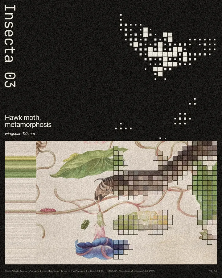
8. Treat a picture instead of buying a better one. Halftone, ASCII, pixel, photocopy and glow turn any picture — even a public-domain painting from a museum collection — into something no one else has. Treat one part, not the whole picture, and the contrast does the work.
9. Check it small. Shrink the poster to the size of a thumbnail, or squint at it. If the one idea still reads, it works. If it turns into grey mush, cut something.
Made in Paletoo
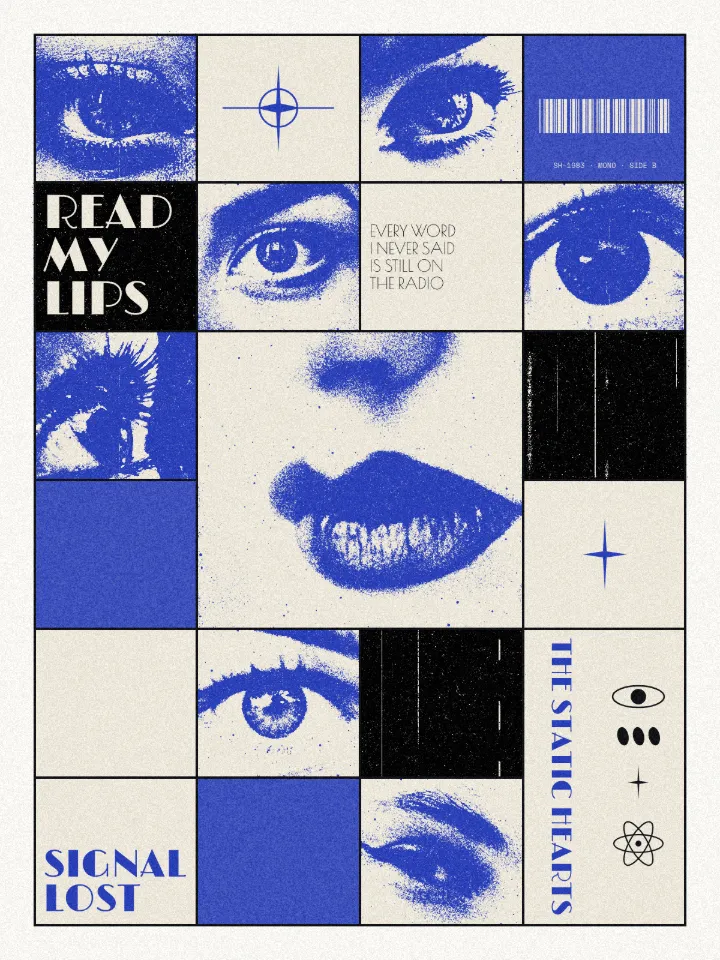
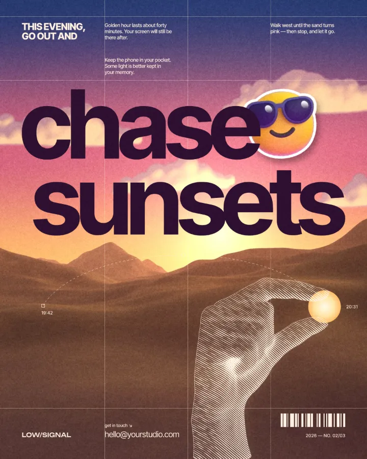
Every picture on this page was made in Paletoo — these three with the same steps on other templates:
Step by step in Paletoo
Press “Open in Paletoo” to open the Too many post as your own document. Layers shows the painting, the blue figure cut from it, the word, and two groups of small captions and labels.
Click the word “too many” to select it. The Design tab shows it turned on its side, and Typography its script font; it has no fill, only a white Stroke, so the painting shows through the letters.
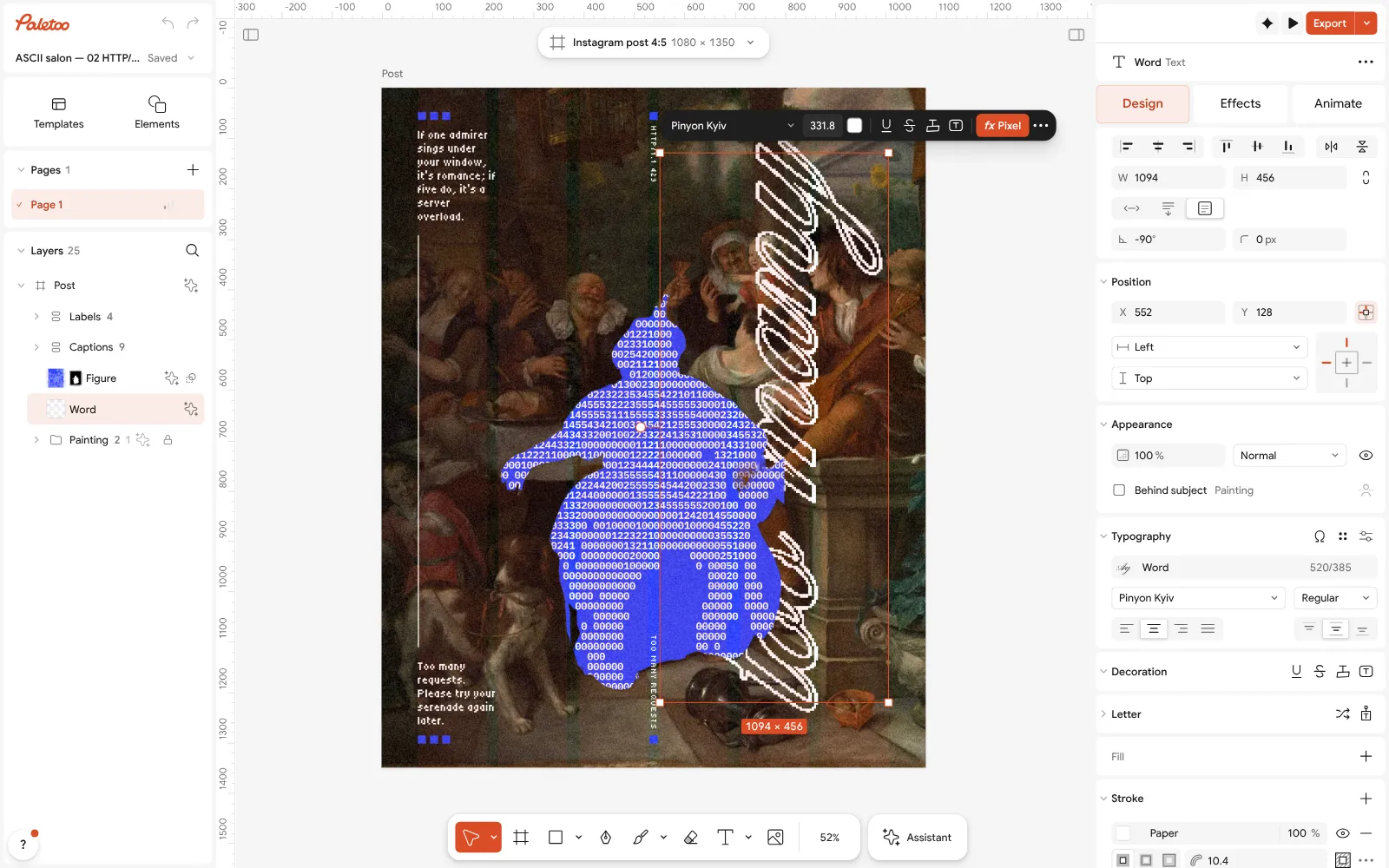
The Too many post open in Paletoo: the word selected, turned on its side, its script font under Typography in the Design tab Click the blue figure and open the Effects tab. Under Applied there is a single step, ASCII, which draws the figure in digits on a 12 px grid.
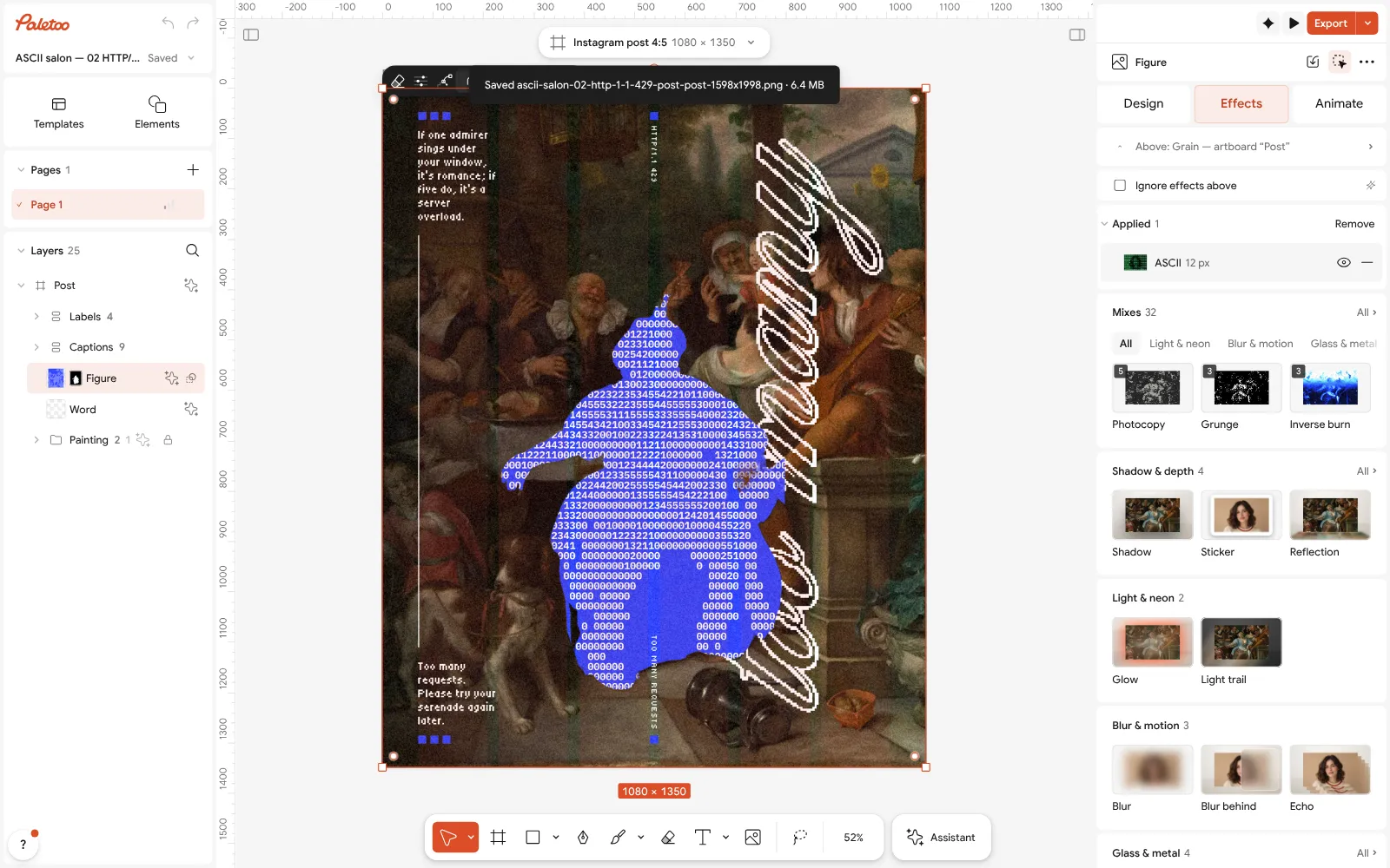
The blue figure selected: one ASCII step under Applied in the Effects tab Click the ASCII row to open it. Cell sets the size of each character, Characters and the text field say which ones are used, here the digits 0 to 5, and Colour their blue.
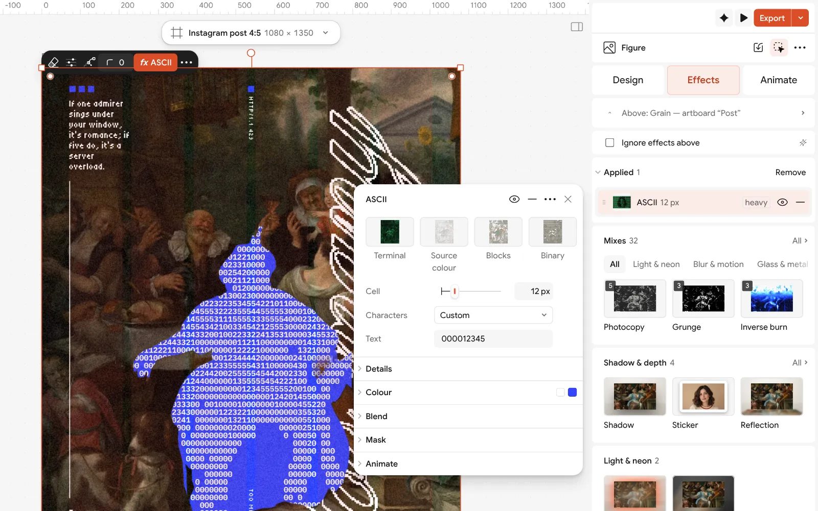
The ASCII step open: the cell size, the characters and the colour beside the poster To use your own picture, select the figure and press Replace picture, or the painting for a new background. Elements has museum paintings that are free to use, and Remove background cuts a figure out of any photo on your device.
Press Export for a PNG of 1080 × 1350 for the feed, or a PDF with Include bleed to print it as a poster.
Make it your own
The trick on this poster is that only one figure is treated. Raise the Cell size and the figure turns into a coarse block that reads from far away; lower it and it becomes a texture that rewards a closer look. Between 10 and 16 px works for a 1080 px post.
Change the Colour to change the whole poster’s mood, but keep it the only saturated colour. Try a hot red, an acid green or a signal orange — each one becomes the poster’s accent.
If the word gets lost, widen its Stroke a little rather than giving it a fill: a white outline over a painting looks drawn by hand, a solid fill looks like a sticker.
Questions
What makes a poster look professional?
One idea, one dominant element, a consistent grid and margin, few fonts, few colours and plenty of empty space. Most amateur posters fail on one of these, not on the picture.
How many fonts should a poster use?
Usually two: a display face for the big words and a quiet one, often monospaced, for the small print. A third only if it has a clear job.
What size should a poster be?
For print, common sizes are A3, A2 and 18 × 24 inches; for social, 1080 × 1350 (4:5) for a post and 1080 × 1920 for a story. Design at the final size and export a PDF with bleed for print.
Where can I get pictures for a poster for free?
Public-domain paintings from museum collections, free photo libraries, or your own photos. A strong treatment — halftone, ASCII, pixel, photocopy — makes any of them your own.
Can I make a poster like this without Photoshop?
Yes. This one was made in Paletoo in the browser; the ASCII figure is a live effect step, and the editor and its exports are free.
Make it online
- Poster makerMake a poster from a template that already has the layout right, then export a print-ready PDF or an image for screens.
- Flyer makerTurn a ready flyer template into yours in minutes and send the printer a PDF with bleed and crop marks.
- Photo effects onlineGive a photo a film, print or glitch look in one click — and keep every step editable afterwards.
Free design templates: Poster templates · Event and launch templates
Try it on your own design
Paletoo opens in your browser, with no sign-up. Every effect here is live: change the picture or the words and the effect follows.
Open in PaletooRead next
- 01
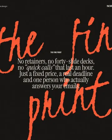 Typography poster: how to make the type the pictureNo photo needed: when the words are drawn big enough, they are the image.
- 02
 Graphic design for beginners: your first poster in 30 minutesFour basics, two rules for type and colour, and a first design you can post today.
- 03
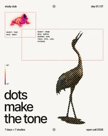 How to make a halftone effectComic-book CMYK dots, newspaper screens or one ink.