Techniques5 min readFreeUpdated 2026-11-13
What is a knockout outline (and why designers love it)
A stroke that is a hole, not a line: what the knockout outline is, why it reads on any photo, and how to make one in a minute.
By the Paletoo team · steps tested in Paletoo on
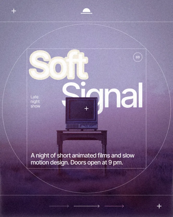
A knockout outline is a stroke around letters that cuts through everything under them — the photo, the colour blocks, the pattern — instead of painting a colour, so a band of the background shows round every letter. The letters keep their own colour; the band is simply missing picture.
Designers love it because it solves the oldest problem in poster typography, text on a busy photo, without adding a colour: the separation is made of the page itself, so it always matches the layout. Below: what the term means in print and on screen, how it differs from a hollow outline, when it works and when it does not, and a live demo you can type into. Every step was run in Paletoo on 11 November 2026.
Try it: your word, cut out of a photo
Type a word, drag it over the photo, and switch between a painted outline and a knockout. Knockout shows the background through the band — swap the background and the band follows.

Opens the poster with your word and these settings, as your own copy. Free, no sign-up.
Where the word comes from
In printing, to knock out means to leave the paper bare where one ink would otherwise print over another. A white headline on a red block is knocked out of the red: no white ink is printed, the paper shows. Prepress operators still talk about knockouts and their opposite, overprints, where one ink lands on top of another.
A knockout outline borrows the idea for the band round the letters. Instead of a stroke in a colour, the stroke knocks out every layer below it — the photo, a colour panel, a texture — down to the background of the page. On screen the effect is the same as in print: the reader sees paper, or whatever the background is, around each letter.
You will also see it called knockout text, a cut-out outline, a transparent outline or a gap stroke. The essence is constant: the outline is made of absence, not ink.
Knockout outline, painted outline, hollow letters
Three effects get confused, and the difference decides how the design will age. A painted outline adds a line of colour round the letters; it is a new colour that has to suit the photo, and on a busy picture it often fights it. Hollow letters are the reverse: the outline stays, the letters themselves turn transparent, so the photo shows through the word.
A knockout outline keeps the letters solid and removes the picture round them. Its colour is whatever sits underneath: the paper, a gradient, another photo. Change the background and the band changes with it; move the word and the cut follows. Try the three side by side in the demo above — switch Paint and Knockout on the same word, then swap the background.
| Painted outline | Hollow letters | Knockout outline | |
|---|---|---|---|
| The letters | Solid, their colour | See-through | Solid, their colour |
| The band round them | A colour of its own | A colour of its own | The background, cut through |
| On a busy photo | One more colour to match | The word gets harder to read | Separates without a new colour |
| Background changed | Band stays the same | Band stays the same | Band follows it |
Why designers love it — and when to skip it
It reads on anything. Because the band is the background colour, the contrast between the band and the letters is decided once, by you, and holds over sky, grass, faces and night. It also looks printed: the gap reads like a die-cut sticker or a screen-printed poster with a paper margin, which suits the print revival of 2026.
It is economical. One background colour does the work of a stroke, a shadow and a dark scrim, and the design keeps two or three colours instead of five. And it survives edits: the cut follows the letters when you retype the headline or swap the font.
Skip it when there is nothing under the word — on a flat colour a knockout looks exactly like a painted outline in the background colour — and with thin or small type, where the band closes up the counters. It needs bold display type, 40 px or larger on screen, and a picture underneath worth cutting.
Made in Paletoo
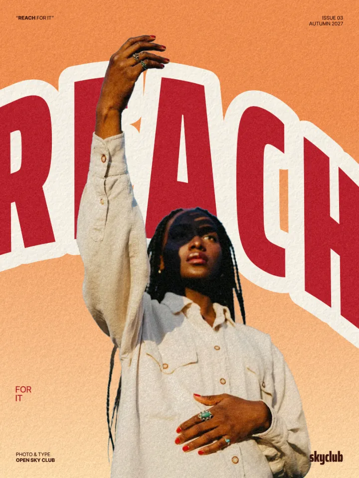
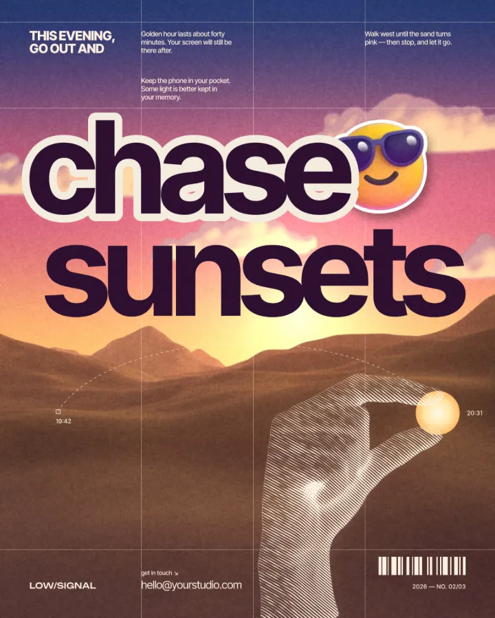
Every picture on this page was made in Paletoo — these three with the same steps on other templates:
Step by step in Paletoo
Open the example: press “Open in Paletoo” on this page. It is a gig poster with a portrait under a blue sky and the word “LOUDER” arched across it, the knockout already on. To start from your own design, select the headline that crosses a photo.
In the right panel, stay in the Design tab and find the text’s Stroke section. Press Add a stroke.
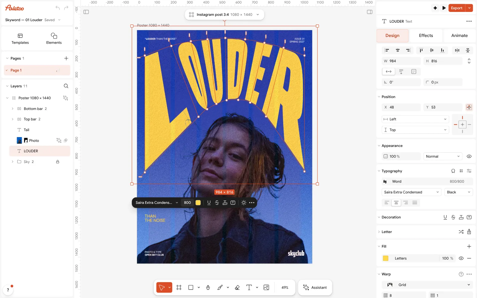
The “LOUDER” poster open in Paletoo, the word selected in the Design tab In the new stroke’s row, press the knockout button — its tip reads Cut through the layers below. The row now says Knockout on a chequer instead of a colour, and a band round the letters is cut through the photo down to the background.
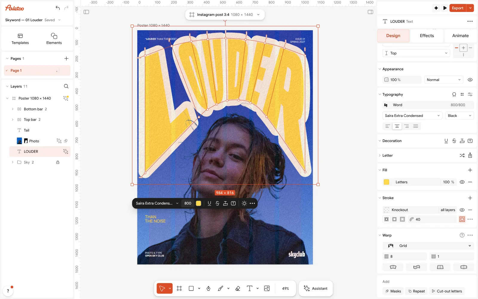
A stroke added and set to cut through: the Stroke section shows Knockout, and a band round the letters is cut through the photo Set the band’s width in the weight field: 4–6 % of the type size is a clean separation, 10 % and more a bold sticker look. The width is kept relative to the type, so the band grows and shrinks with the text.
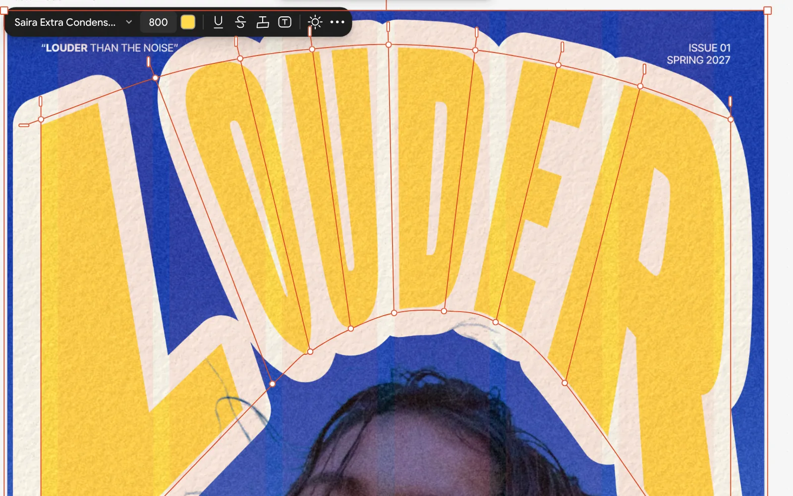
Close up: the knockout band round “LOUDER”, the paper background showing through the blue sky Choose what the band shows by changing the artboard’s background — paper, black or a gradient. To cut only the photo and not a colour panel under it, pick 1 layer instead of All layers in the same row.
Retype the word, move it, change the font: the cut follows. Press Export (Ctrl Shift E) for PNG, JPG or PDF; the band exports exactly as the canvas shows it.
Make it your own
Bold type wants a wider band, light type a narrower one: start at 5 % of the type size and look at the counters of a, e and o — if they close, take the width down.
For an echo, add a second line: in the Effects tab open the outline and set Lines to 2 and a Gap — both lines cut through, the photo stays between them. The demo’s Offset slider is that gap.
The background is your band colour. A cream paper reads warm and printed, black reads dramatic, a two-colour gradient gives the band a sweep across the word that no painted stroke has.
Sources
Questions
What does knockout mean in design?
To knock out is to leave out what is under something, so the paper or the background shows. A knockout outline leaves out the picture in a band round the letters.
Is a knockout outline the same as hollow text?
No. Hollow text makes the letters see-through and keeps the outline; a knockout outline keeps the letters solid and makes the band round them see-through, down to the background.
Why can I not see my knockout?
There is nothing under the text to cut, or the background is the same colour as the band would be. Put the word over a photo or a colour block, or change the background colour.
Does the knockout survive export?
Yes. PNG, JPG, PDF and video exports show the cut exactly as the canvas does. Only PowerPoint export cannot express it, and it says so.
Is it free?
Yes. The knockout stroke is part of Paletoo’s free plan, with no watermark on export and no account needed to try it.
Make it online
- Text effects onlineType your words, press one effect — chrome, gold foil, emboss, cut-out letters, outlines or warps — and download it in a minute, free and with no sign-up; the words stay editable text.
- Poster makerMake a poster from a template that already has the layout right, then export a print-ready PDF or an image for screens.
Free design templates for posts, stories and posters: Social media post templates · Poster templates
Try it on your own design
Paletoo opens in your browser, with no sign-up. Every effect here is live: change the picture or the words and the effect follows.
Open in PaletooOpens this design as your own copy — every layer and effect editable, free.
Read next
- 01
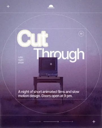 How to make a knockout outline that cuts throughA stroke that cuts through the layers under the text.
- 02
 Knockout text over a photo: 7 poster ideasSeven ways to put a word over a photo so the photo makes room for it — each one live in the demo, each one a poster you can open and change.
- 03
 Transparent outline text: Photoshop, Illustrator, or one click«Transparent outline» means two different looks. Both, step by step in Photoshop and Illustrator — and the one-click way that stays editable.