Free tools5 min readFreeUpdated 2026-11-06
Free logo text effects: seven looks that work on a wordmark
Seven text looks for a wordmark, and how to keep them sharp at 32 px.
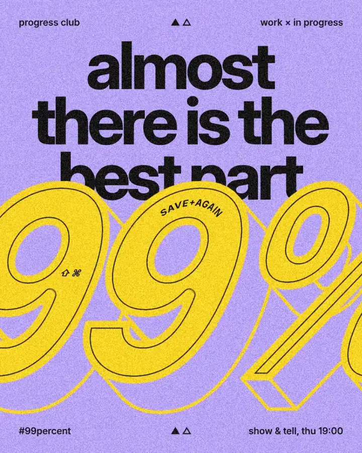
You can add text effects to a logo online for free in Paletoo: type the name, pick an effect such as a 3D block, an outline, pixels, chrome or emboss, and export a PNG with a transparent background or an SVG. The text stays live, so you can retype the name or change the font and the effect follows.
This guide shows seven looks that suit a wordmark and the test that tells you whether one will hold up as an avatar or a favicon. It is taught on a loud poster, “99%”: a giant yellow number with a thin black outline, pushed back into a 3D block whose faces take the lilac of the background and whose edges are drawn in yellow.
Seven text effects that suit a wordmark
3D block. A solid extrusion behind the letters, swept back at one angle. It reads as bold and retro, and because it changes the silhouette, it survives small sizes better than any texture. A long shadow is its flat cousin.
Outline and knockout. A thick stroke round the letters, or a stroke that cuts through what lies beneath so the background shows. Clean, cheap to print, and perfect for one-colour versions. See the knockout outline guide.
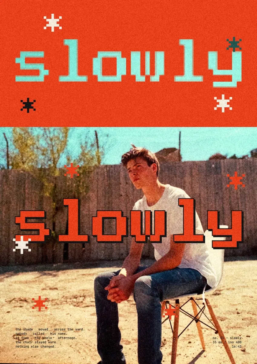
Pixel. Letters broken into square blocks, or a pixel font. Suits games, tech and anything nostalgic, but keep the blocks big enough to read.
Chrome. Polished metal with a bright highlight, the Y2K look. Spectacular large, muddy small: keep a flat version for small uses.
Emboss. The word pressed into paper or metal, so only its relief shows. Quiet and expensive-looking on packaging; see embossed metal.
Distress. Worn edges, as if printed with a rubber stamp. Good for craft, coffee and music brands; keep it light.
Glow. A neon bloom around the letters. Works on dark backgrounds only, and needs a plain fallback for light ones.
The 32 px test
A logo lives mostly small: a profile picture, a favicon, a line in a footer. Shrink your wordmark to 32 px high, or zoom out until it is that size, and squint. Effects that change the shape of the letters, a block, a heavy outline, survive; effects that add texture, grain, distress, fine engraving, turn to noise. Thin strokes under about 2 px at that size disappear.
So design the logo in two weights: the full version with its effect for posters and headers, and a plain one-colour version for small and single-ink uses, such as stamps, embroidery and fax-quality print.
Keep the text live, and export the right file
Flattening a word into a picture early means you cannot fix a typo or try another font later. In Paletoo every effect is a live step on the text: retype it, change the font, and the block, the outline or the chrome redraws. Turn text into outlines only for the final file, if at all.
For the web and social media, export a PNG with a transparent background at 2× or 3×. For a printer or a sign maker, export an SVG or a PDF: the letters and strokes stay vector outlines, and an effect drawn in pixels goes in as a picture beneath them; the Export window names each one. Try the quick text effect generator for a single word.
Made in Paletoo
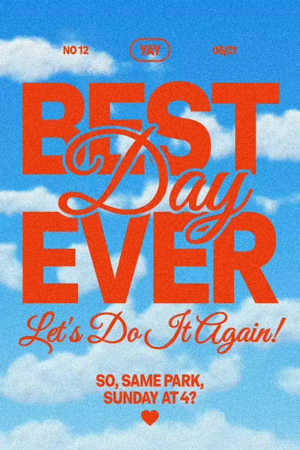
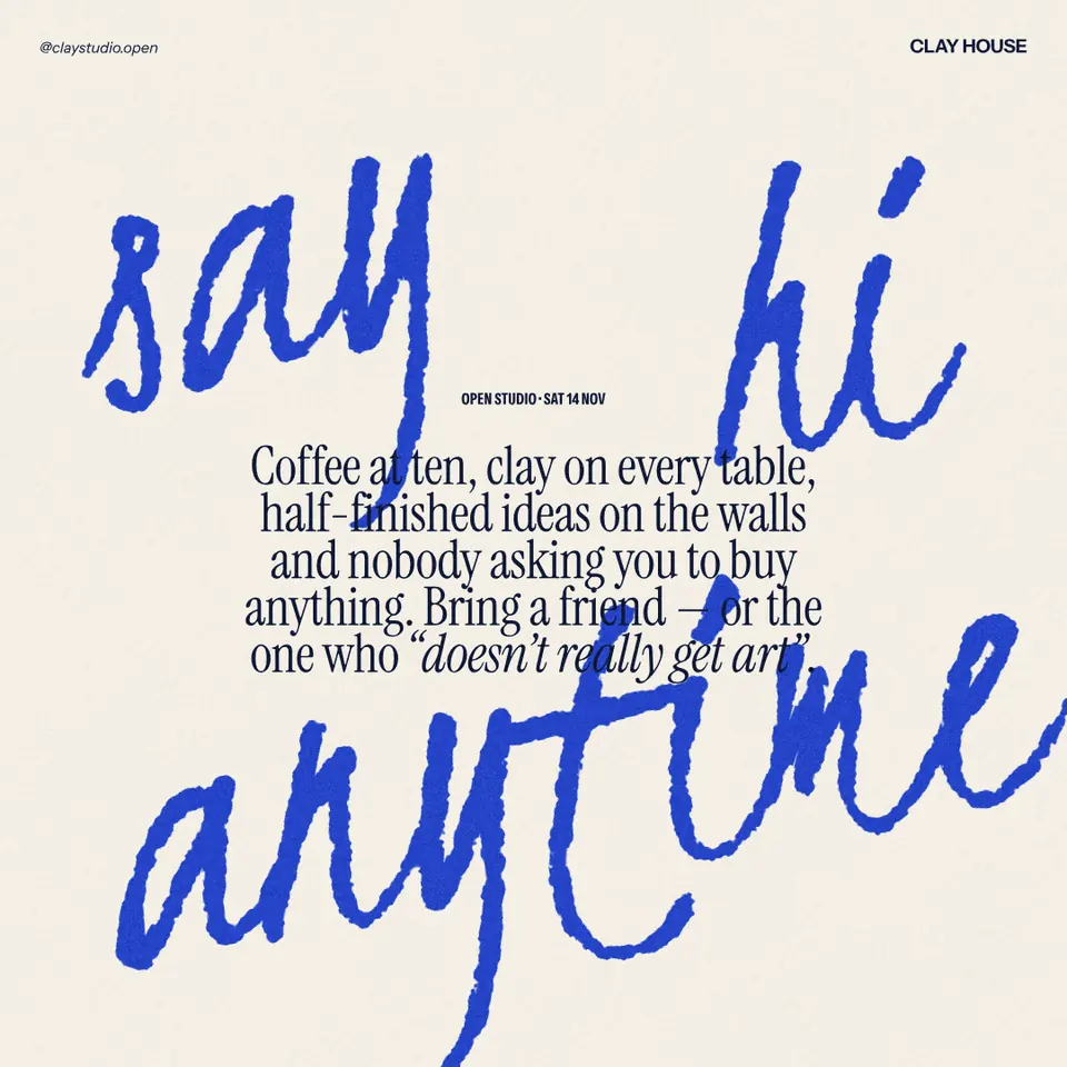
Every picture on this page was made in Paletoo — these three with the same steps on other templates:
Make it free in Paletoo
Press “Open in Paletoo” to open the 99% post as your own document. Layers shows the header and the footer lines, the headline, and the big number in a group of its own.
Click “99%” to select it. The Design tab shows its place, and Typography its font: Inter at its heaviest weight, 790 px. Below, its Fill is yellow and its Stroke a thin black line inside a yellow one.
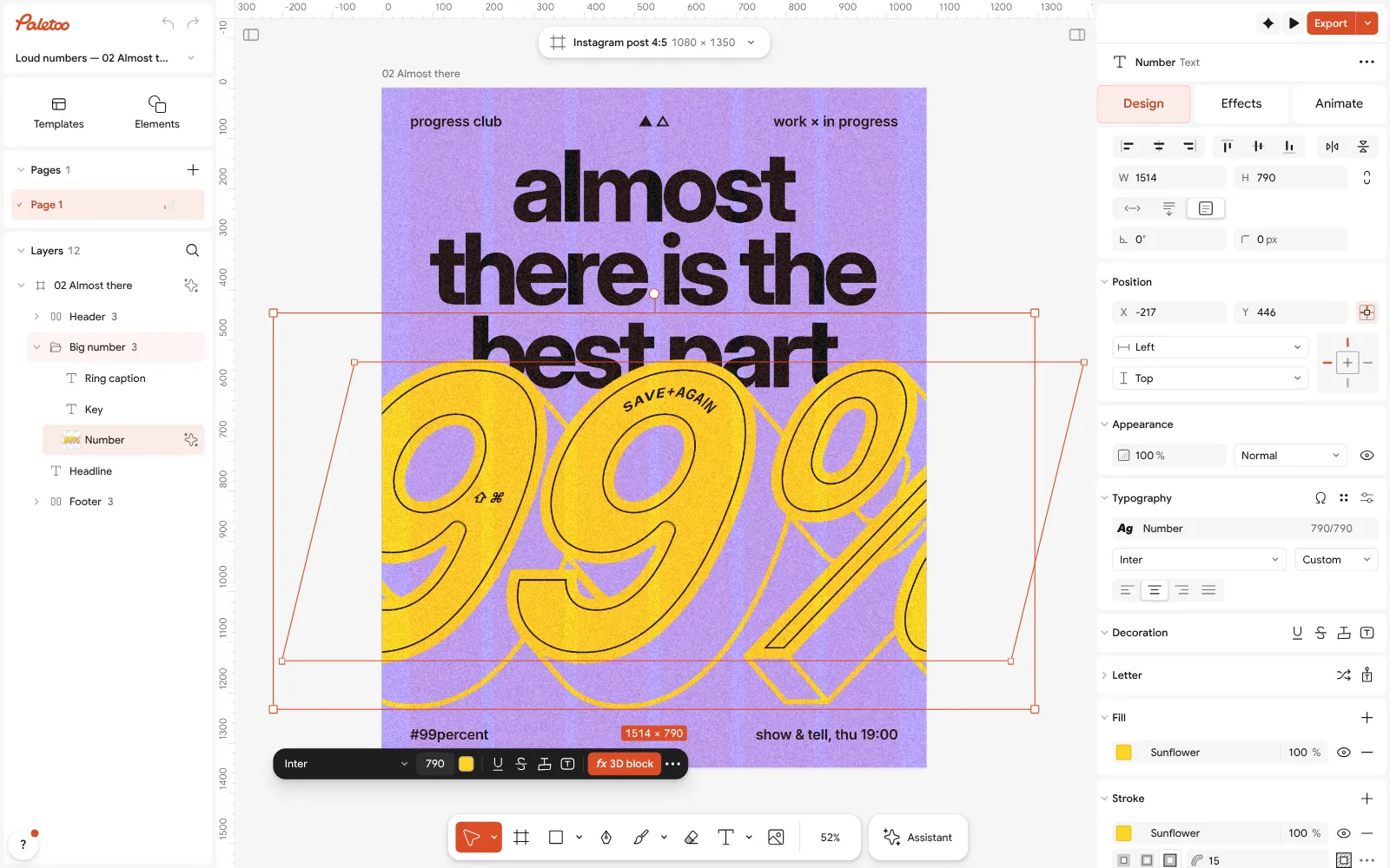
The 99% post open in Paletoo: the number selected, Inter at 790 px under Typography in the Design tab Open the Effects tab. Under Applied is one step, 3D block, which extrudes the number back into a solid block at one angle.
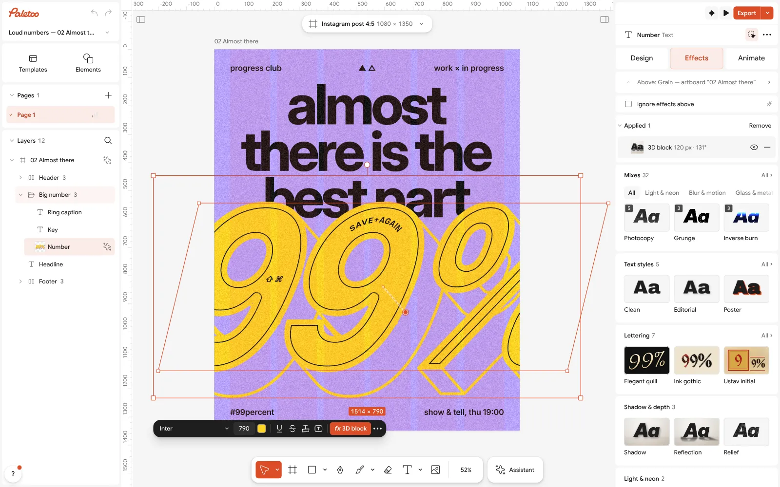
The number in the Effects tab: one 3D block step under Applied Click the 3D block row to open it. Depth is 120 px and Angle 131°; Style is set to Faces, which fills each side in the Colour of the background and draws its edges in the Edge colour, yellow.
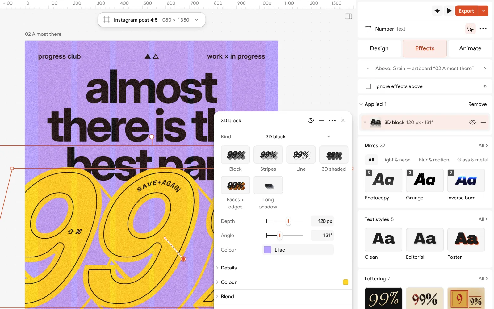
The 3D block step open beside the post: depth, angle, style, face colour and edge colour Double-click the number and type your own name or initials: the block follows the new letters. Change the font in Typography to try another voice; a heavy, wide face gives the block the most to work with.
Press Export. For a logo, choose PNG and set Background to Transparent, with Scale at 2× or 3×; or choose SVG or PDF for print, and switch on Outline text if the file goes to someone without the font.
Make it your own
Lower the Depth for a logo. 120 px suits a 790 px poster number; on a wordmark, a depth of about a sixth of the letter height keeps the block bold without swallowing the counters.
Pick the Angle by where the light should come from: turn it and watch the block swing round the letters. A block falling down and to the right is the classic retro sign. Keep one angle across all of a brand’s effects.
For a one-colour version, set the Style to Outline, or remove the step and keep only a heavy Stroke. That is the version you will use small.
Questions
What text effect is best for a logo?
One that changes the shape of the letters, such as a 3D block or a thick outline, because it still reads small. Textures like grain or distress are best kept for large uses.
Can I export a logo with a transparent background for free?
Yes. In Paletoo choose PNG and a transparent background in the Export window; there is no watermark and no account needed.
Will a text effect stay vector in an SVG?
The letters and strokes do. An effect drawn in pixels, such as a glow or a 3D block, goes into the SVG as a picture under the outlines, and the Export window tells you which.
Should I convert the logo text to outlines?
Only for the final file you hand to a printer or a developer, so it looks right without the font. Keep the live version for edits.
How do I make a logo look good small?
Use a heavy font, one effect at most, high contrast, and a plain one-colour version. Check it at 32 px before you finish.
Make it online
- Text effects onlineChrome, gold foil, emboss, cut-out letters, outlines and warps — and the words stay editable text.
- Logo makerBuild a wordmark or a badge from real type and shapes, and take it away as a sharp SVG or PDF.
- Animated text makerMake words move in one click — rise, typing, pop, wave — and export a video for Reels, a GIF for chats or a Lottie file for the web.
Free design templates: Social media post templates · Brand guidelines templates · Story and Reels templates
Try it on your own design
Paletoo opens in your browser, with no sign-up. Every effect here is live: change the picture or the words and the effect follows.
Open in Paletoo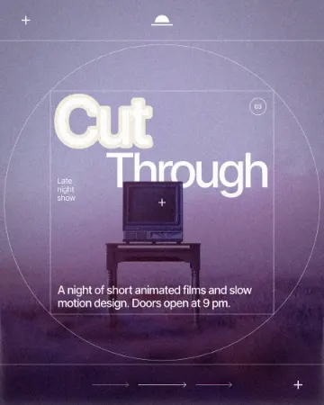 How to make a knockout outline that cuts through
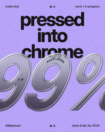 How to make an embossed metal effect
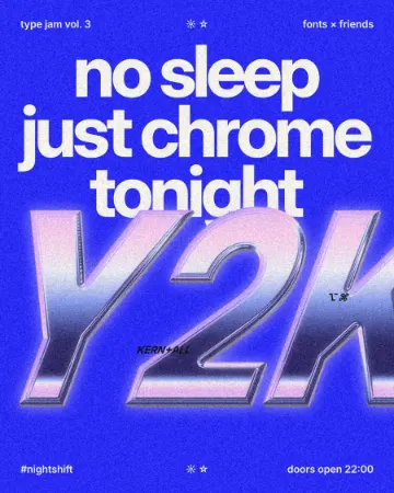 How to make a Y2K chrome text effect