Techniques6 min readFreeUpdated 2026-11-20
Negative text effect: letters that invert the photo
White letters in Difference: every letter shows the negative of the photo under it — live text, free, in your browser.
By the Paletoo team · steps tested in Paletoo on
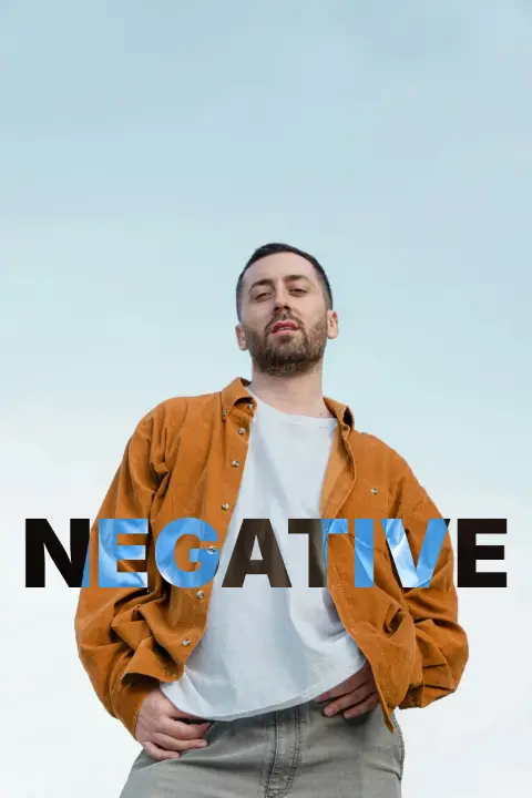
To make a negative text effect, set your words in white and change the text layer’s blend mode to Difference: every pixel under the letters becomes its own negative, so an orange jacket turns blue, a white shirt black and a dark sky light. The letters stay live text, and they change colour by themselves wherever they cross something new.
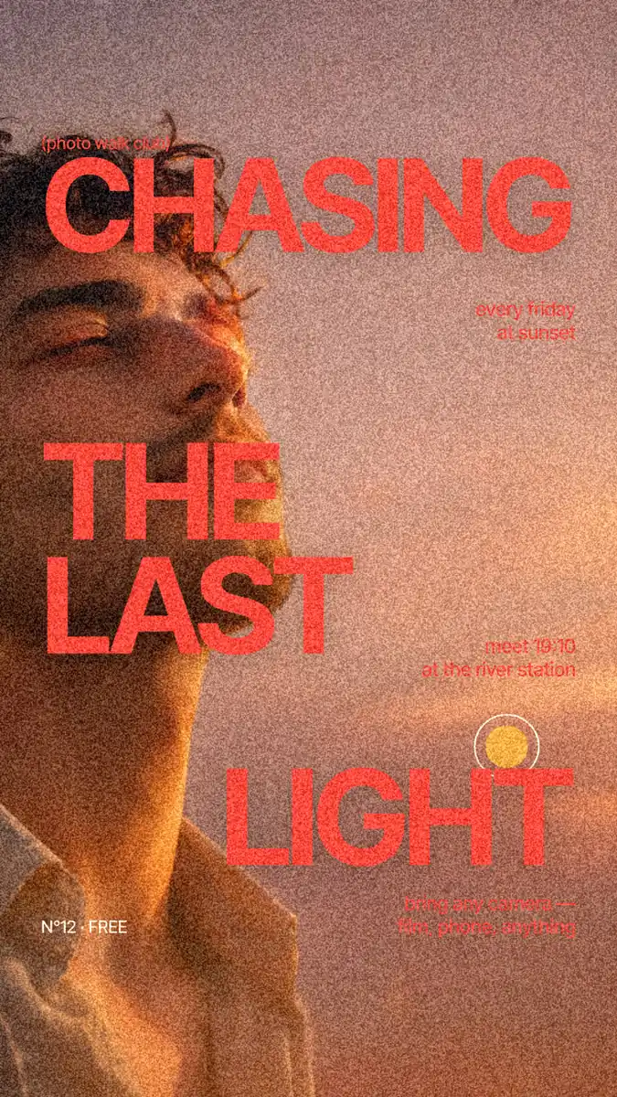
It works because Difference subtracts the two colours and keeps the result positive: white minus any colour is that colour’s opposite. Below: the effect on your own photo, what Difference, Exclusion and an inverted photo each do, how to keep the words readable, and the steps in Paletoo on «Chasing the last light», a photo-walk Instagram story with a huge three-line title.
Try negative text on your photo
Type a word and drop a photo below: the letters show the negative of whatever is under them — blue where the jacket is orange, black where the shirt is white. Switch the look, download a PNG, or open it in Paletoo, where the word stays live text.
Drop a photo here, paste it with Ctrl+V or
Settings
opens the guide’s Instagram story as a ready document: white text set to Difference, still editable
Nothing is uploaded: the picture is made in this browser tab.
How negative text works: Difference, Exclusion and a plain invert
A blend mode decides how a layer’s colours mix with the colours under it. In Difference each channel of the result is the absolute difference of the two: |under − letters|. With white letters (255 in every channel) that is 255 − under, which is exactly the photo’s negative inside the letters, and nothing changes outside them. Black letters in Difference change nothing at all, which is why the effect always starts from white.
Exclusion is Difference with softer middle tones: with pure white letters the two give the same negative, pixel for pixel, but with grey or coloured letters Exclusion washes towards grey where Difference stays vivid. A coloured letter in Difference gives a tinted negative instead of a true one: yellow letters, which already have almost no blue, invert the red and green of the photo and leave much of its blue alone.
An invert is the other way round: the whole picture becomes a negative, and the words are cut back to the positive photo. That is a different look — a dark, strange photo with the original colours only inside the letters — and it is how film negatives and the «negative» filters of phone apps work. A third variant is the negative band: a white strip in Difference across the photo, with the word knocked out of it, so the strip is negative and the word reads as the positive picture.
| Look | How it is built | Inside the letters | Best for |
|---|---|---|---|
| Difference, white letters | White text, blend mode Difference | The exact negative of the photo | Posters, covers, bold one-word titles |
| Exclusion, white letters | White text, blend mode Exclusion | The same negative as Difference | Grey or tinted letters, where it is softer |
| Coloured letters in Difference | Coloured text, blend mode Difference | A tinted negative | Matching a brand colour, neon looks |
| Negative band | A white rectangle in Difference, the word cut out of it | The positive photo, in a negative strip | Headlines across a portrait, video titles |
Keeping negative text readable
The effect is only as readable as the photo under it. Where the photo is flat mid-grey, its negative is flat mid-grey too, and the letters disappear: Difference has nothing to push against. Put the words across contrast — a dark coat against a pale sky, a white shirt against a tan face — and each letter flips colour as it crosses, which is the point of the look. On a mid-grey patch, move the words, scale them up, or add a soft dark shadow under them.
Heavy faces work best: a black-weight grotesk or a condensed display face gives each letter enough area to show the negative. Thin serifs and small sizes turn into scattered coloured strokes. For body text, captions and anything a reader must read in full, keep normal blending: WCAG asks for a contrast of 4.5 to 1 for normal text and 3 to 1 for large text, and a negative over a busy photo cannot promise either everywhere.
In print, Difference is computed on screen colours. Export a flattened PNG or a PDF from Paletoo, which renders the blend into the picture, rather than handing a printer a layered file whose software might not blend it the same way. On the web the same look is one line of CSS, mix-blend-mode: difference on white text, which every current browser supports.
Made in Paletoo
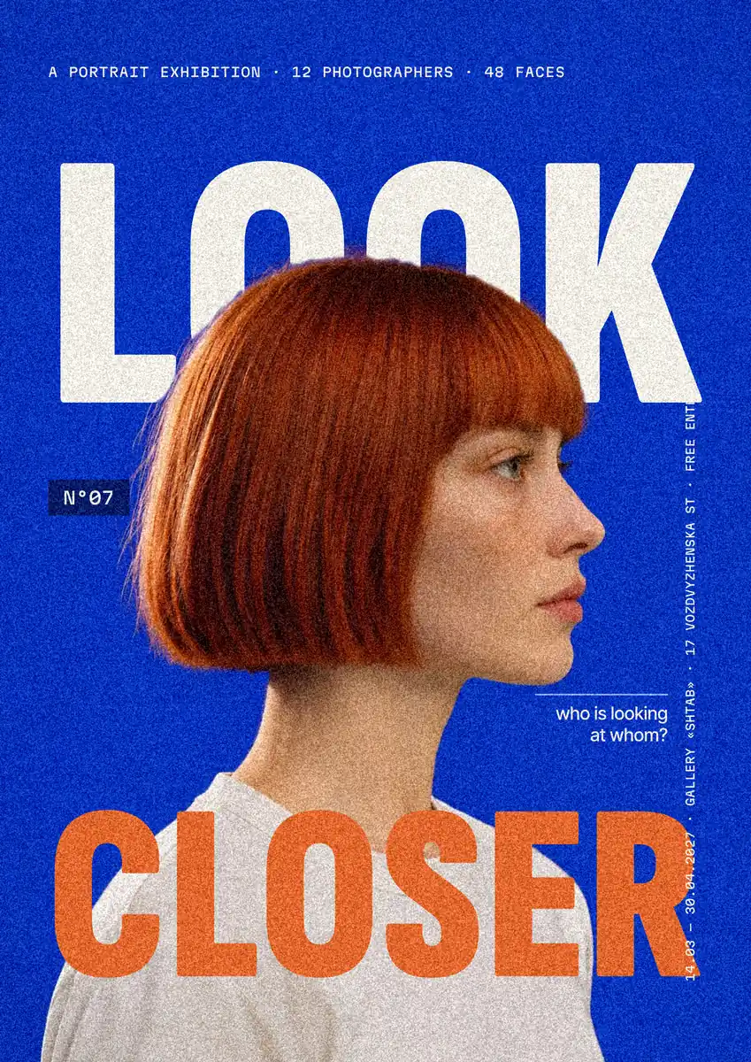
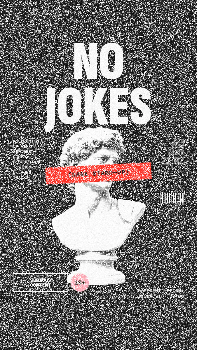
Every picture on this page was made in Paletoo — these three with the same steps on other templates:
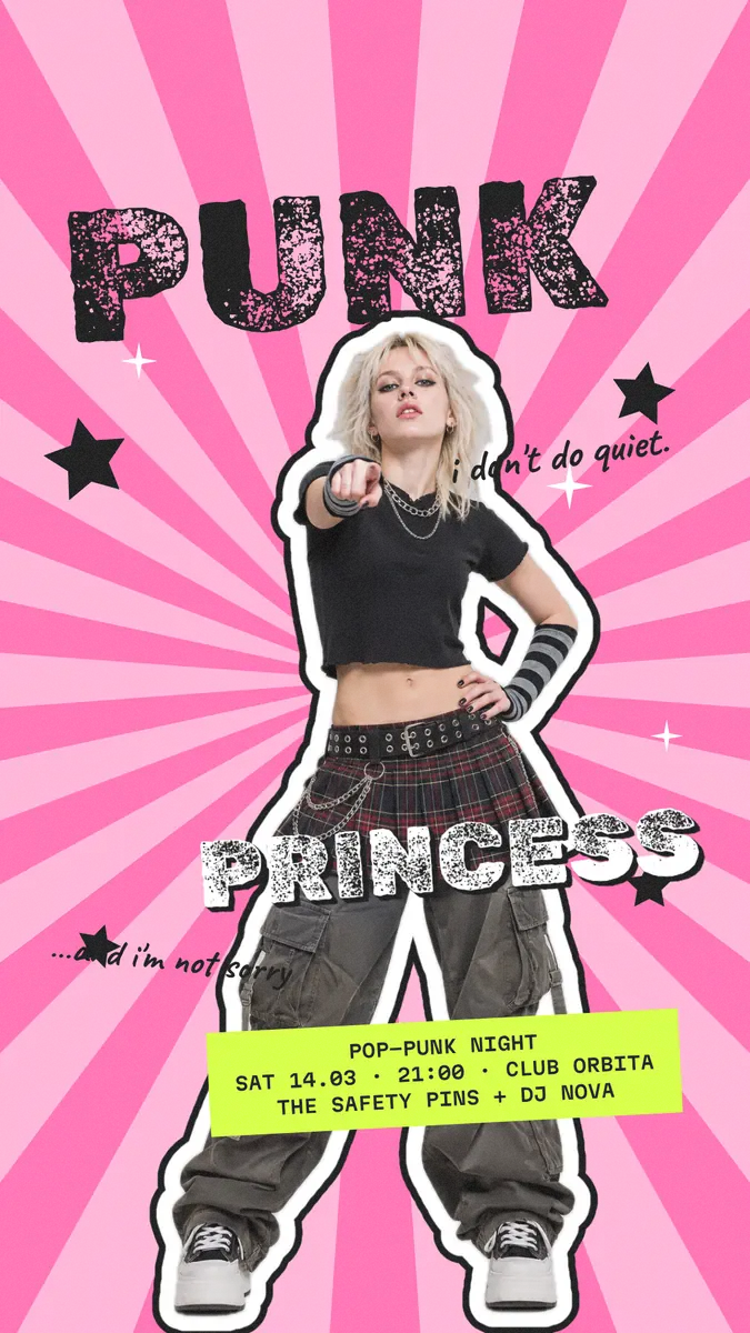
Step by step in Paletoo
Open the story: press “Open in Paletoo” on this page, or open your own photo with Open file… and type a word over it. «Chasing the last light» opens as your own 1080 × 1920 document: a portrait at sunset filling the story, a sun, and the title in three lines of heavy coral capitals.
Click «CHASING», the layer «Headline». Under Typography in the Design tab it is Inter Tight Bold at 232 px — big, tightly set letters with lots of area, which is what negative text needs. Double-click to type your own word.
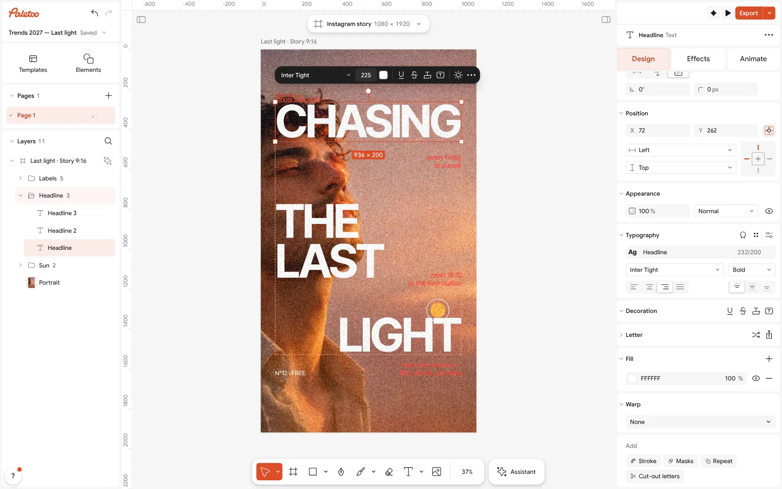
The «Chasing the last light» story open in Paletoo with the title white and its first line selected: Typography in the Design tab With the three title lines selected (Shift-click «THE LAST» and «LIGHT»), set the fill to white. Then open Appearance and change Blend mode from Normal to Difference: the letters show the photo’s negative at once — the warm sunset turns cold blue, the dark hair light.
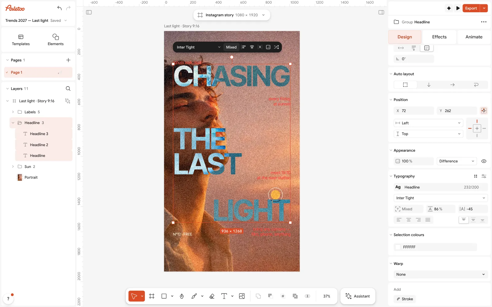
The title set to Difference: Appearance shows the blend mode, and every letter shows the sunset photo in negative Try Exclusion in the same list: with white letters it looks the same. Now change the fill to a colour and compare the two: Difference keeps the tinted negative bright, Exclusion washes it towards grey. Pick whichever reads better on your photo.
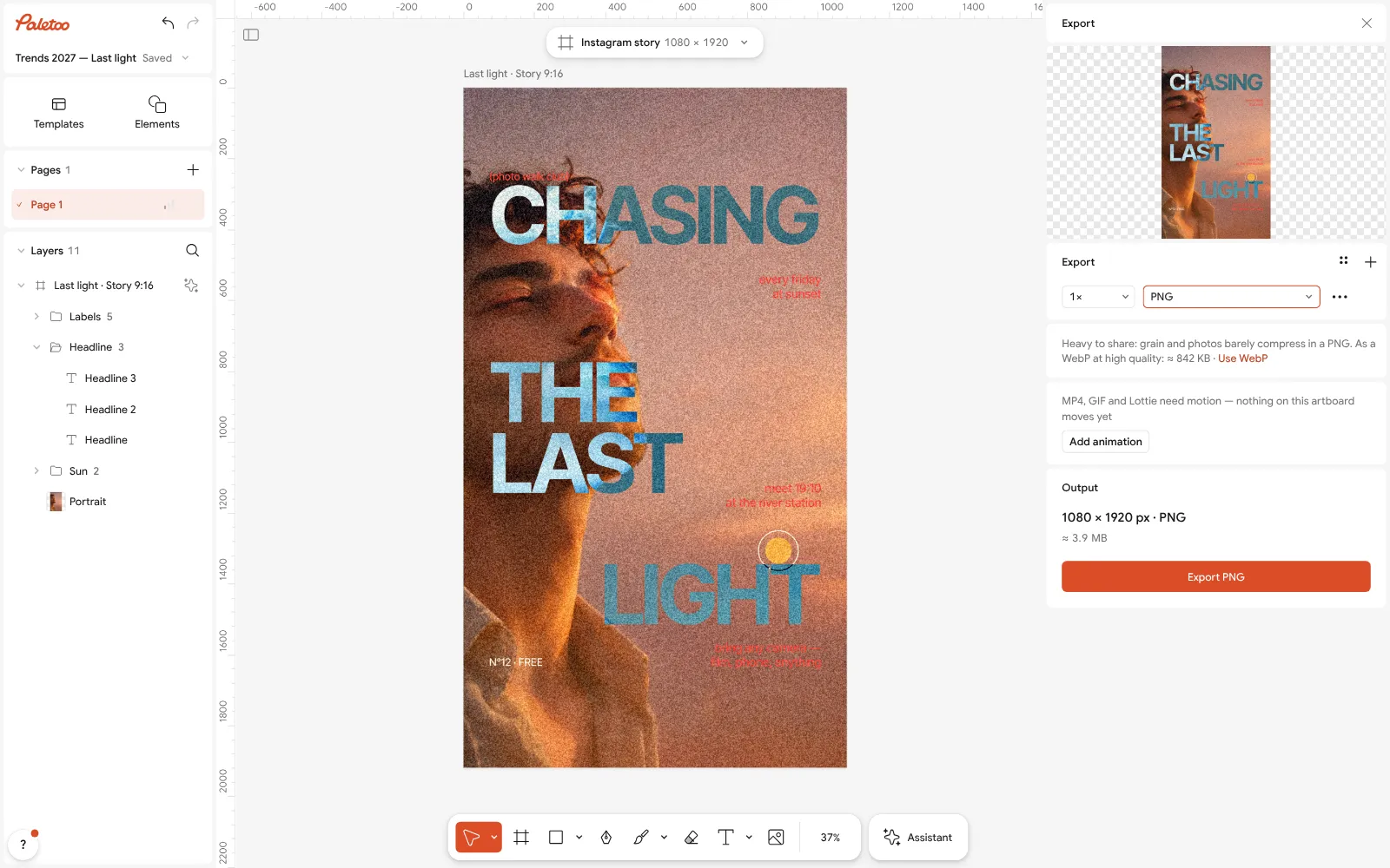
The Export window, ready to save the negative story as a PNG For the negative band, draw a Rectangle across the photo, fill it white and set it to Difference; put the word above it in the photo’s dark colour, so it reads as a cut-out of positive photo inside the negative strip.
Press Export (Ctrl Shift E) and save a PNG or a PDF: the blend is rendered into the file, so it looks the same everywhere. The text stays live in your document, so you can change the word later.
Make it your own
If the letters vanish in part of the photo, that part is mid-grey: move the word with the arrow keys, make it bigger under Typography, or add a soft dark shadow in the Effects tab so the edge holds.
To soften the effect, lower Opacity in Appearance: at 60–70 % the negative mixes with the plain photo, a subtler, double-exposed look.
A colour fill changes the look completely: try your brand colour in Difference for a tinted negative, then the same colour in Exclusion for a quieter one. Pure white is the only fill that gives the true negative.
Sources
Questions
What is a negative text effect?
Text that shows the negative of whatever is under it: white letters set to the Difference blend mode turn each colour of the photo into its opposite inside the letters, so they change colour as they cross the picture.
How do I make text invert the colour behind it?
Make the text white and set its blend mode to Difference — in Paletoo under Appearance, in Photoshop, Illustrator and Figma in the layer’s blend menu, on the web with mix-blend-mode: difference. Black text in Difference does nothing, so it must be white.
What is the difference between Difference and Exclusion?
With white text, nothing: both give the exact negative. With grey or coloured text, Exclusion is softer and greyer in the middle tones, Difference stays vivid.
Why is my negative text hard to read?
The photo under it is mid-grey there, and a mid-grey’s negative is mid-grey. Put the words across light and dark areas, use a heavy face at a large size, or add a soft shadow.
Can I make negative text in Photoshop or Figma?
Yes: both have Difference and Exclusion in the layer’s blend menu — white text, Difference, done. Paletoo has the same blend modes on live text, free in the browser, with no install.
Will negative text print the same as on screen?
Yes, if you export a flattened PNG or a PDF from Paletoo, where the blend is already rendered. A layered file opened in other software may blend differently.
Make it online
- Text effects onlineType your words, press one effect — chrome, gold foil, emboss, cut-out letters, outlines or warps — and download it in a minute, free and with no sign-up; the words stay editable text.
- Instagram story makerPick a 9:16 template, change the words and the photo, add motion if you like, and export an image or a video in a couple of minutes.
- Poster makerMake a poster from a template that already has the layout right, then export a print-ready PDF or an image for screens.
Free design templates for posts, stories and posters: Social media post templates · Story and Reels templates · Poster templates
Try it on your own design
Paletoo opens in your browser, with no sign-up. Every effect here is live: change the picture or the words and the effect follows.
Open in PaletooOpens this design as your own copy — every layer and effect editable, free.
 How to make an inverse burn effect
 What is a knockout outline (and why designers love it)