Techniques4 min readFreeUpdated 2026-11-19
How to choose a colour palette: 5 steps and the 60-30-10 rule
From one colour you love to a palette that works on a poster, a post and a website — with the contrast checked and the colours saved so they stay put.
By the Paletoo team · steps tested in Paletoo on
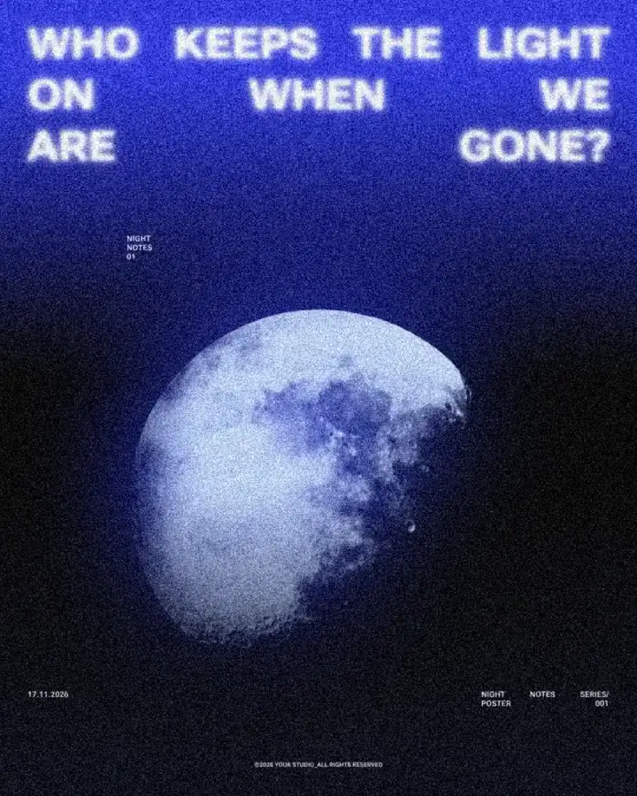
To choose a colour palette, start from one colour that fits the mood (or take it from a photo), pick a scheme around it — one colour in light and dark, neighbours on the colour wheel, or an opposite for an accent — and split the design roughly 60 % main, 30 % secondary and 10 % accent. Then check that text has at least 4.5 : 1 contrast against its background and save the colours as styles, so every design uses the same ones.
This guide does it on «Who keeps the light on», a night poster in deep blues with one warm glow, and explains the colour wheel schemes, the 60-30-10 rule, contrast for readability and how to change a whole palette at once. Every step was run in Paletoo on 11 November 2026; the pictures are the editor itself.
Colour schemes from the colour wheel
The colour wheel puts hues in a circle; most palettes are a simple shape on it. You do not need theory to use them — just know which one you are making:
| Scheme | What it is | Feels |
|---|---|---|
| Monochrome | One hue in light, mid and dark | Calm, elegant — the night poster is nearly this |
| Analogous | Two or three neighbours (blue, blue-violet, violet) | Harmonious, natural |
| Complementary | Two opposites (blue and orange) | Loud, energetic — best as main + accent |
| Split-complementary | One colour and the two beside its opposite | Lively but easier than pure opposites |
| Triadic | Three evenly spaced (red, yellow, blue) | Playful, bold — needs a neutral to rest |
The 60-30-10 rule and neutrals
A palette is not only which colours, but how much of each. The 60-30-10 rule, borrowed from interior design, is a good default: about 60 % of the design in the main colour (often a background), 30 % in a secondary one (type, shapes, a photo) and 10 % in an accent that draws the eye to the one thing that matters — a date, a price, a button. Neutrals — off-white, grey, near-black — do not count as colours here; they give the eye somewhere to rest.
Five colours is plenty for most brands: a main, a secondary, an accent and a light and a dark neutral. Write their hex codes down once and use them everywhere — on the website, the posters and the business cards. More than that and designs start to look different from each other, which is the opposite of what a palette is for.
Contrast: the part people skip
Colours that look lovely side by side can be unreadable as text on a background. The Web Content Accessibility Guidelines ask for a contrast ratio of at least 4.5 : 1 for normal text and 3 : 1 for large text; posters seen from far away need even more. Two quick checks: blur your eyes or view the design in greyscale — if the words disappear, the contrast is too low. Online contrast checkers give the exact ratio from two hex codes in a second. Light text on a mid-tone photo almost always needs the photo darkened behind it.
Remember colour blindness too: about one man in twelve sees reds and greens poorly. Never let colour alone carry meaning — a red «sold out» next to a green «available» should also differ in words or shape. A palette built on light against dark, not only on hue, works for everyone.
Made in Paletoo
Every picture on this page was made in Paletoo — these three with the same steps on other templates:
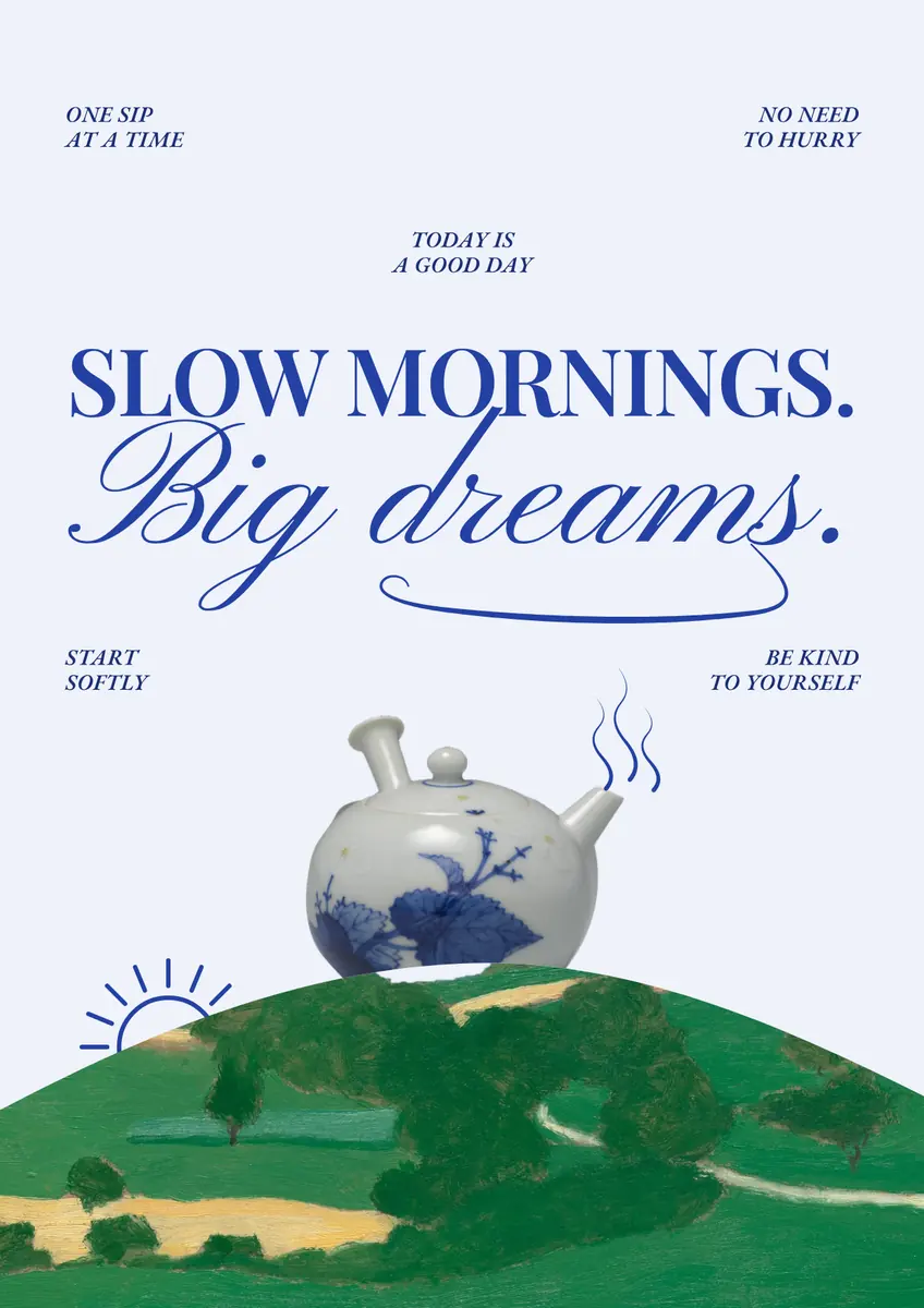
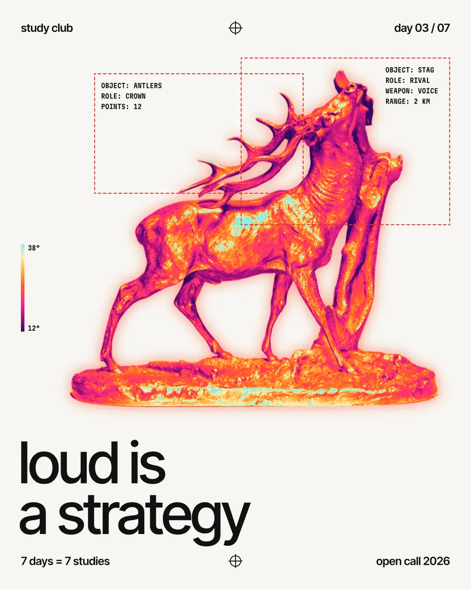
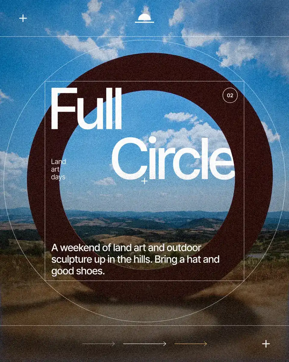
Step by step in Paletoo
Open the poster: press “Open in Paletoo” on this page, or start from the poster maker. With nothing selected, the Design tab lists the document’s Colour styles: its palette, each colour with its role.
Select everything (Ctrl A): the Selection colours section shows every colour actually used. Change one there and every place that uses it changes — the fastest way to try a new palette.
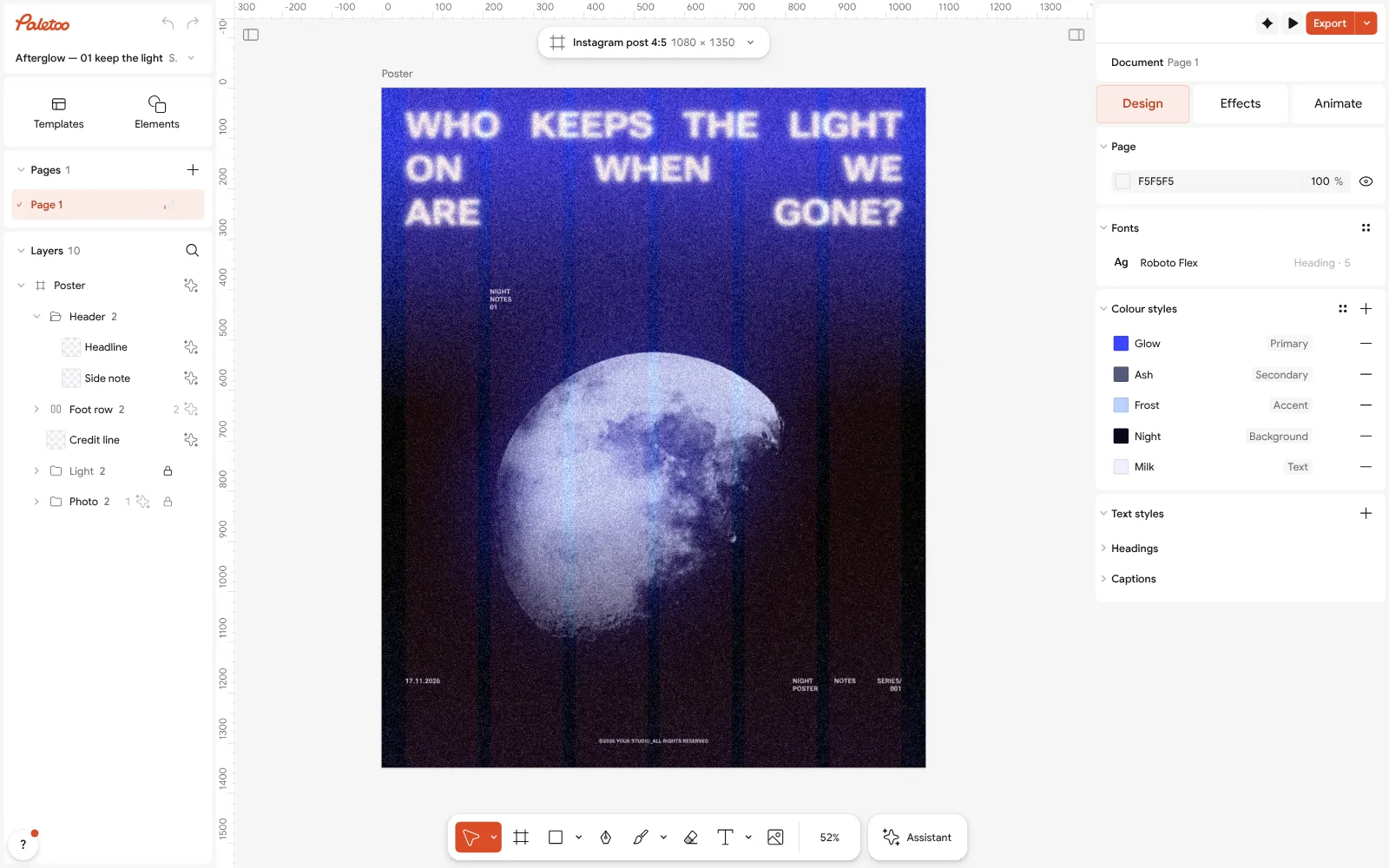
The night poster open in Paletoo with nothing selected: the document’s Colour styles, each with a role Want a starting point? Press Ctrl K and choose Palette from mood…, or take colours from a photo with Pick color (I).
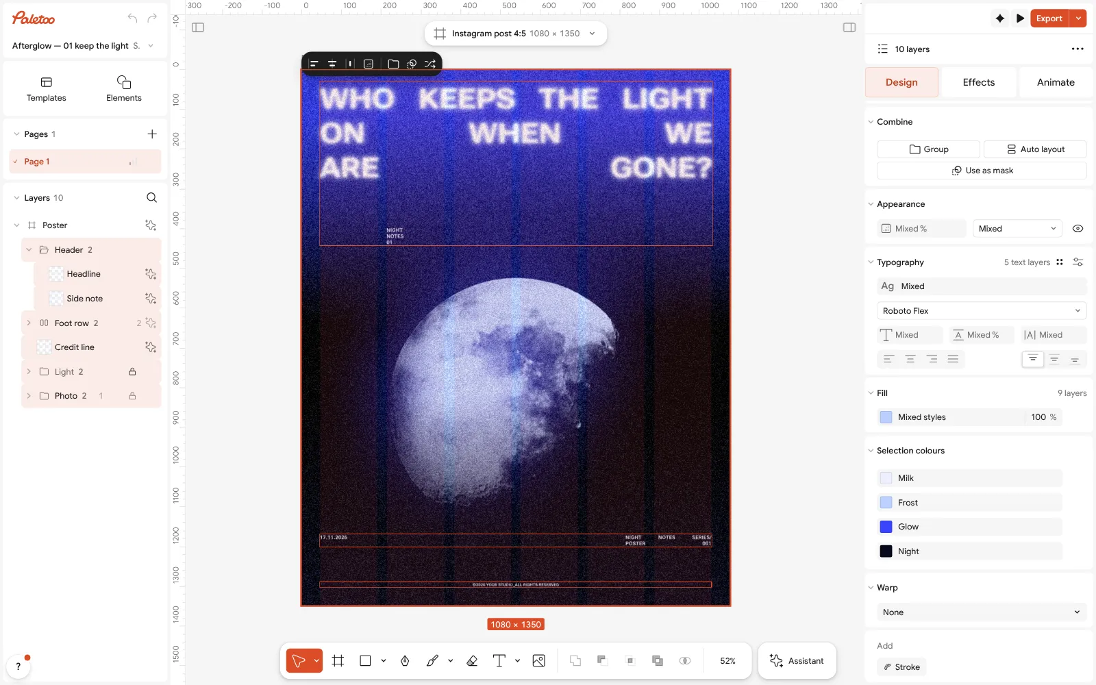
Everything selected: Selection colours lists every colour used in the design Save the palette: in Colour styles give each colour a role — background, primary, accent — so templates and new designs use the same set.
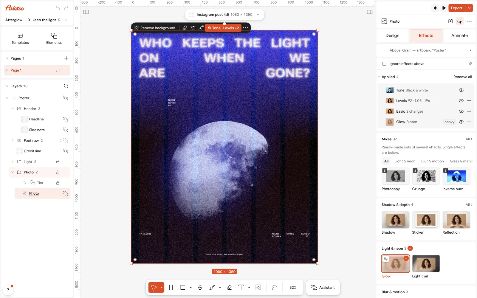
The photo under Effects: its night blue made by live steps, ready to follow a new palette Look at the photo’s colour: select it and open the Effects tab — the night blue comes from live steps under Applied, so you can push a photo towards your palette instead of hunting for one that matches.
Press Export (Ctrl Shift E). Before you do, check the smallest text against its background — if it is hard to read on your screen, it will be harder in print.
Make it your own
Try the opposite: replace the accent with the main colour’s complement in Colour styles and see if the design gets louder in the right place.
For a brand, save five colours and no more; delete the rest from Colour styles so nobody picks a sixth by accident.
If text is hard to read on a photo, darken just the photo with Levels on the Effects tab instead of adding a box behind the words.
Sources
Questions
How do I choose a colour palette?
Start from one colour that fits the mood, pick a scheme around it (monochrome, analogous, complementary), split it roughly 60-30-10, check text contrast and save the colours as styles.
What is the 60-30-10 rule?
About 60 % of a design in the main colour, 30 % in a secondary colour and 10 % in an accent. It is a default, not a law — but it keeps a palette balanced.
How many colours should a palette have?
Three to five: a main, a secondary, an accent and a light and a dark neutral.
What contrast does text need?
At least 4.5 : 1 for normal text and 3 : 1 for large text, according to WCAG. Posters read from afar need more.
Can I make a colour palette for free?
Yes. In Paletoo, Colour styles, Selection colours and Palette from mood are free, with no account.
Make it online
- Poster makerMake a poster from a template that already has the layout right, then export a print-ready PDF or an image for screens.
- Logo makerType your brand name, pick a logo, try fonts, colours and layouts, then download SVG, PNG and app icons — free, no watermark, no sign-up.
- Instagram post makerDesign a post at the right size from a real template, then export a sharp PNG or JPG — free, in your browser.
Free design templates for posts, stories and posters: Poster templates · Brand guidelines templates · Social media post templates
Try it on your own design
Paletoo opens in your browser, with no sign-up. Every effect here is live: change the picture or the words and the effect follows.
Open in PaletooOpens this design as your own copy — every layer and effect editable, free.
Read next
- 01
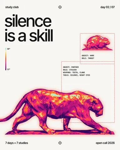 Two-colour poster: how to design with a limited paletteTwo inks, one paper and a picture forced into the palette: why limits make posters stronger.
- 02
 How to keep brand fonts and colours consistent across every designName the colours and the type once, link every layer to them, and change them in one place.
- 03
 RGB vs CMYK: which to use for print, and why colours go dullWhy your neon yellow came back from the printer looking like mustard — and how to see it coming on screen, before you pay for the run.