Techniques6 min readFreeUpdated 2026-11-06
Two-colour poster: how to design with a limited palette
Two inks, one paper and a picture forced into the palette: why limits make posters stronger.
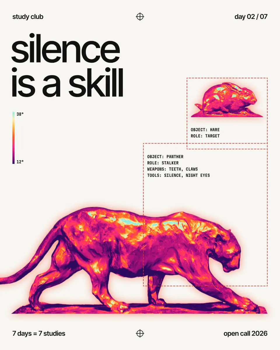
A two-colour poster uses two inks — usually a dark one and a bright one — on one paper colour, and nothing else. The limit is the point: fewer colours make a poster read faster from across a street, look printed rather than generated, and hold together even when the photo is ordinary. The fastest way to get any picture into such a palette is a gradient map, which repaints every pixel by its lightness using only the colours you choose.
This guide covers choosing the inks, keeping contrast and the one-accent rule, then takes apart a post made in Paletoo: “silence is a skill”, a bronze panther turned into heat-camera colours under black type on off-white paper. Strictly it has more than two colours, so we also show how to bring it down to a true two-ink look in one step.
Why limits work: a print habit
Limited palettes come from printing. In screen printing and risograph, every colour is a separate screen or drum and a separate pass through the machine, so two colours cost less than four and line up more easily. Designers learned to get everything out of two inks: a dark one for type and shadows, a bright one for the image or the accent, and the paper as a third colour. Where the inks overlap they mix into a fourth, for free. The risograph effect guide goes deeper into that look.
On screen the cost is gone, but the benefit stays. A tight palette gives a series a recognisable voice, makes a feed of posts look like a set, and saves you from the most common beginner’s problem: colour everywhere and nothing standing out.
Choosing two inks and a paper
Start with value, not hue. The two inks and the paper should differ clearly in lightness: a near-black, a bright mid-tone and a light paper. Squint at the design, or imagine it in grey: if the bright ink and the paper merge, the picture will vanish.
Pairs that work: black and fluorescent pink; navy and orange; dark green and acid yellow; deep violet and coral; black and signal red. Choose an off-white, cream or pale grey paper rather than pure white; it softens the contrast and looks like paper stock rather than a screen.
Give one ink the job of the accent and keep it in one place. On this post the type, the labels and the frames are ink on paper; every bit of colour lives in the animals and in the heat bar that explains them.
The gradient map does the work
A gradient map reads each pixel’s lightness and swaps it for a colour from a ramp: the darkest tones take the first stop, the lightest the last. With two stops you get a classic duotone; with a dark ink and the paper colour alone, a one-ink print. It works on any photo, which is why it is the quickest way to make pictures from different sources look like one set.
Two tips. Fix the tones before the map, with levels or a curve, because the map only repaints what it is given: a flat photo gives a flat print. And cut the ramp into a few flat bands if you want a screen-print look; three or four bands read as separate stencils. For a quick one-off, the duotone generator does just this in one click.
Common mistakes
Two colours of the same lightness, which print as one muddy colour. An accent used everywhere, so it stops being an accent. Pure white paper, pure black ink and a neon in between, which looks harsh; warm the paper a little. And forgetting the type: if the headline is in the bright ink, the picture should lean on the dark one, and the other way round.
Made in Paletoo
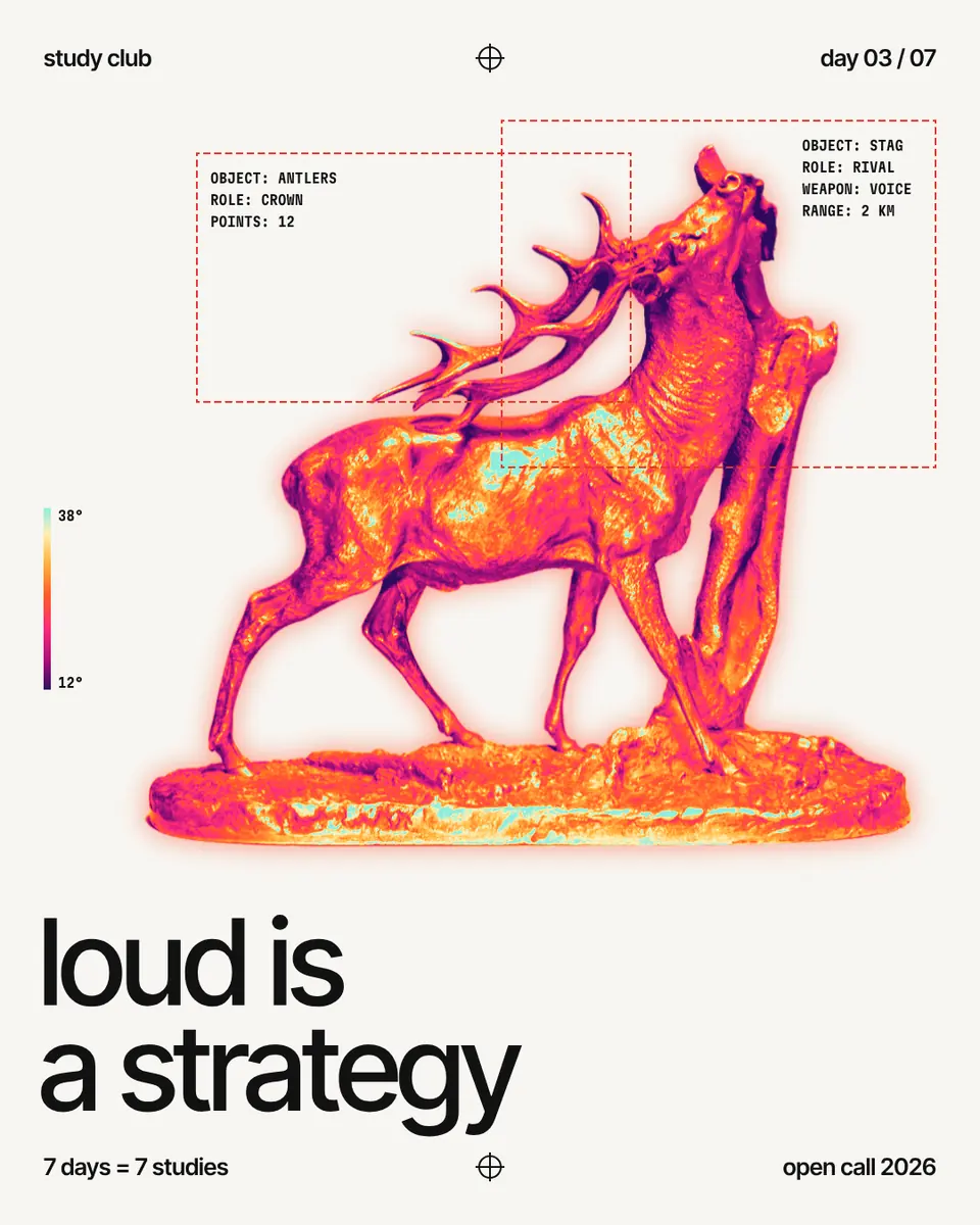
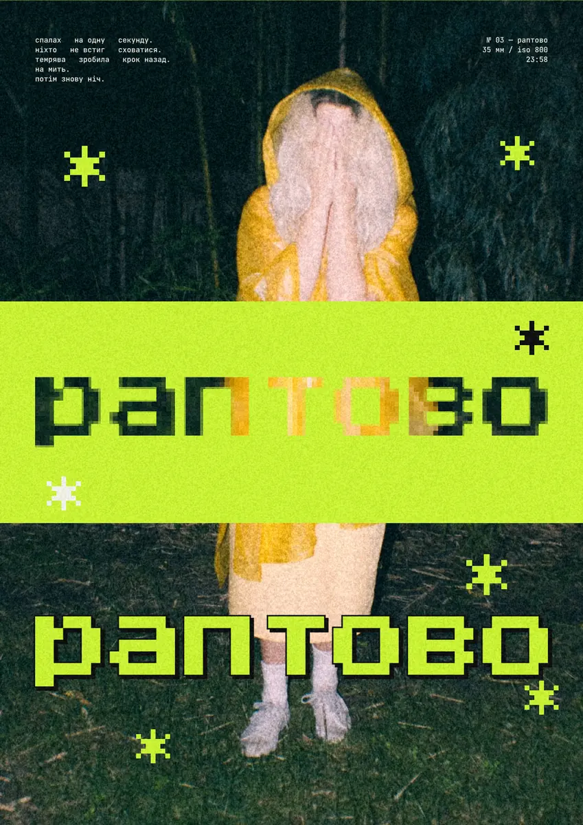
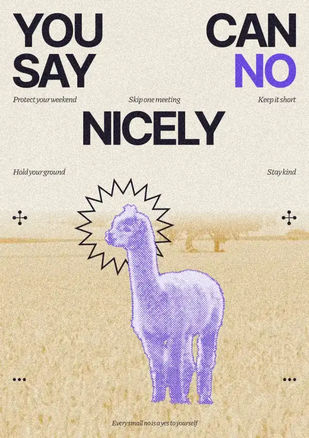
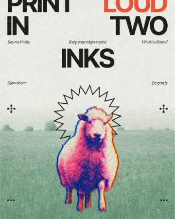
Every picture on this page was made in Paletoo — these three with the same steps on other templates:
Step by step in Paletoo
Press “Open in Paletoo” to open the Silence post as your own document. Layers shows a panther and a smaller hare, both photos of bronze sculptures, the headline, mono labels in dashed frames and a heat bar.
Click the headline, “silence is a skill”, to select it. The Design tab shows its frame, and Typography its font, Inter Tight at 150 px, set tight with negative tracking and flush left, in the document’s ink colour.
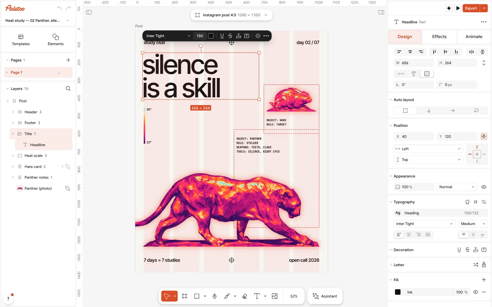
The Silence post open in Paletoo: the headline selected, Inter Tight at 150 px under Typography in the Design tab Click the panther and open the Effects tab. Under Applied are three steps: Levels, which opens up the bronze’s tones, Gradient map, which repaints them from deep violet through pink and orange to mint, and Shadow, a soft orange glow behind it.
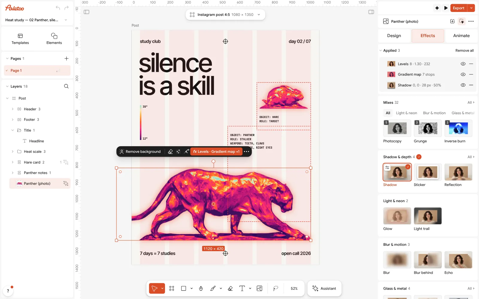
The panther selected: Levels, Gradient map and Shadow under Applied in the Effects tab Click the Gradient map row to open it. The Gradient ramp holds seven stops, darkest on the left; Contrast sharpens the picture before it is mapped, Reverse flips the ramp, and Levels, now off, cuts it into flat bands. The cards offer other ramps, from Heatmap to Noir.
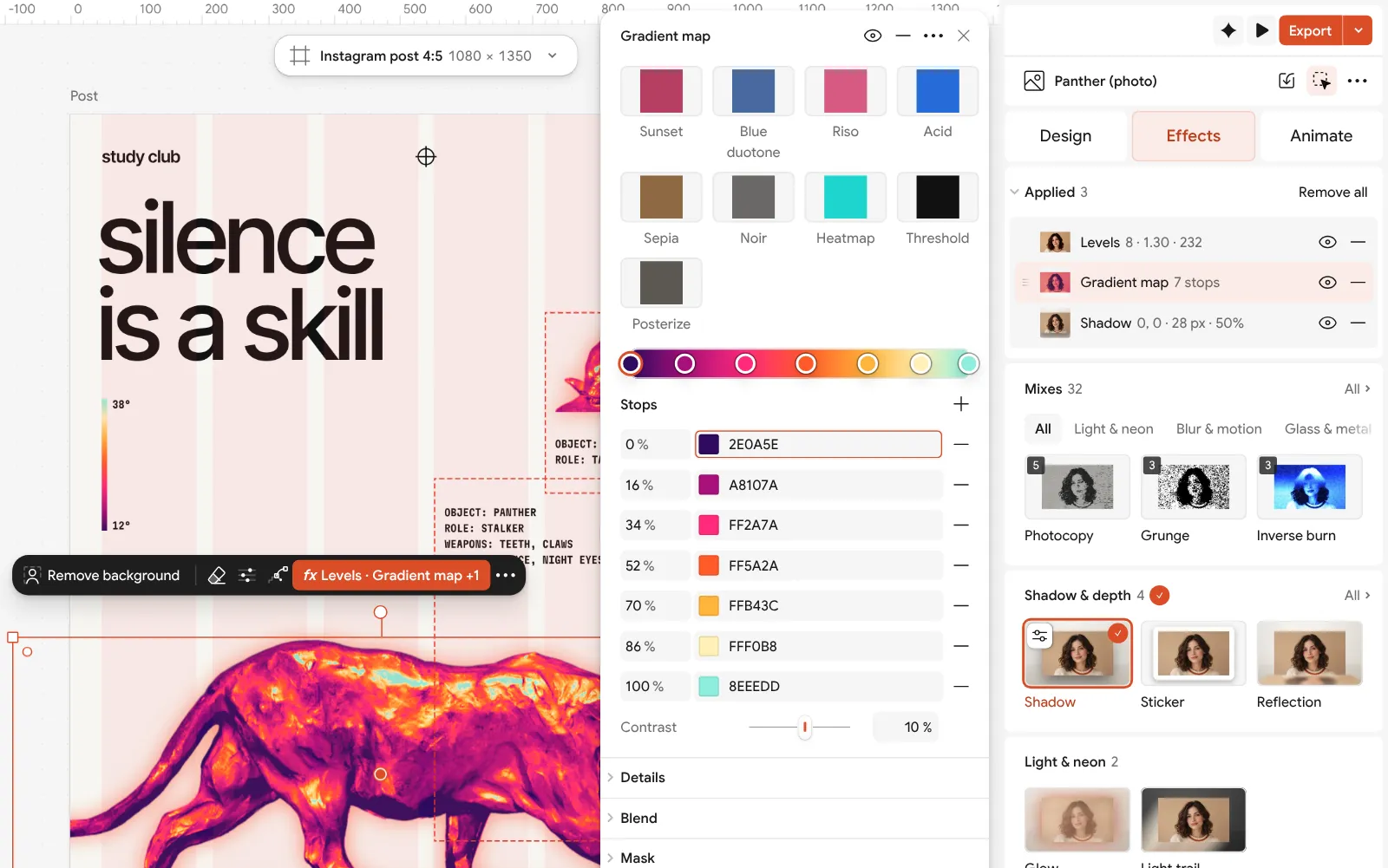
The Gradient map step open: the seven-stop ramp, contrast, reverse and levels beside the post To use your own picture, select the panther and press Replace picture: the new one comes out in the same heat colours. An object or an animal on a plain background works best; Remove background cuts one out of a busy photo first.
Double-click the headline to write your own, then press Export for a 1080 × 1350 PNG for the feed, or a PDF with Include bleed to print it.
Make it your own
For a true two-ink look, open the Gradient ramp, pick stops and press Remove stop until two are left — a deep violet and a hot pink, say; a ramp always keeps at least two. Or start from Noir or Blue duotone, which are two-colour ramps already, and change their colours.
Raise Levels in the step to 3 or 4 for a screen-print look: the panther turns into flat bands, as if each tone had its own stencil. Keep the Shadow glow in the same family as the ramp, or switch it off with its eye for a cleaner print.
The ink, the paper and the glow are colour styles. Click an empty part of the canvas and change them under Colour styles in the Design tab; the type and the glow follow. The hare carries the same three steps, so if you change the panther’s ramp, change the hare’s too and the pair still match.
Questions
What is a two-colour poster?
A poster printed, or designed to look printed, with only two inks on one paper colour. The paper counts as a third colour, and where the inks overlap they make a fourth.
Which two colours go well together on a poster?
A dark and a bright that differ clearly in lightness: black and fluorescent pink, navy and orange, dark green and acid yellow, violet and coral. Put them on an off-white paper.
How do I turn a photo into two colours?
Use a gradient map with two stops: the darks take one colour and the lights the other. In Paletoo that is the Gradient map effect; a Levels step before it decides how much of the picture falls on each side.
Is duotone the same as a two-colour poster?
Duotone is the image technique, one photo in two colours. A two-colour poster applies the same limit to everything: the picture, the type and the shapes.
Why do designers use a limited colour palette?
It reads faster, looks more deliberate and prints cheaper. It also holds a series together: posters that share two inks look like a set even with different pictures.
Make it online
- Poster makerMake a poster from a template that already has the layout right, then export a print-ready PDF or an image for screens.
- Duotone, halftone and glitch photo effects onlineThree of the strongest looks for a photo, each one click away and every step still yours to tune.
- Photo effects onlineGive a photo a film, print or glitch look in one click — and keep every step editable afterwards.
Free design templates: Poster templates
Try it on your own design
Paletoo opens in your browser, with no sign-up. Every effect here is live: change the picture or the words and the effect follows.
Open in Paletoo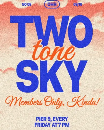 How to make a duotone effect
 How to make a risograph effect
 How to make a screen print effect