Techniques5 min readFreeUpdated 2026-11-16
RGB vs CMYK: which to use for print, and why colours go dull
Why your neon yellow came back from the printer looking like mustard — and how to see it coming on screen, before you pay for the run.
By the Paletoo team · steps tested in Paletoo on
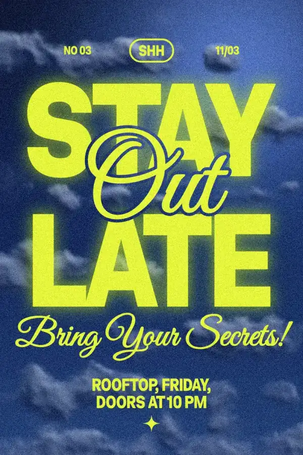
RGB mixes red, green and blue light and is how every screen shows colour; CMYK mixes cyan, magenta, yellow and black ink and is how most printers put it on paper. Design in RGB, and for print either send an RGB PDF and let the printer convert it, or export a CMYK PDF (PDF/X-4) yourself — and check the result first, because the brightest screen colours (neon green, electric blue, hot orange) cannot be printed and come out duller.
This guide shows that on a poster built on purpose to fail: «Stay out late», a party poster with acid-yellow type on an electric-blue sky. We turn on Paletoo’s soft proof to see what CMYK does to it, then export a CMYK PDF with rich black. Every step was run in Paletoo on 11 November 2026; the pictures are the editor itself.
RGB and CMYK in plain words
A screen starts black and adds light: full red, green and blue together make white. That is additive colour, RGB. Paper starts white and inks take light away: cyan, magenta and yellow together make a muddy dark brown, so printers add a fourth ink, black (the K), for real black and sharp text. That is subtractive colour, CMYK. The two systems overlap but do not match: a screen can show greens, blues and oranges that no four-ink press can mix, and a few dark cyans print that a screen barely shows.
| RGB | CMYK | |
|---|---|---|
| Made of | Red, green, blue light | Cyan, magenta, yellow, black ink |
| Mixing | Additive — all together is white | Subtractive — all together is near-black |
| Used for | Screens, social media, websites, video | Offset and digital print: posters, flyers, cards |
| Range of colours | Wider: neon greens, electric blues | Narrower: brightest colours go dull |
| Files | PNG, JPG, WebP, MP4, an RGB PDF | PDF/X-4 or PDF/X-1a, sometimes TIFF |
Should I send RGB or CMYK to the printer?
Ask the print shop — and expect one of two answers. Most digital printers, copy shops and online poster services take an RGB PDF or even a PNG and convert it with their own profile, which knows their machine better than any file you make. Offset printers and many sticker and packaging printers want CMYK, usually as PDF/X-4 or PDF/X-1a, often with a named profile such as FOGRA39 or PSO Coated v3 from the European Color Initiative. Home printers and photo labs want RGB. Clothes printed with direct-to-garment usually want an RGB PNG.
What matters more than the setting is expectations. If your design relies on a colour outside CMYK, it will print duller either way. Choose a slightly deeper version of that colour yourself, or add a fifth ink (a Pantone spot colour), or accept it.
Black: rich, plain and for text
Plain black in print is 100 % K, which on its own looks slightly grey in big areas. Rich black adds the other inks underneath — a common mix is 60 % cyan, 40 % magenta, 40 % yellow and 100 % black — for a deep, velvety background. Never use it for small text: four inks never land in exactly the same place, and thin letters get coloured fringes. Big black areas rich, text plain K, and keep the total ink under about 300 %.
Made in Paletoo
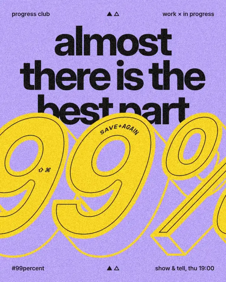
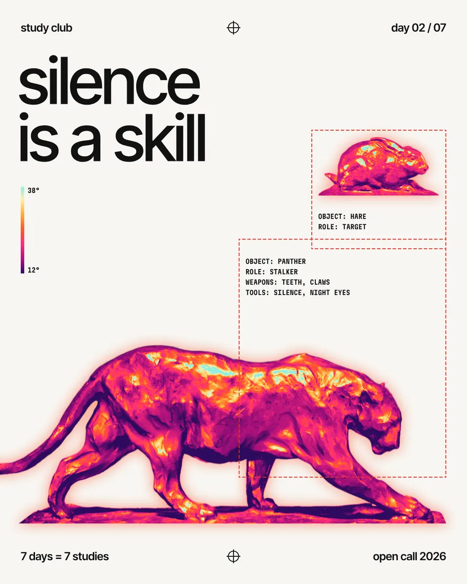
Every picture on this page was made in Paletoo — these three with the same steps on other templates:

Step by step in Paletoo
Open the poster: press “Open in Paletoo” on this page, or start from the poster maker. Select «STAY»: its acid yellow is under Fill and its font under Typography — an RGB colour, as everything on a screen is.
Turn on the soft proof: press Ctrl K, type «proof» and choose Proof colours (CMYK). The canvas shows the poster as a CMYK print would — the yellow drops towards mustard, the blue loses its glow. A chip says it is an approximate proof; it changes nothing in the file.
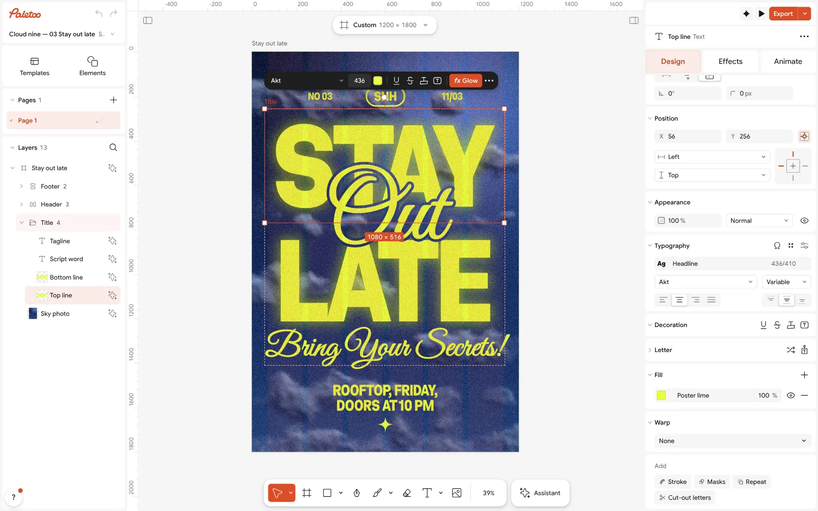
The «Stay out late» poster open in Paletoo: the acid-yellow «STAY» selected, its colour under Fill Decide what to do about the colours that change most. Lower the yellow’s green a little, or deepen the blue, in Colour styles — every part that uses the colour updates, and you can compare with the proof on and off.
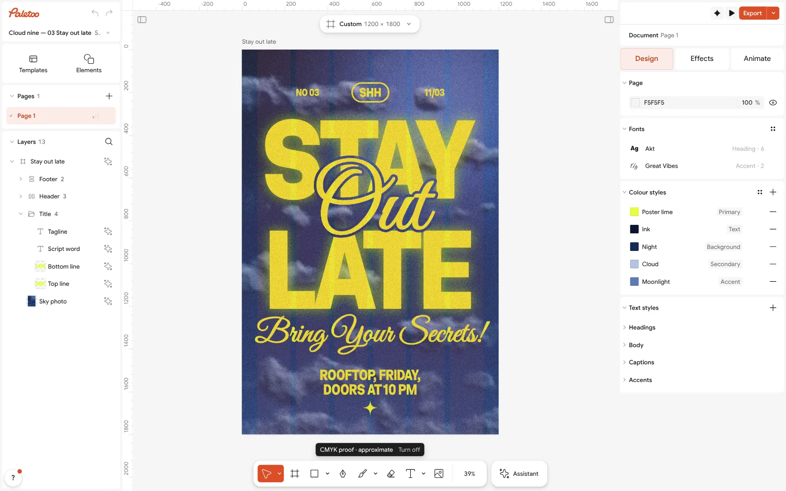
Proof colours (CMYK) on: the yellow and the blue as a CMYK print would show them, with the «approximate» chip Turn the proof off the same way. Press Export (Ctrl Shift E) and choose PDF. Open Export settings (the ⋯ beside the format) and under Colour choose CMYK print: the PDF is written as PDF/X-4.
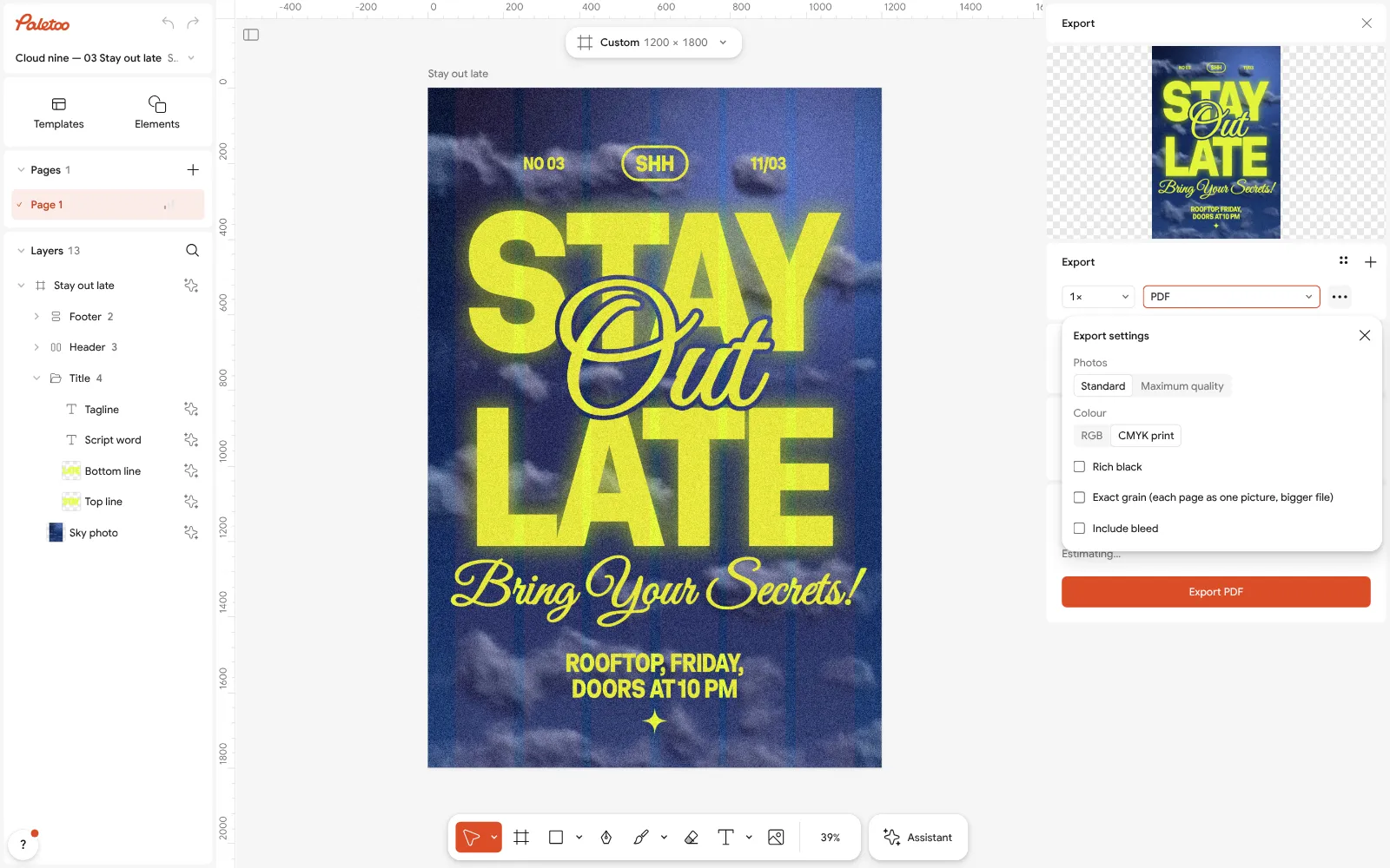
Export as PDF with Colour set to CMYK print and the Rich black option Turn on Rich black for deep black backgrounds (text stays in black ink only), and Include bleed with Crop marks for a poster that is trimmed. Or pick the PDF print CMYK (PDF/X-4) preset, which sets all of this at once.
Send it with a note: «CMYK PDF/X-4, approximate profile — please convert with yours if needed». Paletoo says its CMYK profile is approximate; a printer with its own profile will match its press more closely.
Make it your own
Making a poster only for screens? Do not convert anything: export PNG or JPG and keep every RGB colour as bright as it is.
For risograph or screen printing, which use real coloured inks rather than CMYK, design in two or three flat colours and ask the printer for their ink list — Colour styles makes swapping them easy.
If the printer asks for a specific profile you cannot pick here, send them the RGB PDF and let them convert: that is safer than an approximate CMYK file.
Sources
Questions
What is the difference between RGB and CMYK?
RGB mixes red, green and blue light for screens; CMYK mixes cyan, magenta, yellow and black ink for print. RGB can show brighter colours than CMYK can print.
Should I use RGB or CMYK for printing?
Ask the printer. Most digital and online printers accept RGB and convert it; offset printers usually want CMYK as PDF/X-4 or PDF/X-1a. Home printers want RGB.
Why do my colours look dull when printed?
Bright screen colours — neon greens, electric blues, vivid oranges — are outside what four inks can mix, so they print duller. A CMYK soft proof shows it before you print.
Should a poster be RGB or CMYK?
For screens and social media, RGB. For print, CMYK or an RGB file the printer converts — check with the shop. Design in RGB either way and convert at the end.
Can I export a CMYK PDF for free?
Yes. Paletoo exports PDF/X-4 in CMYK with bleed, crop marks and rich black for free; its CMYK profile is approximate, which it says on export.
Make it online
- Poster makerMake a poster from a template that already has the layout right, then export a print-ready PDF or an image for screens.
- Flyer makerTurn a ready flyer template into yours in minutes and send the printer a PDF with bleed and crop marks.
- Business card makerDesign a business card at the exact print size, add a QR code that really scans, and export a PDF the printer accepts.
Free design templates for posts, stories and posters: Poster templates · Event and launch templates · Contact and call-to-action templates
Try it on your own design
Paletoo opens in your browser, with no sign-up. Every effect here is live: change the picture or the words and the effect follows.
Open in PaletooOpens this design as your own copy — every layer and effect editable, free.
Read next
- 01
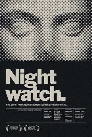 Print-ready PDF: bleed, crop marks and CMYK, freeEverything a printer means by “print-ready”, and a checklist before you send the file.
- 02
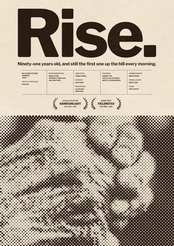 Poster sizes: A4 to A0, 18 × 24, 24 × 36 and pixels for printEvery common poster size in one table — millimetres, inches and the pixels to export — and a poster that switches size in one menu.
- 03
 How to make a risograph effectTwo riso inks out of register, a coarse screen, riso paper.