Techniques5 min readFreeUpdated 2026-11-06
Graphic design hacks: 15 small habits that save hours
Fifteen habits, each a few seconds long, that add up to hours.
The most useful graphic design tips and tricks are not secret effects; they are small habits that save a few seconds each and catch mistakes before anyone sees them. Designers who seem fast are mostly making the same fifteen moves without thinking. Here they are, in three groups: speed, consistency and checking.
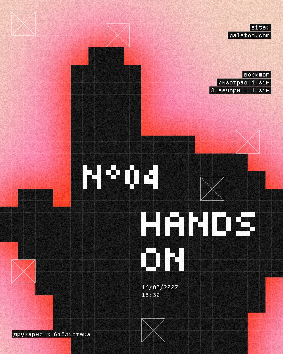
Each one is shown on a poster from the Pixel glow series, “HANDS ON”: a workshop poster with a black pixel hand pointing through a red and pink glow on peach, white pixel letters and small mono captions on a grid. Every shortcut below works in Paletoo, which uses Figma’s keys for the same actions, on any keyboard layout. On a Mac, read ⌘ for Ctrl and ⌥ for Alt.
Speed: hands on the keyboard
1. Learn the shortcuts you need ten times a day. Press ? to see the whole list, and start with three: Ctrl+D to duplicate, Ctrl+G to group, Ctrl+Shift+H to hide.
2. Alt-drag to copy. Hold Alt and drag an object: the original stays put and a copy comes with you. It is the quickest way to make a second caption that matches the first.
3. Align with keys, not by eye. Alt+A, Alt+D, Alt+W and Alt+S line the selection up on its left, right, top and bottom edges; Alt+H and Alt+V centre it. A single object aligns to its artboard.
4. Zoom with Shift. Shift+1 fits the whole design on screen and Shift+2 zooms to what is selected, so you never scroll around hunting for a layer.
5. Copy the look, not the object. Ctrl+Alt+C copies a layer’s properties — fill, effects, style — and Ctrl+Alt+V gives them to another. Ctrl+Shift+R puts what you copied in place of the selected layer.
Consistency: decide once, reuse everywhere
6. Turn colours into colour styles. The Hands on poster has five: Peach, Ink, Signal red, Pink and Paper. Edit Signal red once and the glow changes everywhere it is used — that is how one poster becomes a series in five colourways.
7. Turn type into text styles. Two are enough for most posters: a headline and a label. Change the label once and every caption follows.
8. Recolour a group in one go. Select several layers, a group or an artboard and the Design tab lists their selection colours; change one and it changes in all of them.
9. Select by sameness. Select same colour and select same font pick up every matching layer, so a wrong grey or a stray font is fixed in one move.
10. Keep effects live. In Paletoo an effect is a step you can switch off, reorder or retune at any time. Rasterize, which bakes it into a plain picture, only when you must, and never on your only copy.
11. Save a look you like as a preset, so the next poster starts where this one ended.
Checking: see it the way others will
12. The squint test. Squint, or zoom out until the design is thumbnail-sized. Whatever is still visible is your hierarchy; if it is not the headline, fix that before anything else.
13. One thing at a time. Switch an effect step off with its eye and look again. If you cannot tell the difference, the step is not earning its place.
14. Name your layers. Tidy layer names names them from what they hold, so the list still makes sense when you come back a month later.
15. Export in one go. Export all artboards saves every version of a series at once, and Ctrl+Shift+C copies the selection as a PNG for a quick message.
Made in Paletoo
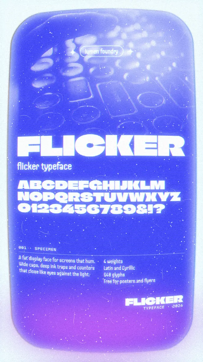
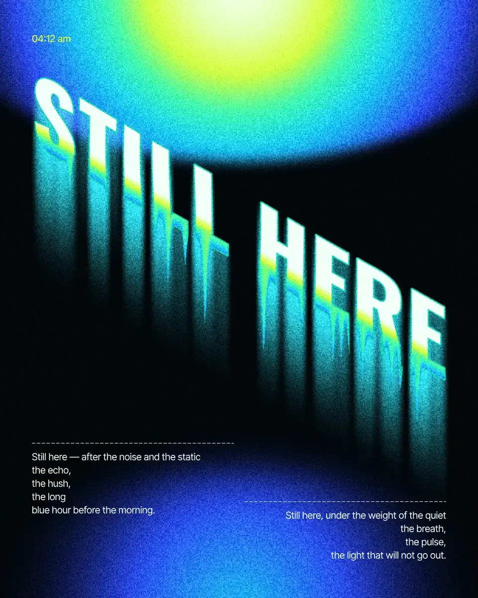
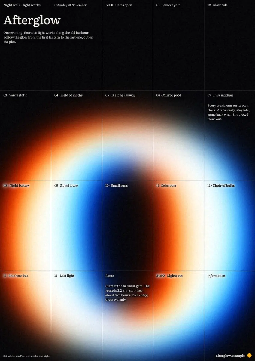
Every picture on this page was made in Paletoo — these three with the same steps on other templates:
Step by step in Paletoo
Press “Open in Paletoo” to open Hands on as your own document. Layers lists the hand, the grid lines and frame marks, two pixel headlines and four small mono captions; press ? at any time for the Keyboard shortcuts.
Click “HANDS ON” to select it. The Design tab shows its place, and Typography its pixel font, Tiny5, at 144 px, set by the document’s Headline text style; the small captions share a second style, Label.
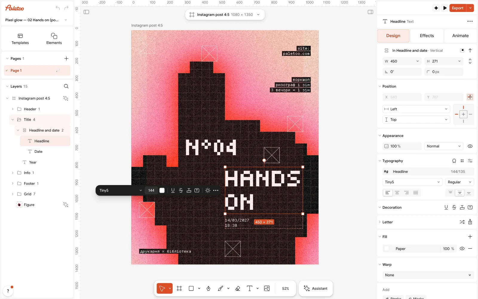
The Hands on post open in Paletoo: the headline “HANDS ON” selected, its pixel font and size under Typography in the Design tab Click the hand and open the Effects tab. Under Applied are five steps: Pixel, then Levels, which flattens it to near-black, then three Shadow steps whose red and pink come from the colour styles.
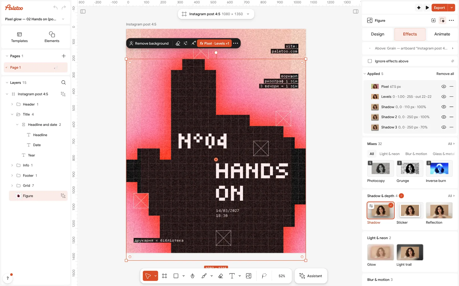
The hand selected: Pixel, Levels and three Shadow steps under Applied in the Effects tab Click the Pixel row to open it. Size sets the blocks, Shape and Edges their form, and the cards above offer ready looks from 8-bit to LED; the glow follows, because it is drawn from the pixels.
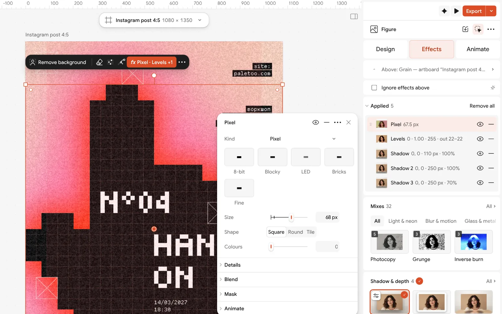
The Pixel step open: its size, shape and edges beside the poster Make it yours: Replace picture puts any photo into the same pixel glow, a double-click on the headline lets you write your words, and an Alt-drag on a caption adds another one that matches.
Press Export for a PNG of 1080 × 1350. Making a series? Duplicate the artboard, change the colour styles on the copy, and save every version at once with Export all artboards.
Make it your own
With nothing selected, the Design tab lists the Colour styles. Change Signal red and Pink and the glow takes the new colours, along with every other layer that uses them. Two neighbouring colours keep the glow soft; opposite ones make it buzz.
For a phone, keep the pixel Size big enough that the hand is about a dozen blocks across; smaller blocks look like a blurry photo rather than pixel art.
When a step is set just right, keep it: Save as preset… in the step’s menu saves its settings for the next poster. To test whether a step matters, choose Hide and look again.
Questions
What are the most useful graphic design shortcuts?
Duplicate (Ctrl+D), group (Ctrl+G), align (Alt+A, D, W, S), zoom to fit (Shift+1) and copy and paste properties (Ctrl+Alt+C, Ctrl+Alt+V). Learn five, then add one a week.
How do designers keep colours consistent?
They save the palette as colour styles and use only those. Changing a style then changes every layer that uses it, which also makes a series easy.
What is the squint test in design?
Squinting blurs the details so only the big shapes and contrasts remain. If the most important element is not what you see first, the hierarchy needs work.
Should I flatten effects before exporting?
No, the export renders them. Keep effects live so you can change them later; flatten a copy only when another program needs a plain picture.
How can I design faster without losing quality?
Start from a template or your last file, reuse styles, use keys for aligning and zooming, and check at thumbnail size before polishing details.
Make it online
- Poster makerMake a poster from a template that already has the layout right, then export a print-ready PDF or an image for screens.
- Instagram post makerDesign a post at the right size from a real template, then export a sharp PNG or JPG — free, in your browser.
- Photo effects onlineGive a photo a film, print or glitch look in one click — and keep every step editable afterwards.
Free design templates: Poster templates · Social media post templates
Try it on your own design
Paletoo opens in your browser, with no sign-up. Every effect here is live: change the picture or the words and the effect follows.
Open in PaletooRead next
- 01
 Poster design tips: 9 tricks that make a poster look designedNine habits that separate a designed poster from an assembled one.
- 02
 How to keep brand fonts and colours consistent across every designName the colours and the type once, link every layer to them, and change them in one place.
- 03
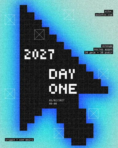 Your first poster in 10 minutes: a timed exercise for beginnersSet a timer. Ten minutes, six small decisions, one finished poster.