Techniques5 min readFreeUpdated 2026-11-06
Image to ASCII art: how to turn a photo into characters
Rows of characters, as dense as the light under them, that add up to a picture.
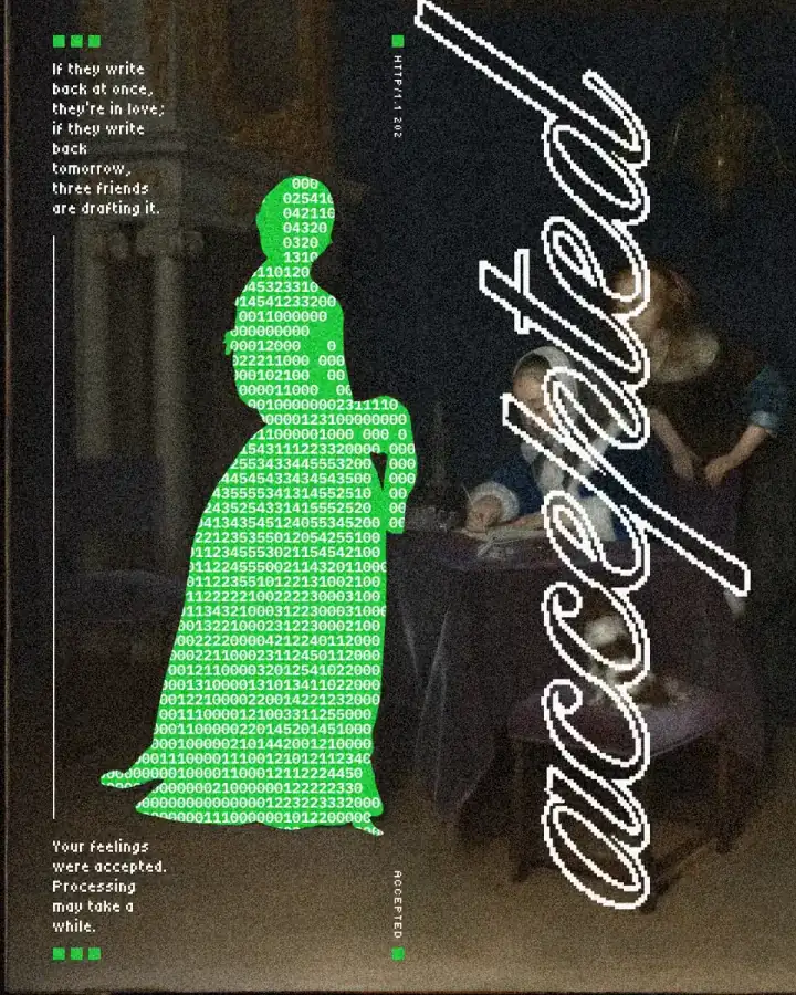
To turn an image into ASCII art, a converter lays a grid over the photo and puts one character in each cell: a space or a dot where the tone is empty, a dense digit or symbol where it is full. Seen from a distance, the rows become the picture again. Paletoo does it two ways, both free: the quick image to ASCII tool, which gives you a PNG or the text itself, and the ASCII effect in the editor, which keeps the picture live inside a poster.
This guide covers both, on a poster from the Motifs series, “accepted”: a 17th-century painting from The Met in which one woman in a long gown has become a green silhouette full of white digits, with the word “accepted” in a script down the side and small pixel captions. Only the figure is treated, and that is the whole trick. For more of the retro screen look, see Y2K pixel art.
Which pictures convert well
Contrast first. ASCII has only a handful of tones, one per character, so a photo with strong light and shadow survives and a flat grey one turns to mush. Raise the contrast before converting, or pick another photo.
A simple silhouette. One figure, a face in profile, a hand, a bottle, a building against the sky: shapes you would recognise as a shadow read best. A crowd or a detailed landscape does not.
Enough cells. A face needs roughly 40 to 60 characters across to be recognisable; a silhouette, 20 to 30. On a 1080 px post, a 12 px cell gives 90 columns across the full width, so a figure a third as wide gets about 30.
Characters, cell and colour
The character set is the look. A classic ramp of punctuation (. : - = + * # % @) reads as old-school text art, blocks (░ ▒ ▓ █) as a terminal graphic, zeros and ones as code. You can also type your own: the accepted poster uses a few spaces, zeros and the digits 1 to 5, so the figure looks like data.
The cell is the resolution. Smaller cells give more detail and a finer texture; bigger cells give a bolder, more graphic shape that still reads on a phone. On a poster, choose the cell for the viewing distance, not for your screen.
Colour sets the mood. Characters can take the colours of the picture under them, or one ink on a solid background. One flat colour behind white digits, as here, turns the figure into a sign that stands out from the painting.
The quick tool or the editor
Use the quick tool when the ASCII is the result: a profile picture, a banner for a README, a sticker. Set the characters across, pick a set, light or dark, keep the colours if you like, then download a PNG or copy the text. It runs in your browser, and pasted text needs a monospaced font, or the columns drift.
Use the editor when the ASCII is part of a design. There it is an effect step on a layer: you can treat one figure and leave the rest of the photo as it is, set type around it, change the cell or the colour whenever you like, and export the poster as PNG, JPG or PDF. A mask around the figure, or a cut-out copy, limits the effect to one part.
Made in Paletoo
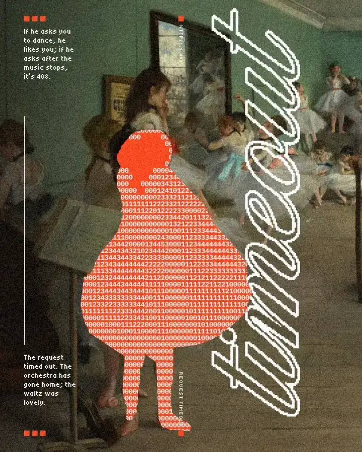
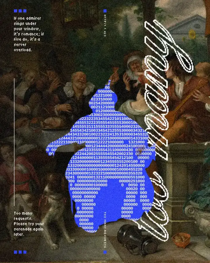
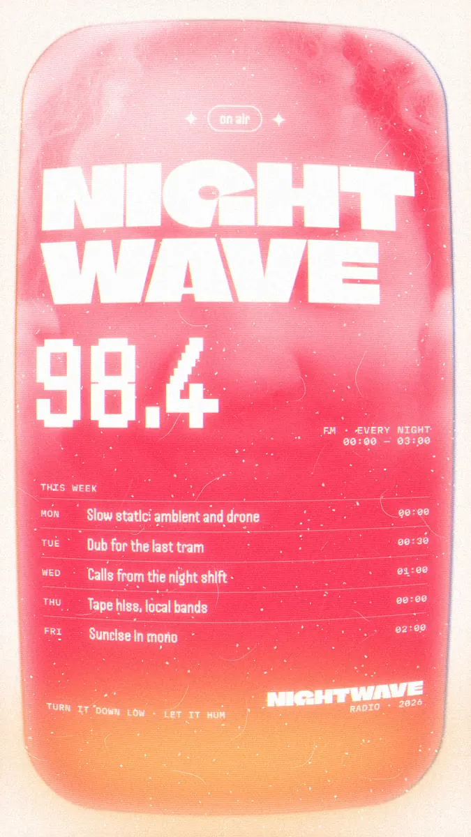
Every picture on this page was made in Paletoo — these three with the same steps on other templates:
Step by step in Paletoo
Press “Open in Paletoo” to open the accepted post as your own document. Layers shows the painting, a copy of it masked to the woman’s figure, the word, and the small captions and labels.
Click the green figure to select it. The Design tab shows its place and size: it is the whole painting again, cut to her silhouette by a mask, so whatever happens to this layer happens only to her.
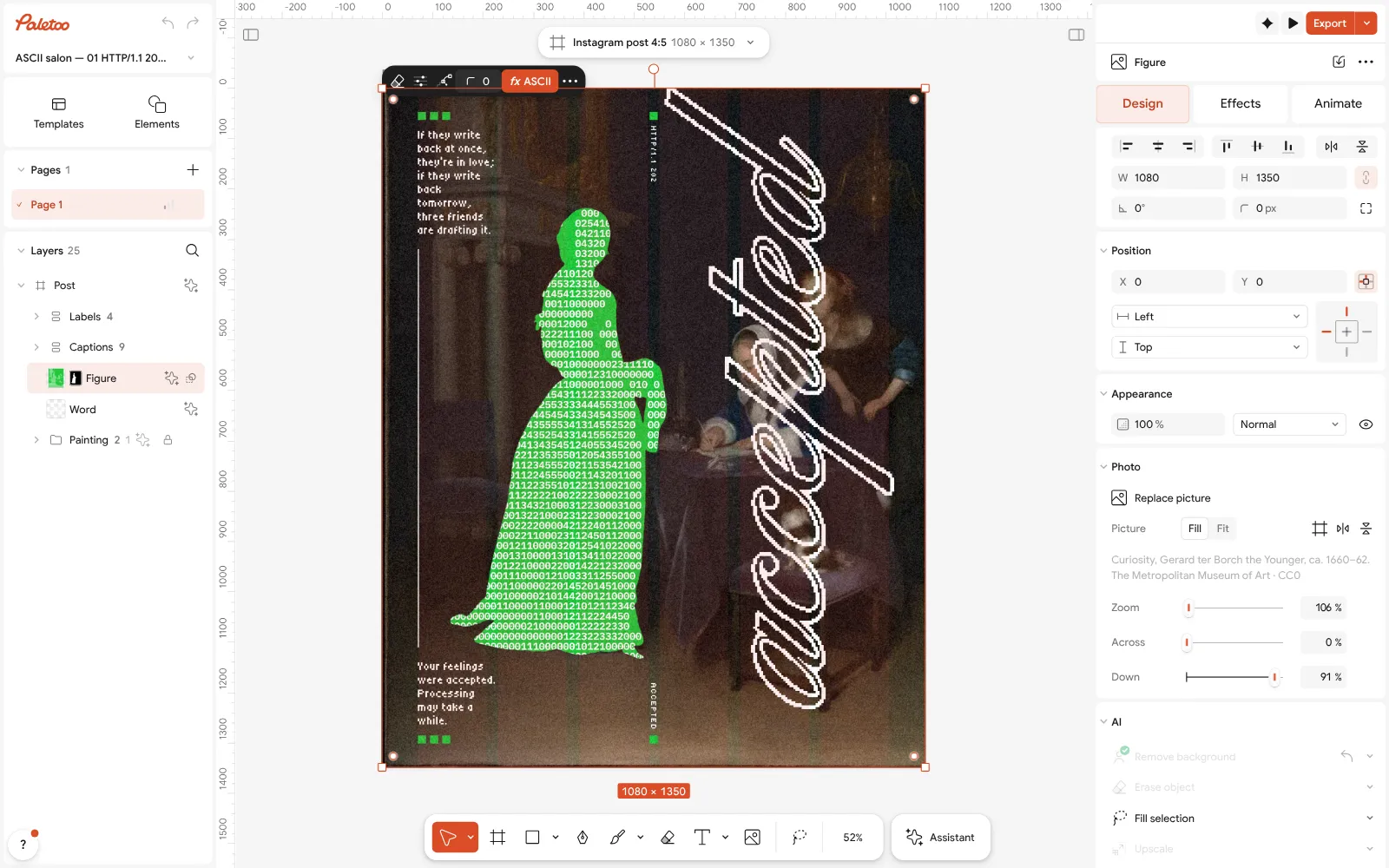
The accepted post open in Paletoo: the green ASCII figure selected, its place and size in the Design tab Open the Effects tab. Under Applied is a single step, ASCII, which redraws the figure as characters on a 12 px grid.
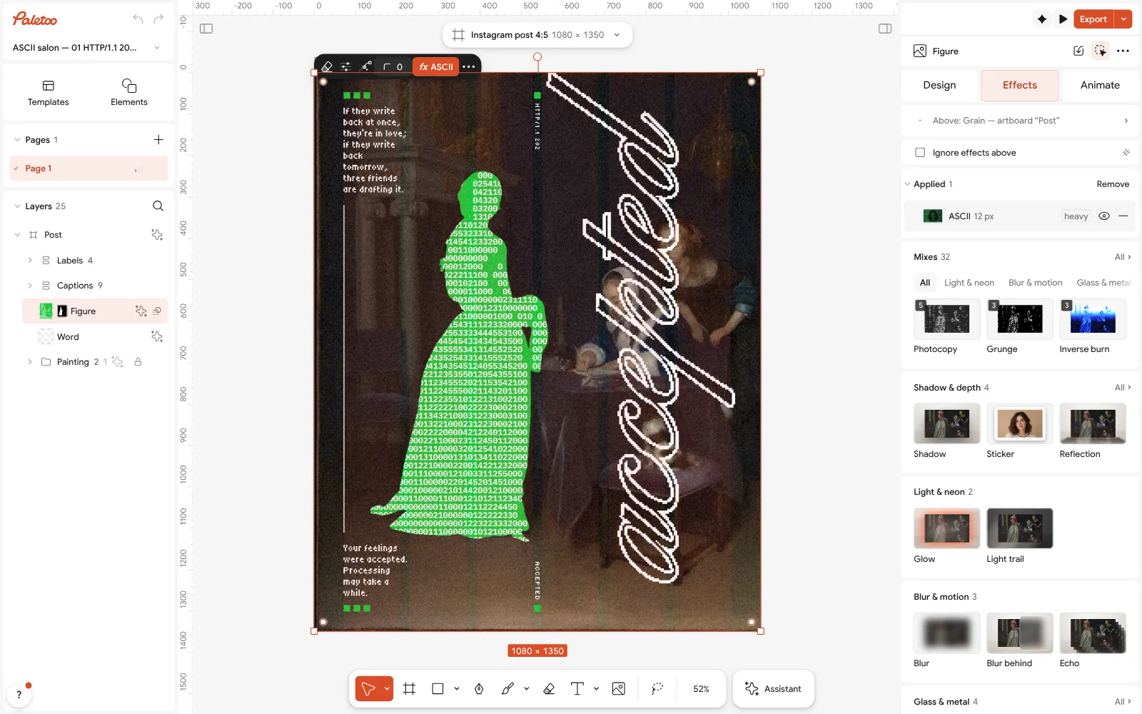
The figure in the Effects tab: a single ASCII step under Applied Click the ASCII row to open it. Cell is the size of each character, Characters is set to Custom with the spaces and digits typed in Text, Colour is a white Ink, and Background puts them on solid green.
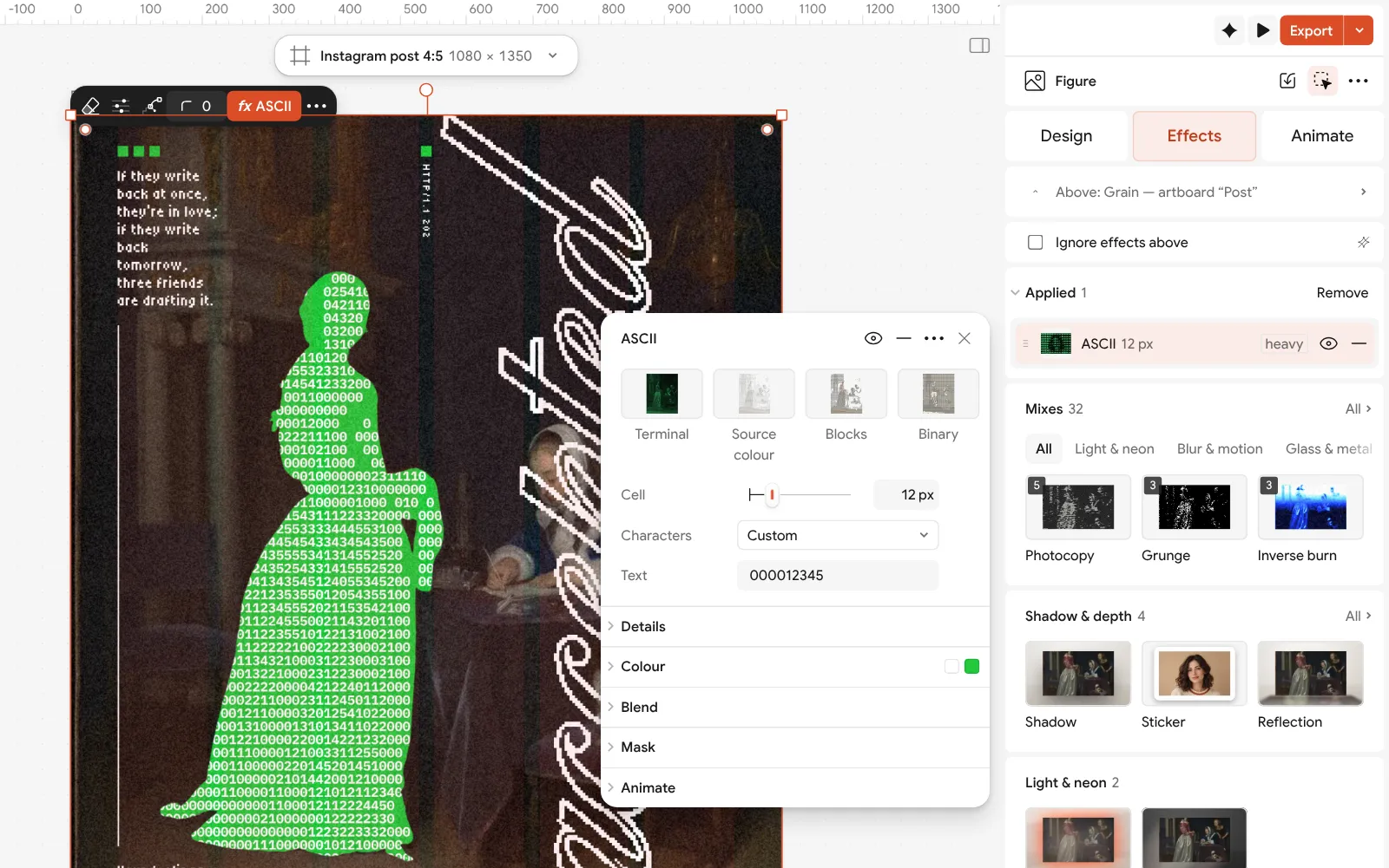
The ASCII step open: the cell, the custom characters, the white ink and the green background beside the poster For your own picture, add a photo, duplicate it, press Remove background on the top copy and give that copy the ASCII step; the photo below stays as it was. Double-click the word to write your own.
Press Export for a PNG of 1080 × 1350 for the feed, or a PDF with Include bleed to print it as a poster.
Make it your own
Change the Cell first. At 8 px the figure becomes a fine texture that rewards a closer look; at 16–20 px it turns into a bold block that reads across a room or on a phone.
Try the ready sets in Characters: Classic for old-school text art, Blocks for a terminal look, Binary for code. If light and dark come out the wrong way round, switch on Invert ramp.
For a softer result, set Colour to Object so each character takes the colour of the painting under it, and switch Background off: the figure then dissolves into the scene instead of standing out.
Questions
How do I convert an image to ASCII art?
Use a converter: it lays a grid over the photo and picks a character for each cell by its brightness. Paletoo’s free image to ASCII tool gives you a PNG or the text; the editor’s ASCII effect does the same inside a design.
What photos work best for ASCII art?
High-contrast photos with one clear subject and a simple outline: a face in strong side light, a figure against the sky. Busy, low-contrast pictures turn to noise.
Why does my ASCII art look stretched when I paste it?
Text art needs a monospaced font, where every character is the same width. Paste it into a code block, or use the PNG instead.
Can ASCII art be in colour?
Yes. Each character can take the colour of the picture under it, or you can use one ink on a coloured background, like the white digits on green on this poster.
Is the image to ASCII converter free?
Yes. The tool and the editor are free, with no watermark, and you do not need an account to make and export.
Make it online
- Photo effects onlineGive a photo a film, print or glitch look in one click — and keep every step editable afterwards.
- Poster makerMake a poster from a template that already has the layout right, then export a print-ready PDF or an image for screens.
- Instagram post makerDesign a post at the right size from a real template, then export a sharp PNG or JPG — free, in your browser.
Free design templates: Poster templates · Social media post templates
Try it on your own design
Paletoo opens in your browser, with no sign-up. Every effect here is live: change the picture or the words and the effect follows.
Open in PaletooRead next
- 01
 Y2K pixel art trend 2027: 8-bit, LED boards and CRT screensChunky pixels, a few hard colours and the glow of an old screen.
- 02
 Poster design tips: 9 tricks that make a poster look designedNine habits that separate a designed poster from an assembled one.
- 03
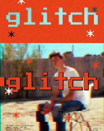 How to make a glitch effectBlocky pixels, torn colour channels and a smeared trail.