Techniques5 min readFreeUpdated 2026-11-20
Pastel colour palette: 11 palettes with HEX codes
Eleven ready pastel palettes with the codes to copy, a generator that stays soft, and the one rule that makes pastels work: a dark ink to read them by.
By the Paletoo team · steps tested in Paletoo on
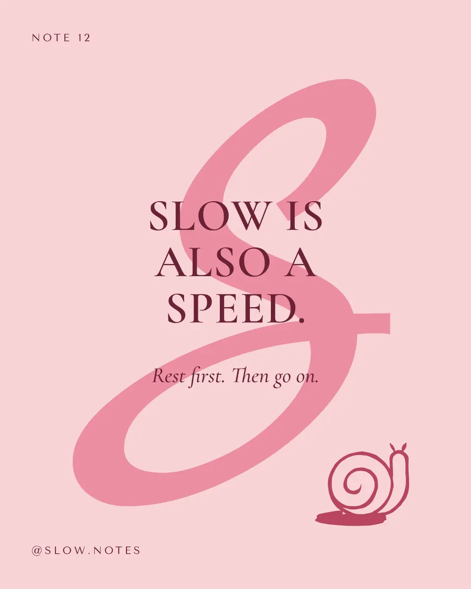
Pastel colours are pale, softly saturated tints — a colour mixed with a lot of white, such as blush pink #F4B6C2, baby blue #A7C7E7, lavender #C3B1E1, mint #A8E6CF or peach #FFCBA4. They make a calm, friendly background, but they are almost as light as white, so text in a pastel on white is unreadable (about 1.5:1 contrast); a pastel palette needs one dark colour for the words.
That is how every palette below is built: three soft colours, a deeper shade of the same hue, and a dark ink for text, with the contrast measured live as you generate and lock colours. After the generator: the classic pastels and their codes, which pairs can carry text, how to keep a pastel design from looking washed out, and the steps in Paletoo on «Slow is also a speed», a quote post in blush and wine.
Generate a palette and see it on a posterLive
Press Generate for a new pastel palette: three soft colours and a dark ink to read them by. Tap a colour to lock it; the rest follow its hue. The contrast shows which pairs can carry text.
- Ink on paper
- —
- Accent on paper
- —
- Paper on deep
- —
Pastel palettes — press one to load it
Open this in PaletooOpens a new document with exactly this setup — free, no sign-up.
Pastel colours and their HEX codes
A pastel is defined by lightness and softness, not by hue: any colour becomes a pastel when it is light (roughly 75–90 % lightness) and only moderately saturated. These are the pastels people search for most, with a code you can paste anywhere — in Paletoo, Canva, Figma, CSS or Google Calendar.
| Pastel | HEX | On white | With a dark ink |
|---|---|---|---|
| Blush pink | #F4B6C2 | 1.7:1 — not for text | 8.6:1 with #3D1F2B |
| Baby blue | #A7C7E7 | 1.8:1 — not for text | 8.1:1 with #1F2A44 |
| Lavender | #C3B1E1 | 2.0:1 — not for text | 7.5:1 with #2B2340 |
| Mint | #A8E6CF | 1.4:1 — not for text | 8.7:1 with #173B30 |
| Peach | #FFCBA4 | 1.5:1 — not for text | 9.7:1 with #3E2418 |
| Butter yellow | #FDFD96 | 1.1:1 — not for text | 12.5:1 with #33301A |
Why pastel text disappears — and the fix
Readability depends on the difference in lightness between text and background, not on how different the hues look. WCAG, the web’s accessibility guideline, asks for at least 4.5:1 for normal text and 3:1 for large text. Every pastel on white scores between 1.1 and 2:1, which is why a lilac headline on a white post looks pretty in the editor and vanishes on a phone in the sun.
The fix is to give the palette an ink: a very dark shade of one of its own hues — deep plum for a pink palette, navy for baby blue, forest green for mint. Ink on a pastel easily passes 7:1, and because it shares the hue it looks softer than black. Use the pastels for areas — backgrounds, shapes, highlights — and the ink for every word. The «Pastel rainbow» row in the generator has no ink on purpose: press it and watch every contrast score turn red.
Keep pastels from looking washed out
Pick one family of lightness. Pastels look deliberate when they are equally light; one bright colour among them looks like a mistake. If you need an accent, take the deeper shade of a pastel you already use, as the second colour of each palette here does.
Give the eye one strong thing: a dark headline, a photo with real shadows, or a single deeper colour block. A design made only of pastels has nothing to look at first. And mind print: pastels are mostly white paper with a little ink, so they print reliably, but a pale yellow can vanish entirely on cream stock — check a proof.
Pastels suit baby showers, spring sales, beauty and wellness brands, wedding stationery and calm educational posts. For loud events, sales countdowns or anything that must be read from across a street, use them only as a background behind dark type.
Made in Paletoo
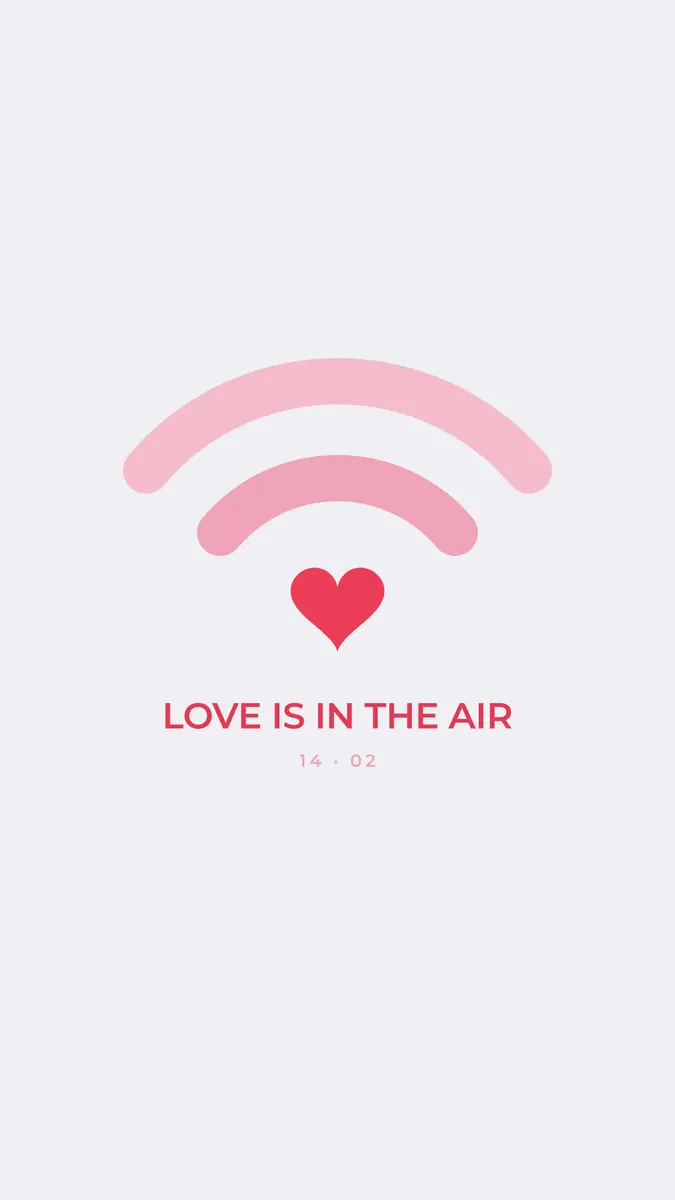
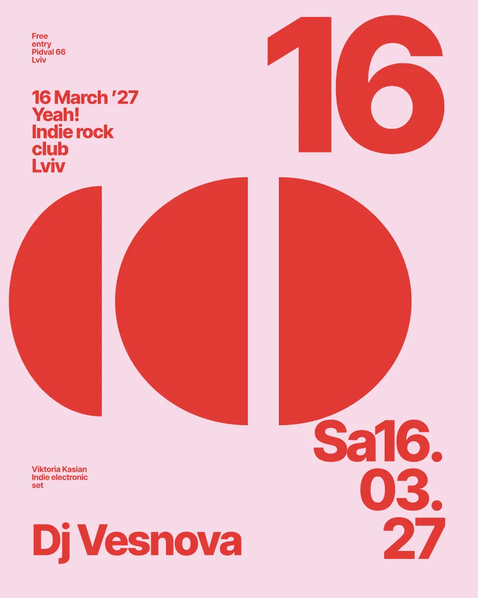
Every picture on this page was made in Paletoo — these three with the same steps on other templates:

Step by step in Paletoo
Open the post: press “Open in Paletoo” on this page, or “Open this in Paletoo” under the generator, which opens a new square with your five colours saved as Colour styles. «Slow is also a speed» is a quote post in blush, rose and a deep wine.
With nothing selected, the Design tab lists the document’s Colour styles — Blush, Wine, Rose, Cream and Berry. Change a style, and every shape and word that uses it changes.
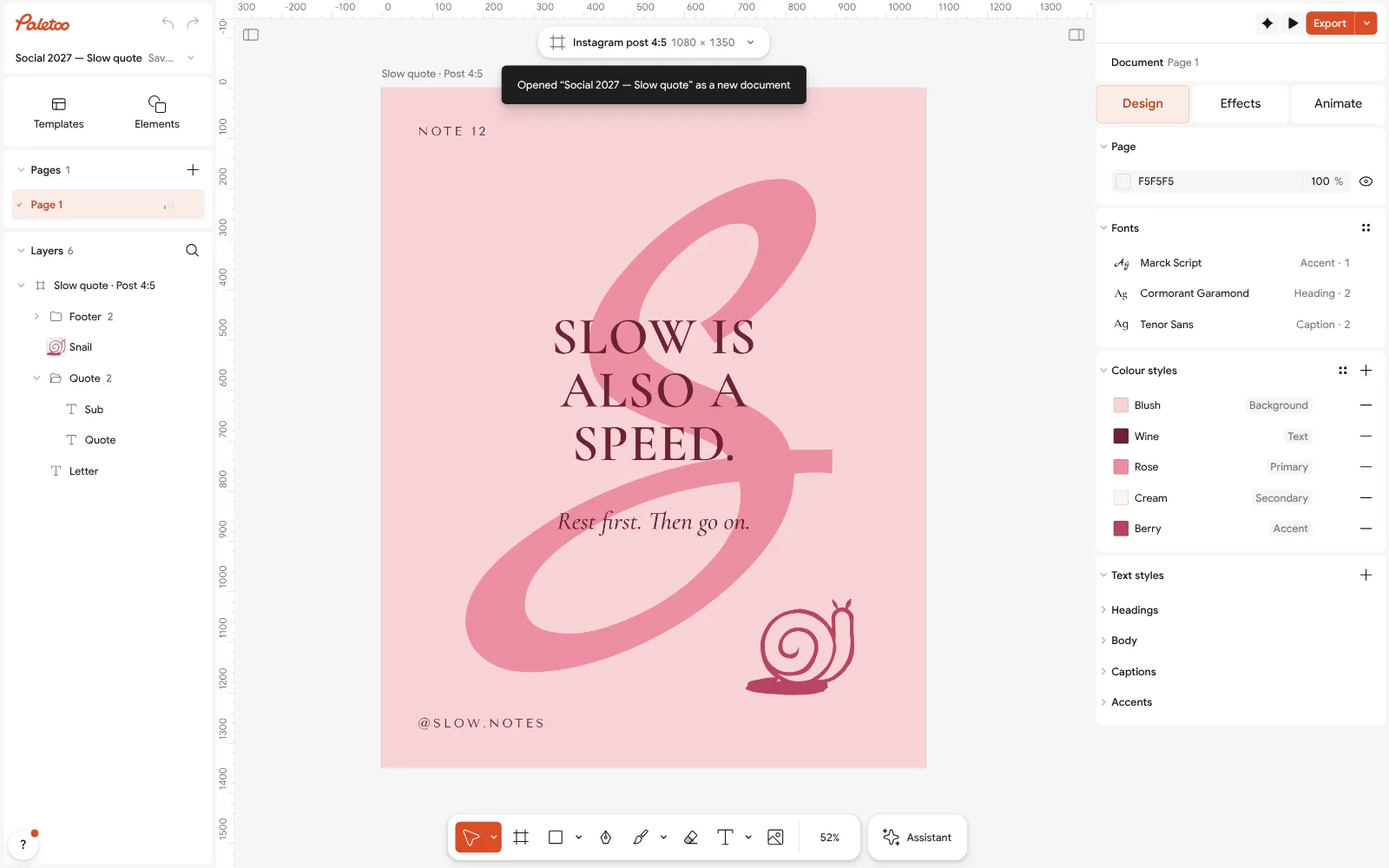
The «Slow is also a speed» post open in Paletoo with nothing selected: its colour styles under Design Select everything (Ctrl A): Selection colours lists every colour the post actually uses. Paste a pastel code from the palettes above into the background colour, and keep the wine for the words.
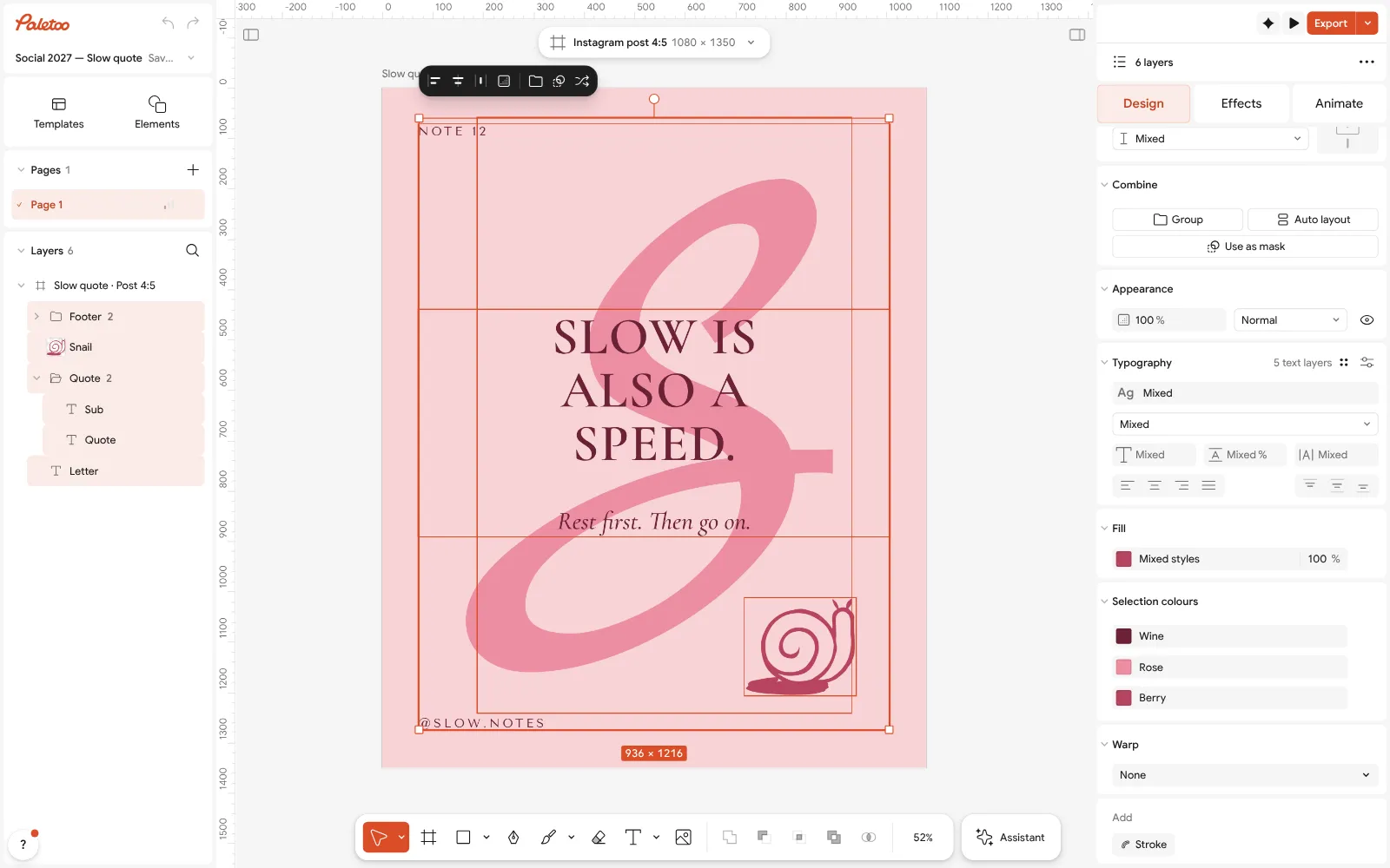
Everything selected: Selection colours lists each colour of the pastel post Want a pastel from your own photo? Take it with Pick color (I), or press Ctrl K and choose Palette from mood… for a starting point, then lighten the soft colours.
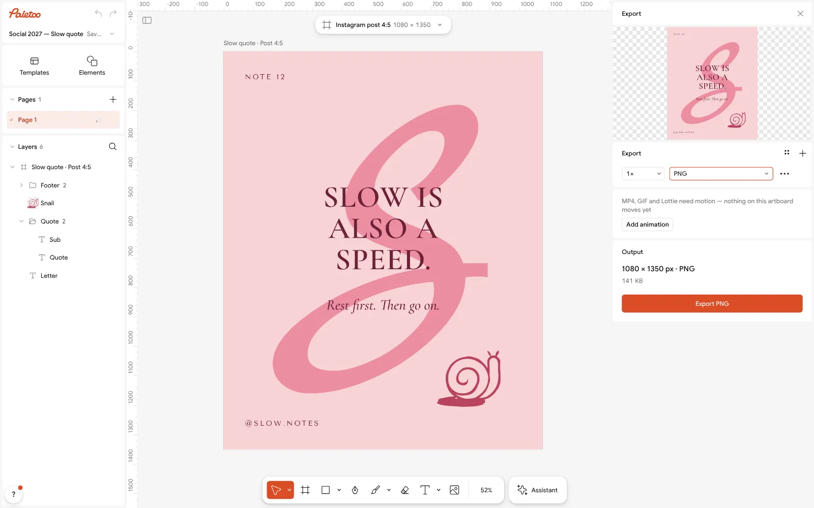
The Export window with the post ready to download Check the smallest line once more: if the caption is in a pastel, switch it to the ink colour — a pastel on a pastel is decoration, not text.
Press Export (Ctrl Shift E) and download a PNG for Instagram or a PDF for print — free, without a watermark.
Make it your own
To make a pastel softer, raise its lightness, not its greyness: in Colour styles keep the hue and move the colour towards white — grey turns a pastel dusty instead.
If the design looks flat, darken one thing only: the ink in Colour styles, or a single shape. Selection colours shows at a glance whether a stray bright colour crept in.
For a set of posts, keep the same five Colour styles in every file and rotate which pastel is the background — the feed reads as one brand.
Sources
Questions
What are the HEX codes for pastel colours?
Popular pastels are blush pink #F4B6C2, baby blue #A7C7E7, lavender #C3B1E1, mint #A8E6CF, peach #FFCBA4 and butter yellow #FDFD96. The palettes on this page give each one with a matching dark ink and a light paper.
What makes a colour pastel?
High lightness and gentle saturation: a pastel is a colour mixed with a lot of white. Hue does not matter — any colour becomes a pastel when it is light and soft enough.
Can I use pastel text on a white background?
Not for anything people need to read. Pastels on white score about 1.1–2:1 contrast, far below the 4.5:1 WCAG asks for. Set the words in a dark ink and keep the pastels for backgrounds and shapes.
What colour goes with pastels?
A dark shade of one of the pastels’ own hues — plum, navy, forest green, chocolate — works better than black: it reads clearly and keeps the mood soft. Cream or off-white makes a gentler paper than pure white.
Is there a free pastel palette generator?
Yes, the one on this page: press Generate for a new pastel palette, lock the colours you like, copy the HEX codes, or open the palette in Paletoo as colour styles — free, with no account.
Do pastel colours print well?
Usually, because they are mostly paper with a little ink. Very pale yellows and greens can disappear on cream or recycled paper, so print a proof, and keep text in the dark ink.
Make it online
- Instagram post makerDesign a post at the right size from a real template, then export a sharp PNG or JPG — free, in your browser.
- Poster makerMake a poster from a template that already has the layout right, then export a print-ready PDF or an image for screens.
- Invitation makerTap an invitation below and it opens ready to edit: write who, when and where, then send it as a picture or print it on A5. Free, with no watermark and no sign-up.
- Make a Valentine card onlinePick a Valentine, write your own words, add a photo of the two of you and send it as a picture or a little animation, or print it — free, no sign-up, no watermark.
Free design templates for posts, stories and posters: Social media post templates · Poster templates · Invitation templates · Holiday card templates
Try it on your own design
Paletoo opens in your browser, with no sign-up. Every effect here is live: change the picture or the words and the effect follows.
Open in PaletooOpens this design as your own copy — every layer and effect editable, free.
Read next
- 01
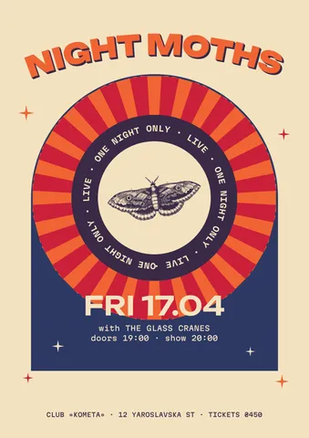 Colour palettes 2027, with HEX codesTwelve ready palettes for next year’s posters, posts and brands, with the codes to copy, a generator that keeps your locked colour, and the contrast measured as you go.
- 02
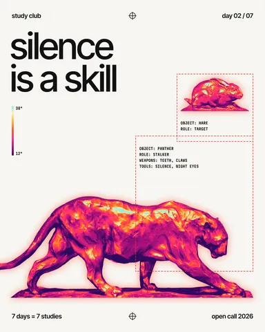 Two-colour poster: how to design with a limited paletteTwo inks, one paper and a picture forced into the palette: why limits make posters stronger.
- 03
 RGB vs CMYK: which to use for print, and why colours go dullWhy your neon yellow came back from the printer looking like mustard — and how to see it coming on screen, before you pay for the run.