Techniques5 min readFreeUpdated 2026-11-12
Colour palettes 2027, with HEX codes
Twelve ready palettes for next year’s posters, posts and brands, with the codes to copy, a generator that keeps your locked colour, and the contrast measured as you go.
By the Paletoo team · steps tested in Paletoo on
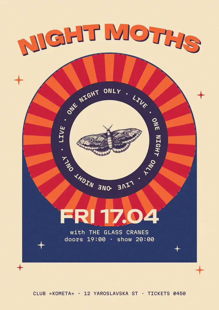
The colour palettes trending into 2027 are limited and warm-against-cool: a deep ink blue with coral and cream, a dusk purple melting into apricot, thermal-camera heat maps, two bright risograph inks on off-white paper, and a deep teal with a soft cloud white. Below are twelve of them as five colours each — ink, deep, accent, soft and paper — with HEX codes, on a live poster, with the text contrast measured.
The generator is the same one as in our Telegram Palette widget: half its palettes are picked by eye, half are built from a colour harmony around a hue; lock a colour and the rest follow it. Every palette opens in Paletoo as five colour styles, ready to use on any template. The directions follow our colour trends 2027 round-up; the codes are ours.
Generate a palette and see it on a posterLive
Press Generate for a new palette — half are palettes picked by eye, half a colour harmony. Tap a colour to lock it; the rest follow its hue. The contrast is measured as you go.
- Ink on paper
- —
- Accent on paper
- —
- Paper on deep
- —
Palettes for 2027 — press one to load it
Open this in PaletooOpens a new document with exactly this setup — free, no sign-up.
Why five colours, and what each one is for
A palette that works is not five colours of equal weight but five roles. Ink is for text and must be dark enough to read; deep is a darker tone of the family for shapes and shadows; accent is the one loud colour, used sparingly — a date, a price, a button; soft is a light tint for panels and backgrounds of cards; paper is the ground everything sits on. Read like this, the twelve palettes become easy to apply: swap a template’s colours role for role.
Keep the accent to about a tenth of the design. The rest of the palette exists so that the accent can be loud: if everything is coral, nothing is.
The 2027 directions in short
Ink blue and coral replaces both bright brand blue and all-beige minimalism: confident and readable, it pairs with black type. Sunset warmth — dusk purple, rose, apricot — flatters skin and photos and looks best with grain. Heat-map colours from deep violet to a white-hot yellow suggest speed and energy for sport, music and tech. Two-ink riso keeps a whole series consistent with blue and fluorescent pink on cream.
The quieter end matters as much: a deep transformative teal with mint and white, a warm cloud white with grey-browns and gold for calm brands, matcha green with a clay accent, and butter yellow, the soft shade that kept appearing on packaging and interiors through 2026. Pantone names its Colour of the Year each December; we do not guess it here.
Contrast: check it before you fall in love
The generator measures three pairs as you go: ink on paper, accent on paper and paper on the deep colour. The Web Content Accessibility Guidelines ask for at least 4.5 : 1 for normal text and 3 : 1 for large text; a poster seen from across a room needs more. Most accents land between 3 and 4.5 — fine for a big headline or a shape, not for small text.
If a palette you love fails, move lightness rather than hue: darken the ink a step, or lighten the paper. Lock the colours you want to keep, press Generate, and the rest of the palette is rebuilt around them.
| Ratio | Grade | Use |
|---|---|---|
| 7 : 1 and up | AAA | Any text, small print, long reading |
| 4.5 : 1 | AA | Normal text on screens |
| 3 : 1 | AA large | Headlines from 24 px, icons, shapes |
| Below 3 : 1 | — | Decoration only |
Made in Paletoo
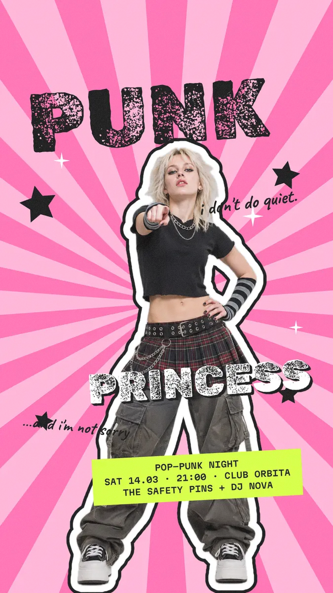
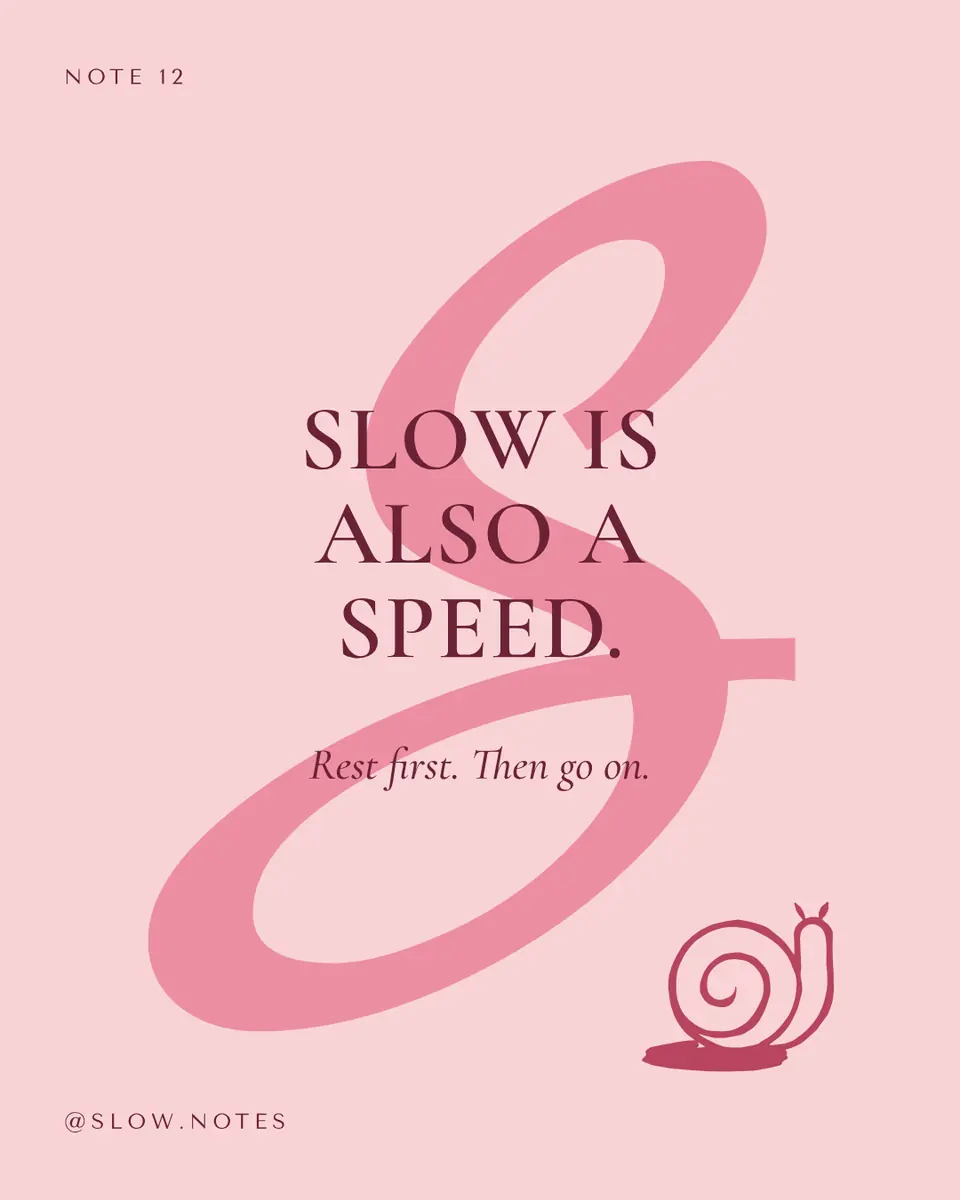
Every picture on this page was made in Paletoo — these three with the same steps on other templates:

Step by step in Paletoo
Open the poster: press “Open in Paletoo” on this page — or “Open this in Paletoo” under the generator, which opens a new square with your five colours saved as Colour styles. «Night moths» is a gig poster in navy, red and cream.
With nothing selected, the Design tab lists the document’s Colour styles: each colour with its role. Change a style, and every shape and word that uses it changes.
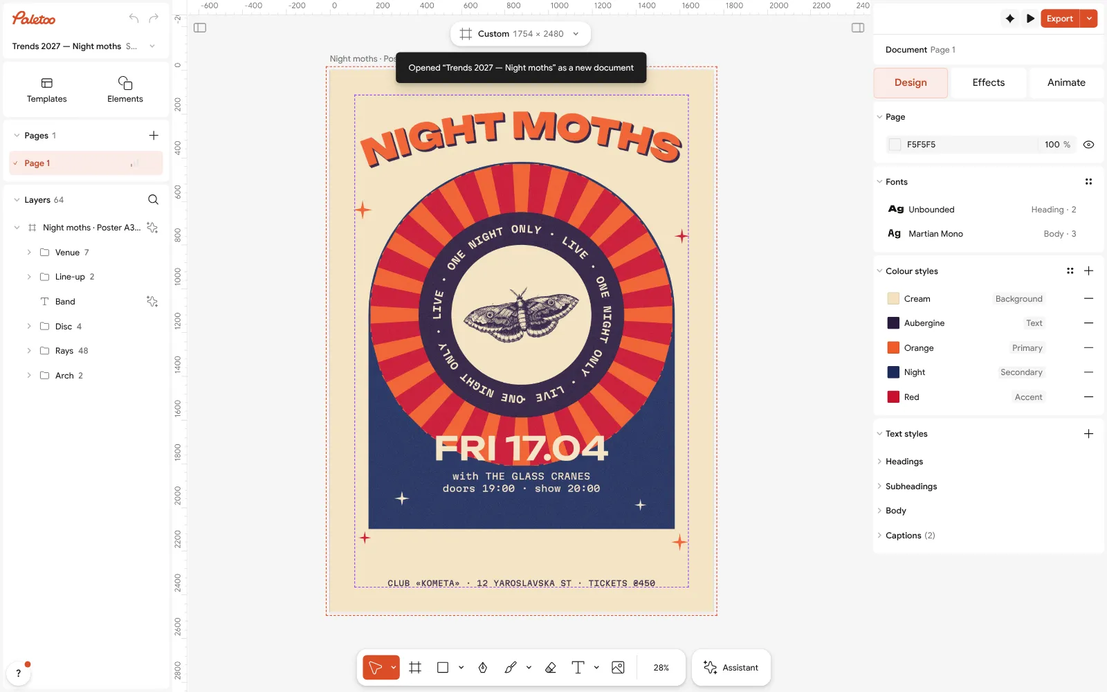
The «Night moths» poster open in Paletoo with nothing selected: its colour styles under Design Select everything (Ctrl A): Selection colours lists every colour the design actually uses. Paste a HEX code from the palettes above into any of them to swap that colour everywhere.
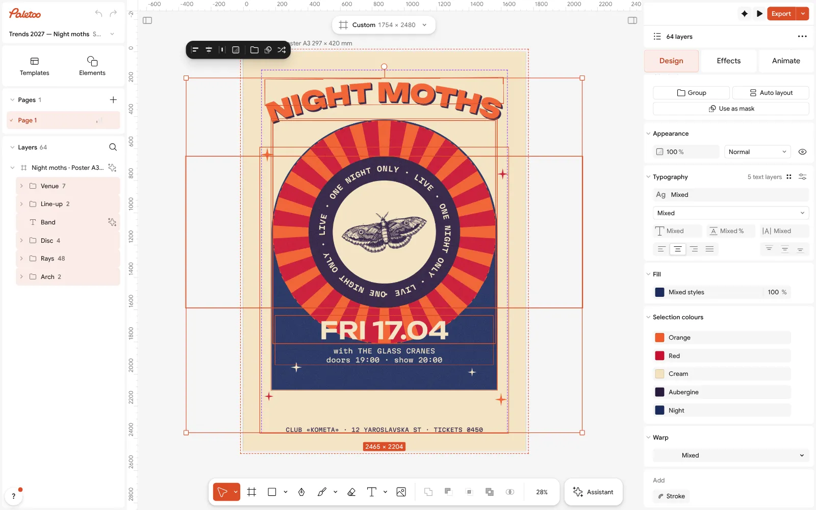
Everything selected: Selection colours lists each colour the poster uses No palette yet? Press Ctrl K and choose Palette from mood…, or take a colour from a photo with Pick color (I).
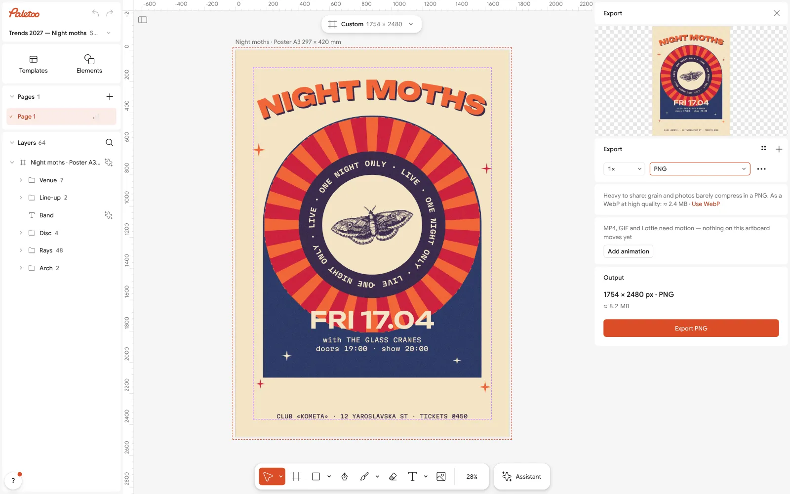
The Export window with the poster ready to download Check the smallest text once more against its background: if it is hard to read on screen, darken the ink style rather than adding a box behind the words.
Press Export (Ctrl Shift E) and download the poster — PNG for screens, PDF for print, free.
Make it your own
To make a palette yours, keep its lightness steps and move the hue: in Colour styles change the accent first, then nudge the deep colour towards it.
If the poster looks busy, make the soft colour lighter and use the accent on one thing only; Selection colours shows at a glance how many colours are really there.
For print, export a PDF and look at it on paper: saturated blues and fluorescent pinks print duller than they look on screen.
Sources
Questions
What are the trending colour palettes for 2027?
Ink blue with coral, sunset purples and apricots, heat-map gradients, two-ink riso blue and pink, deep teal with mint, warm cloud white, matcha with clay and butter yellow. This page has twelve of them with HEX codes.
What is the Pantone Color of the Year 2027?
Pantone announces it in December. This page does not guess it; the palettes here are what designers are already using.
How do I copy the HEX codes?
Every palette shows its five codes under its name. In the generator, press Copy HEX to put all five on the clipboard.
Is the palette generator free?
Yes. The generator, the contrast check and opening a palette in Paletoo are free, with no account.
How do I use a palette on a template?
Open the template, select everything and replace each colour in Selection colours with one from the palette, role for role: ink for text, paper for the background, the accent for one highlight.
Make it online
- Poster makerMake a poster from a template that already has the layout right, then export a print-ready PDF or an image for screens.
- Instagram post makerDesign a post at the right size from a real template, then export a sharp PNG or JPG — free, in your browser.
- Logo makerType your brand name, pick a logo, try fonts, colours and layouts, then download SVG, PNG and app icons — free, no watermark, no sign-up.
Free design templates for posts, stories and posters: Poster templates · Social media post templates · Brand guidelines templates
Try it on your own design
Paletoo opens in your browser, with no sign-up. Every effect here is live: change the picture or the words and the effect follows.
Open in PaletooOpens this design as your own copy — every layer and effect editable, free.
Read next
- 01
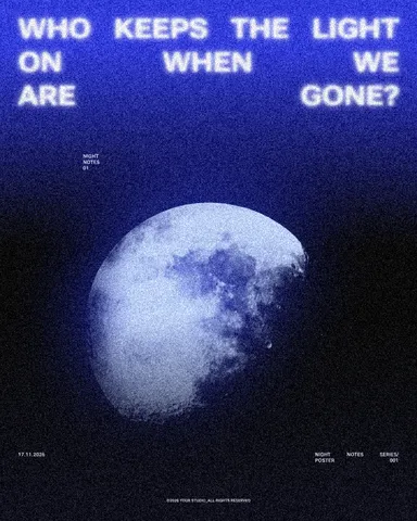 How to choose a colour palette: 5 steps and the 60-30-10 ruleFrom one colour you love to a palette that works on a poster, a post and a website — with the contrast checked and the colours saved so they stay put.
- 02
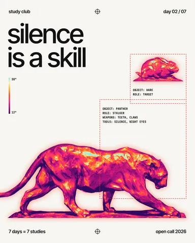 Two-colour poster: how to design with a limited paletteTwo inks, one paper and a picture forced into the palette: why limits make posters stronger.
- 03
 RGB vs CMYK: which to use for print, and why colours go dullWhy your neon yellow came back from the printer looking like mustard — and how to see it coming on screen, before you pay for the run.