Techniques5 min readFreeUpdated 2026-11-17
Poster layout tricks: 5 layouts and the grid behind each one
One poster, five classic layouts — switch between them, turn on the grid, change the margins — and the tricks that make each one read.
By the Paletoo team · steps tested in Paletoo on
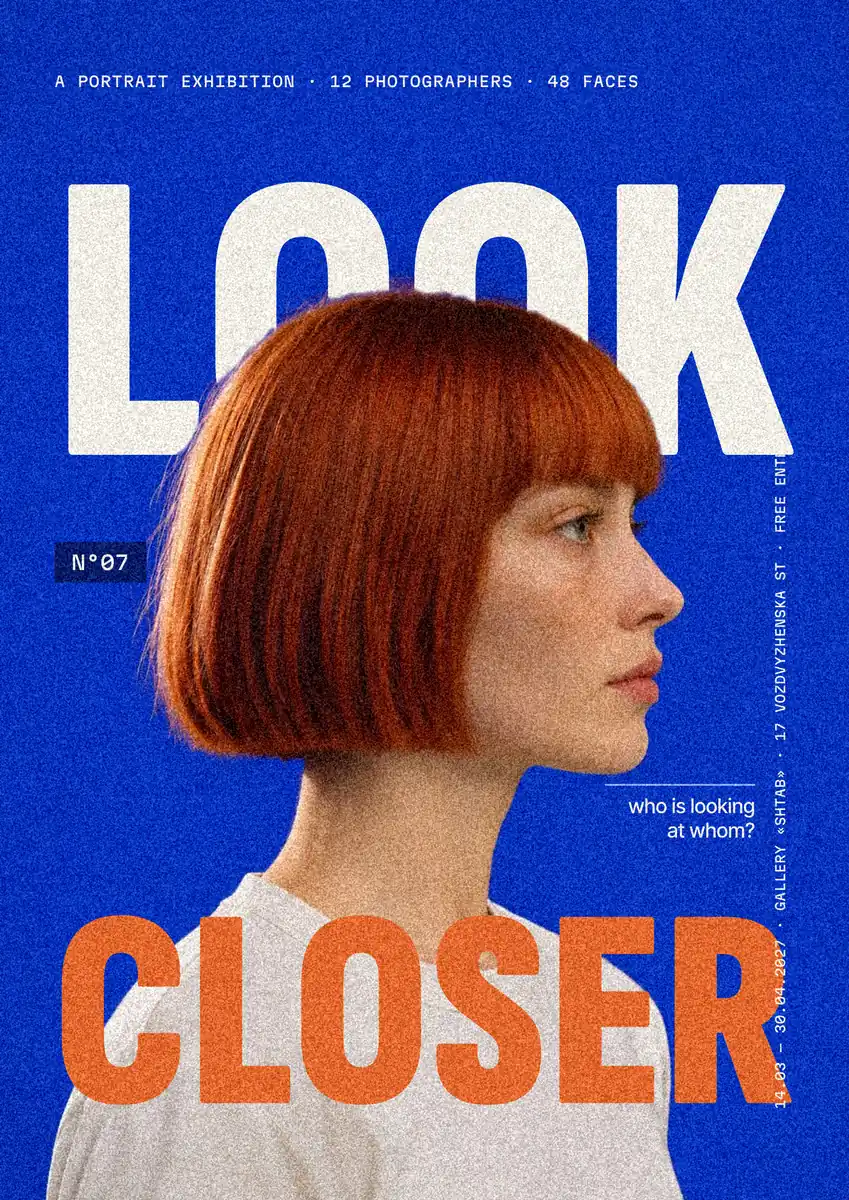
A poster layout works when the eye knows where to go first, second and third. Five layouts cover almost every poster: a Swiss grid where everything hangs from the same columns; a centred layout on one axis; a Z pattern that leads from the top left to a call to action at the bottom right; big type, where the title is the picture; and a split, picture on one half and words on the other. The poster below switches between them with the same content, so you can see the difference instead of reading about it.
Turn on the grid and the thirds to see why each works, change the margins and the title size, and compare it with the «before» — no margins, everything centred and the same size. Then the tricks behind good layouts, and the steps to set a layout grid in Paletoo on «Look closer», an exhibition poster.
Switch the layout, keep the contentLive
The same poster — title, picture, details — in five classic layouts. Turn on the grid to see why each one works, then change the margins and the title size.

Night market
Friday 19:00
Food, music and prints by local makers
Podil, Kyiv · free entry
N°27Everything hangs from the same columns and one top line: the eye trusts it before it reads it.
Before: no margins, everything centred and the same size.
Open this in PaletooOpens a new document with exactly this setup — free, no sign-up.
Hierarchy first: decide what is read first
Before choosing a layout, rank the words: one thing must be read first (usually the title or the date), two or three things second (what, where, when), and everything else last. Make the first thing much bigger than the second — at least twice — and the second clearly bigger or bolder than the rest. A poster where three things are the same size has no first thing, and the eye leaves.
Then let the layout carry the ranking: the top left and the centre are where eyes land first, the bottom right is where they finish. That is why a date or a call to action works at the end of a Z, and why a title alone in the middle of a centred poster reads as an event.
Five tricks that make any layout look designed
Generous margins. Leave at least 5–8 % of the poster’s width empty on every side; posters look cheap when the text touches the edges. Align to something: every block should line up with at least one other — a column, the title’s left edge, a baseline. Use the grid’s columns for widths too: a text block two columns wide looks intentional, one of a random width does not.
Crop with intent: a photo that runs off the edge feels bigger than one floating in the middle. And leave one area empty on purpose — white space is what makes the title loud. The table below shows which layout to start from.
| Layout | Feels | Use it for |
|---|---|---|
| Swiss grid | Precise, modern, trustworthy | Exhibitions, lectures, programmes with many details |
| Centred | Calm, formal, classic | Concerts of one artist, invitations, quotes |
| Z pattern | Clear, commercial | Sales, events with a call to action |
| Big type | Loud, confident | Festivals, slogans, one-word announcements |
| Split | Clean, balanced | A strong photo plus details, products |
Grids, columns and the rule of thirds
A layout grid is a set of columns (and sometimes rows) with gutters between them and margins around them. Six or twelve columns divide neatly into halves, thirds and quarters, which is why designers use them. The rule of thirds is a simpler cousin: put the most important thing on one of the four points where the thirds cross, not dead centre.
You do not have to follow a grid slavishly — the big-type layout breaks it on purpose — but you should be breaking it on purpose. Turn the grid on in the widget above, switch layouts, and watch how each one uses the same columns differently.
Made in Paletoo
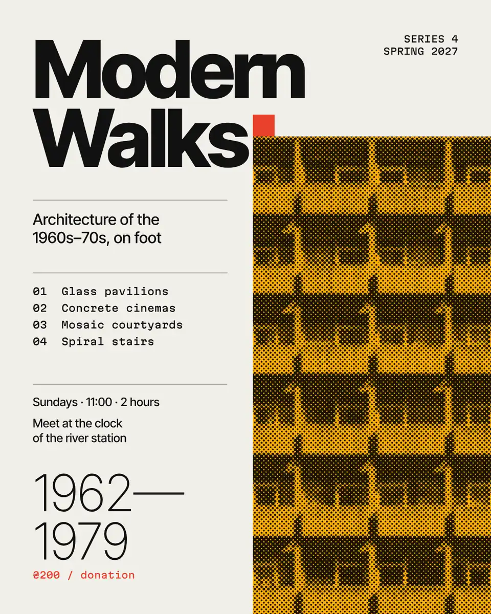
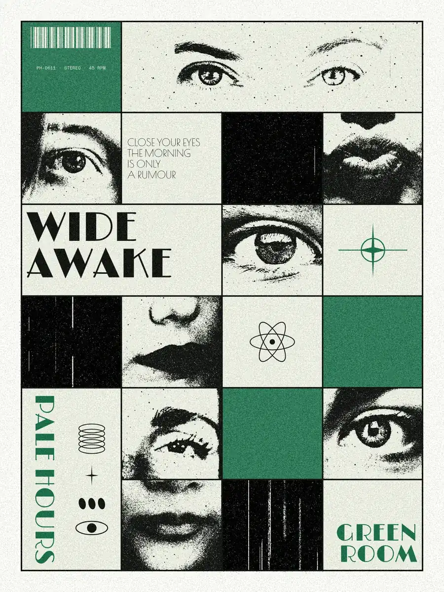
Every picture on this page was made in Paletoo — these three with the same steps on other templates:

Step by step in Paletoo
Open the poster: press “Open in Paletoo” on this page. «Look closer» is an A-format exhibition poster: a portrait between two huge words, with small details placed on a grid.
Click the artboard’s name to select it: its Layout grid section on the Design tab already holds a bleed and a safe area. Press + to add Columns and set their Margin and Gutter — the grid the details hang from.
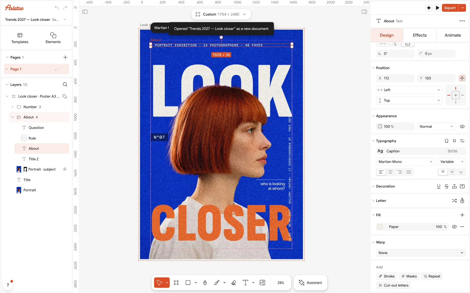
The «Look closer» poster open in Paletoo, a text block selected: its size under Typography Select a block of small text and drag it until it snaps to a column; the Typography section shows its size — keep details at one size and one style.
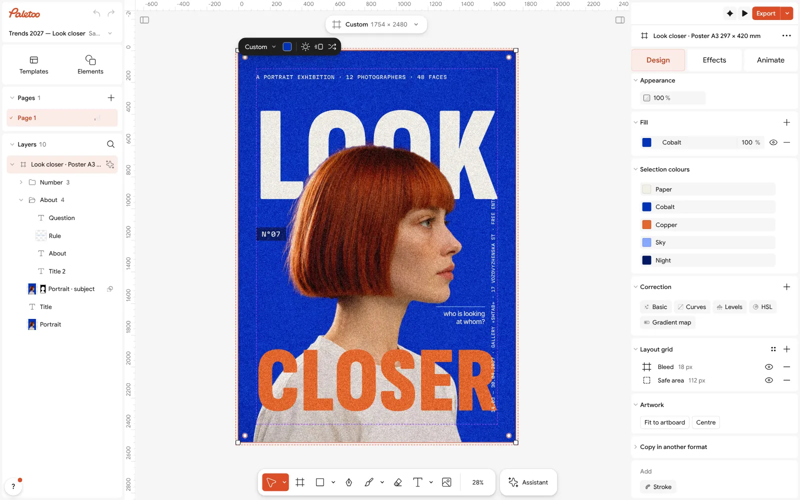
The artboard selected: its layout grid, a bleed and a safe area, with + to add columns To centre a block on the poster, select it with the artboard and use Align; to line up several blocks, select them together and align their left edges.
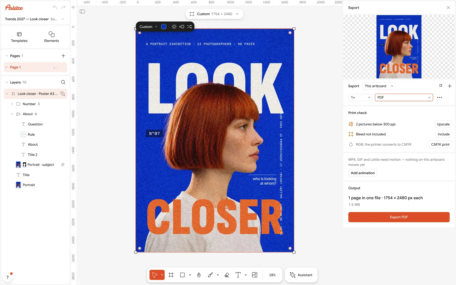
The Export window with the poster as PDF for print Check the hierarchy: the title should be at least twice the size of the next thing. Change it under Typography and look at the poster from a distance (Shift 1 fits it to the screen).
Press Export (Ctrl Shift E) and choose PDF for print — free, without a watermark.
Make it your own
If the poster feels crowded, make the Margin of the layout grid bigger before you shrink anything; space is cheaper than smaller type.
Use fewer Columns for a poster with few words (four or six) and more for a programme with many details (twelve).
Keep the details in one text style: Typography with the same size and line height for every small block makes them read as a set.
Sources
Questions
What is the best layout for a poster?
There is no single best: a Swiss grid for detailed information, centred for formal events, a Z pattern for a call to action, big type for slogans and a split for a strong photo. The widget on this page shows all five with the same content.
How big should the margins of a poster be?
At least 5–8 % of the poster’s width on every side. For A3 that is about 15–25 mm; posters with very little text can have much more.
What is the rule of thirds?
Divide the poster into three equal columns and rows and place the most important element on one of the four crossings, rather than in the exact centre.
How many columns should a poster grid have?
Six or twelve are the most flexible, since they divide into halves, thirds and quarters. Four is enough for a simple poster.
Can I make a poster layout for free?
Yes. In Paletoo the layout grid, the templates and PDF export for print are free, with no account.
Make it online
- Poster makerMake a poster from a template that already has the layout right, then export a print-ready PDF or an image for screens.
- Flyer makerTurn a ready flyer template into yours in minutes and send the printer a PDF with bleed and crop marks.
- Instagram post makerDesign a post at the right size from a real template, then export a sharp PNG or JPG — free, in your browser.
Free design templates for posts, stories and posters: Poster templates · Event and launch templates · Social media post templates
Try it on your own design
Paletoo opens in your browser, with no sign-up. Every effect here is live: change the picture or the words and the effect follows.
Open in PaletooOpens this design as your own copy — every layer and effect editable, free.
Read next
- 01
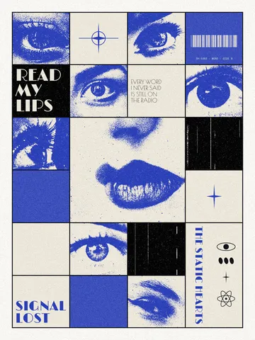 Swiss grid poster: how to design with a modular gridColumns, rows, a margin and one accent: the oldest system in poster design, built on a real poster.
- 02
 Poster design tips: 9 tricks that make a poster look designedNine habits that separate a designed poster from an assembled one.
- 03
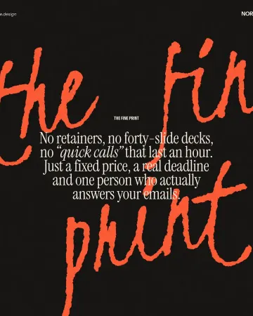 Typography poster: how to make the type the pictureNo photo needed: when the words are drawn big enough, they are the image.