QR codes6 min readFreeUpdated 2026-11-06
QR code size for print: the «will it scan» checklist
Size, quiet zone, contrast, correction and a proof: the five checks that decide whether a printed code scans.

A QR code that scans on screen can still fail on paper. The usual culprits are boring and avoidable: printed too small for the distance, text crowding its margin, a pale colour, a glossy finish that throws the ceiling lights back at the camera, a long link that made the grid too fine.
None of these needs guesswork. There are five checks — size, quiet zone, contrast, error correction and a real proof — and each has a simple rule of thumb. Run through them before a print order and the code will work for everyone who points a phone at it.
This guide gives the checklist with the numbers, explains where they come from, and shows how Paletoo helps: a scan check that reads the code back as you design, the quiet zone and correction in plain controls, and a vector export that prints sharp at any size.
1. Size: a tenth of the distance, never under 2 cm
The common rule is a ratio of about 10 : 1 between scanning distance and code width: read from 30 cm, a code wants about 3 cm; from 2 m, about 20 cm; from across a street, much more. For things held in the hand — a card, a flyer, a label — 2 × 2 cm is a practical minimum for a short link, 2.5–3 cm for a denser code.
What really matters is the size of one module, so the amount of data counts too. A short link makes a code of 25 × 25 modules; a contact card or a long tracking link can reach 45 × 45 or more and needs a proportionally bigger print. Shorten what you encode before you enlarge the code.
2. Quiet zone: four modules of nothing
The QR standard asks for an empty margin, the quiet zone, four modules wide on every side. It is how a reader finds where the code begins. Text, a frame, a pattern or the edge of the paper inside that margin is the most common reason a well-sized code fails.
Count it in modules, not millimetres: on a 3 cm code of 25 modules, four modules are about 4 mm. On a busy background, give the code a plain tile that includes the margin. And keep the whole thing clear of the trim and the fold, where the guillotine and the crease will wander.
3. Contrast: dark on light, 3 : 1 at least
Readers look for dark modules on a light ground. Aim for strong contrast — black or a deep colour on white or pale paper — and treat 3 : 1 as the floor, not the goal. Pastels, mid-greys, metallic inks and a light code on a dark background are where scanning gets unreliable; some readers never try an inverted code at all.
Finish matters too. Gloss lamination and foil reflect light into the camera; matt paper scans more reliably. If you put an effect on the code — grain, halftone, a texture — check that the modules are still clearly dark.
4. Error correction and 5. a proof
Error correction lets a reader rebuild a damaged code: L about 7 %, M 15 %, Q 25 %, H 30 %. M suits clean print; Q is worth it for menus, labels and posters that get scuffed; H is for a logo in the middle. Higher correction adds modules, so it means a slightly bigger print.
The last check is the only one that settles it: print a proof at 100 %, put it where it will be used, under that light, at that distance, and scan it with two different phones — one of them older. If both open the right page at once, send it to the printer. For styling a code that still passes, see QR code design.
Made in Paletoo
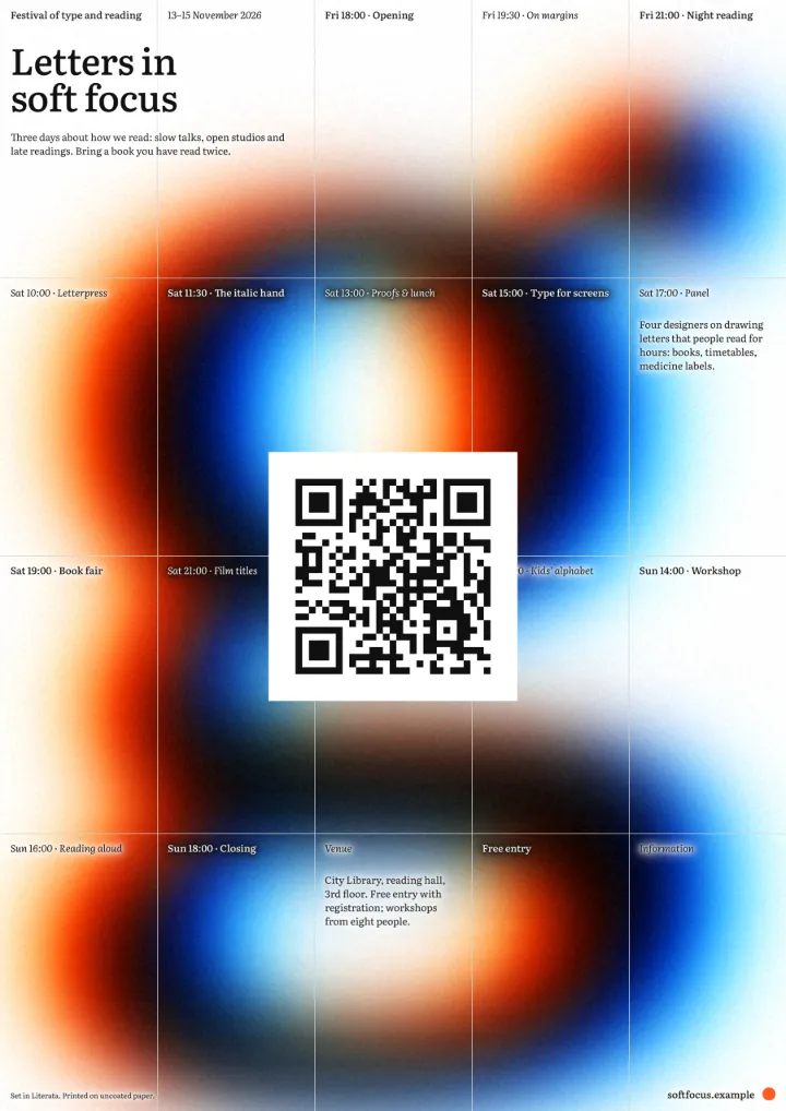
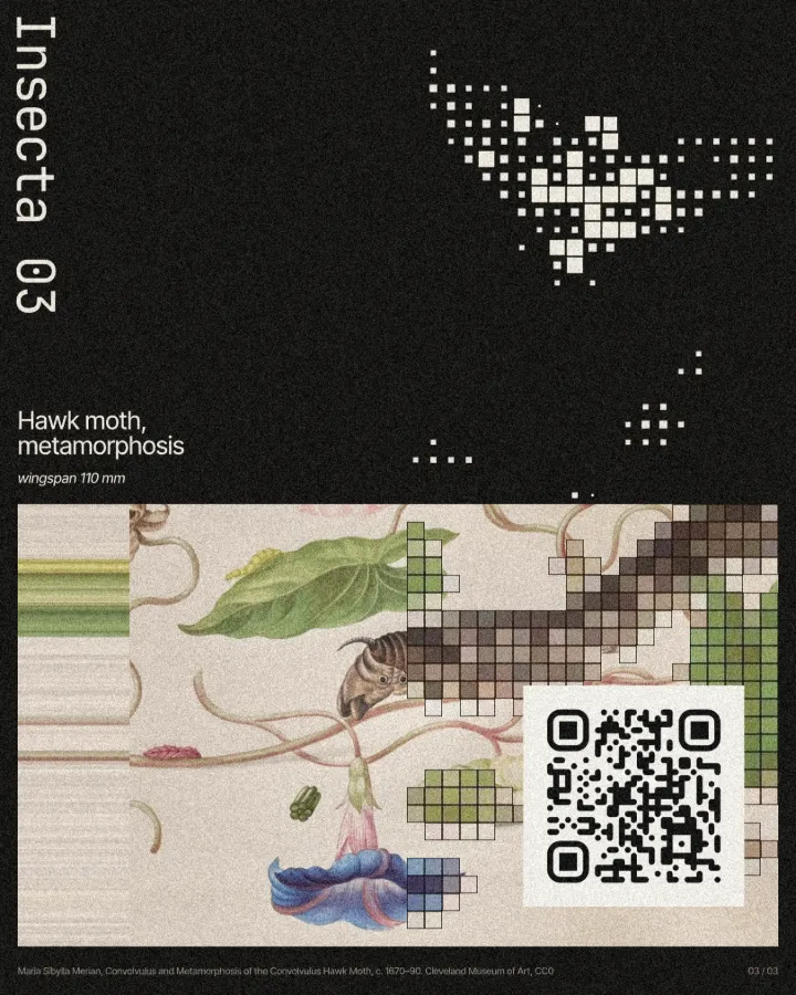
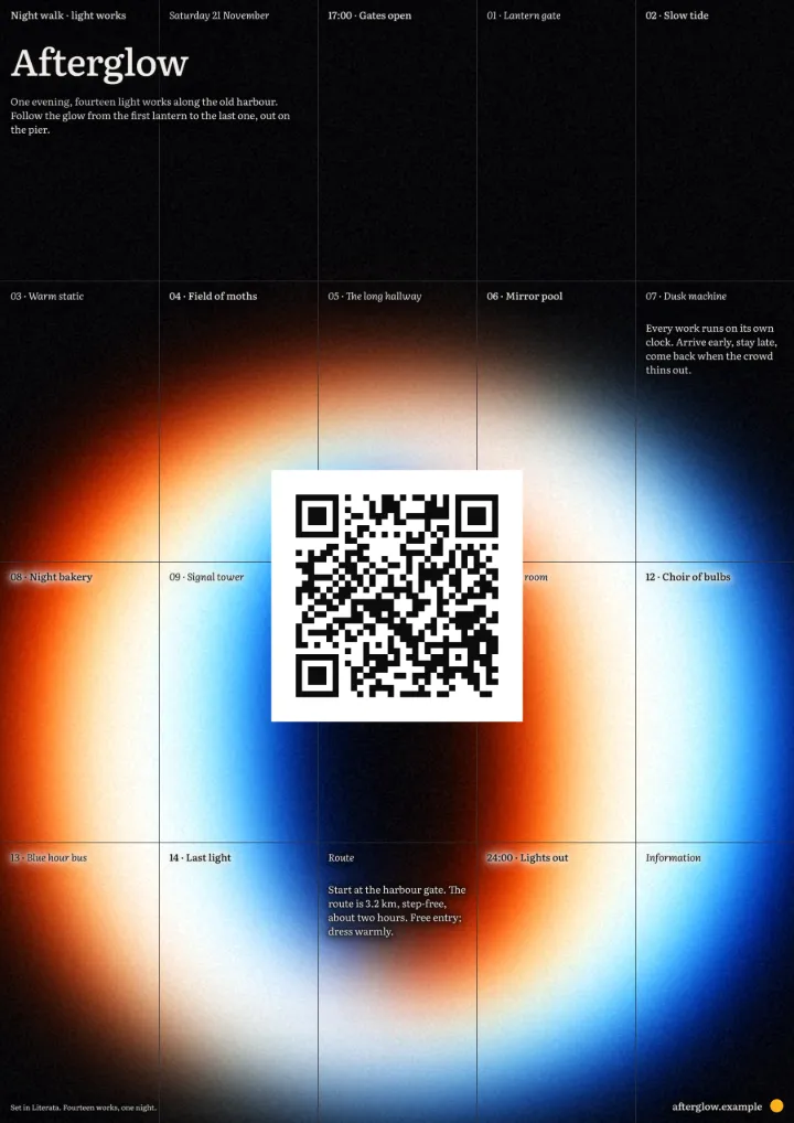
Every picture on this page was made in Paletoo — these three with the same steps on other templates:
Make it in Paletoo, free
Open your design in Paletoo — this guide uses «Long exposure» from the Halation series, its giant glyph turned into a «2» — and press ⌘ K, then run QR code.
In the QR code section of the Design tab keep Type on Link and type a short address. Hover the scan line when it says ✓ Scans: its tooltip gives the module count and the contrast ratio.
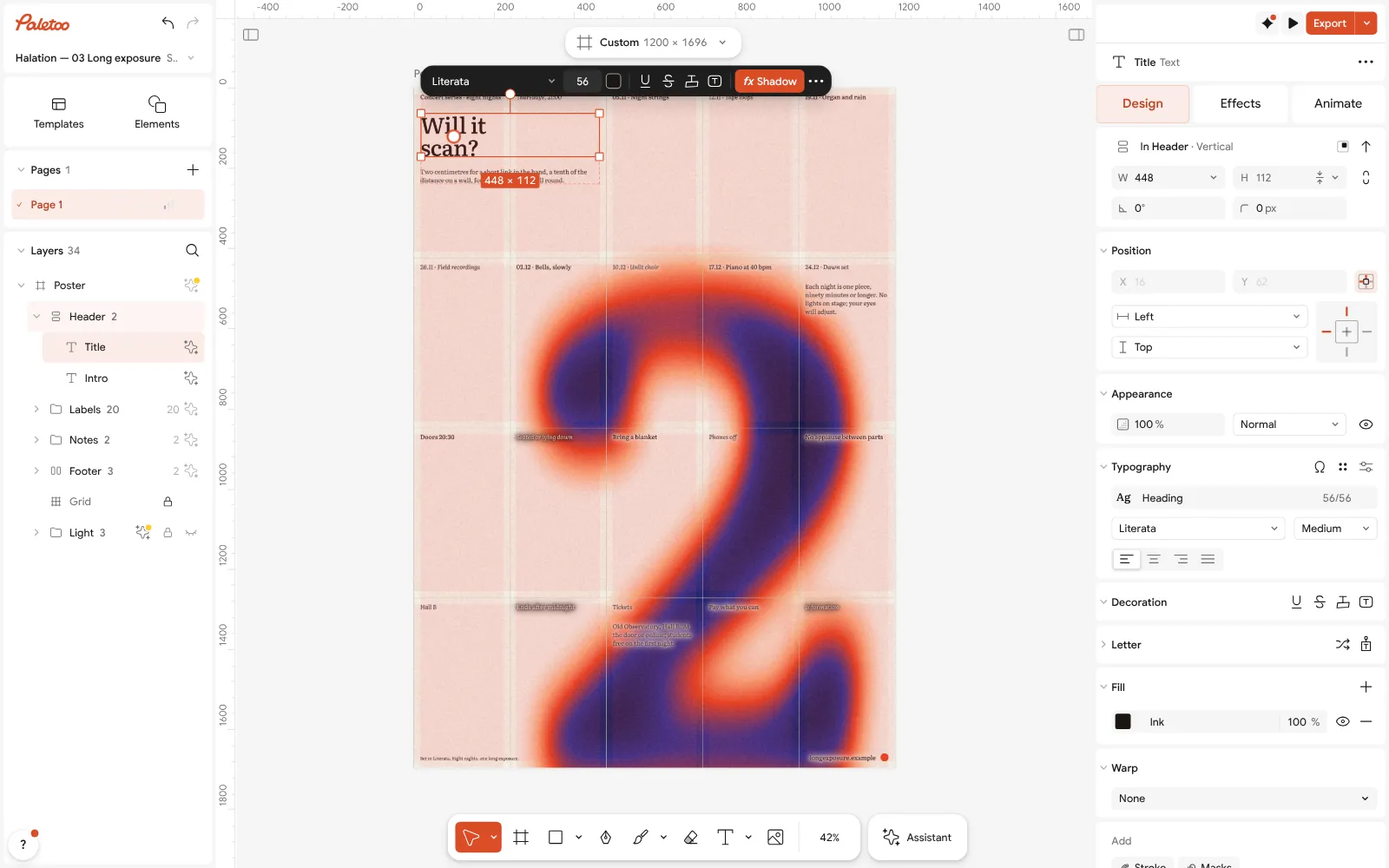
«Long exposure» from the Halation series, its title rewritten to «Will it scan?», open in Paletoo with the title selected Set Correction by where it goes: M for clean print, Q for menus and posters that will be handled, H for a logo. Watch the module count rise as you go up.
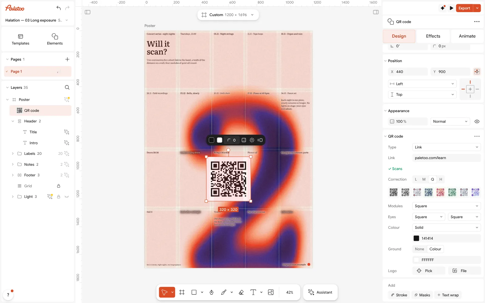
The code on the poster selected, its QR code section open with the link and the scan check Size the code for the distance. On a poster read from 2 m, make it about 20 cm across; on a card, at least 2 cm. The artboard’s size in the format button above the canvas tells you how many pixels that is at 300 dpi.
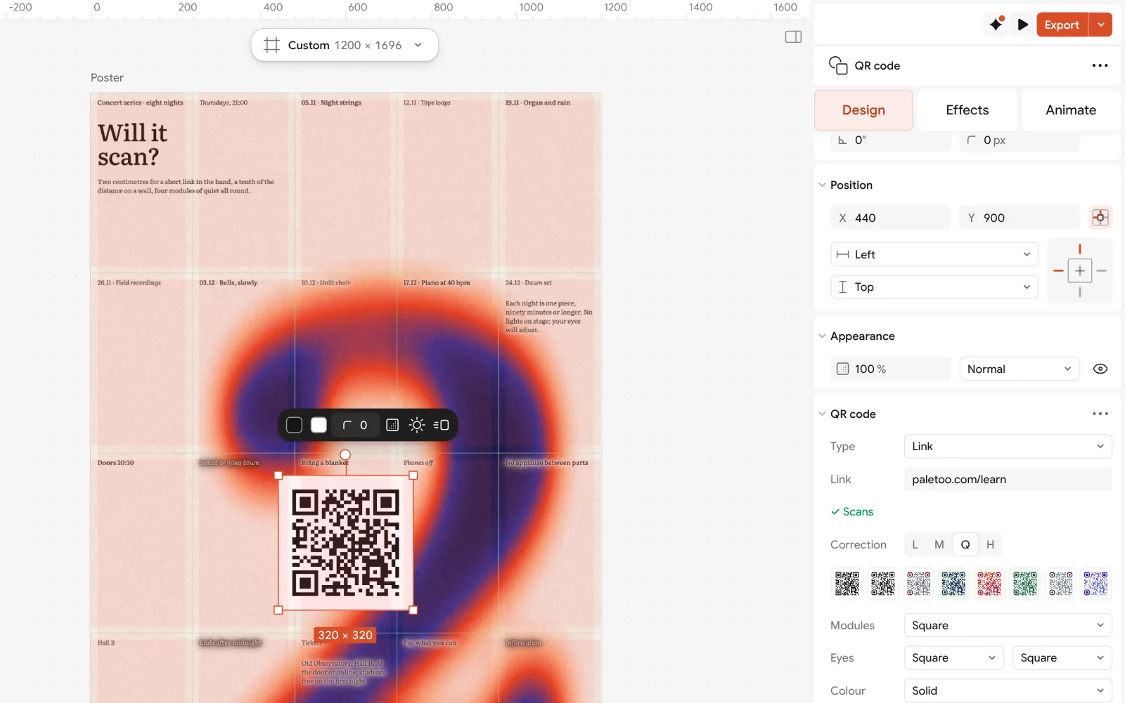
Close up: Correction from L to H, the line that decides how much of a printed code can be lost Open QR code settings from the ⋯ in the section’s header and keep the Quiet zone at 4. Give the code a light Ground so the margin is a clean tile, then keep text and the trim outside it.
Press Export and choose PDF with Include bleed and Crop marks. Print one copy at 100 % and scan it with two phones before the run.
Make it your own
Shorten before you enlarge. If the module count in the scan line’s tooltip is high, encode a shorter address — Link needs no https:// typed — or move details to the page it opens. A smaller grid scans further at the same size.
Do not shave the margin. The Quiet zone can go down to 0 for a code that sits on its own tile, but on paper keep it at 4; when the layout is tight, make the code smaller rather than the margin narrower.
Watch the warnings. ⚠ May not scan names its reason: contrast under 3 : 1, a light code on a dark ground, or a reader that could not read the drawing back. Fix that before anything else; then remember the check reads the code’s own drawing, so test effects on top of it with a phone.
Templates with this look
Questions
What is the minimum size for a printed QR code?
About 2 × 2 cm for a short link read from hand distance. Denser codes and longer distances need more — roughly a tenth of the scanning distance.
How big should a QR code be on a poster?
Divide the distance people will scan from by ten: a poster read from 2 m wants a code of about 20 cm. Then add the quiet zone round it.
What is the quiet zone of a QR code?
The empty margin around the code, four modules wide on every side. Readers need it to find where the code starts; text or edges inside it are a common cause of failed scans.
Which error correction level should I use for print?
M for clean print, Q for menus, labels and posters that get handled, H when a logo covers the middle. Higher levels add modules, so print a little bigger.
Can I print a QR code in colour?
Yes, if it stays dark on a light ground with strong contrast — 3 : 1 at the very least. Pale colours, metallic inks and inverted codes are the risky ones.
Should I use PNG or SVG for print?
SVG or PDF: they are vectors and stay sharp at any size. A PNG works if it is large enough for the print size, but enlarging a small one makes the edges soft.
Make it online
- QR code generatorMake a QR code in your own colours and shapes, with a logo in the middle, and see that it scans before you print.
- Poster makerMake a poster from a template that already has the layout right, then export a print-ready PDF or an image for screens.
- Flyer makerTurn a ready flyer template into yours in minutes and send the printer a PDF with bleed and crop marks.
Free design templates: Contact and call-to-action templates · Poster templates · Event and launch templates
Try it on your own design
Paletoo opens in your browser, with no sign-up. Every effect here is live: change the picture or the words and the effect follows.
Open in PaletooRead next
- 01
 QR code design: how to style a QR code that still scansColours, shapes and a logo — inside the few rules that keep a phone reading it.
- 02
 How to make a QR code for a restaurant menu, freeA menu code that never expires, a table card people actually scan, and a menu you can change without reprinting.
- 03
 Poster design tips: 9 tricks that make a poster look designedNine habits that separate a designed poster from an assembled one.