Techniques4 min readFreeUpdated 2026-11-21
Types of logos: 7 kinds with examples, and which one to choose
Seven kinds of logo, what each one is good at, the famous examples you already know — and a free one of each kind you can make your own.
By the Paletoo team · steps tested in Paletoo on
There are seven types of logos: a wordmark (the name in type, like Google), a lettermark or monogram (initials, like IBM), a pictorial mark (a picture, like Apple’s apple), an abstract mark (a shape, like the Nike swoosh), a mascot (a character, like KFC’s Colonel), an emblem (words inside a badge, like Starbucks) and a combination mark (a symbol plus the name). Most new brands start with a wordmark or a combination mark, because nobody knows their symbol yet.
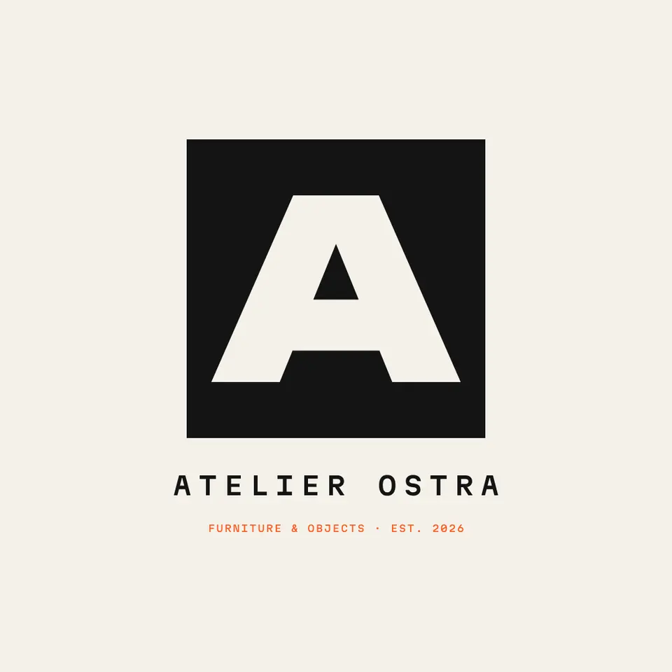
This guide explains each type with examples, says which suits a new business, a long name or a small app icon, and shows four of them in our logo set — starting with «Atelier Ostra», a lettermark: a white «A» in a black square over the full name. Every step was run in Paletoo on 11 November 2026; the pictures are the editor itself.
The 7 types of logos
Designers name them slightly differently, but these seven cover almost every logo you will see:
| Type | What it is | Famous examples | Best for |
|---|---|---|---|
| Wordmark (logotype) | The name set in a distinctive way | Google, Coca-Cola, FedEx | Short, memorable names |
| Lettermark (monogram) | One to three initials | IBM, HBO, CNN | Long names, fashion, studios |
| Pictorial mark | A recognisable picture | Apple | Brands already well known |
| Abstract mark | A shape that means nothing literal | Nike, Pepsi | Global brands, tech |
| Mascot | A character | KFC, Michelin | Food, games, family brands |
| Emblem | Words inside a badge or crest | Starbucks, Harley-Davidson | Cafés, schools, clubs, crafts |
| Combination mark | A symbol and the name together | Adidas, Lacoste | New brands — the symbol learns the name |
Which type of logo should you choose?
Start from what people need to remember. A new business needs its name remembered, so a wordmark or a combination mark is the safe start: the symbol alone means nothing until people have seen it next to the name many times. Big brands drop the name only after years — Nike’s swoosh appeared with the word «Nike» for decades.
A long name («Atelier Ostra Furniture & Objects») is hard to read small, so a lettermark gives you a compact version for an app icon, a stamp or a social avatar, with the full name underneath where there is room. An emblem suits places with a sense of tradition — a bakery, a club, a school — but its small text disappears at small sizes, so it needs a simpler version too. Mascots are memorable and friendly but expensive to draw well and hard to keep consistent.
Logos also move between types as a brand grows. Starbucks dropped the words from its ring in 2011 and kept only the siren; Mastercard removed its name from the two circles in 2019. Both could do it only because millions of people had already learned the name from the combination mark. A new brand that starts with a symbol alone is skipping that step.
One logo, several versions
Most real logos are a small family rather than one picture: the full combination mark for the website header, the wordmark alone for documents, the symbol or monogram alone for a 32-pixel favicon and an app icon, and one-colour versions for embroidery, stamps and dark photos. Plan the family from the start and make each version from the same parts, so they always look related. Save them as SVG for print and the web, and as transparent PNG for slides and video. Write down the rules in a single page — the clear space around the logo, the smallest size, the colours on light and dark — and the logo stays the same wherever someone else uses it.
Made in Paletoo
Every picture on this page was made in Paletoo — these three with the same steps on other templates:
Step by step in Paletoo
Open the logo: press “Open in Paletoo” on this page, or start from the logo maker, which writes your name into a hundred logos of every type. The Layers panel lists the square, the initial, the name and the tagline.
Double-click the initial and type yours. Under Typography in the Design tab pick a heavy font for a lettermark — thin letters disappear at favicon size.
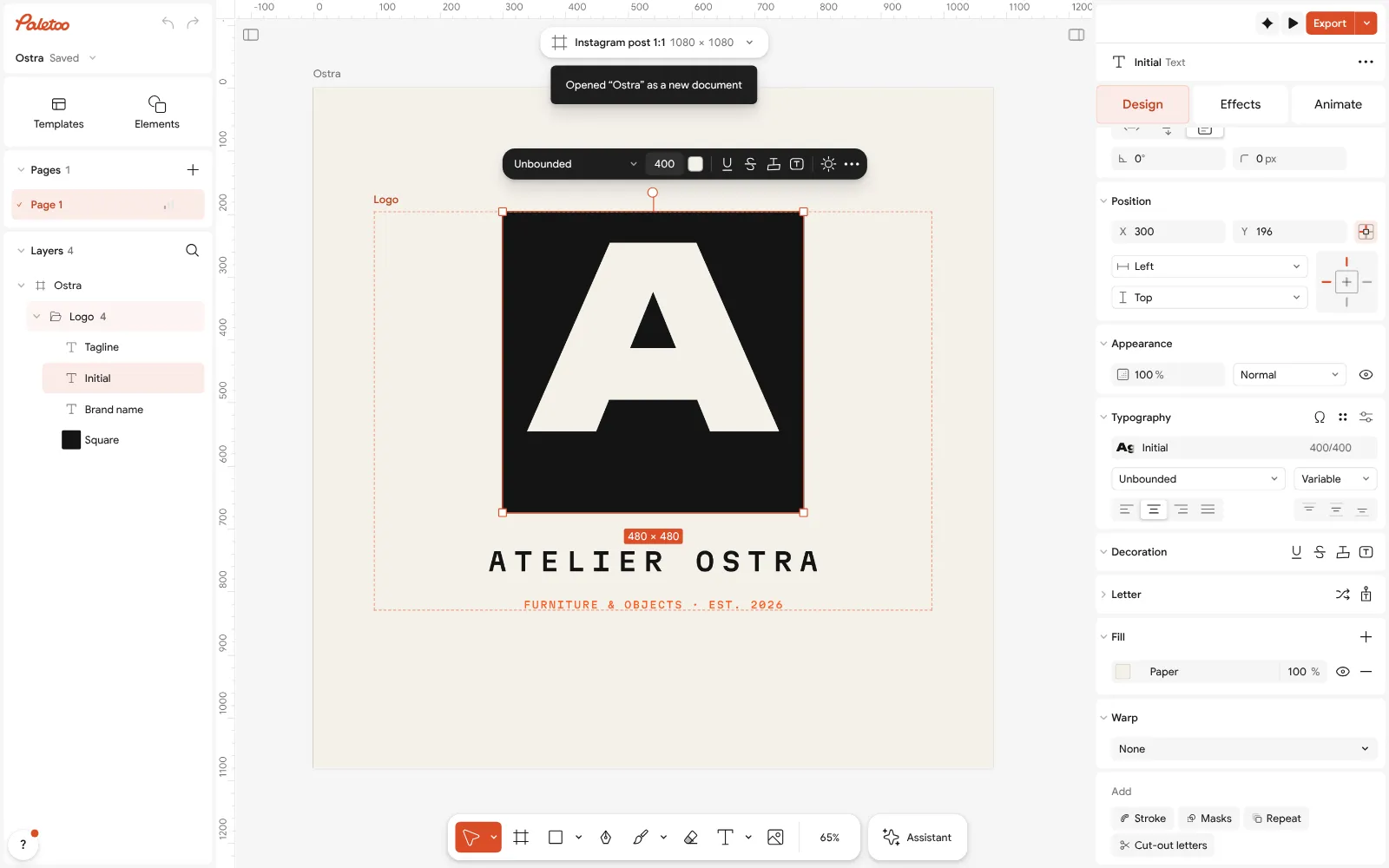
The «Atelier Ostra» lettermark open in Paletoo: the initial «A» selected, its font under Typography Select the square: its colour is under Fill. Change the shape’s colour or the name below to try a lighter or a bolder version of the same mark.
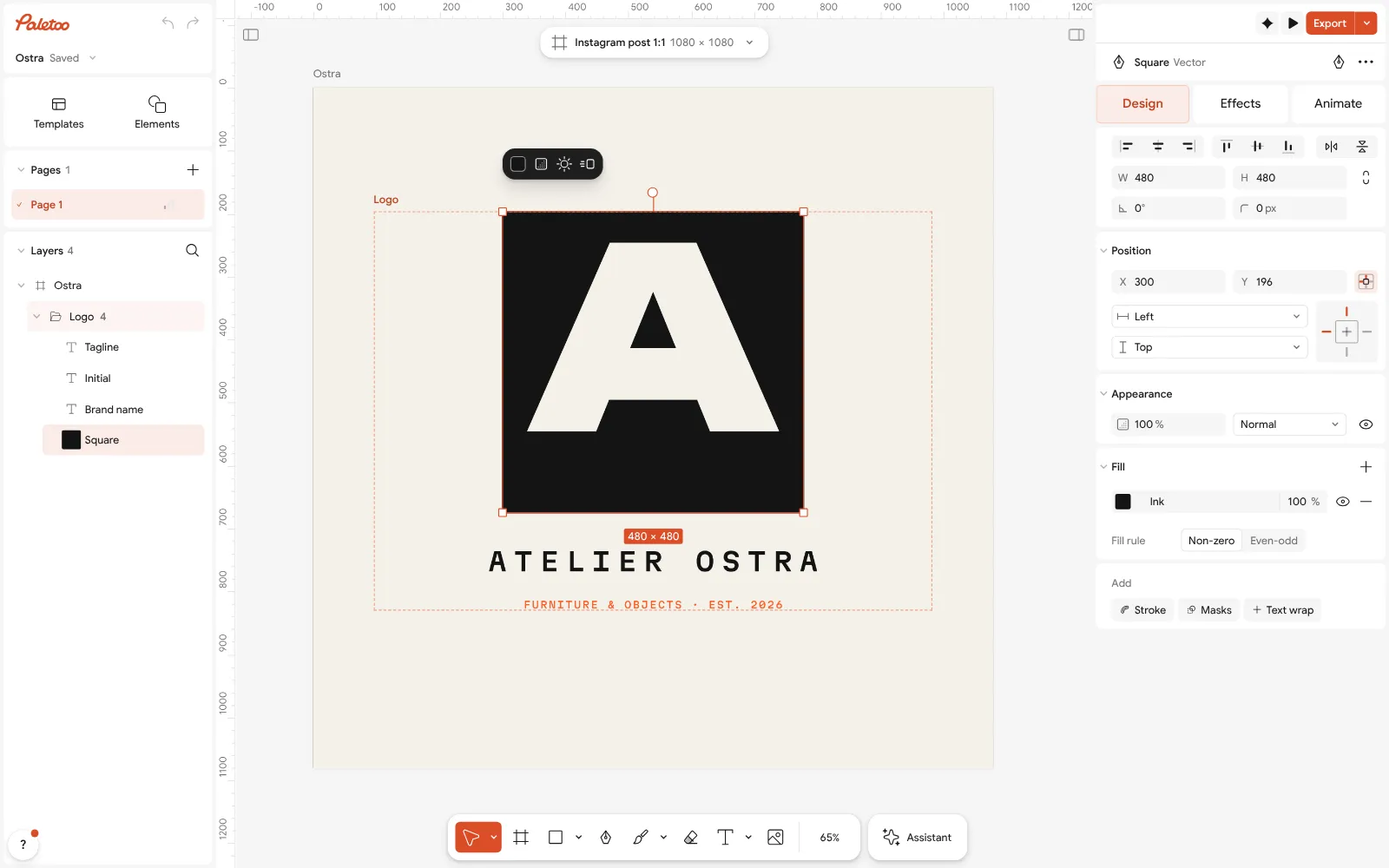
The black square selected: its colour under Fill Make the versions: Duplicate artboard for a version with the monogram alone and another in one colour; keep them in the same document so they stay in step.
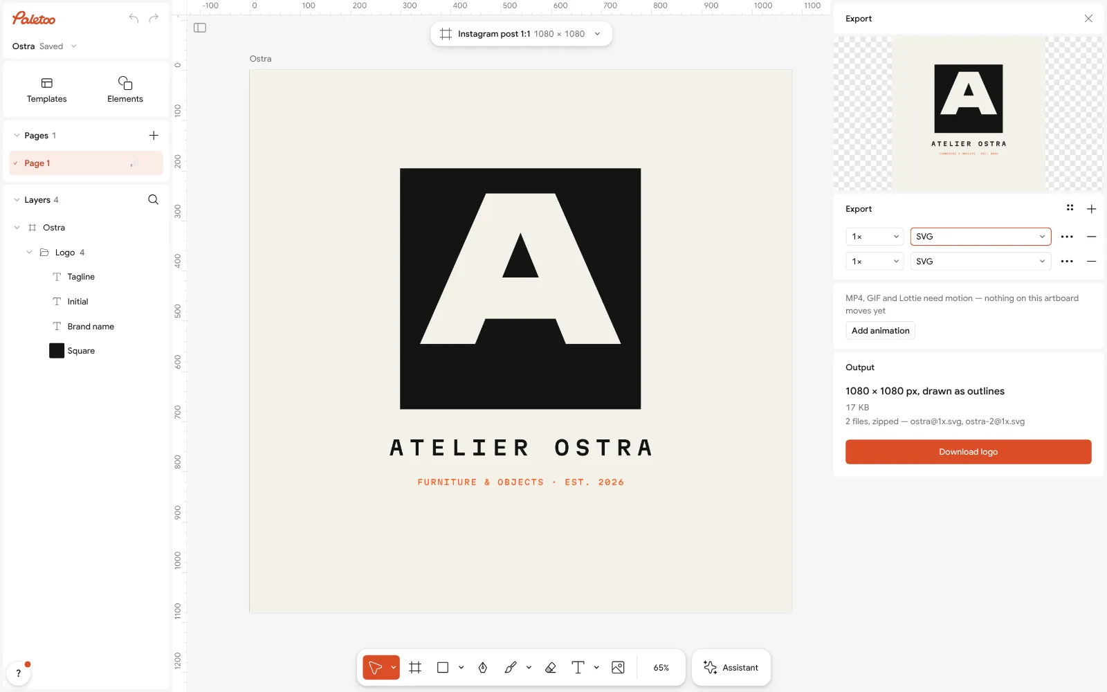
Export as SVG for print and the web Press Export (Ctrl Shift E) and choose SVG for print and the web, or PNG with a transparent background for slides and video.
Try the other types in the logo maker — a wordmark, an emblem, a combination mark — with your own name, and compare them side by side. Nothing carries a watermark.
Make it your own
Test the mark at 32 px: zoom out until it is the size of a browser tab icon. If it turns into a blur, simplify — fewer letters, a heavier font, no tagline. Then print it small on paper: screens flatter tiny logos, paper does not.
For a one-colour version, set every part to the same colour in Colour styles; a good logo still works in plain black.
If a printer needs the text as shapes, use Outline text on a copy — keep the editable original.
Sources
Questions
What are the 7 types of logos?
Wordmark, lettermark (monogram), pictorial mark, abstract mark, mascot, emblem and combination mark.
What type of logo is best for a new business?
A wordmark or a combination mark, because people need to learn your name first; a symbol alone works only once the name is known.
What is the difference between a wordmark and a lettermark?
A wordmark spells the whole name (Google); a lettermark uses only initials (IBM). Lettermarks suit long names.
What is a combination mark?
A symbol and the name together, like Adidas’ stripes with the word. It is the most flexible type: the parts can also be used alone.
Can I make a logo of each type for free?
Yes. Paletoo’s logo maker writes your name into wordmarks, monograms, emblems and combination marks for free, with SVG and transparent PNG export.
Make it online
- Logo makerType your brand name, pick a logo, try fonts, colours and layouts, then download SVG, PNG and app icons — free, no watermark, no sign-up.
- Image to vector converterTurn a PNG or JPG logo, icon or drawing into a clean SVG in about 30 seconds — free, no sign-up, and your picture never leaves your browser.
- Business card makerDesign a business card at the exact print size, add a QR code that really scans, and export a PDF the printer accepts.
Free design templates for posts, stories and posters: Brand guidelines templates · Contact and call-to-action templates
Try it on your own design
Paletoo opens in your browser, with no sign-up. Every effect here is live: change the picture or the words and the effect follows.
Open in PaletooOpens this design as your own copy — every layer and effect editable, free.
Read next
- 01
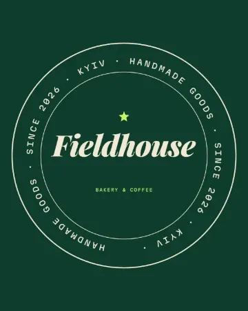 How to make a logo for free — no AI, no sign-upA logo you own, from your name to an SVG file, in about fifteen minutes.
- 02
 Free logo text effects: seven looks that work on a wordmarkSeven text looks for a wordmark, and how to keep them sharp at 32 px.
- 03
 Wordmark logo: how to design one, with examples and a free makerA logo that is just the name, done well: the font, the spacing, one small detail that makes it yours — and the tests that tell you it works.