Techniques4 min readFreeUpdated 2026-11-21
Wordmark logo: how to design one, with examples and a free maker
A logo that is just the name, done well: the font, the spacing, one small detail that makes it yours — and the tests that tell you it works.
By the Paletoo team · steps tested in Paletoo on
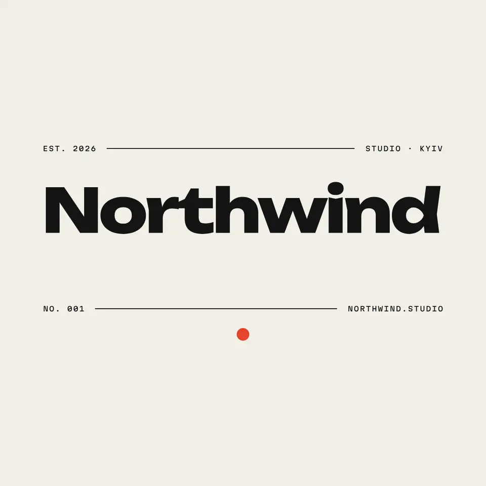
A wordmark is a logo made only of the brand’s name in type, like Google or Coca-Cola. To design one, choose a typeface whose voice fits the brand, set the name in it, tighten and even out the spacing between letters (kerning), add at most one distinctive detail — a joined pair, a cut, a dot — and test it at 32 pixels and in one colour before exporting it as SVG.
This guide builds on «Northwind», a wordmark from our logo set — the name in heavy geometric capitals and lowercase between two thin rules, with a red dot — and walks through the decisions that turn a typed name into a logo, with the mistakes to avoid. Every step was run in Paletoo on 11 November 2026; the pictures are the editor itself.
What makes a good wordmark
A wordmark has nowhere to hide: no symbol carries the meaning, so every letter shows. The best ones share four things. The typeface has the right voice — a geometric sans feels modern and engineered, a serif feels established, a script feels personal, a heavy condensed face feels sporty. The spacing is even to the eye, not to the ruler: pairs like «AV», «To» and «rn» are adjusted by hand. There is one idea, not five — FedEx’s famous hidden arrow lives in the space between the E and the x and is invisible until someone points it out. And it survives small sizes and one colour.
| Typeface | Voice | Suits |
|---|---|---|
| Geometric sans | Modern, clean, engineered | Tech, studios, architecture |
| Serif | Established, literary, premium | Publishing, law, fashion |
| Script | Personal, warm, handmade | Bakeries, beauty, weddings |
| Condensed bold | Sporty, loud, confident | Sport, music, events |
| Mono | Technical, honest, indie | Developers, zines, labels |
Spacing and kerning, the part that shows
Fonts are spaced for running text, not for a word set huge. Large type almost always needs its letter spacing tightened a little and individual pairs adjusted: round letters (o, c, e) need to sit closer than straight ones (l, i, n) to look evenly spaced, and diagonals (A, V, W, y) leave gaps that need closing. Work at the size the logo will be seen most, squint, and fix whatever pair looks too loose or too tight. Then check the word upside down — spacing errors jump out when you cannot read it. Do the same check again in the font’s other weights if you use them.
Capitals or lowercase change the character too: all caps feel formal and stable, lowercase friendly and approachable, title case is the neutral middle. «Northwind» uses a capital N and lowercase, a confident but approachable mix.
One detail, then stop
A wordmark becomes yours through one small decision: a ligature where two letters join, a letter cut or extended, a coloured dot, a custom «g». One is memorable; three look busy and stop working when the logo is small. Test every idea at 32 pixels — the size of a browser tab — and in plain black on white. If the detail vanishes or the word turns into a smudge, simplify.
Made in Paletoo
Every picture on this page was made in Paletoo — these three with the same steps on other templates:
Step by step in Paletoo
Open the wordmark: press “Open in Paletoo” on this page, or start from the logo maker, which writes your name into every logo of the set. The Layers panel lists the name, the dot, the rules and the small lines.
Double-click the name and type yours. Under Typography in the Design tab try a few typefaces — the voice table above is a good start — and keep the weight heavy enough to survive small sizes.
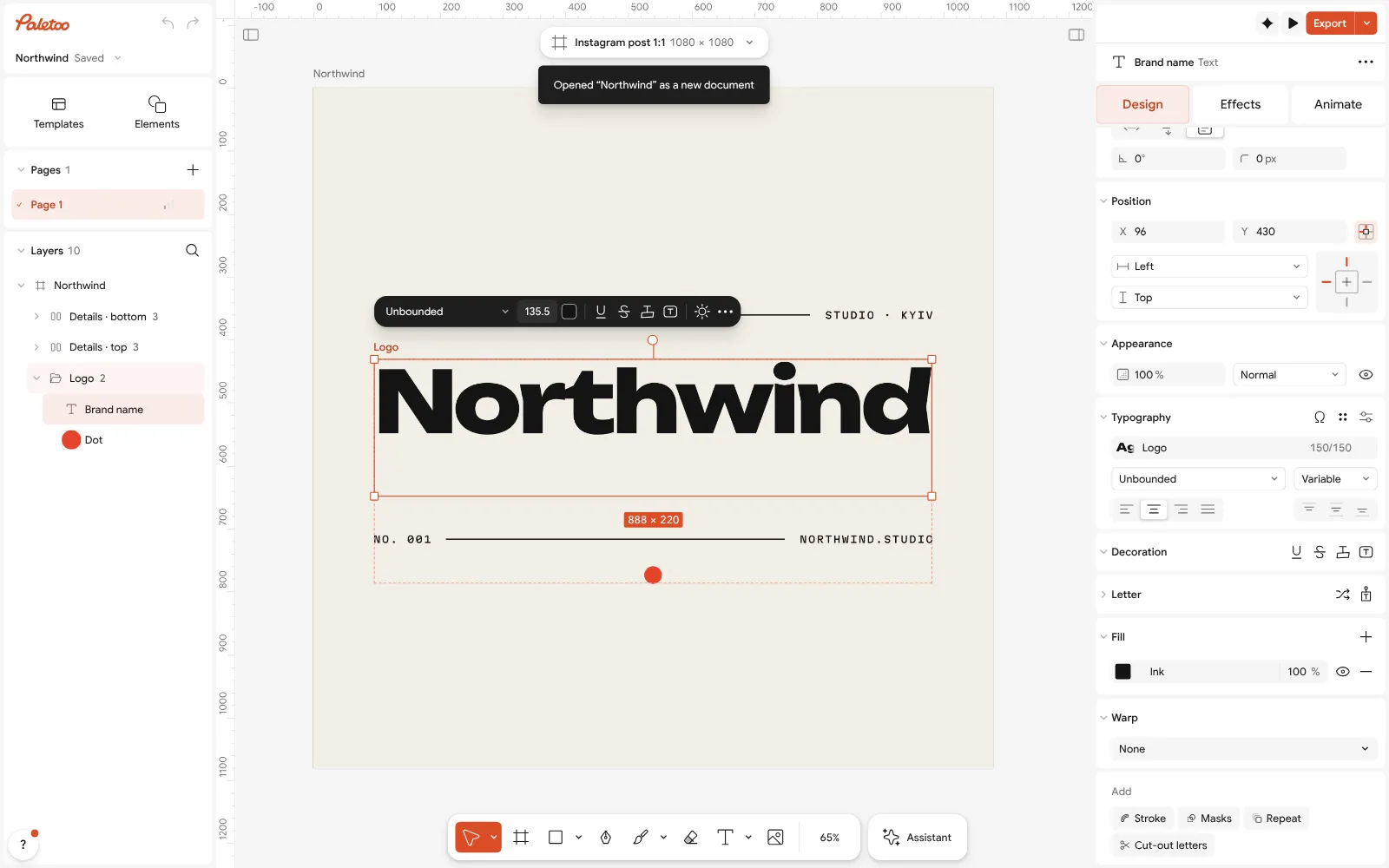
The «Northwind» wordmark open in Paletoo: the name selected, its font and spacing under Typography Tighten the spacing: lower the letter spacing a little in Typography, then place the cursor between two letters and adjust the Kerning of any pair that looks loose (Alt ← / →).
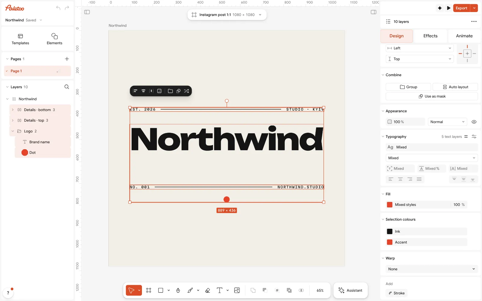
Everything selected: the logo’s colours under Selection colours Select everything to see the colours under Selection colours: try the name in one colour and the dot in an accent — then check that it still works all in black.
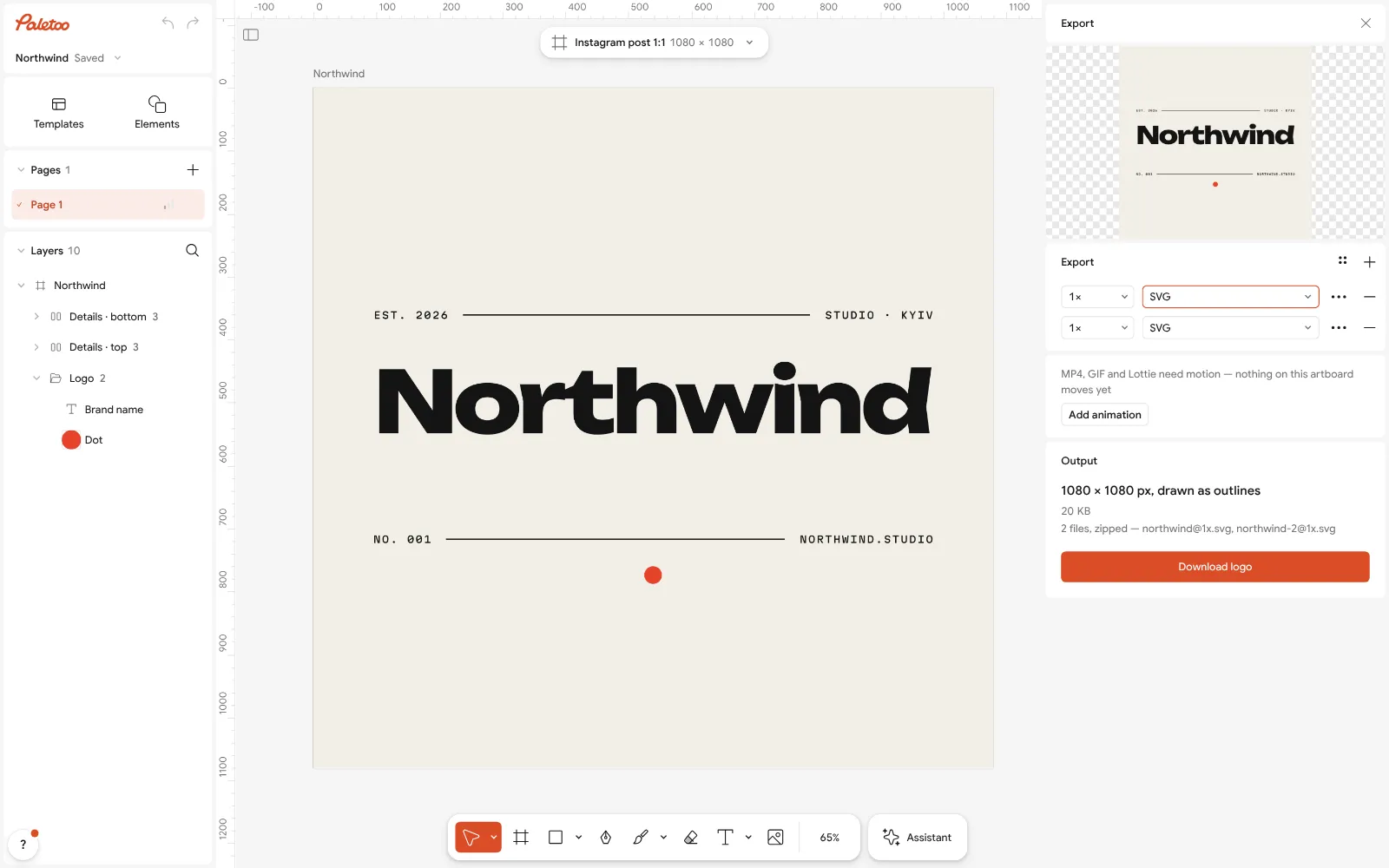
Export as SVG for print and the web Make the versions with Duplicate artboard: the full lockup with the rules, the name alone, a one-colour version. Zoom out until it is 32 px wide and check it still reads.
Press Export (Ctrl Shift E) and choose SVG for print and the web, or PNG with a transparent background. For a printer that needs shapes, use Outline text on a copy. Nothing carries a watermark.
Make it your own
Want the letters to feel crafted? Try a Stroke or a subtle texture from the Effects tab on a copy — but keep the flat version as the master.
Save the brand colour and the name’s font in Colour styles and Text styles so posters and cards use exactly the same wordmark settings.
Use the wordmark on a business card and a favicon before you commit: real use shows problems the canvas hides.
Sources
Questions
What is a wordmark logo?
A logo made only of the brand’s name in type, like Google, Coca-Cola or FedEx — no separate symbol.
How do I design a wordmark?
Pick a typeface with the right voice, set the name, tighten the spacing and kern the awkward pairs, add one distinctive detail, and test it at 32 px and in one colour.
What is the difference between a wordmark and a logo?
A wordmark is one kind of logo — the name alone. Other kinds use a symbol, initials, a badge or a mascot, alone or with the name.
Which font is best for a wordmark?
One whose voice fits the brand: geometric sans for modern, serif for established, script for personal, condensed bold for sporty. Heavier weights survive small sizes better.
Can I make a wordmark logo for free?
Yes. Paletoo’s logo maker and wordmark templates are free to edit and export as SVG or transparent PNG, with no watermark and no account.
Make it online
- Logo makerType your brand name, pick a logo, try fonts, colours and layouts, then download SVG, PNG and app icons — free, no watermark, no sign-up.
- Image to vector converterTurn a PNG or JPG logo, icon or drawing into a clean SVG in about 30 seconds — free, no sign-up, and your picture never leaves your browser.
- Text effects onlineType your words, press one effect — chrome, gold foil, emboss, cut-out letters, outlines or warps — and download it in a minute, free and with no sign-up; the words stay editable text.
Free design templates for posts, stories and posters: Brand guidelines templates · Social media post templates
Try it on your own design
Paletoo opens in your browser, with no sign-up. Every effect here is live: change the picture or the words and the effect follows.
Open in PaletooOpens this design as your own copy — every layer and effect editable, free.
Read next
- 01
 Types of logos: 7 kinds with examples, and which one to chooseSeven kinds of logo, what each one is good at, the famous examples you already know — and a free one of each kind you can make your own.
- 02
 Free logo text effects: seven looks that work on a wordmarkSeven text looks for a wordmark, and how to keep them sharp at 32 px.
- 03
 Font pairing for posters: six combinations that workOne loud voice, one quiet one, and a clear difference between them.