Design trends 20276 min readFreeUpdated 2026-11-06Save to Pinterest
Color trends 2027 for designers: five palettes and how to use them
Five palette directions for posters, posts and brands next year, each tried on a real design.
Colour forecasts for 2027 arrive in stages. Fashion and interiors publish theirs a season or two ahead; Pantone names its Color of the Year each December (the 2026 pick, Cloud Dancer, was a soft white). We do not guess the next one here. What a designer can already see is how colour is being used on posters, covers and feeds: fewer flat brand gradients, more limited palettes with a reason behind them, and colour that carries texture.
Below are five colour trends for 2027, written as palettes you can use rather than single swatches. Each is shown on a real design made in Paletoo, with the steps to make it and a live example to open. In every case the colours sit in one Gradient map step, so changing the palette to your brand’s takes a minute.
Every picture in this article is a real design made in Paletoo, on our own templates — exported from the editor, not stock.
Ink blue and coral duotones
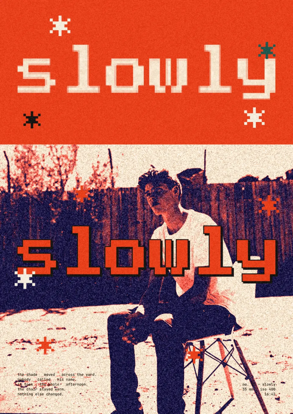
A deep, inky navy against a warm coral and a cream paper is the most useful palette on this list: confident, readable and easy to pair with black type. It answers the move away from both bright brand blue and all-beige minimalism. In the example a zine poster’s photo of a man on a folding chair turns navy and coral-red on cream, and the pixel word “slowly” across it is set in the same coral-red.
Use the darkest colour for shadows and type, the coral for the light parts of the subject, and leave a lot of cream. Choose a high-contrast photo; flat, grey light turns a duotone into mud.
Make it in Paletoo
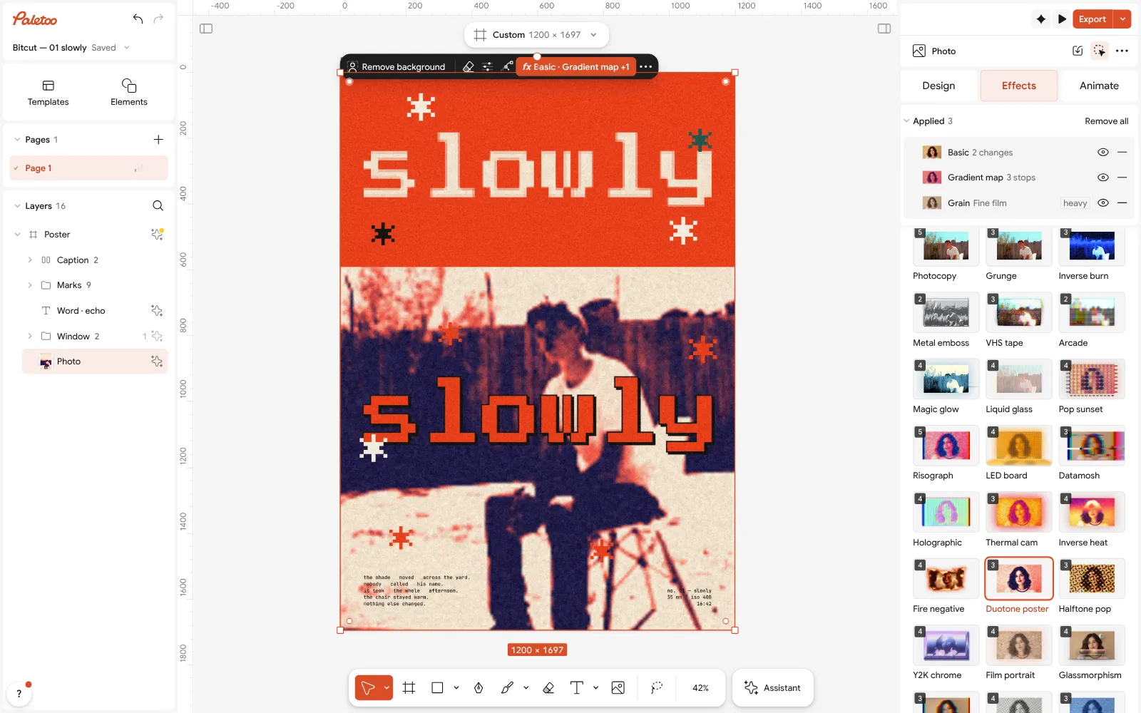
Select the photo, open Effects, go to Mixes and press All.
Press Duotone poster: Basic, Gradient map and Grain go on under Applied.
Click the Gradient map row and change the stops of its Gradient to your own two colours and paper.
Open this example in Paletoo Step-by-step guide: How to make a duotone effect
Sunset warmth
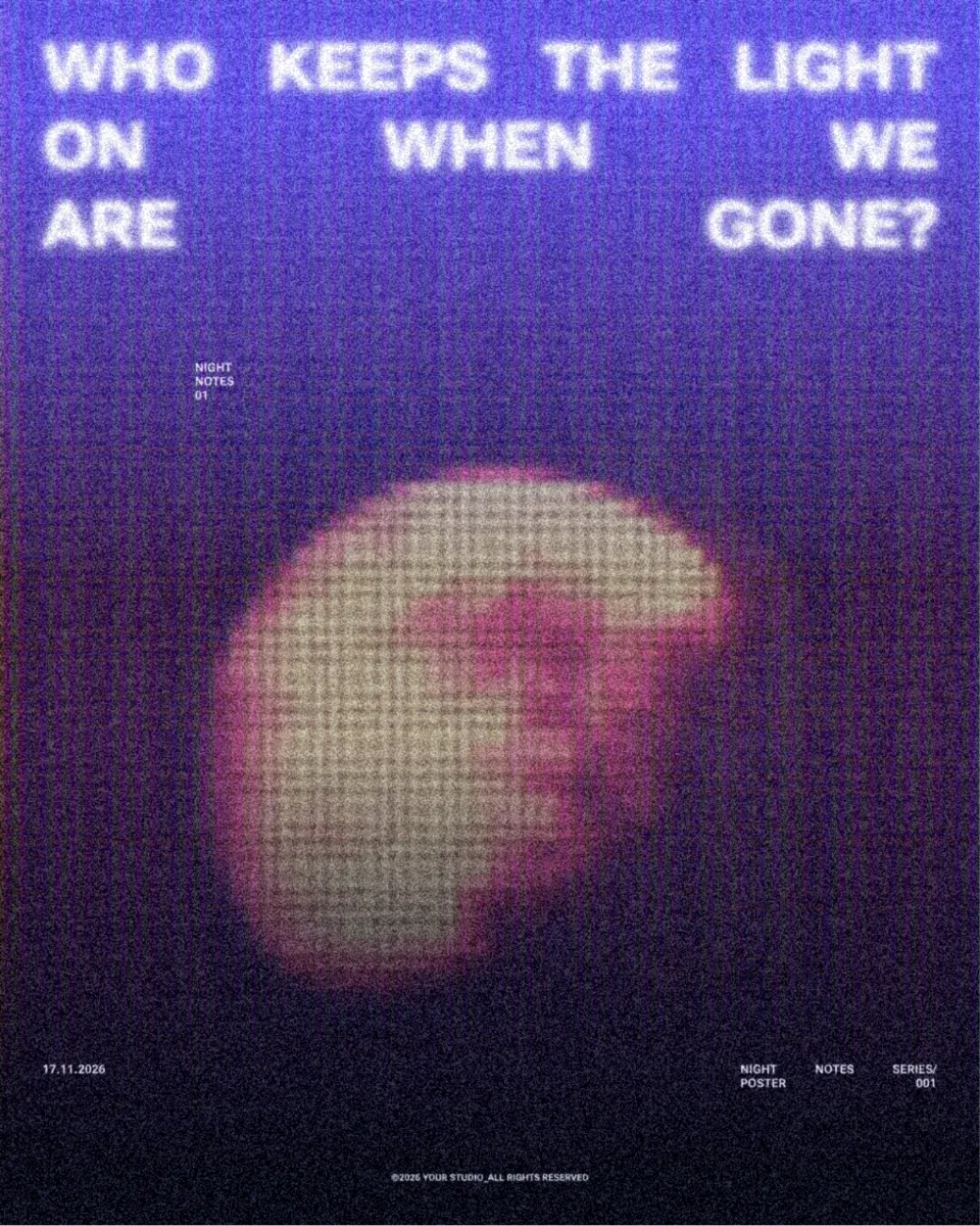
Warm, seventies-style colour — dusk purple melting into rose and apricot — keeps coming back because it flatters skin and makes even an ordinary photo feel like a memory. In 2027 it shows up with texture: comic dots, a soft glow and slightly misregistered inks rather than a smooth gradient.
Keep the darkest stop really dark, or the picture loses its shape. Pair it with cream or off-white type; pure white looks cold beside it. In the example a night poster’s moon turns rose and peach on a violet ground, under a coarse grid of comic dots.
Make it in Paletoo
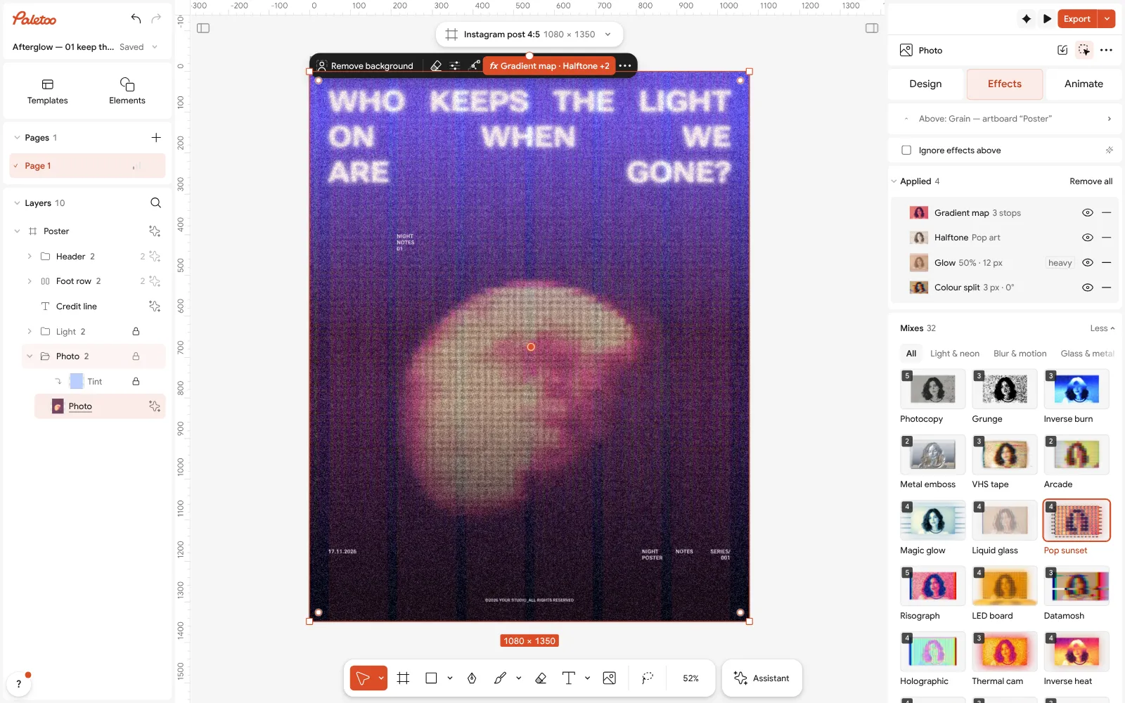
Select the picture and open Mixes in the Effects tab.
Press Pop sunset: a Gradient map, Halftone, Glow and Colour split go on.
Open the Gradient map to warm or cool the stops, and lower the Halftone step’s Amount for a smoother finish.
Open this example in Paletoo Step-by-step guide: How to make a halftone effect
Heat-map gradients
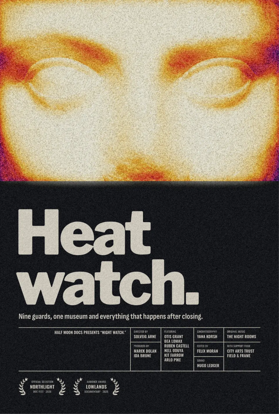
The colours of a thermal camera — deep violet, magenta, red, amber and a white-hot centre — have moved from science images into sports, music and tech graphics. They make a subject glow out of the dark and suggest energy and speed without a single word.
Use them on a clear subject — a cut-out works best, so the hot colours land on the person and the layout around stays calm. Keep the type dark or white; a third accent colour fights the gradient. In the example the close-up face of a film one-sheet glows in purple, magenta, orange and yellow above the calm, dark title block “Heat watch.”
Make it in Paletoo
Select the photo and open Mixes in the Effects tab.
Press Thermal cam: Glow, Gradient map and Grain go on under Applied.
In the Gradient map, turn on Reverse if the hot colours land on the wrong side.
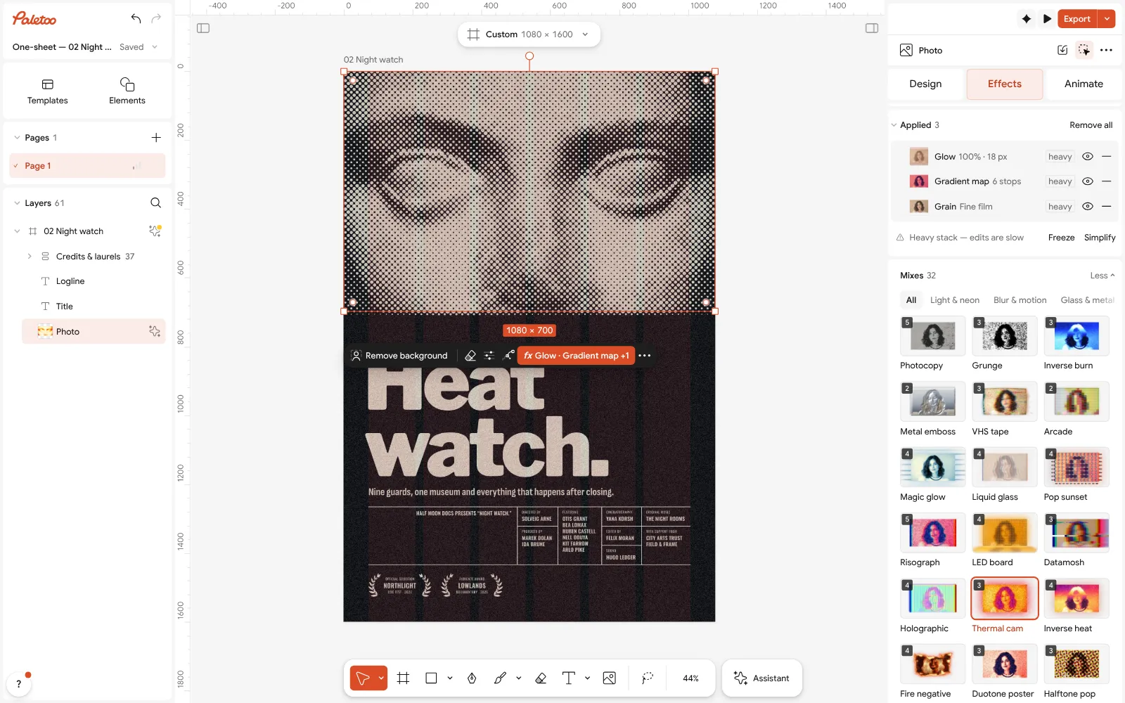
Open this example in Paletoo Step-by-step guide: How to make an inverse heat effect
Grainy blurred gradients
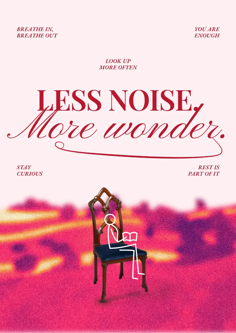
A soft field of colour under visible grain — violet into hot pink, orange and cream — is the colour trend of the moment for gig posters, album covers and story backgrounds. The grain is the point: it makes a gradient look printed, and it survives compression on social apps better than a smooth blend.
Give the blur one clear subject to melt, such as a cut-out figure, and put crisp type on top so something is in focus. In the example the landscape at the foot of a calm reminder poster melts into a grainy magenta, pink and gold haze, while the chair in front and the headline stay sharp.
Make it in Paletoo
Select the picture or the cut-out and open Mixes in the Effects tab.
Press Grainy blur: Blur, Gradient map and Grain go on.
Open the Gradient map to change the four colours; raise or lower the Blur for a sharper or a softer field.
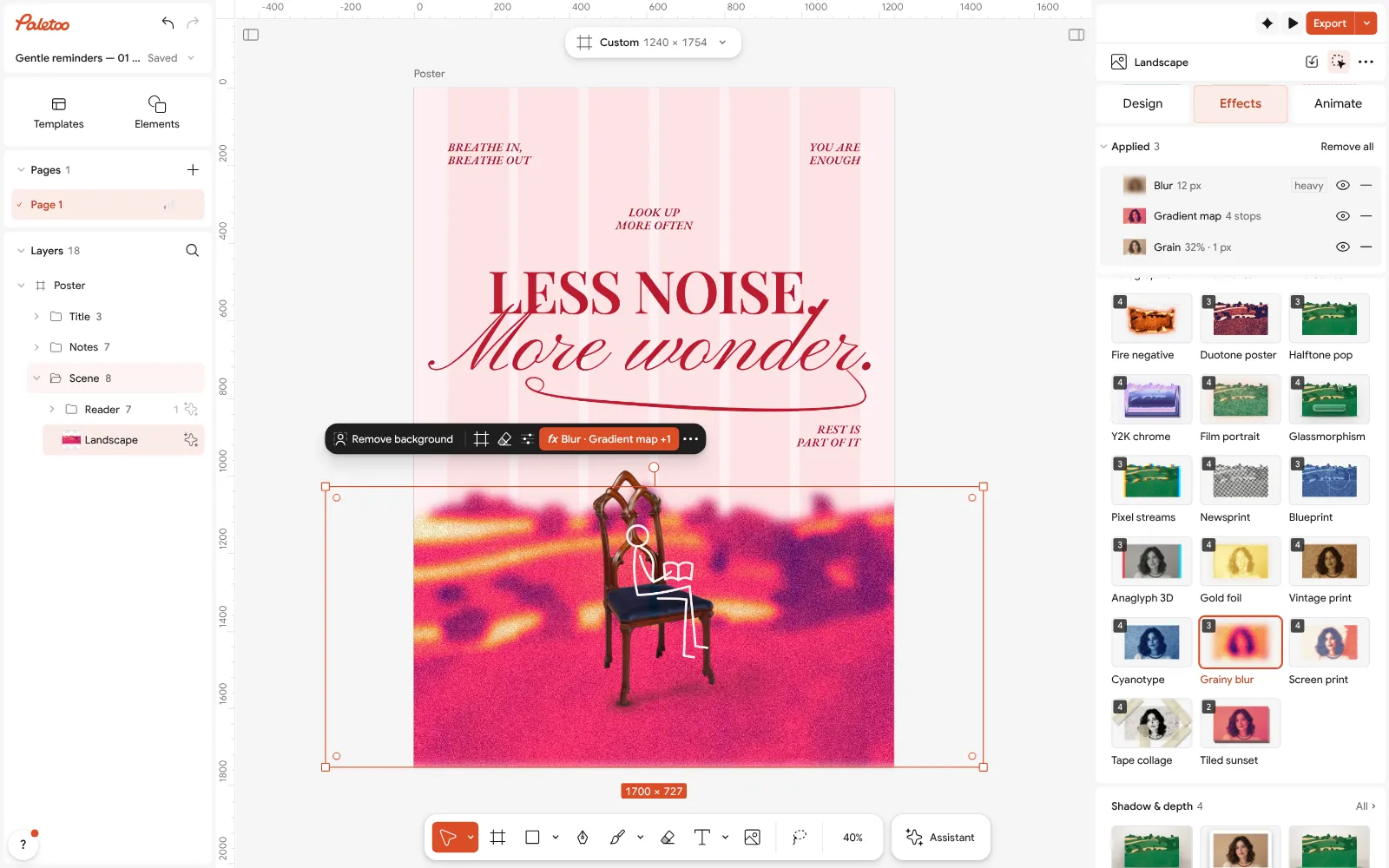
Open this example in Paletoo Step-by-step guide: How to make a grainy gradient, the grainy blur look
Two-ink riso palettes
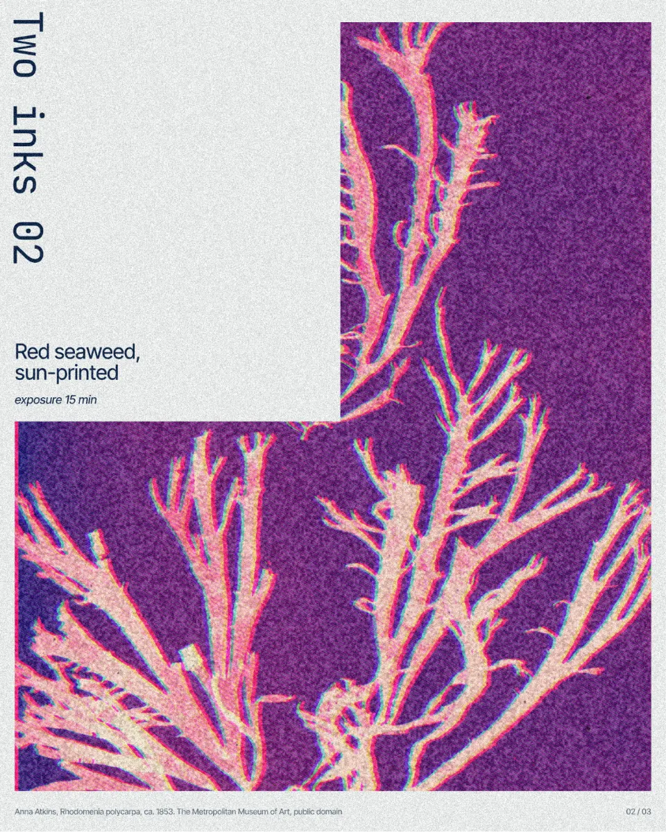
Two bright inks and the colour of the paper — blue and fluorescent pink is the classic risograph pair — are a palette and a process at once. Small studios, zines and events use them because a strict palette reads as made by hand, and it is easy to keep consistent across a whole series.
Choose one dark ink for the detail and one bright one for the accents, let the off-white paper show, and keep everything else on the page in the same two inks. In the example a sun-printed seaweed from a specimen series is held to violet and fluorescent pink, with a coarse riso grain, beside a calm column of off-white paper.
Make it in Paletoo
Select the photo and open Mixes in the Effects tab.
Press Risograph: five steps go on under Applied, starting with a Gradient map of the two inks and paper.
Click the Gradient map row and set the two ink stops; keep the paper stop light.
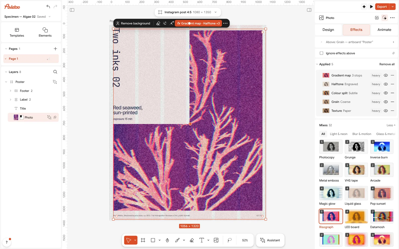
Open this example in Paletoo Step-by-step guide: How to make a risograph effect
Picking a 2027 palette
Start from what the design must say, then limit the palette. Calm and editorial: ink blue and coral. Warm and nostalgic: sunset. Fast and electric: heat-map. Dreamy and musical: grainy blur. Local and handmade: two inks. Whichever you choose, one Gradient map holds it, so you can swap the stops for your brand colours or next season’s without redoing the design.
More of next year’s looks are in Graphic design trends 2027. For type to set in these colours, see Typography trends 2027; for colour on photos, Photo effect trends 2027.
Questions
What is the Pantone color of the year 2027?
Pantone announces its Color of the Year each December, so check its own announcement. This article does not guess it; it shows palettes designers are already using.
How do I use my brand colours with these trends?
Every palette here lives in one Gradient map step. Open it and replace the stops with your brand colours, keeping one very dark stop and one light one.
Do these palettes work on text as well as photos?
Yes. A Gradient map works on text, shapes and pictures. On text, the darkest and lightest stops matter most.
Why does my duotone look muddy?
The photo is too flat. Choose one with strong light and shadow, or raise the contrast in the Basic step before the Gradient map.
Is it free?
Yes. Every effect, mix and export is free and carries no watermark. Credits are only for AI image generation and materials.
Make it online
- Photo effects onlineGive a photo a film, print or glitch look in one click — and keep every step editable afterwards.
- Duotone, halftone and glitch photo effects onlineThree of the strongest looks for a photo, each one click away and every step still yours to tune.
Free design templates: Poster templates
Try it on your own design
Paletoo opens in your browser, with no sign-up. Every effect here is live: change the picture or the words and the effect follows.
Open in PaletooRead next
- 01
 How to make a duotone effectTwo bold inks, punchy contrast and a fine poster grain.
- 02
 How to make a grainy gradient, the grainy blur lookMelted into a violet-to-peach gradient under heavy grain.
- 03
 How to make a risograph effectTwo riso inks out of register, a coarse screen, riso paper.
- 04
 How to keep brand fonts and colours consistent across every designName the colours and the type once, link every layer to them, and change them in one place.