Techniques5 min readFreeUpdated 2026-11-20
Neutral colour palette: 10 palettes with HEX codes
Ten ready neutral palettes, warm and cool, with the codes to copy, a generator that stays calm, and how to keep a beige design from going flat.
By the Paletoo team · steps tested in Paletoo on
Neutral colours are the barely coloured ones — white, black, grey, beige, greige, taupe, sand and the earth tones — such as linen #FAF6F0, sand #C8B49A, greige #A89F94, taupe #8B7D77 and charcoal #2F2A26. They are «neutral» because they sit quietly behind photos, products and words, which is why minimal brands, interiors, wedding stationery and «clean» Instagram feeds are built on them.
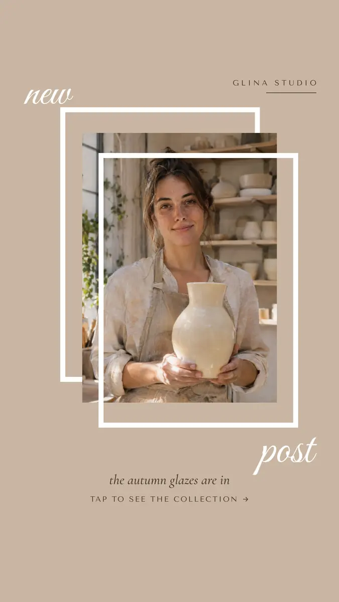
Every palette below is a neutral family from the lightest paper to a dark ink, with the contrast measured live as you generate and lock colours. After the generator: the common neutrals and their codes, warm versus cool neutrals, how to keep a neutral design from looking flat, and the steps in Paletoo on «New post», a ceramics studio’s story in taupe, sand and cream.
Generate a palette and see it on a posterLive
Press Generate for a new neutral palette: warm and cool greys, beiges and taupes with a dark ink. Tap a colour to lock it; the rest follow its hue. The contrast is measured as you go.
- Ink on paper
- —
- Accent on paper
- —
- Paper on deep
- —
Neutral palettes — press one to load it
Open this in PaletooOpens a new document with exactly this setup — free, no sign-up.
Neutral colours and their HEX codes
A neutral has very low saturation: it is mostly lightness, with only a hint of hue. That hint decides whether it feels warm (yellow, red, brown underneath: beige, sand, greige) or cool (blue or green underneath: grey, slate, sage). The table gives the neutrals people search for most, with how much contrast each has against white — the number that decides whether it may carry text.
| Neutral | HEX | Warm or cool | On white |
|---|---|---|---|
| Linen / ivory | #FAF6F0 | Warm | 1.1:1 — a paper, not text |
| Oat / beige | #E8DCCB | Warm | 1.4:1 — a paper |
| Sand | #C8B49A | Warm | 2.0:1 — shapes only |
| Greige | #A89F94 | Warm | 2.6:1 — shapes only |
| Cool grey | #8A939B | Cool | 3.1:1 — large text only |
| Taupe | #8B7D77 | Warm | 4.0:1 — large text only |
| Terracotta (earth) | #B5651D | Warm | 4.3:1 — large text only |
| Umber | #6B4F2A | Warm | 7.6:1 — any text |
| Charcoal | #2F2A26 | Warm | 14.2:1 — any text |
Warm or cool neutrals — pick one side
The most common mistake with neutrals is mixing the two temperatures: a cool blue-grey next to a warm beige makes the beige look dirty and the grey look cold. Choose a side and stay on it. Warm neutrals (cream, sand, greige, taupe, umber) feel cosy, natural and handmade — ceramics, cafés, interiors, weddings, skincare. Cool neutrals (white, light grey, slate, charcoal) feel precise and modern — tech, architecture, finance, portfolios.
The generator keeps to one temperature at a time: most of its palettes lean warm, about a third lean cool, and the hue you lock decides which. If you have a photo, pick the neutral from the photo itself — a wall, a linen cloth, a shadow — and it will sit in the picture instead of fighting it.
How to keep a neutral design from looking flat
Neutrals need contrast in lightness, because there is little contrast in colour. Use the whole range: a near-white paper, one or two mid tones for shapes, and a really dark ink for words. A design made only of mid beiges has nothing to hold the eye and fails the contrast check for every line of text.
Add texture and one accent. Neutral palettes come alive with real materials — paper grain, linen, clay, a photo with shadows — and with a single accent colour used sparingly: terracotta, olive, a dusty blue, or a muted pastel from the pastel palettes. Keep the accent to one or two elements per design, as the studio story does with its one warm photo.
For a brand, write the neutral palette down once as colour styles — paper, sand, taupe, umber, ink — and reuse it on every post, card and price list. A neutral feed only looks calm when the beige is the same beige every time.
Made in Paletoo
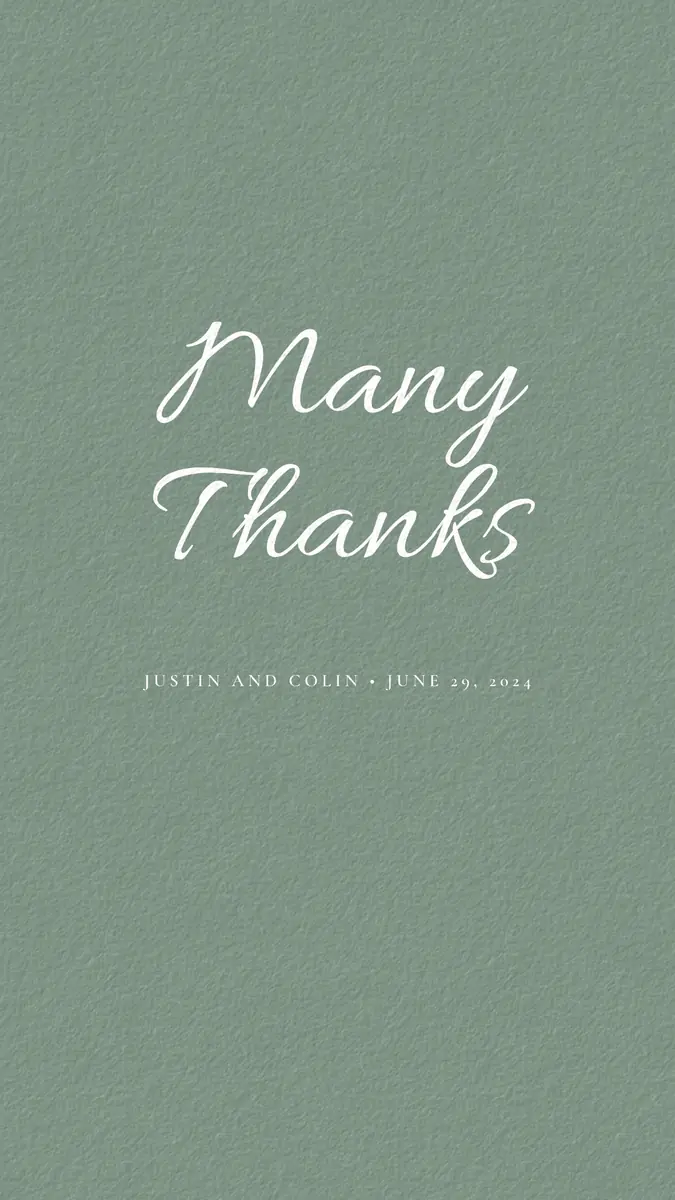
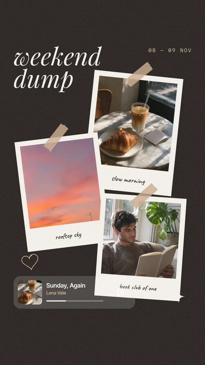
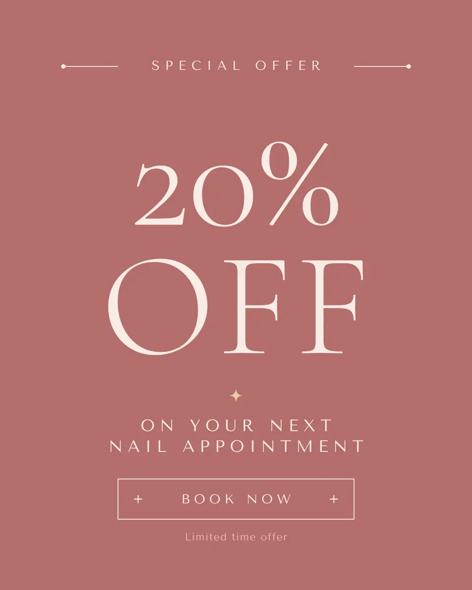
Every picture on this page was made in Paletoo — these three with the same steps on other templates:
Step by step in Paletoo
Open the post: press “Open in Paletoo” on this page, or “Open this in Paletoo” under the generator, which opens a new square with your five colours saved as Colour styles. «New post» is a ceramics studio’s story: a potter with a vase in a thin white frame on taupe, the words in a cream script.
With nothing selected, the Design tab lists the document’s Colour styles — Taupe, Umber, White, Sand and Clay. Change a style, and every shape and word that uses it changes.
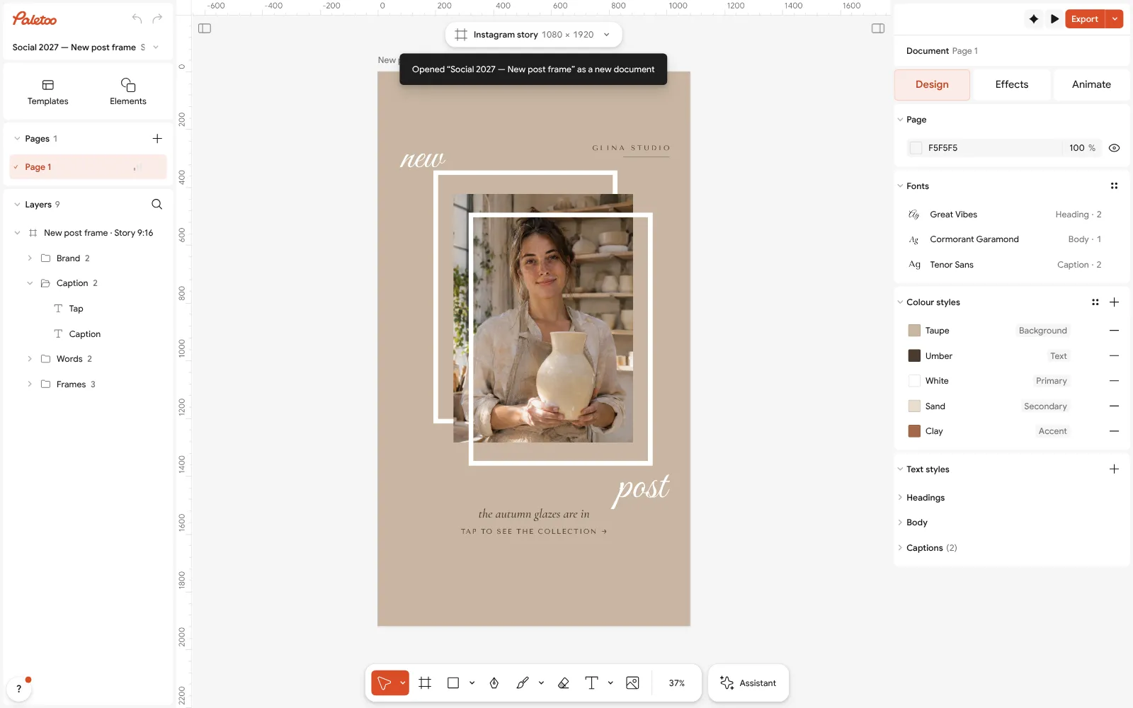
The «New post» template open in Paletoo with nothing selected: its colour styles under Design Select everything (Ctrl A): Selection colours lists every colour the story uses. Paste a neutral from the palettes above into any of them to swap that colour everywhere.
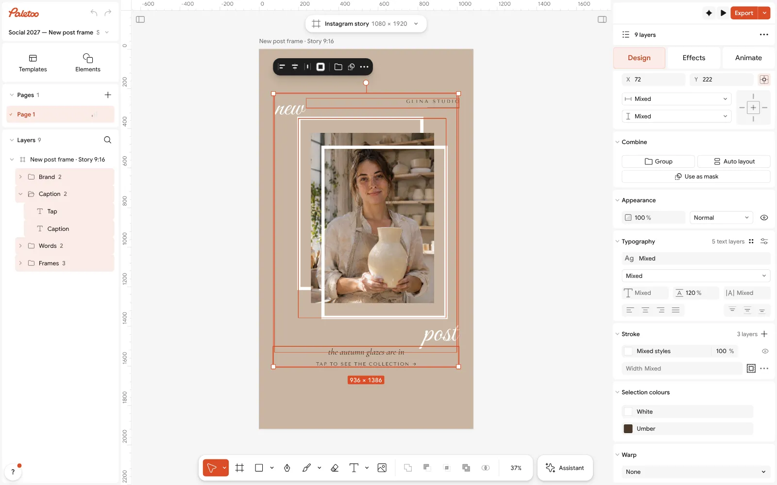
Everything selected: Selection colours lists each neutral the story uses Take a neutral from the photo itself with Pick color (I), or press Ctrl K and choose Palette from mood… and keep only its quietest colours.
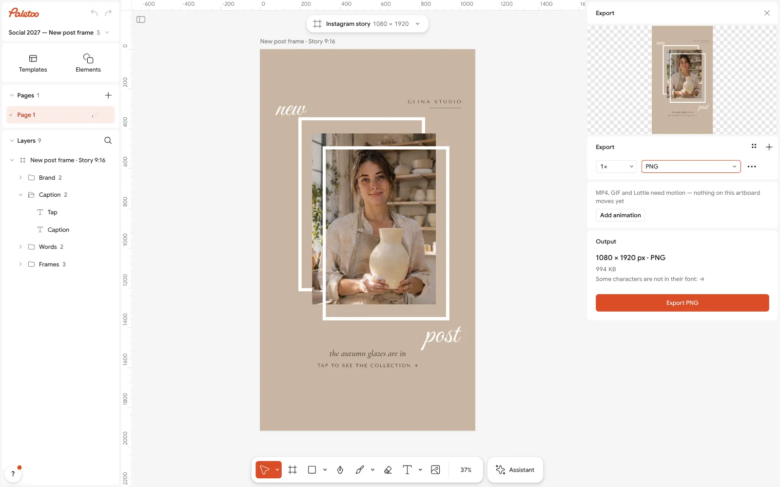
The Export window with the story ready to download Check the caption against its background: if a beige line on a beige ground is hard to read, set it in the darkest style instead of making it bigger.
Press Export (Ctrl Shift E) and download a PNG for Instagram or a PDF for print — free, without a watermark.
Make it your own
To make a neutral warmer or cooler, keep its lightness and nudge only the hue in Colour styles — towards yellow-red for warm, towards blue-green for cool.
If everything looks the same, darken the ink in Colour styles and lighten the paper; Selection colours shows whether the mid tones crept too close together.
Save the brand’s neutrals once and reuse them: open the same Colour styles in every new post, so the beige never drifts.
Sources
Questions
What are neutral colours?
Colours with very little saturation: white, black, grey and the browns and beiges — cream, sand, greige, taupe, umber and the earth tones. They sit quietly behind photos, products and words.
What are the HEX codes for neutral colours?
Common ones are linen #FAF6F0, beige #E8DCCB, sand #C8B49A, greige #A89F94, taupe #8B7D77, cool grey #8A939B, umber #6B4F2A and charcoal #2F2A26. The palettes on this page give each in a full family, light to dark.
What is the difference between warm and cool neutrals?
Warm neutrals have yellow, red or brown underneath (cream, sand, taupe); cool neutrals have blue or green (grey, slate). Choose one side for a design: mixing them makes both look off.
What colour goes with neutrals?
One accent used sparingly — terracotta, olive, dusty blue, mustard or a muted pastel — and a really dark ink for text. Keep the accent to one or two elements.
Are earth tones neutral colours?
Mostly yes: sand, clay, umber and olive are low-saturation, nature-based neutrals. Stronger earth colours such as terracotta work best as the palette’s accent.
Is there a free neutral palette generator?
Yes, the one on this page: press Generate for a new neutral palette, lock the colours you like, copy the HEX codes, or open the palette in Paletoo as colour styles — free, with no account.
Make it online
- Instagram post makerDesign a post at the right size from a real template, then export a sharp PNG or JPG — free, in your browser.
- Logo makerType your brand name, pick a logo, try fonts, colours and layouts, then download SVG, PNG and app icons — free, no watermark, no sign-up.
- Business card makerDesign a business card at the exact print size, add a QR code that really scans, and export a PDF the printer accepts.
- Make a thank-you card onlineA card for every parcel, a wedding thank-you or a note to a client: pick a card, write your words, add your logo or a QR code and print it — free, no sign-up, no watermark.
Free design templates for posts, stories and posters: Social media post templates · Brand guidelines templates · Contact and call-to-action templates
Try it on your own design
Paletoo opens in your browser, with no sign-up. Every effect here is live: change the picture or the words and the effect follows.
Open in PaletooOpens this design as your own copy — every layer and effect editable, free.
Read next
- 01
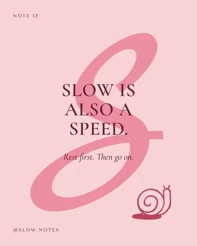 Pastel colour palette: 11 palettes with HEX codesEleven ready pastel palettes with the codes to copy, a generator that stays soft, and the one rule that makes pastels work: a dark ink to read them by.
- 02
 Colour palettes 2027, with HEX codesTwelve ready palettes for next year’s posters, posts and brands, with the codes to copy, a generator that keeps your locked colour, and the contrast measured as you go.
- 03
 How to keep brand fonts and colours consistent across every designName the colours and the type once, link every layer to them, and change them in one place.