Design trends 20277 min readFreeUpdated 2026-11-06Save to Pinterest
Logo design trends 2027: five branding looks and how to make them
Chrome, metal, foil, grids and lamps: five ways brands will dress their wordmarks next year.
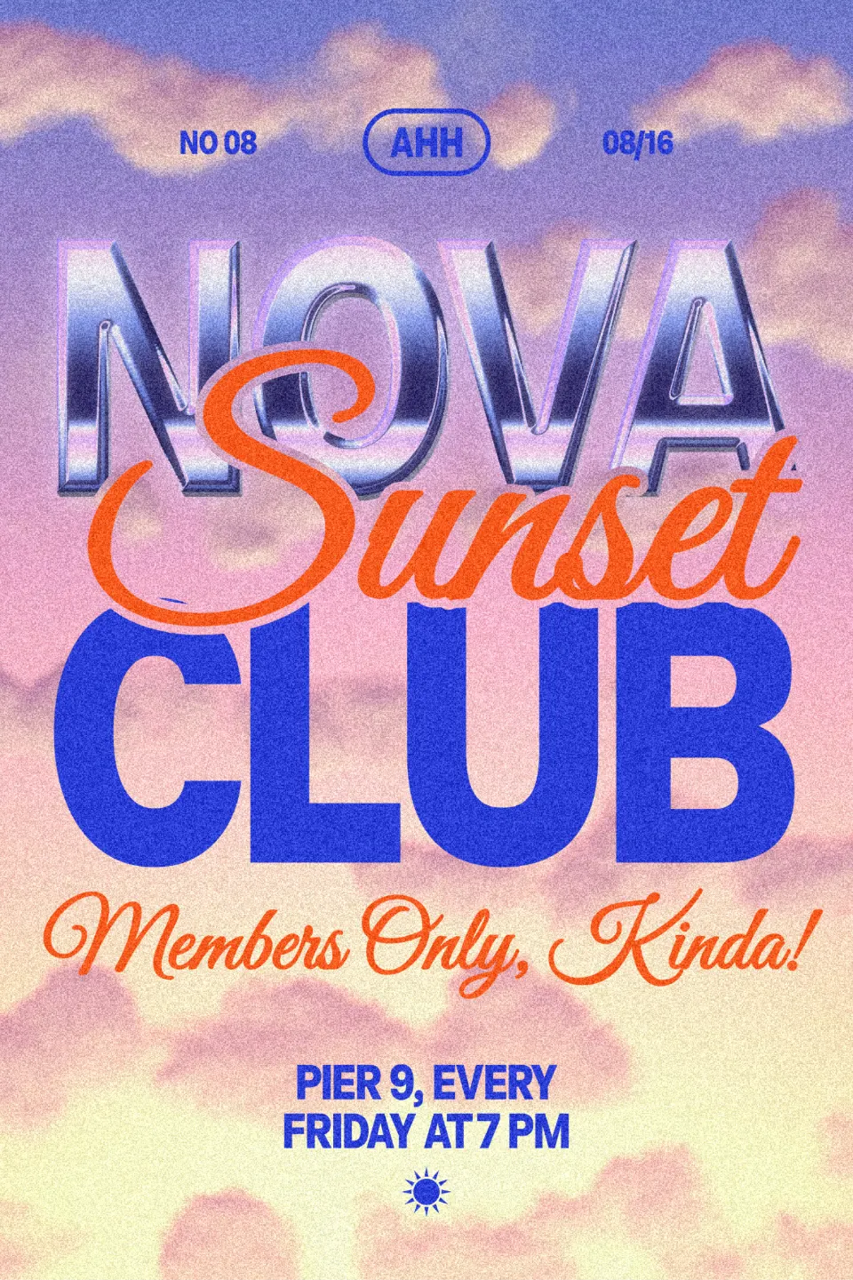
Logo trends move slower than poster trends, and that is a good thing: a brand mark has to last for years. What changes quickly is how brands dress their mark for the moment — a launch post, a merch drop, a festival screen, an animated sticker. Heading into 2027, those moments lean on material: liquid chrome, metal pressed into a plate, rainbow foil, a glowing dot-matrix sign. Next to them sits the opposite move, the construction grid, which shows how a mark is built rather than what it is made of.
Below are five of these looks, each made in Paletoo on one of our own templates and each with a live example you can open. One honest note: these are treatments on a wordmark set as live text. They are great for campaign visuals, social posts and covers, but a real logo also needs a plain, flat version that works in one colour and at the size of a favicon. Design that version first, then dress it.
Every picture in this article is a real design made in Paletoo, on our own templates — exported from the editor, not stock.
Liquid chrome wordmarks
Chrome lettering has been back since the Y2K revival, and it is not going away: music, streetwear and tech brands keep using mirror metal for launches because it reads as new, a little futuristic and expensive at the same time. The 2027 version is softer than the hard chrome of the early 2000s — pastel reflections, a lilac bloom, a short 3D block behind the letters.
Use it on one or two words, set heavy and big. Thin type has no room for reflections, and a whole sentence in chrome turns to noise. Keep a dark or a calm background so the highlights read, and keep the flat version of the mark for everything small: chrome at 32 px is a grey smudge.
Make it in Paletoo
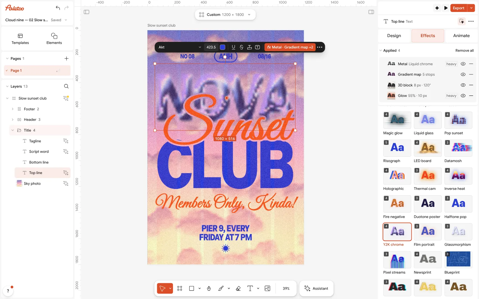
Select the wordmark and open the Effects tab on the right. Under Mixes, press All to see every card.
Press Y2K chrome. Its steps appear under Applied: Metal, a Gradient map with the pastel reflections, a 3D block and a soft Glow.
Click the Metal row to open it and turn Light to match your photo; switch the preset to Chrome for a harder, classic finish.
The text stays text: retype it and the chrome follows. Press Export when it is ready.
Open this example in Paletoo Step-by-step guide: How to make a Y2K chrome text effect
Pressed metal and blind emboss
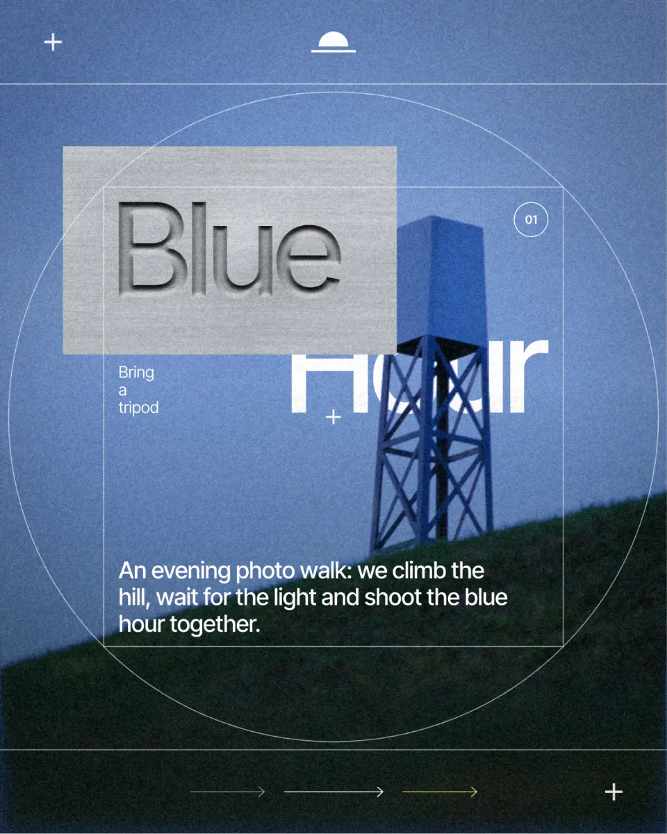
The quiet sibling of chrome is the mark pressed into a surface: a name stamped into brushed aluminium, a crest debossed in slate, a blind emboss with no ink at all. It borrows from packaging, business cards and hardware, where brands press their name into the object itself, and it suits anything that wants to feel crafted rather than loud — architecture studios, watches, spirits, audio gear.
Pressed metal works best with simple, bold shapes and generous spacing; fine serifs and tight kerning fill in. It needs light to read, so keep the surface large and the background plain, and check the result on a phone, where a shallow emboss can disappear.
Make it in Paletoo
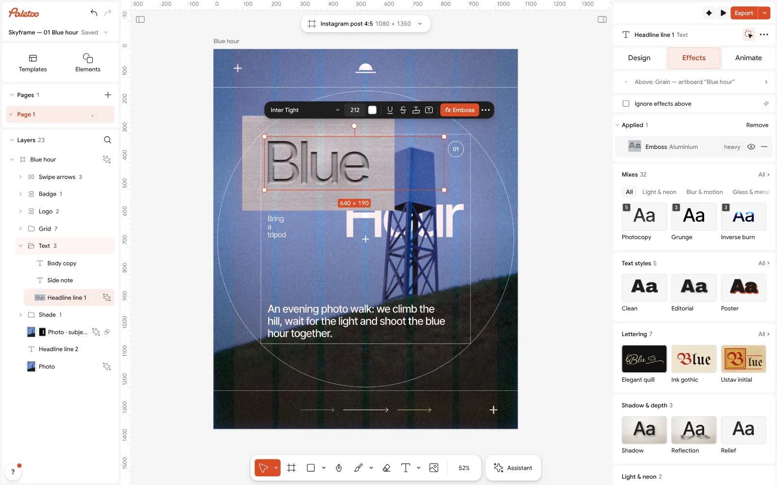
Select the word, open the Effects tab and unfold Retro & print; press the Emboss card.
One step goes on under Applied: Emboss, which presses the letters into a metal plate so only their relief shows.
Click the Emboss row to open it. The presets are Aluminium, Slate, Foil, Blind and Raised; Surface picks the material — Steel, Kraft paper and more — and Direction is Down to press the mark in or Up to raise it.
Set Depth for how deep the press goes, then Export.
Open this example in Paletoo Step-by-step guide: How to make an emboss effect: press text into metal or stone
Holographic foil
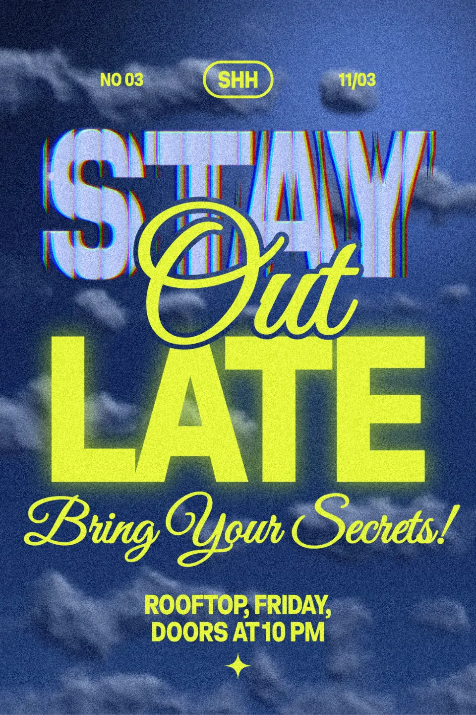
Iridescent foil — the rainbow sheen of a hologram sticker or a foiled card — keeps coming back in beauty, fashion and event branding, and it is now as common on screens as on print. It works because it is playful and premium at once, and because it shifts: pastels melt into each other the way light moves across real foil.
Treat it as a finish, not a palette. A holographic wordmark on a busy, colourful photo fights for attention; on black, deep navy or plain white it glows. Use it for a single moment — a launch, a limited edition — and keep the everyday mark in one solid colour.
Make it in Paletoo
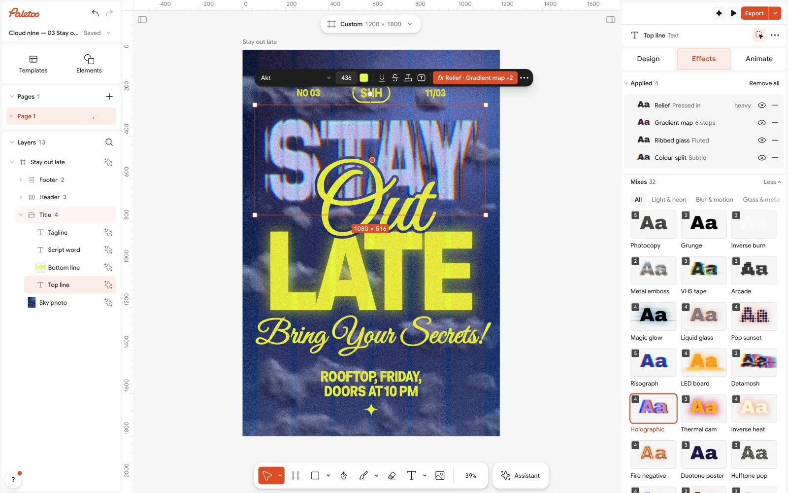
Select the wordmark, open the Effects tab and press Holographic in Mixes.
Four steps go on under Applied: a Relief bevel, a rainbow Gradient map, Ribbed glass and a slight Colour split.
Open the Gradient map to change the foil’s colours, or lower Ribbed glass for a smoother sheen. Export as PNG to keep the colours crisp.
Open this example in Paletoo Step-by-step guide: Chrome and liquid glass: the shiny trend of 2027, and how to make it
Construction grids on show
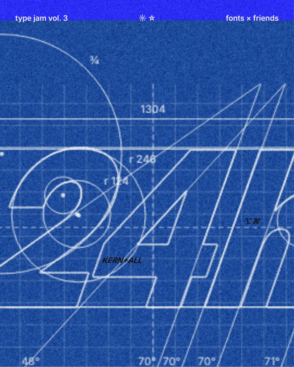
Brand case studies have long shown the circles and guides a mark was drawn on, and in recent years that drawing has moved out of the presentation and into the brand itself: construction lines on launch posts, blueprint backgrounds, dimension labels as decoration. It says “this was designed carefully” without a single adjective, which is why studios and tech brands like it.
The grid should explain the mark, not hide it. Keep the lines thin and in one colour, let the mark stay solid, and use it where people have time to look — a case-study slide, a poster, an about page. It does not belong on the small logo in a header.
Make it in Paletoo
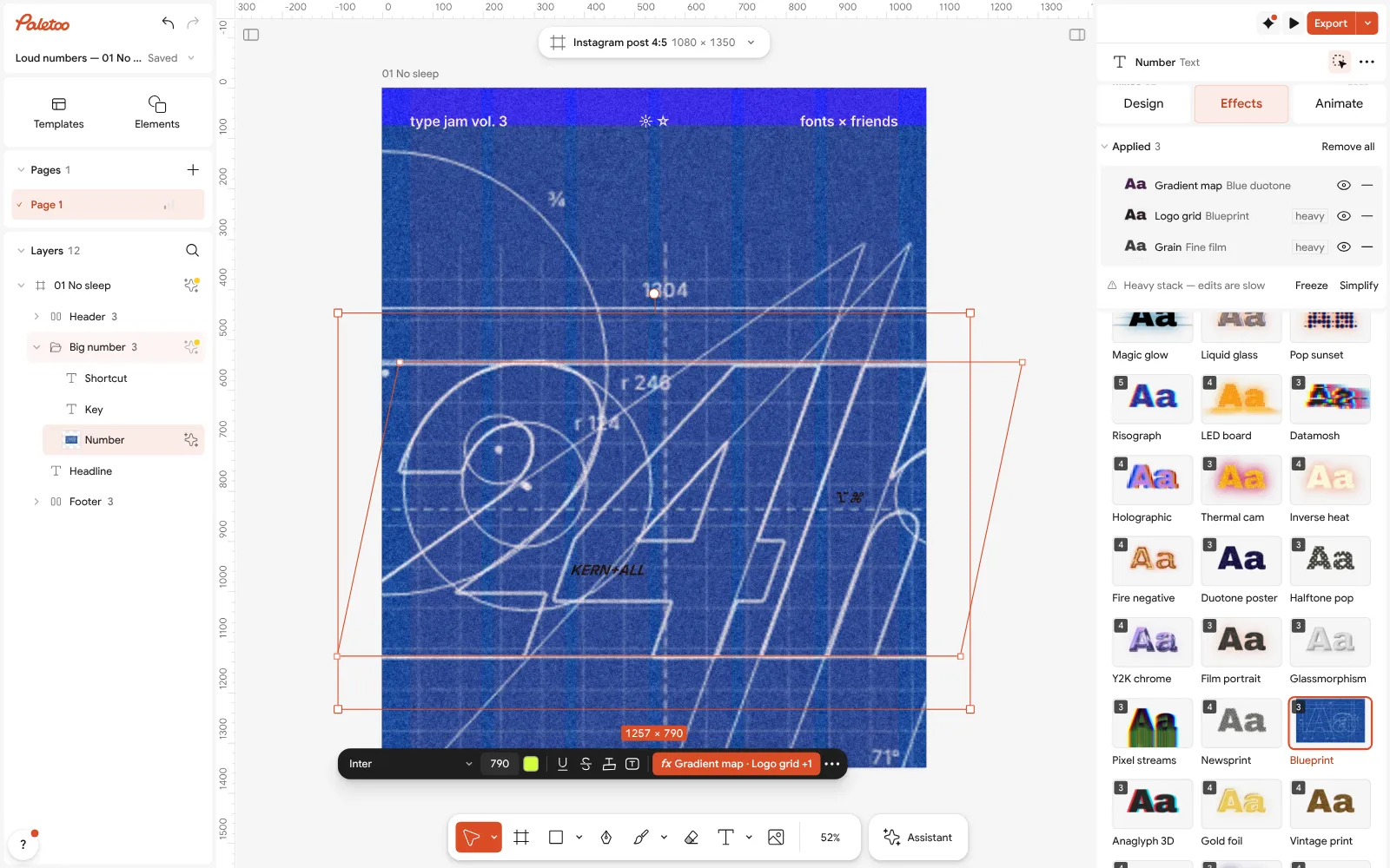
Select the mark or the word and press Blueprint in the Effects tab’s Mixes.
Three steps go on under Applied: a blue Gradient map, the Logo grid and a little Grain.
Open Logo grid to switch its preset — Minimal, Golden ratio, Circles — and turn Labels, Dimensions or Graph paper on or off.
Set the Object to Solid, Faded or Outline, then Export.
Open this example in Paletoo Step-by-step guide: How to keep brand fonts and colours consistent across every design
LED and dot-matrix type
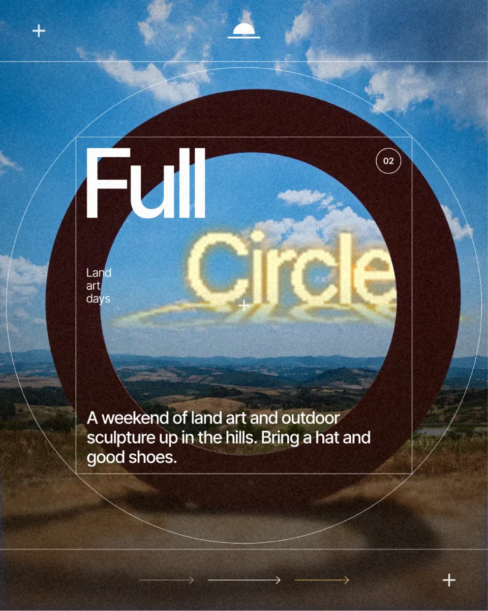
The dot-matrix sign — amber lamps on a black board, the look of station departures and old scoreboards — is a natural fit for brands that live on screens and at events. It ties into the wider pixel and Y2K revival, but it is warmer: each letter is made of glowing points, and the glow spills onto the surface below.
Pick short words and wide, simple letters; a dot grid eats detail. It shines on dark grounds, in stories and on event screens, and pairs well with a plain monospace for the small text. Like chrome, it is a moment look, not the master logo.
Make it in Paletoo
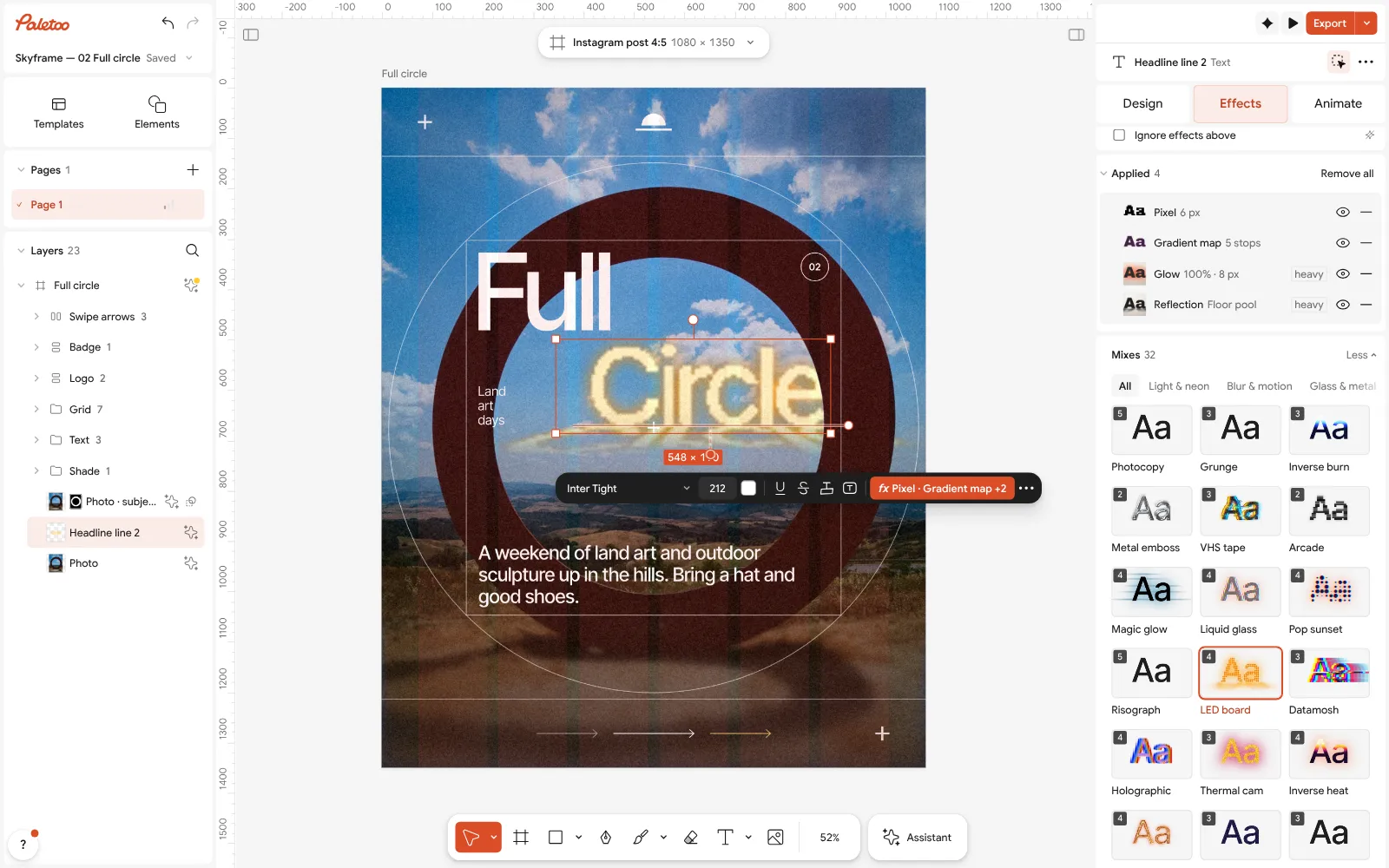
Select the word and press LED board in Mixes on the Effects tab.
Four steps go on under Applied: Pixel breaks the letters into round lamps, a Gradient map colours them amber, a Glow lights them and a Reflection pools the light below.
Open Pixel and change Size for bigger or smaller lamps and Gap for the dark space between them. Then Export.
Open this example in Paletoo Step-by-step guide: Y2K pixel art trend 2027: 8-bit, LED boards and CRT screens
Choosing a logo look for 2027
Start from the brand, not the effect. Loud, young, musical: chrome or LED. Crafted and calm: pressed metal. Playful and premium: holographic foil. Thoughtful and precise: the construction grid. Then make sure the mark still works flat, in one colour, small and on both light and dark — that version is the logo; the treatment is the outfit it wears this season.
For the rest of 2027, read the design trends 2027 overview, the typography trends that sit under every wordmark and the colour trends to dress it in.
Questions
Can I design a real logo with these effects?
You can design the wordmark and its campaign versions. A logo also needs a flat, one-colour master that works small, so build that first; the chrome, foil or LED versions are for posts, covers and launches.
Will the effects follow if I change the brand name?
Yes. Every look here is a stack of live steps on a text layer, so you can retype the word, change the font or the spacing, and the effect is drawn again.
Can I export the treated logo as a vector?
The plain text and shapes export as vectors in SVG and PDF. Chrome, foil, emboss and LED are drawn effects, so they go into the file as a picture — export them at the size you need, as PNG for a transparent background.
Is it free?
Yes. Every effect, mix and export is free and carries no watermark. Credits are only for AI image generation and materials.
Make it online
- Logo makerBuild a wordmark or a badge from real type and shapes, and take it away as a sharp SVG or PDF.
- Text effects onlineChrome, gold foil, emboss, cut-out letters, outlines and warps — and the words stay editable text.
Free design templates: Brand guidelines templates · Social media post templates
Try it on your own design
Paletoo opens in your browser, with no sign-up. Every effect here is live: change the picture or the words and the effect follows.
Open in PaletooRead next
- 01
 Chrome and liquid glass: the shiny trend of 2027, and how to make itMirror-bright metal and clear, bending glass: surfaces that reflect the world around them.
- 02
 How to keep brand fonts and colours consistent across every designName the colours and the type once, link every layer to them, and change them in one place.
- 03
 How to make an emboss effect: press text into metal or stoneThe design pressed into a plate of metal or stone, its own colour gone.
- 04
 Y2K pixel art trend 2027: 8-bit, LED boards and CRT screensChunky pixels, a few hard colours and the glow of an old screen.