Design trends 20276 min readFreeUpdated 2026-11-06Save to Pinterest
Poster design trends 2027: five looks and how to make them
Inks, toner, paper and heavy type: the poster wall is going physical again.
Open in Paletoo Screen-print inks: three flat colours and a coarse dot
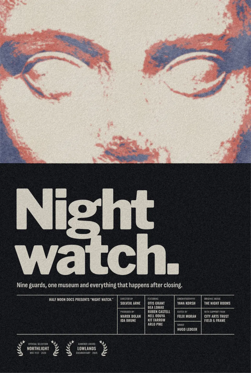
Posters are where design trends get tested in public. A gig poster has two seconds on a wall full of other gig posters, a film poster has a thumbnail on a streaming app, and a sale poster has a shop window. The looks heading into 2027 answer that pressure the same way: they make the picture feel like an object — ink on paper, toner from a copier, a sheet torn off a pad, letters with real depth.
Below are five of them, each shown on one of our own templates and exported straight from Paletoo. For every trend you get where it comes from, how to use it on a poster and what goes wrong, then a short «make it» block and a live example you can open in the editor and change.
Every picture in this article is a real design made in Paletoo, on our own templates — exported from the editor, not stock.
Screen-print inks: three flat colours and a coarse dot
Screen printing gives a poster a handful of opaque inks, a visible dot where the tones meet and slightly rough edges. It is the look of gig posters, art prints and limited runs, and it is back because it reads as made by someone, not rendered by something. On a busy photo it also does a useful job: it throws away detail and keeps only big shapes of light, shadow and one bright ink.
Pick the inks first. A dark ink, one loud colour and the paper tone is a reliable trio; here it is slate blue, red and cream on the close-up face of a film one-sheet. Keep the words flat and on a solid block so they stay readable over the print, and judge the dot at the final size — what reads as texture on a wall can look like noise on a phone.
Make it in Paletoo
Select the photo, open the Effects tab, go to Mixes and press All.
Press Screen print. Four steps go on under Applied: Basic, Gradient map, Halftone and Print.
Click Gradient map to change the three inks, or Halftone for the dot’s Size and Angle, then press Export.
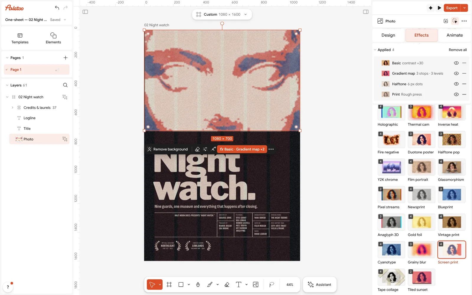
Open this example in Paletoo Step-by-step guide: How to make a screen print effect
Photocopy grit: the xerox zine poster
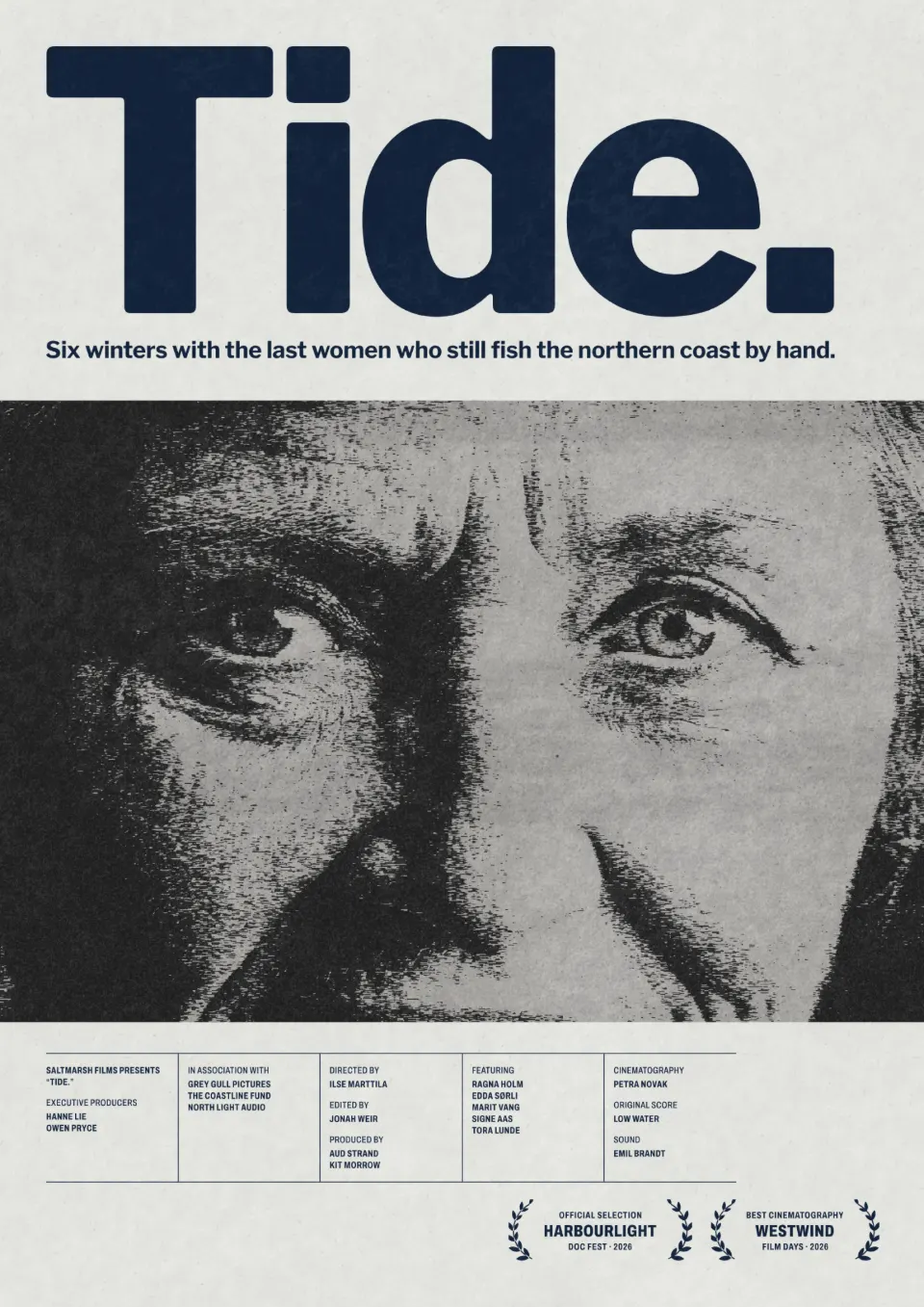
The photocopied flyer is the DIY poster’s native format: black toner, crushed greys, streaks from the glass and a hard edge where the copy ran out. Club nights, small festivals and zines keep returning to it because it is honest about being cheap, and in a feed of glossy, generated images that honesty stands out. It works especially well on a busy photo — the copier flattens it into a strong graphic shape.
Let the photo take the grit and keep the words clean. A crisp headline over a dirty copy is what makes the look intentional; grit on the type as well tends to read as a bad scan. Black and white with one spot colour — a pink button, a yellow sticker — is plenty. Avoid it on faces you need to flatter: a photocopy is never kind to skin.
Make it in Paletoo
Select the photo and open the Effects tab, then Mixes.
Press Photocopy. Its steps — Basic, Torn edges, Grain, Texture and Levels — appear under Applied.
Open Torn edges and move Contrast and Smoothness until the toner holds the shape you want.
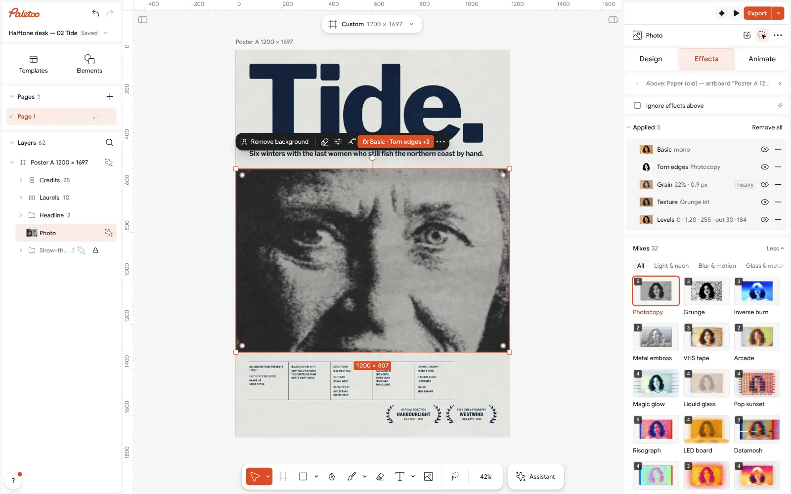
Open this example in Paletoo Step-by-step guide: How to make a photocopy effect
Newsprint dots: the front page as a poster
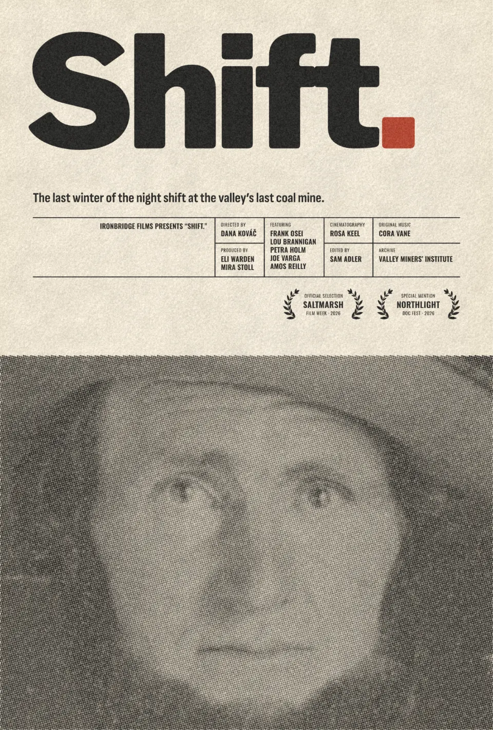
Newsprint is halftone at its most modest: grey ink, a visible dot screen, worn spots and the cheap off-white of newspaper stock. Designers use it to make a poster feel like a document — a report, a headline, something that happened — and it pairs naturally with the big condensed type and narrow columns of a front page. It is a quieter cousin of pop-art dots, which makes it easy to use on serious subjects.
Set the type like a paper would: one heavy headline, a short standfirst, small captions. Colour can come back in one place only — a red word, a stamp — so the grey stays the ground. Keep the dot fine enough for the photo to read at arm’s length; the moment the dot is bigger than the eye, the picture turns into a pattern.
Make it in Paletoo
Select the photo, open the Effects tab and the Mixes.
Press Newsprint: Gradient map, Halftone, Distress and Texture go on under Applied.
Open Halftone to set the dot’s Size, or lower the Texture step for a cleaner sheet.
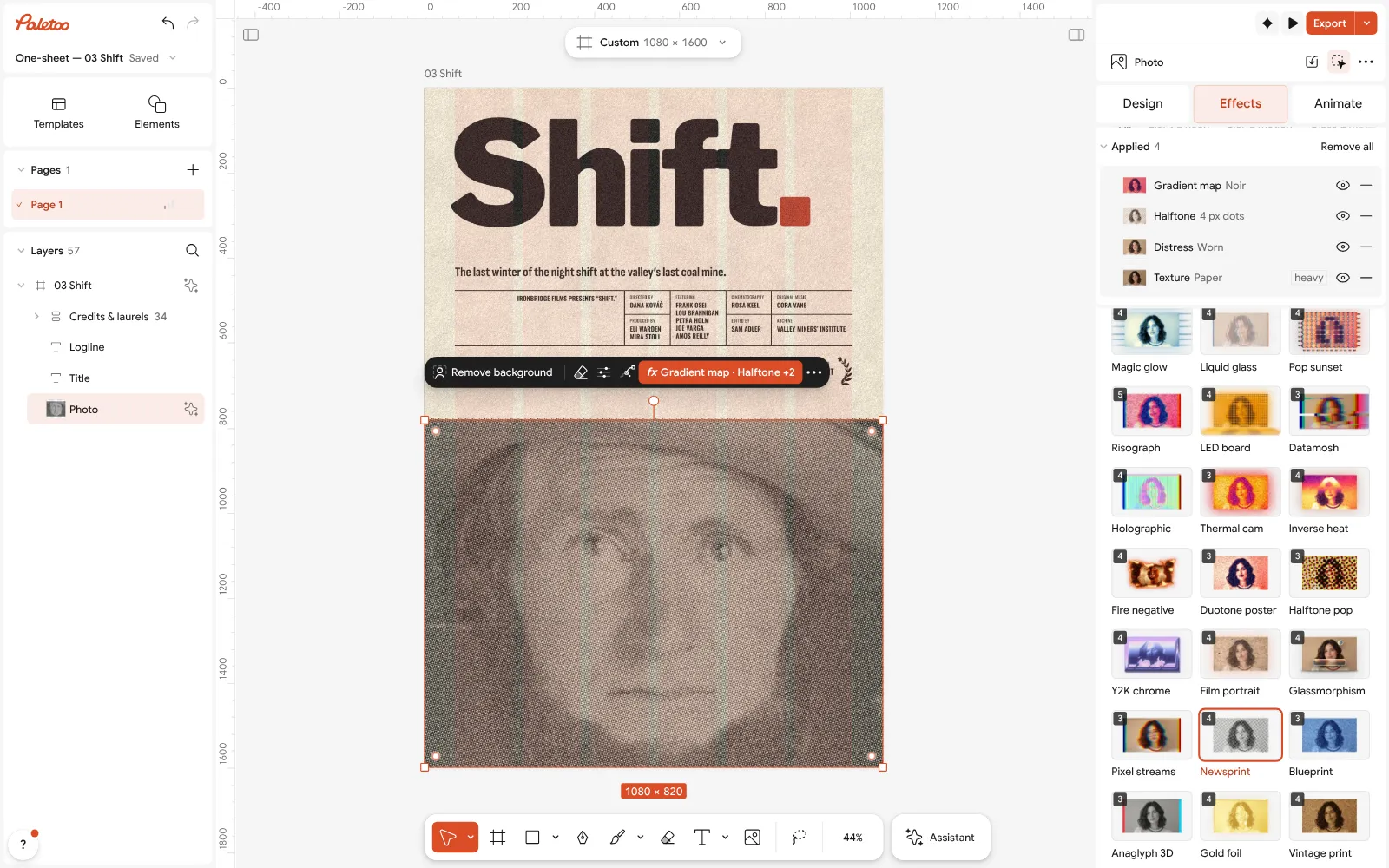
Open this example in Paletoo Step-by-step guide: How to make a halftone effect
Torn-edge prints: photos cut to ink and paper
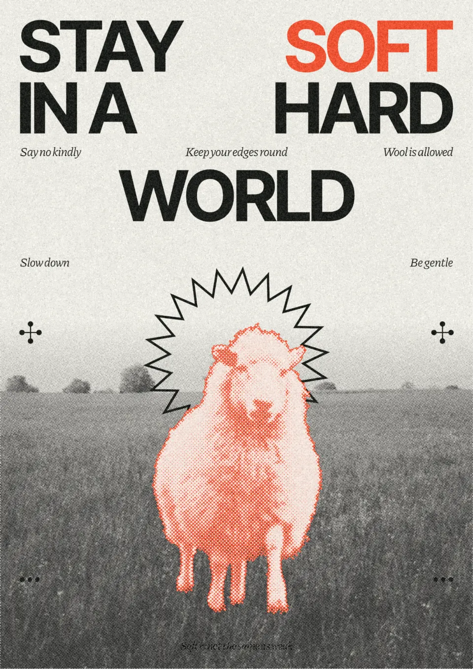
Torn edges is an old print filter made new: every tone becomes either solid ink or bare paper, and the border between them breaks into a ragged, grainy line. Zine covers, gig posters and editorial pages use it because it turns any photo into something that looks pressed onto paper, and it sits well beside halftone figures and heavy type — the wider pull towards surfaces you can almost feel.
Use it on one picture, not everything. A rough field or background against clean type and a crisp figure looks deliberate; on every layer the poster turns into noise. Photos with clear light and shadow tear best; a flat, grey photo loses its shape, so raise the contrast first.
Make it in Paletoo
Select the photo, open the Effects tab and scroll to Retro & print; press All if the card is not in the first row.
Press Torn edges: its step goes on under Applied.
Click the row and move Image balance and Smoothness, or change Ink, Paper and Seed.
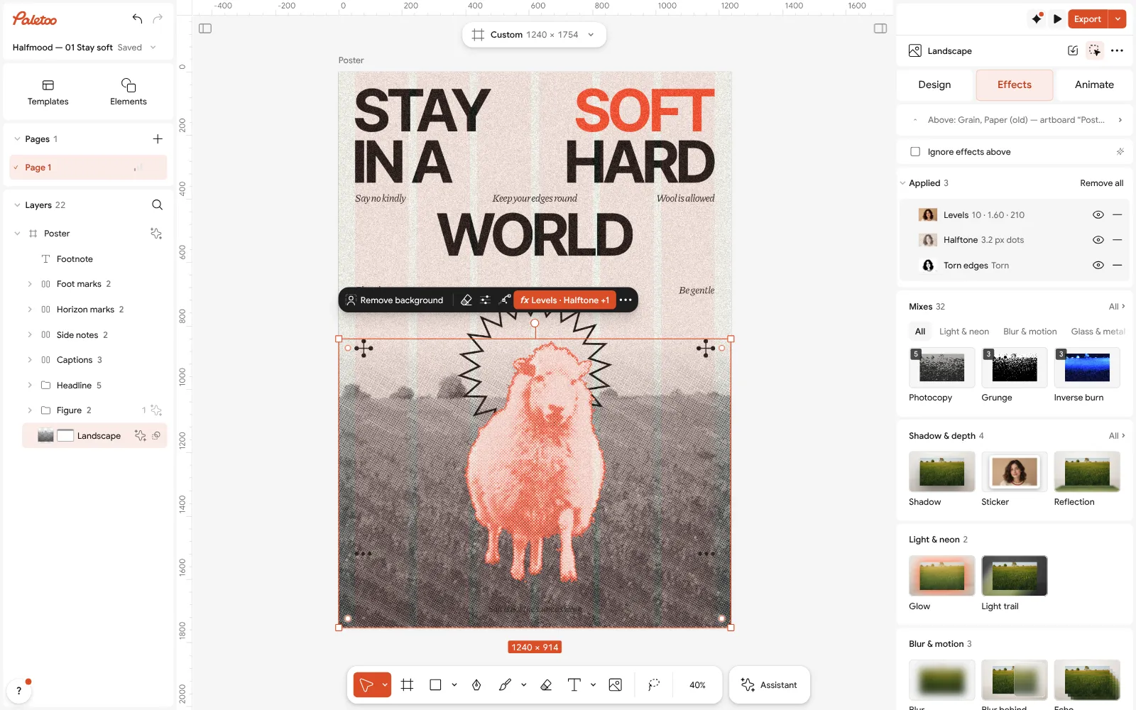
Open this example in Paletoo Step-by-step guide: How to make a torn edges effect, like Photoshop’s Torn Edges
Tiled 3D display type for gig posters
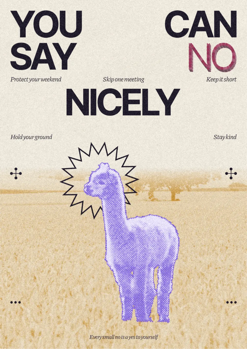
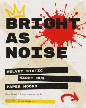
Big display words built from tiles and pushed back into a 3D block borrow from shop signs, arcade titles and mosaic lettering. Gig posters, sports graphics and packaging use them because a headline with surface and depth holds its own against a paint splash, a photo or a full-bleed colour — and a tiled word still reads as one shape from across the street.
Give it one short, heavy word or line; tiles break up thin strokes and long sentences. Keep everything else flat — band names on plain bars, small type in one colour — so the title is the only object with depth. Pick the 3D direction once and keep it if anything else on the poster has a shadow.
Make it in Paletoo
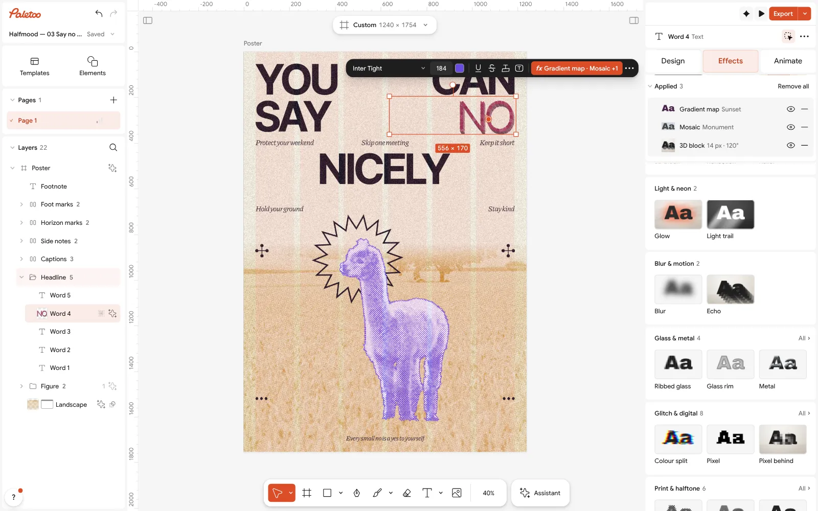
Select the title, open the Effects tab and go to Mixes.
Press Tiled sunset: Gradient map, Mosaic and 3D block go on under Applied.
Open 3D block to set Depth and Angle. The title stays text: double-click to retype it.
Open this example in Paletoo Step-by-step guide: How to make a concert poster from a template
How to choose a poster trend
Let the place decide. On a crowded wall, the louder looks — screen print, tiled 3D type — carry further; on a café noticeboard or an exhibition flyer, newsprint and torn-edge prints feel more personal. Use one look per poster, keep the headline legible from three metres, and check the export at the size it will be printed.
The other 2027 trends, grouped by topic, start from the hub: Graphic design trends 2027. For posts rather than posters, see Instagram post design trends 2027; for the type itself, typography trends 2027.
Questions
Can I print these posters?
Yes. Export a PDF or a large PNG and send it to any digital or offset printer. A real screen print or riso needs one file per ink, which Paletoo does not separate.
Do the effects work on my own photo?
Yes. Replace the template’s picture and the steps stay on the layer, so the new photo gets the same look. You may want to adjust the levels for a darker or lighter photo.
Can I change the effect later?
Every step stays live under Applied: open it to tune it, hide it to compare, or remove it. Nothing is flattened until you export.
Is it free?
Yes. Every effect, mix and export is free and carries no watermark. Credits are only for AI image generation and materials.
Make it online
- Poster makerMake a poster from a template that already has the layout right, then export a print-ready PDF or an image for screens.
- Flyer makerTurn a ready flyer template into yours in minutes and send the printer a PDF with bleed and crop marks.
Free design templates: Poster templates · Event and launch templates
Try it on your own design
Paletoo opens in your browser, with no sign-up. Every effect here is live: change the picture or the words and the effect follows.
Open in PaletooRead next
- 01
 How to make a screen print effectThree flat inks, a coarse dot and screens out of register.
- 02
 How to make a photocopy effectDense toner blacks, greys in scan lines and grey copier paper, from any photo.
- 03
 How to make a concert poster from a templateA ready-made gig flyer, your bands and your date, a file for print and one for social.