Type effects, hands-on3 min readFreeUpdated 2026-11-20
Halftone and risograph text effect, free online
Dots, two inks, a little misregistration and paper grain: print your word without a printer.
By Paletoo’s designers · every step done in Paletoo
The short answer
A halftone text effect breaks the letters into dots whose size follows the tone — big dots where it is dark, small where it is light. A risograph effect prints the word in two bright inks, slightly out of register, on grainy paper. Combine them and the type looks printed on a real riso. In Paletoo both are live steps: Halftone with its Misregistration, and Grain.
Halftone: tone made of dots
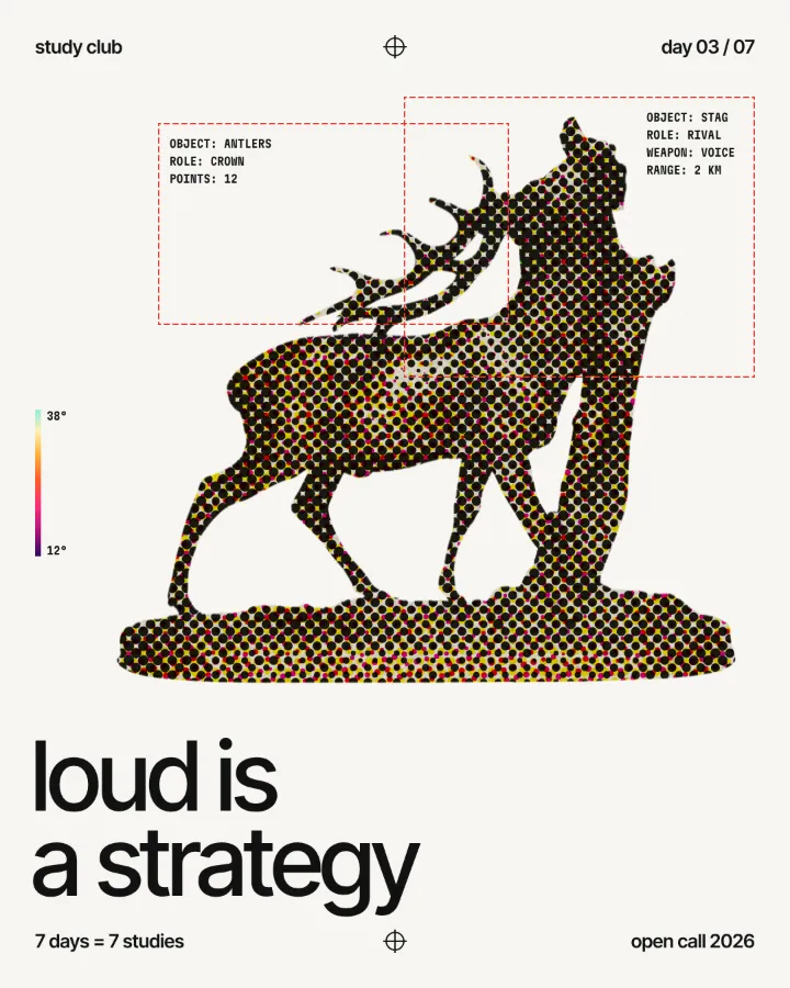
Printing presses cannot print grey; they print dots of one ink, and the eye mixes them. On type, a halftone turns a solid letter into a field of dots, and if the letter carries a gradient — dark at the top, light at the bottom, as in the lab — the dots shrink along it, so the word seems to fade into the paper. Comics, pop art, newspapers and screen-printed gig posters all live on this.
Size is the whole look. Small dots read as a fine, almost photographic texture; big dots are a graphic statement and need a big word. Keep at least a few dots across each stroke, or the letters fall apart.
Risograph: two inks, never quite aligned
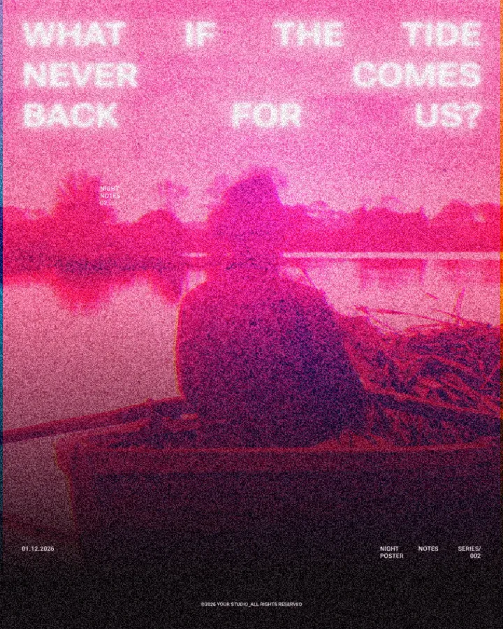
A risograph prints one colour at a time, and the second pass never lands exactly on the first. That small shift — misregistration — is the soul of the look: a pink and a blue that overlap into purple in the middle and show a thin pink or blue edge on each side. Fluorescent pink with blue, yellow with teal, red with black are the classic riso pairs.
Push the misregistration slider in the lab: at 10–20 the word looks carefully printed; past 60 it looks like a zine run off at 2 a.m. Paper grain on top makes both inks feel absorbed rather than pasted on. For the same look on photos, see the risograph effect and halftone effect guides.
Where it works
Posters and flyers for gigs, zines, exhibition and festival programmes, bookshop and coffee shop menus, album covers, Instagram posts that should feel local and handmade. It is part of the grain and print trend of 2027. Keep the palette to two inks plus paper and resist adding a third colour: the limit is what makes it look printed.
Made in Paletoo
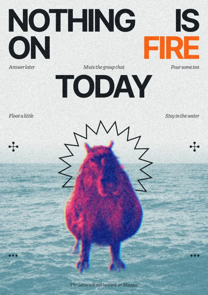
Every design here was made in Paletoo with this look — open one and change anything:
How to make it in Paletoo
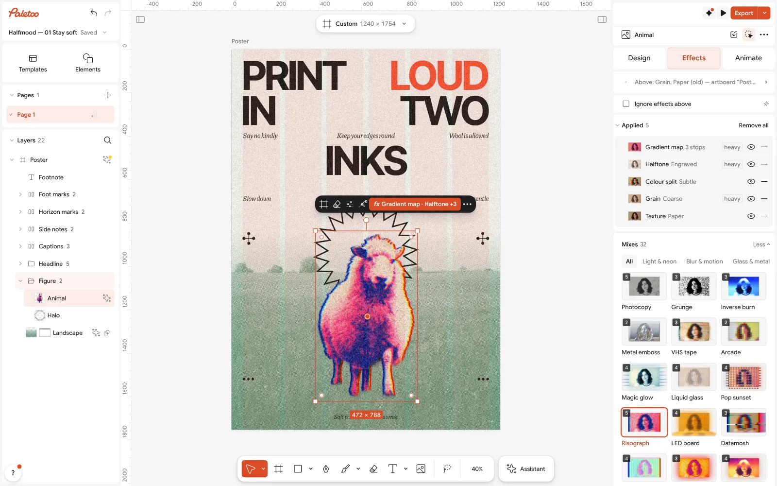
Open the editor and select your text. Heavy letters keep their shape when they turn into dots.
Open the Effects tab and add Halftone.
Set Size for the dots and Angle for the screen; Shape switches to lines or a grid.
Raise Misregistration to knock the inks out of register, and change the Ink colours.
Add Grain for the paper, then Export — the dots are drawn at the export size, crisp in print.
Questions
How do I make a halftone text effect for free?
Try it on your word in the lab on this page, then open it in the free Paletoo editor: add Halftone to the text, set Size and Angle, and export PNG, JPG or PDF with no watermark.
What is misregistration?
The small shift between two inks printed in separate passes, so their edges do not line up. In a risograph print it is expected, and it is what makes digital riso look real.
Which colours are best for a riso effect?
Two strong inks plus the paper colour: fluorescent pink and blue, yellow and teal, red and black. Where they overlap they make a third colour for free.
Will the dots stay sharp when I print?
Yes. In Paletoo the halftone is drawn at the export size, so a large print file has round, crisp dots instead of an enlarged screenshot.
Make it online
Try it on your own design
Paletoo opens in your browser, with no sign-up. Every effect here is live: change the picture or the words and the effect follows.
Open in PaletooOpens this design as your own copy — every layer and effect editable, free.
Read next
- 01
 Glitch text effect: colour split and echo, freeBreak your word on purpose: split the colours, slice the letters, or let echoes trail behind.
- 02
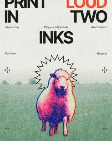 How to make a risograph effectTwo riso inks out of register, a coarse screen, riso paper.
- 03
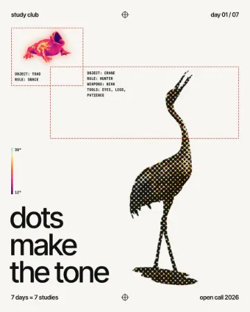 How to make a halftone effectComic-book CMYK dots, newspaper screens or one ink.
- 04
 Grain and print textures: the riso trend of 2027, and how to make itFlat inks, a coarse dot, toner grit and paper: the print look, on any photo.